Organic Baby Food Brand Landing Page Template
Nourish is a hero-dominant baby food landing page template built for organic baby food and formula brands. It pairs a nine-tile Photo Grid Mosaic hero with a calm Gallery Walk content flow, an interactive ingredient wheel, and a personalized Stage Quiz. Every design choice earns parent trust before asking for anything in return.
by Rocket studio
Quick summary
Nourish is a single-page template for baby food and formula brands. It opens with a staggered nine-tile photo mosaic and guides visitors through gallery-style feeding stories, a spinning ingredient wheel, and a four-question stage quiz. The rosehip call-to-action button and sticky micro-bar make conversion feel gentle rather than pushy.
Who this template is for
This template is built for brands and creators who need to earn parent trust before asking for a sign-up or purchase. It suits small-batch organic producers and growing direct-to-consumer baby food labels equally well.
- Baby food and formula brands selling direct to parents online
- Nutritionists or pediatric health educators launching a guided feeding resource
- Daycare product buyers or family-focused e-commerce stores showcasing multi-stage meal lines
What problem this template solves
Parents researching baby nutrition at 2 a.m. do not want a hard sell. They want calm, credible information that feels personal. Most baby food pages rush straight to a checkout button, losing the parent before trust is built.
- Generic product pages lack the expert storytelling that anxious first-time parents need
- Stage-based feeding information is rarely presented in a clear, unhurried visual flow
- Email capture forms feel transactional without personalization tied to the child's age or readiness
What you get with this template
You get a fully structured, single-page layout designed around four core content moments: a cinematic hero, a two-frame gallery walk, an interactive ingredient wheel, and a personalized quiz with email capture. Every section follows a deliberate sequence that informs before it asks.
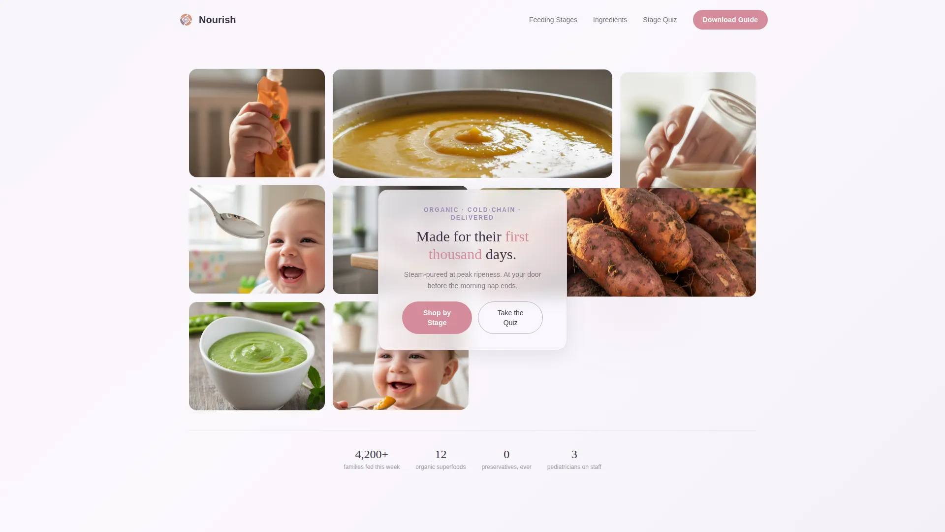
- A nine-tile Photo Grid Mosaic hero with a centered floating headline typeset in rounded serif
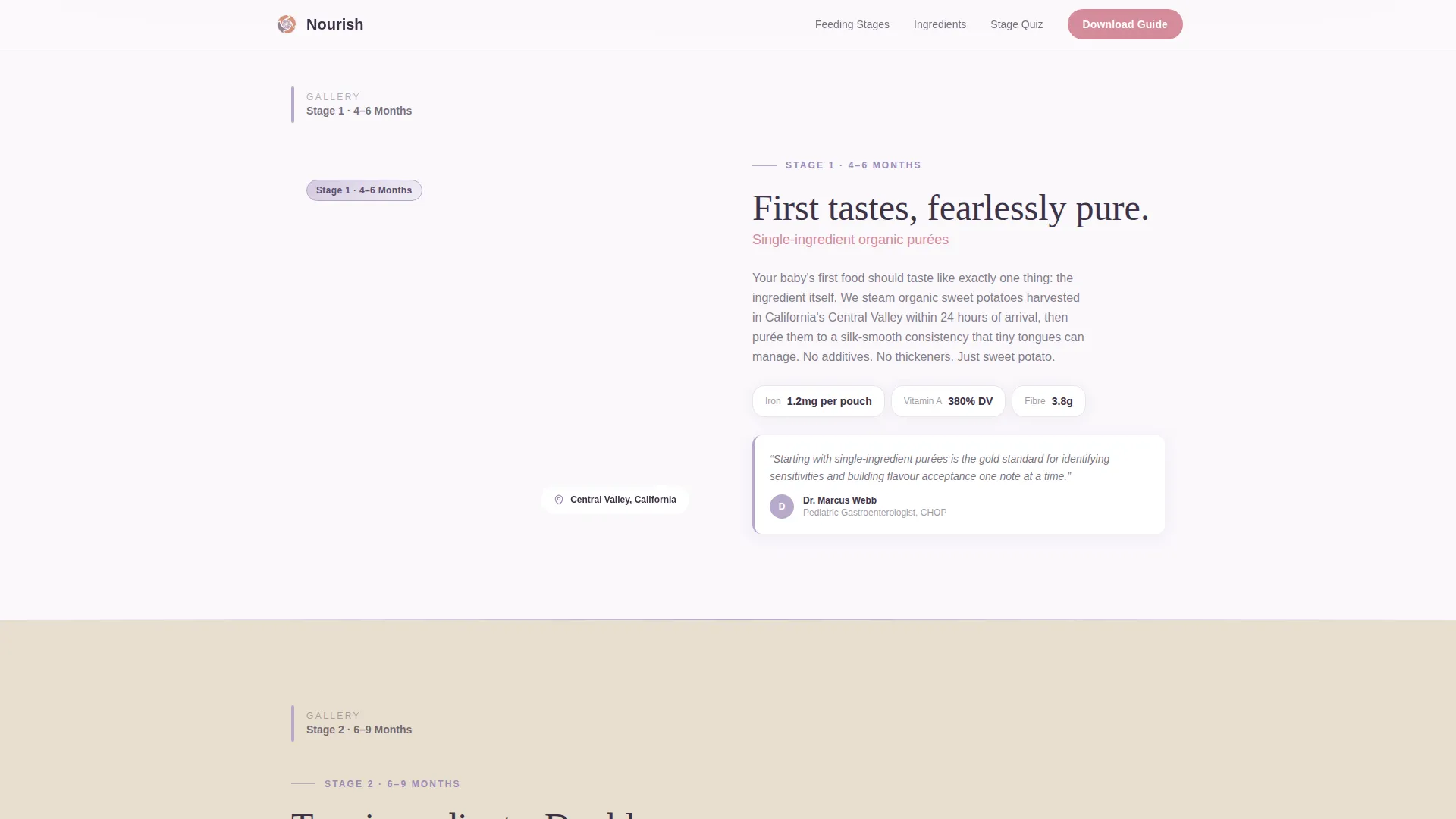
- Two gallery frames pairing hero ingredient photography with narrative cards and pediatrician quote slots
- An interactive ingredient wheel, a four-question Stage Quiz, a single-step download form, and a sticky micro-bar call-to-action
Feature list
This template ships with six purposeful components, each serving a specific moment in the parent's decision journey.
Nine-Tile Photo Grid Mosaic Hero
Nine softly rounded, staggered image tiles fill ninety percent of the viewport at load. The tiles overlap like pinned Polaroids, giving the hero a warm, handmade energy. A floating headline sits in the center gap, typeset in Fraunces rounded serif.
Gallery Walk Content Frames
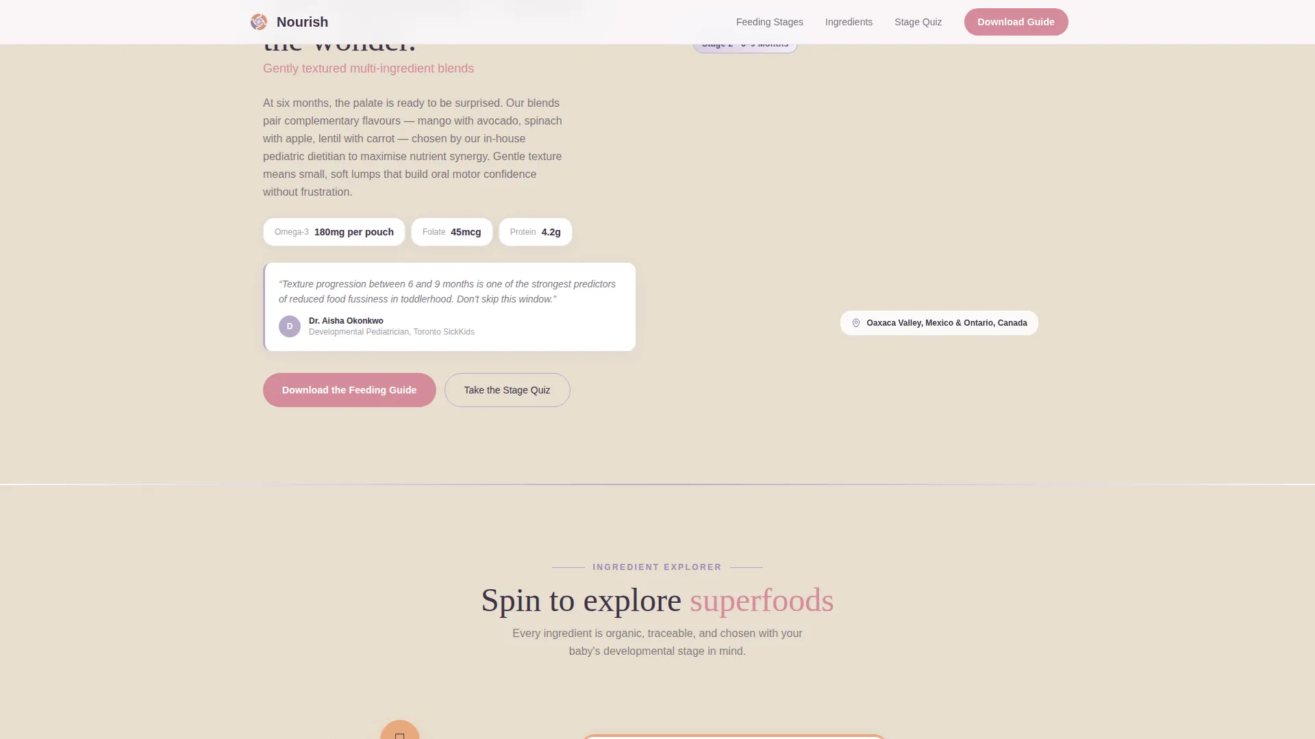
Two full-width gallery frames each pair a hero ingredient photograph on the left with a short narrative card on the right. Each card includes a sourcing origin note, a nutrient callout, and a slot for a pediatrician quote. Generous whitespace between frames keeps the pace unhurried.
Interactive Ingredient Wheel
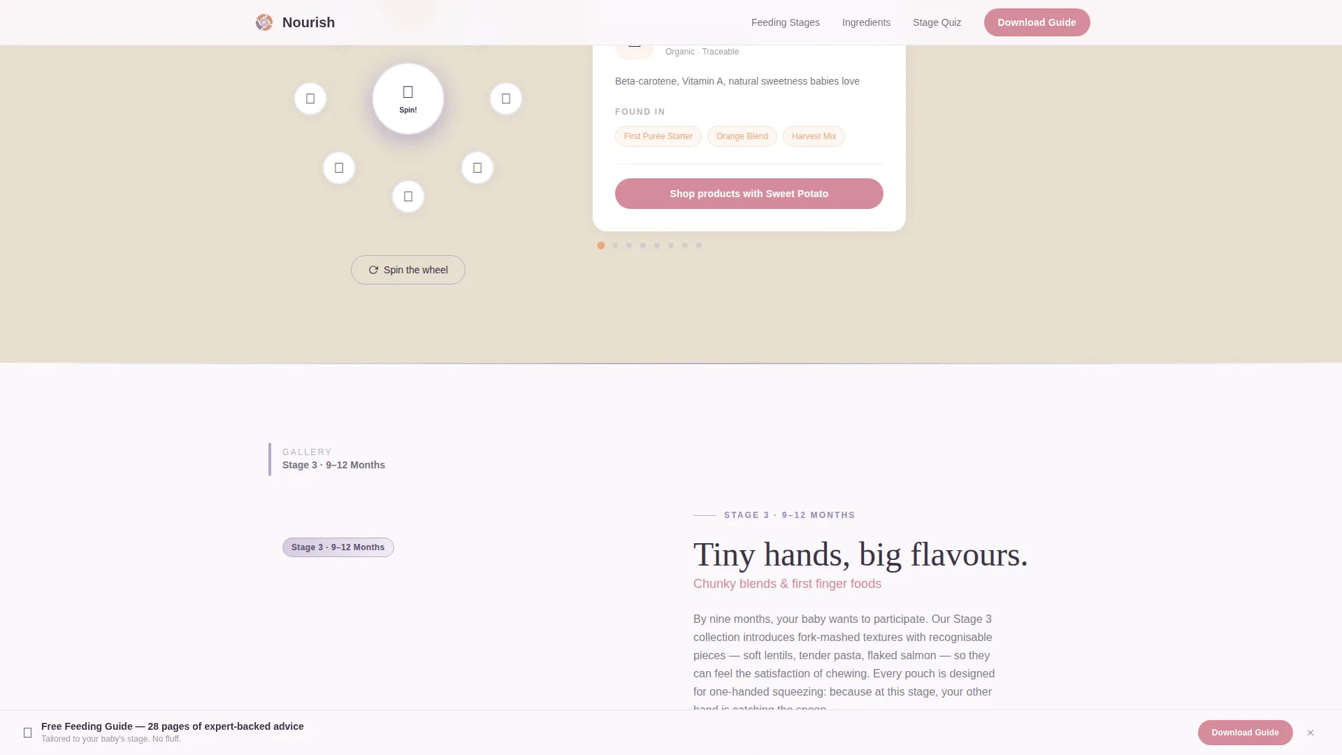
A spin-and-discover wheel lets visitors explore superfoods and see which products in the range contain them. The interaction turns passive reading into gentle play, keeping parents engaged longer without pressure.
Personalized Stage Quiz
A four-question flow asks about the child's age and texture readiness, then recommends the right product tier. The quiz makes the recommendation feel tailored rather than algorithmic, which builds immediate confidence in the suggestion.
Single-Step Download Form
After the quiz, a one-screen form collects the baby's first name, birth month and year, and parent email address. Three fields feel personal rather than demanding. The primary call-to-action button is styled in rosehip and reads "Download the Feeding Guide."
Sticky Micro-Bar Call-to-Action
Once a visitor scrolls past fifty percent of the page, a compact sticky bar appears at the bottom of the screen. It repeats the primary call-to-action without covering the main content, keeping the conversion path visible for mobile users browsing one-handed.
Page sections overview
| Section | Purpose |
|---|---|
| Hero Photo Mosaic | Opens with nine staggered tiles and a floating brand headline |
| Gallery Frame One | Tells the first-purées ingredient story with a pediatrician quote |
| Gallery Frame Two | Covers textured blends and introduces the Feeding Guide download |
| Ingredient Wheel | Lets visitors spin through superfoods and find matching products |
| Stage Quiz Flow | Four questions recommend the right product tier by age |
| Download Form | Captures baby name, birth date, and parent email in one step |
| Footer | Horizontal flow footer with brand and navigation links |
Design & branding system
The visual identity follows a Nurture and Care theme built around the Lavender Dream color system. Every tone is chosen to feel hushed, powdery, and reassuring rather than clinical or loud.
- Soft wisteria (#B8A9C9) anchors section dividers and iconography; cloud-white (#FAF8FC) gives text maximum breathing room; warm oat (#E8DFD0) warms background panels
- Rosehip (#D48B9A) is reserved for buttons and interactive highlights, drawing the eye without raising the pulse
- Fraunces rounded serif handles display headings; DM Sans handles body copy for clean, friendly readability
Mobile & speed optimization
The template is built mobile-first because its primary audience is parents browsing on a phone, often one-handed, often in low-light conditions. Every interactive component is designed to work comfortably at thumb reach.
- Scroll-triggered reveals animate sections into view as the user scrolls, reducing initial load weight
- Lazy-loaded images and CSS scroll-behavior keep the page responsive on slower mobile connections
- The sticky micro-bar and quiz flow are optimized for single-column, one-handed interaction on small screens
How this template helps you convert
The conversion path is built around earned trust. Two full gallery frames of expert content appear before any form or call-to-action, so visitors already feel informed when the ask arrives.
- The Gallery Walk delivers ingredient stories and pediatrician credibility first, so the parent trusts the brand before seeing a form.
- The Stage Quiz makes the product recommendation feel personalized, which reduces hesitation at the download form step.
- The sticky micro-bar re-surfaces the call-to-action after fifty percent scroll depth, catching parents who paused mid-page without interrupting their reading flow.
Other information about this template
This template is a strong fit for any organic baby food or formula brand building a direct-to-consumer content hub. It is equally useful as a campaign landing page for a new product launch or a seasonal feeding guide promotion.
- The social proof slots support a real-time family count metric ("4,200 families fed this week"), organic certification badges, and pediatrician attribution quotes
- The footer follows a horizontal flow pattern with brand links and navigation, keeping the page complete without adding visual clutter
- The template uses medium-level animation: scroll-triggered reveals and the ingredient wheel spin are included, but the pacing stays calm and does not distract from the content
- Typography pairing of Fraunces and DM Sans is intentional; Fraunces conveys warmth and craft while DM Sans keeps body text legible at small sizes on bright phone screens
Theme
Nurture & Care
Creative direction
Gallery Walk
Color system
Lavender Dream
Style
Hero-Dominant (90/10)
Direction
Content/Resource
Page Sections
Nine-tile Photo Grid Mosaic Hero
Gallery Walk Content Frames
Interactive Ingredient Wheel
Personalized Stage Quiz
Single-step Download Form
Sticky Micro-bar Call-to-action
Related questions
Who is this landing page template designed for?
What interactive features are included in this template?
Can I use this template to capture email leads?
How does the Stage Quiz work?
Does the template support social proof and trust signals?