Parkinson's Disease Nutrition Landing Page Template
Nourish is a single-page landing page template built for Parkinson's disease nutrition and diet programs. It uses comparison tables, a testimonial mosaic, and a credentialing badge bar to convert recently diagnosed patients and caregivers into leads. The design pairs warm clinical typography with a calming Slate and Sky color system, delivering authority and empathy in equal measure.
by Rocket studio
Quick summary
Nourish is a focused landing page template for a Parkinson's disease nutrition program. It leads with trust-building award badges, walks visitors through three side-by-side comparison tables, and weaves in caregiver and patient testimonials between each table. The primary goal is a simple lead-capture form tied to a downloadable meal timing guide.
Who this template is for
This template is built for nutrition practitioners, registered dietitians, and health educators who serve the Parkinson's disease community. It speaks directly to people who need to earn trust quickly with a medically literate but emotionally worn audience.
- Dietitians and clinicians offering Parkinson's-specific meal planning programs
- Health educators and care organizations building lead-generation resources for PD caregivers
- Adult children or family advocates creating resources for a newly diagnosed parent
What problem this template solves
Generic nutrition landing pages fail the Parkinson's disease audience because they do not address medication timing, tremor-friendly eating mechanics, or the emotional weight of a new diagnosis. This template is built around that specific gap.
- Visitors arrive with complex, medication-aware questions and quickly leave pages that give them generic healthy-eating advice
- Caregivers and patients need both clinical authority and human warmth before they will trust a downloadable resource
- A standard opt-in page cannot carry the proof load required in a sensitive health niche, this template uses comparison tables, credentialing badges, and real testimonials to do that work
What you get with this template
You get a fully structured, single-page layout that moves a visitor from skepticism to action through a deliberate sequence of evidence and emotion. Every section is purpose-built for the Parkinson's nutrition context.
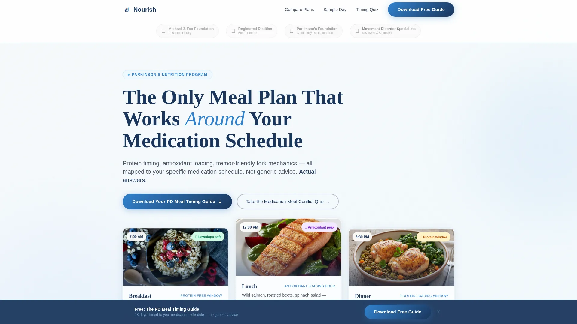
- A hero section with an award badge credentialing bar, a bold headline, three floating meal-timing cards, and a primary download call to action
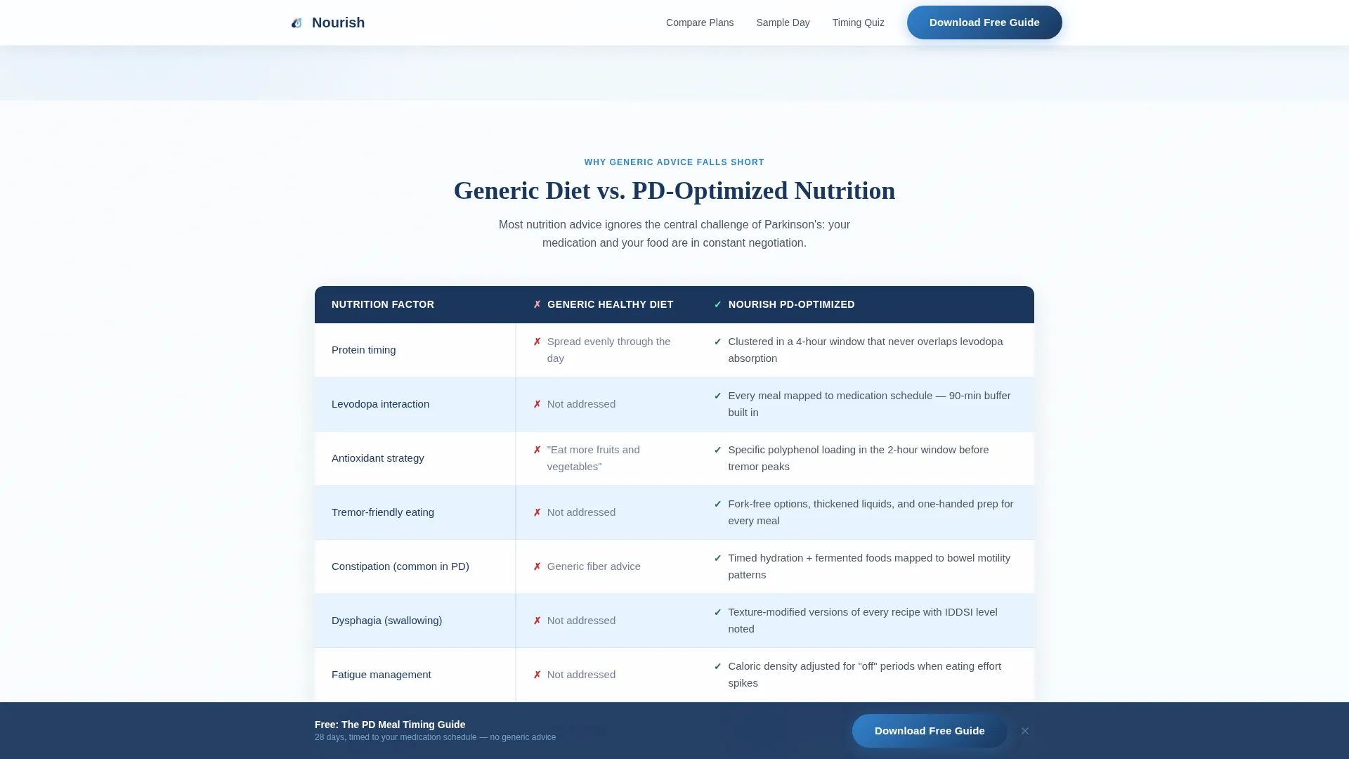
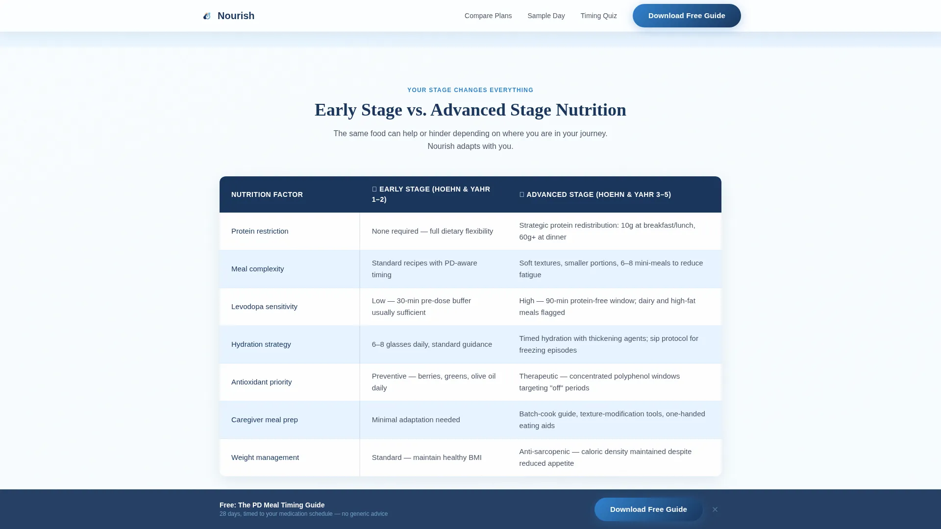
- Three comparison tables covering Generic Diet versus PD-Optimized, Early Stage versus Advanced Stage, and With Levodopa versus Without Levodopa
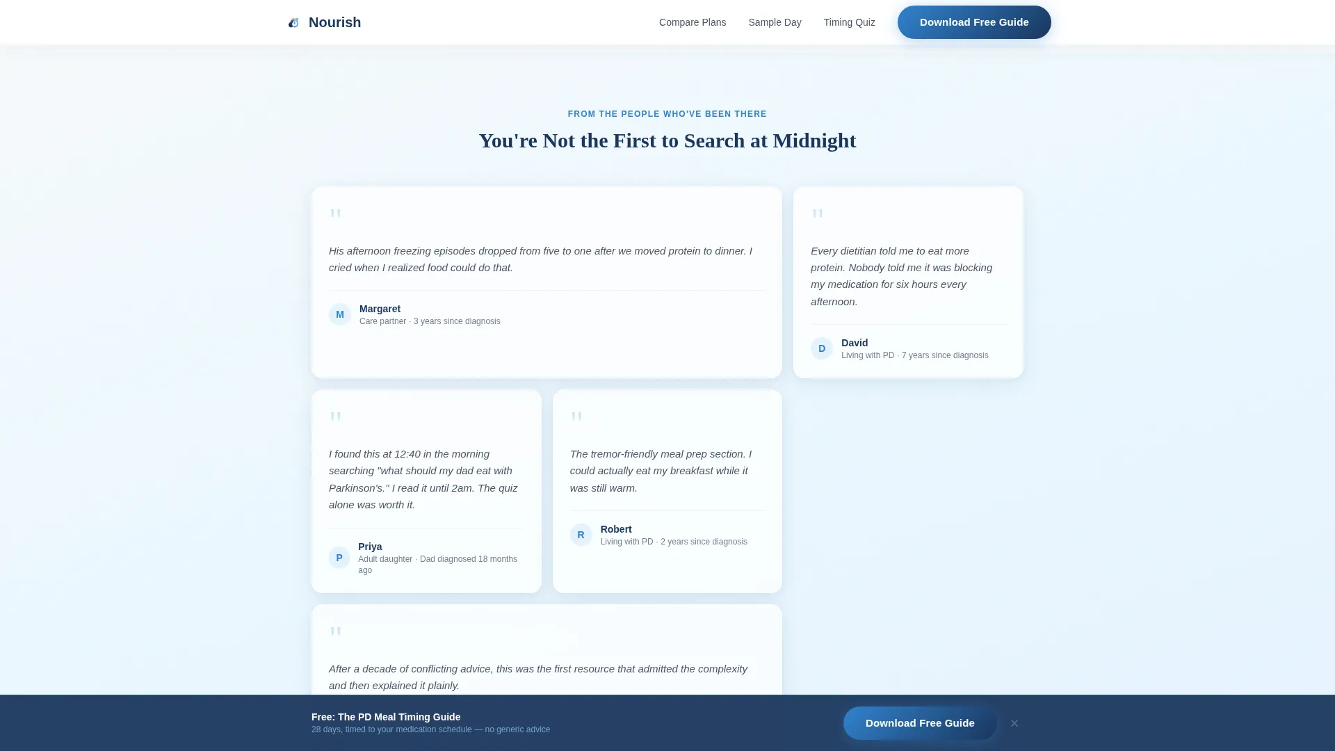
- A testimonial mosaic with staggered caregiver and patient quote tiles placed between each comparison table
- A visible sample day meal plan and an interactive five-question Medication-Meal Conflict Quiz with its own lead-capture path
- A sticky bottom bar call to action that appears after 40 percent scroll depth, and a minimal footer using a horizontal flow pattern
Feature list
This section describes the core built-in components that define the Nourish template.
Award Badge Credentialing Bar
A horizontal bar of muted, monochrome slate badges sits above the hero headline. On hover, each badge blooms into its full-color version. The badges reference recognitions from relevant Parkinson's disease health authorities, a registered dietitian seal, and a movement disorder specialist review shield. This bar signals clinical credibility before the visitor reads a single word of body copy.
Three-Table Comparison System
The template includes three structured side-by-side comparison tables. Each table addresses a distinct decision point: generic versus PD-optimized diet, early stage versus advanced stage nutrition needs, and meal planning with levodopa versus without. Alternating near-white and whisper-blue rows keep the tables readable, and interactive hover states warm to a soft periwinkle.
Testimonial Mosaic Layout
Between every comparison table, a staggered grid of quote tiles appears. Each tile carries a first name, years since diagnosis, and one specific outcome detail. The mosaic alternates with the tables in a deliberate evidence-then-emotion rhythm, so visitors feel both informed and understood as they scroll.
Dual Lead-Capture Paths
The primary path is a three-field form asking for first name, email, and a single radio selection identifying the visitor as the person with Parkinson's disease or a care partner. The secondary path is the Medication-Meal Conflict Quiz, a five-question interactive tool that delivers a personalized timing snapshot and captures the same lead data through demonstrated value.
Sticky Bottom Bar Call to Action
A persistent bottom bar labeled "Download Your PD Meal Timing Guide" activates after 40 percent scroll depth. It stays visible as the visitor reads deeper into the page, keeping the primary conversion action reachable without interrupting the reading flow.
On-Page Sample Meal Plan
One full sample day of meal timing is displayed directly on the page, not hidden behind the form. This proves the resource is specific and clinically grounded before asking for any contact information, building trust before the ask.
Page sections overview
| Section | Purpose |
|---|---|
| Hero with Badges | Opens with credentialing bar, headline, floating meal-timing cards, and primary download call to action |
| Comparison Table 1 | Contrasts a generic diet with a PD-optimized approach to establish clinical authority |
| Testimonial Mosaic 1 | Staggered caregiver and patient quote tiles deliver emotional proof after the first table |
| Comparison Table 2 | Contrasts early-stage and advanced-stage nutrition needs for stage-specific relevance |
| Sample Day Plan | Displays one full day of PD-timed meals on-page to prove program specificity |
| Comparison Table 3 | Contrasts meal planning with levodopa versus without levodopa |
| Quiz Call to Action | Interactive five-question tool with a personalized result and secondary lead capture |
| Sticky Bottom Bar | Persistent download prompt activates after 40 percent scroll |
| Minimal Footer | Horizontal flow footer pattern closes the page cleanly |
Design & branding system
The visual identity uses a Soft Gradient theme anchored in the Slate and Sky color system. The overall feeling is calm, clinical, and unhurried, like the quiet first hour of a morning before the day's demands begin.
- Colors: clinical-trust navy (#1A365D) for headers and table borders, open-sky blue (#63B3ED) for buttons and progress indicators, calming slate (#4A5568) for body text, and a dawn-white gradient (#F7FAFC to #EBF8FF) washing softly across section backgrounds
- Typography: Fraunces serif for headings to convey warmth and trust, DM Sans for body copy to keep reading easy and clean
- Interactive details: badge hover states bloom from monochrome slate to full color, table rows alternate between near-white and whisper-blue, hover states on rows warm to soft periwinkle
Mobile & speed optimization
The template is built desktop-first but includes full mobile responsiveness. This matters because a meaningful share of the target audience searches late at night on a phone, urgently looking for answers after a parent's diagnosis.
- Scroll-reveal animations use Intersection Observer so elements appear as the visitor reaches them, reducing visual overload on smaller screens
- The sticky bottom bar and quiz interactive states are designed to function cleanly on touch devices
- Server Components handle the comparison table rendering for a fast initial paint on both desktop and mobile
How this template helps you convert
The page uses a layered proof strategy rather than a single persuasion tactic. Every section earns a little more trust before presenting the next ask.
- The award badge bar and clinical headline establish credibility in the first five seconds, so skeptical visitors keep reading rather than bouncing
- The alternating comparison table and testimonial mosaic rhythm prevents the page from feeling like a lecture, keeping emotional engagement high as scroll depth increases
- The on-page sample meal plan gives away real value before asking for contact information, making the download feel like a fair and obvious next step
Other information about this template
The Nourish template is a strong fit for anyone building a content-driven health resource in the Parkinson's disease nutrition space. A few additional details are worth noting.
- The single radio button in the lead form ("I am the person with PD" or "I am a care partner") is designed to segment the follow-up sequence so each audience receives language that matches their situation
- The quiz tool offers a second conversion path for visitors who are not yet ready to download, capturing lead data through a value-first interaction
- The footer uses a horizontal flow pattern (Pattern 3) for a clean, minimal close that does not distract from the final call to action
- This template is well suited for use alongside resources from Parkinson's disease nutrition communities and caregiver support networks, as its credentialing bar is designed to reference relevant authority sources in the movement disorder space
Theme
Soft Gradient
Creative direction
Testimonial Mosaic
Color system
Slate & Sky
Style
Comparison Table
Direction
Content/Resource
Page Sections
Award Badge Credentialing Bar
Three Comparison Tables
Testimonial Mosaic Between Tables
Dual Lead-capture Paths
On-page Sample Meal Plan
Sticky Bottom Bar Call to Action
Related questions
Who is the Nourish template designed to serve?
What makes this different from a standard health opt-in page?
How does the dual lead-capture system work?
Can I customize the comparison table content for my program?
When does the sticky bottom bar appear?



