Whole30 Meal Delivery Catering Landing Page Template
Nourish is a full-width immersive landing page template built for Whole30 catering and meal delivery services. It leads with appetite-first food photography, a warm neighborhood founder story, and a three-step booking flow. The Fire & Earth color system, Fraunces serif headlines, and sticky call-to-action design work together to turn hungry visitors into confirmed delivery clients.
by Rocket studio
Quick summary
Nourish is a landing page template designed for local Whole30 meal delivery and catering businesses. It opens with a full-bleed overhead food photo, walks visitors through a founder story and delivery map, and closes the loop with a three-step booking form. Every section is built to create appetite, establish trust, and make scheduling feel effortless.
Who this template is for
This template is ideal for food entrepreneurs running a neighborhood-scale catering or meal delivery operation. It works especially well when your business serves clients with specific dietary needs and your food deserves to be seen before anything else is said.
- Whole30 meal delivery kitchens serving a defined local radius
- Catering professionals whose clients include postpartum mothers, health-focused couples, and busy founders
- Food business owners who want a landing page that earns the booking by showing the food first
What problem this template solves
Catering websites for special-diet food often feel clinical or apologetic. They list ingredients before showing a single appetizing image. Visitors leave before they feel anything. A well-designed catering landing page earns the click by making the visitor hungry before asking for a commitment.
- Visitors arrive without context and leave before they connect with the food or the person making it
- Whole30 catering services struggle to communicate full program compliance, variety, and warmth in one page
- Most booking flows feel transactional, not personal, which raises drop-off before the first delivery day
What you get with this template
This template ships with a complete, ready-to-edit layout built around real Whole30 catering use cases. Every section, form, and design detail comes directly from the Nourish brief. You get a landing page that is structured, visual, and conversion-ready from the first scroll.
- A full-width hero with a fade-in headline and primary call-to-action button
- An asymmetric meal gallery, a founder story split layout, a neighborhood delivery map section, and a testimonials block
- A three-step booking modal plus an email-capture form for the rotating weekly menu
Feature list
This landing page template ships with six core design and content features built directly from the Nourish brief.
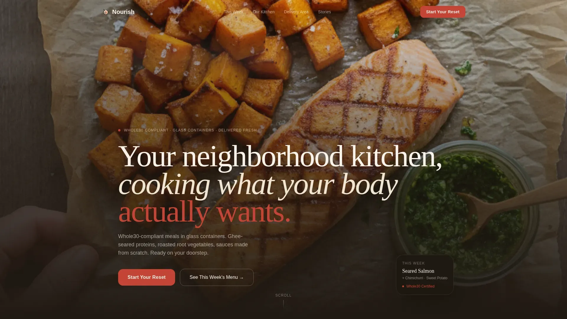
Full-Bleed Hero with Fade-In Headline
The hero opens with an overhead food photo filling the entire viewport. A seared protein, roasted vegetables, and a jar of scratch sauce set the visual tone before a single word appears. The headline fades in after a brief pause, giving the food a moment to speak first.
Three-Step Booking Modal
The primary booking flow opens from the "Start Your Reset" button. It guides the user through three steps: number of people eating, dietary notes including egg-free and pescatarian Whole30 options, and a calendar picker to select the first delivery day. The form is designed to feel personal, not clinical.
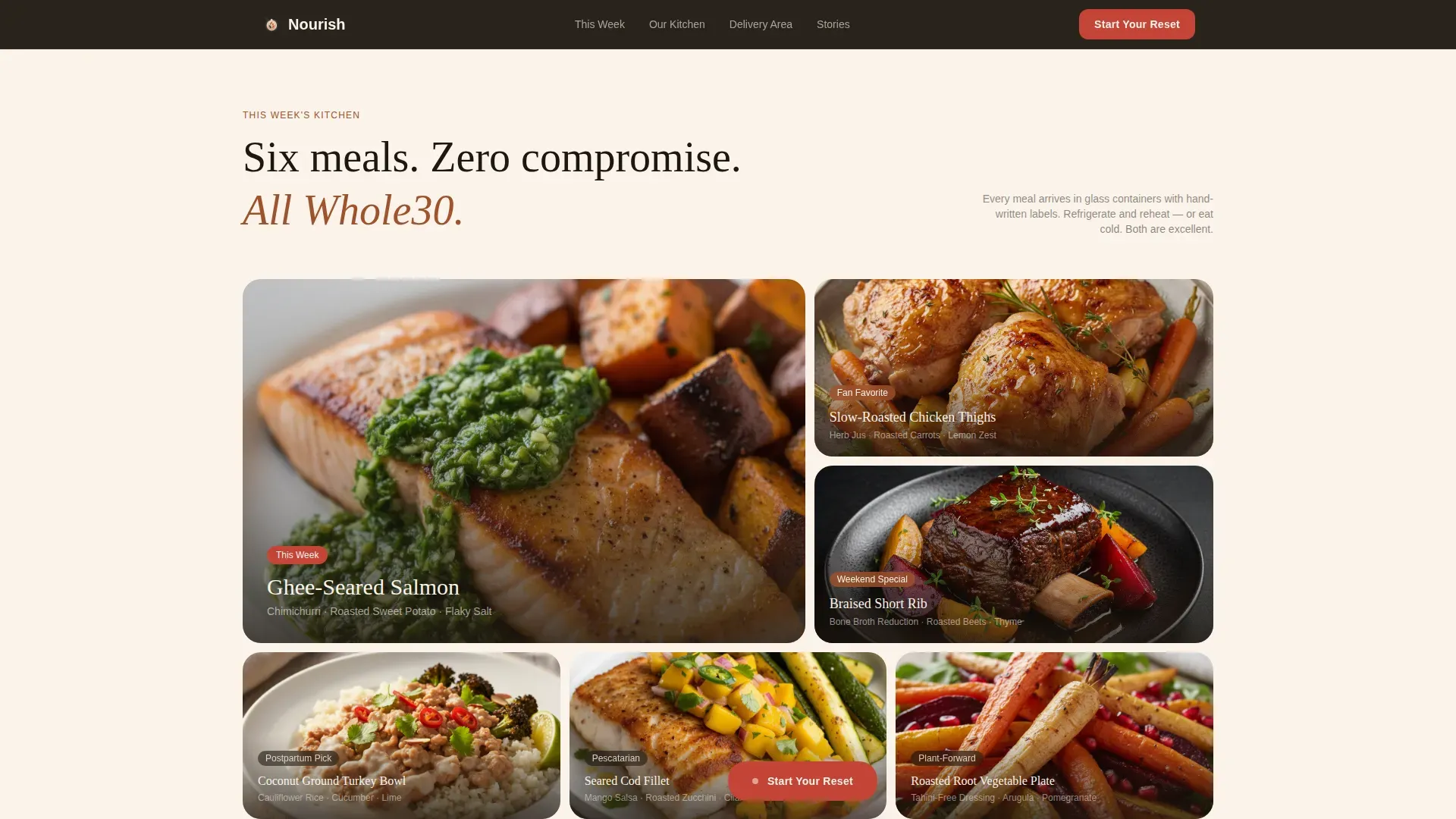
Asymmetric Meal Gallery with Menu Capture
The gallery uses a bento-style grid to showcase high quality images of Whole30-compliant meals. Close-up shots reveal textures, colors, and the care behind each dish. A secondary path offers "See This Week's Menu," capturing an email in exchange for the rotating PDF so visitors not ready to commit can still stay connected.
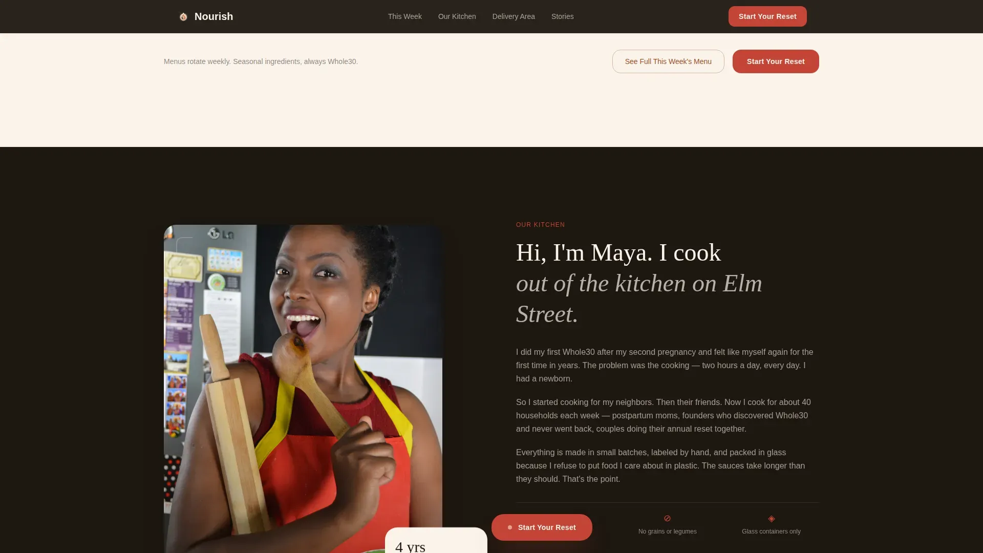
Founder Story Split Layout
A dedicated section places the founder in her actual kitchen, apron on, wooden spoon in hand. This design choice builds trust by putting a real person behind the food. It answers the unspoken question every visitor has: who is making this, and do I trust them?
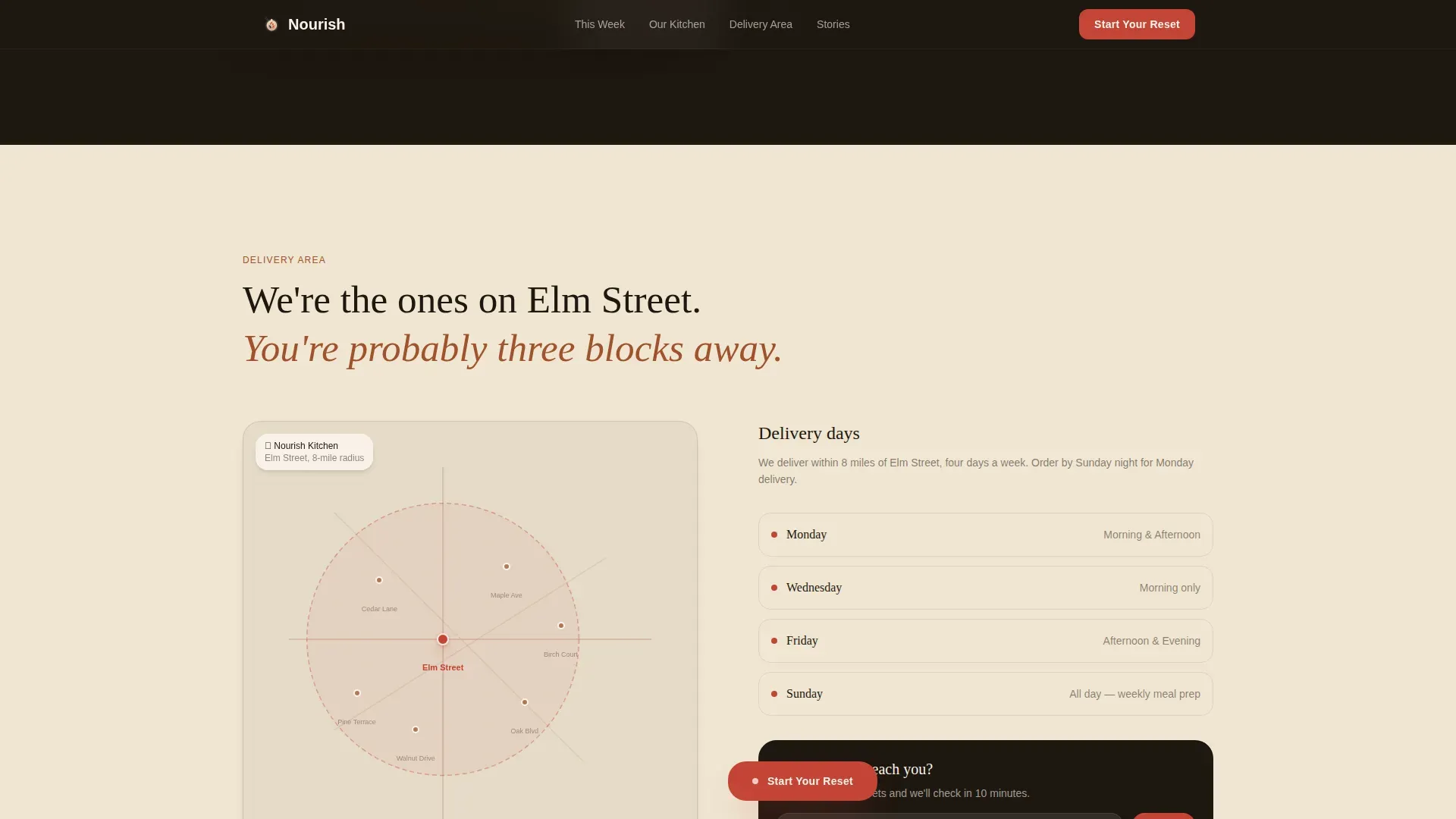
Neighborhood Delivery Map Section
The delivery map section shows a tight local radius with real street names, not a generic service area. This creative direction makes the brand feel like it lives three blocks away. It is one of the most effective ways to build trust with local food delivery clients.
Sticky Call-to-Action on Scroll
The "Start Your Reset" button stays visible as visitors scroll through the entire page. This ensures the primary conversion action is always one tap away, whether a user is checking the meal gallery or reading a testimonial. The smoked paprika accent color makes the button stand out against every background section.
Page sections overview
| Section | Purpose |
|---|---|
| Full-Bleed Hero | Opens with food, fades in headline |
| Meal Gallery Grid | Showcases food with menu capture |
| Founder Story Split | Builds personal trust and warmth |
| Neighborhood Delivery Map | Shows local reach and proximity |
| Client Testimonials Block | Shares neighborhood-tagged social proof |
| Footer Arc Split | Logo, tagline, and navigation links |
Design & branding system
The design follows a Luxe Minimal theme using the Fire & Earth color system. Every palette choice is intentional, making the landing page feel warm, grounded, and appetite-forward without visual clutter.
- Colors: charred ember black (#1E1710), slow-roasted clay (#A0522D), warm linen white (#FAF3EB), and smoked paprika (#C44536) reserved for buttons and hover states
- Typography: Fraunces serif for headlines, DM Sans for body text and user interface elements, pairing warmth with readability
- Backgrounds alternate between linen white and ember black, and food photography is framed with generous negative space so every plate breathes
Mobile & speed optimization
Mobile-first design is central to this template. Many users will browse and place orders directly from their phones, so the layout and interactivity are structured to perform on smaller screens without sacrificing visual quality.
- Food photography scales cleanly on mobile, and the sticky call-to-action button remains accessible at all scroll depths
- The three-step booking modal and email-capture form are touch-friendly and easy to fill on any device
- Section reveals and the headline fade-in animation are set to medium intensity, keeping the experience engaging without slowing the page
How this template helps you convert
A clear value proposition and a benefit-driven headline are essential for encouraging conversions on any landing page. This template is structured to earn the booking progressively, not demand it upfront.
- The food appears first. The hero and meal gallery create appetite and desire before any pricing or commitment language appears, reducing friction early in the visit.
- The founder story and neighborhood map build trust at the moment visitors are most curious about who is behind the food and whether delivery reaches their area.
- The sticky button and simplified booking form make it easy to act the moment a visitor is ready, without making them scroll back to find the next step.
Other information about this template
The nourish whole30 meal delivery catering landing page template is intended for food business owners who want to plan and launch a professional catering website quickly. Here are a few practical tips and additional details to help you get the most from this template.
- You can edit all content, swap your logo, customize the color set, and print or export assets directly from the template files
- The page is intended to reflect Whole30 program compliance messaging, including assurance that meals are free from dairy, grains, soy, legumes, and refined sugar; messaging around SWYPO avoidance helps protect program integrity and build trust with informed visitors
- A rotating menu preview helps prevent food fatigue by sharing variety across proteins, vegetables, and healthy fats week to week; planning meals in advance can save clients time and stress during the program
- Whole30 Approved criteria apply to restaurant, catering, and meal delivery services; partners who achieve that status can grow their brand and community by placing the Whole30 Approved logo on packaging and marketing materials, including this landing page
- The testimonials section supports sharing first-name and neighborhood-tagged comments; adding more comments over time gives visitors ongoing social proof that your catering services deliver results
- You can expand the page with additional recipes, experiment with seasonal menu sections, and choose new photography without changing the core layout structure
- The information in the booking form, including number of guests, dietary notes, and preferred delivery day, flows into a confirmation experience that makes the commitment feel considered rather than rushed
Theme
Luxe Minimal
Creative direction
Local & Neighborhood
Color system
Fire & Earth
Style
Full-Width Immersive
Direction
Booking/Scheduling
Page Sections
Full-bleed Hero with Fade-in Headline
Three-step Booking Modal
Asymmetric Meal Gallery with Menu Capture
Founder Story Split Layout
Neighborhood Delivery Map Section
Sticky Scroll Call-to-action Button
Related questions
Can I customize the colors and fonts in this template?
Does this template support dietary variation options in the booking flow?
Is the weekly menu email capture built into the template?
How does this template help establish trust with new visitors?
Is this template suitable for a Whole30 catering service seeking program compliance?



