Whole30 Frozen Meal Delivery Landing Page Template
The Nourish landing page template is built for Whole30-compliant frozen food brands that want to earn trust before asking for a commitment. It pairs a hand-illustrated bison mascot, an interactive before/after reveal slider, a visual meal grid, and a guided box-building flow to move health-focused visitors from curiosity to first order in a single scroll.
by Rocket studio
Quick summary
This is a full-width immersive landing page designed for a Whole30 frozen food brand. It opens with a stoic bison mascot, guides visitors through a visceral before/after contrast of real food moments, and closes with a guided box-building session. Every section is built to earn trust through ingredient transparency before it asks visitors to sign up or commit.
Who this template is for
This landing page template fits brands and founders selling healthy, chef-crafted frozen meals to clean-eating consumers. It works especially well when the core audience reads ingredient labels carefully and needs to feel confident before they plan a purchase.
- Whole30 challengers on Day 8 or Day 21 who need fast, compliant food without the cooking burden
- Postpartum mothers and CrossFit couples doing weekly meal prep who want delicious, fresh meals delivered
- Direct-to-consumer frozen food brands that want a high-trust, visually rich landing page to build a subscriber base
What problem this template solves
Most food delivery landing pages ask for a commitment too early. Visitors who follow a strict nutrition program want to see every ingredient, understand the meal plan, and feel certain the food is worth it before they add anything to a cart. This template solves that trust gap by leading with transparency.
- Visitors see the full ingredient list for every whole30 meal before a single sign-up prompt appears
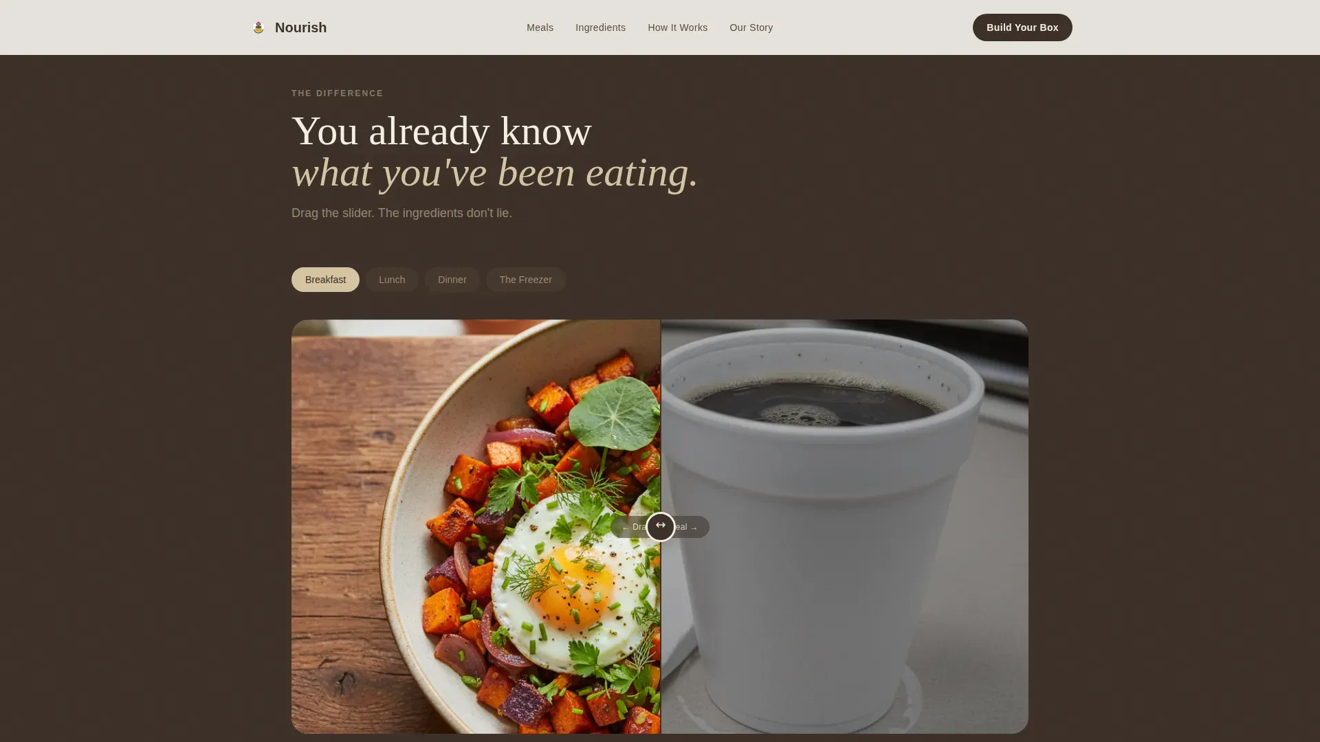
- The before/after slider shows the real contrast between sad desk lunches and clean, recognizable food
- The guided box-building flow removes the guesswork from meal planning and delivery scheduling
What you get with this template
You get a complete single-page layout designed to convert health-conscious visitors into first-box subscribers. The page is structured to display food beautifully, communicate nutrition honestly, and make the ordering session feel guided rather than pressured.
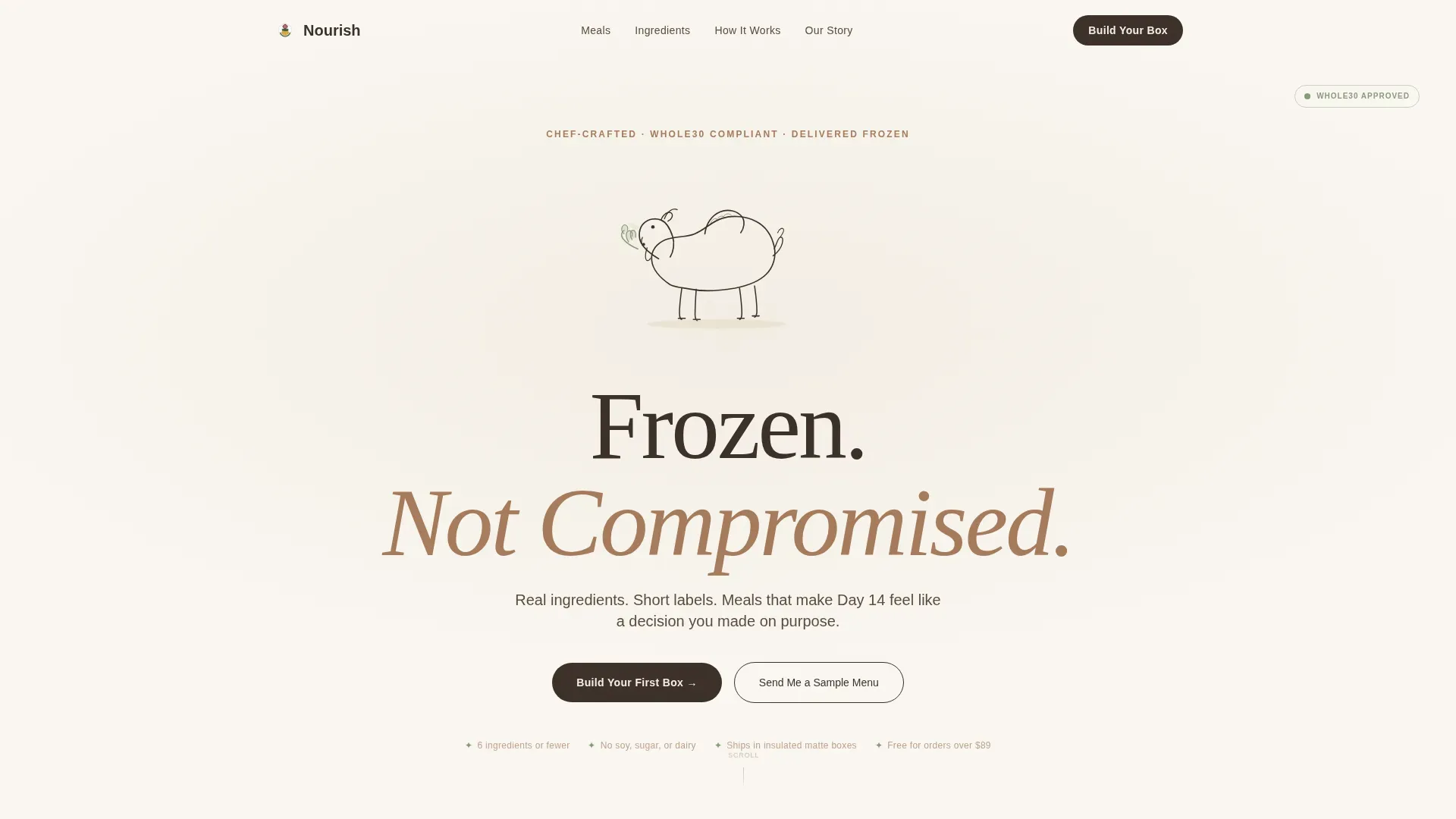
- Hero section with hand-illustrated bison SVG, CSS vapor animation, and the headline "Frozen. Not Compromised."
- Interactive drag-slider Before/After Reveal sections covering breakfast through a full fridge lifestyle transformation
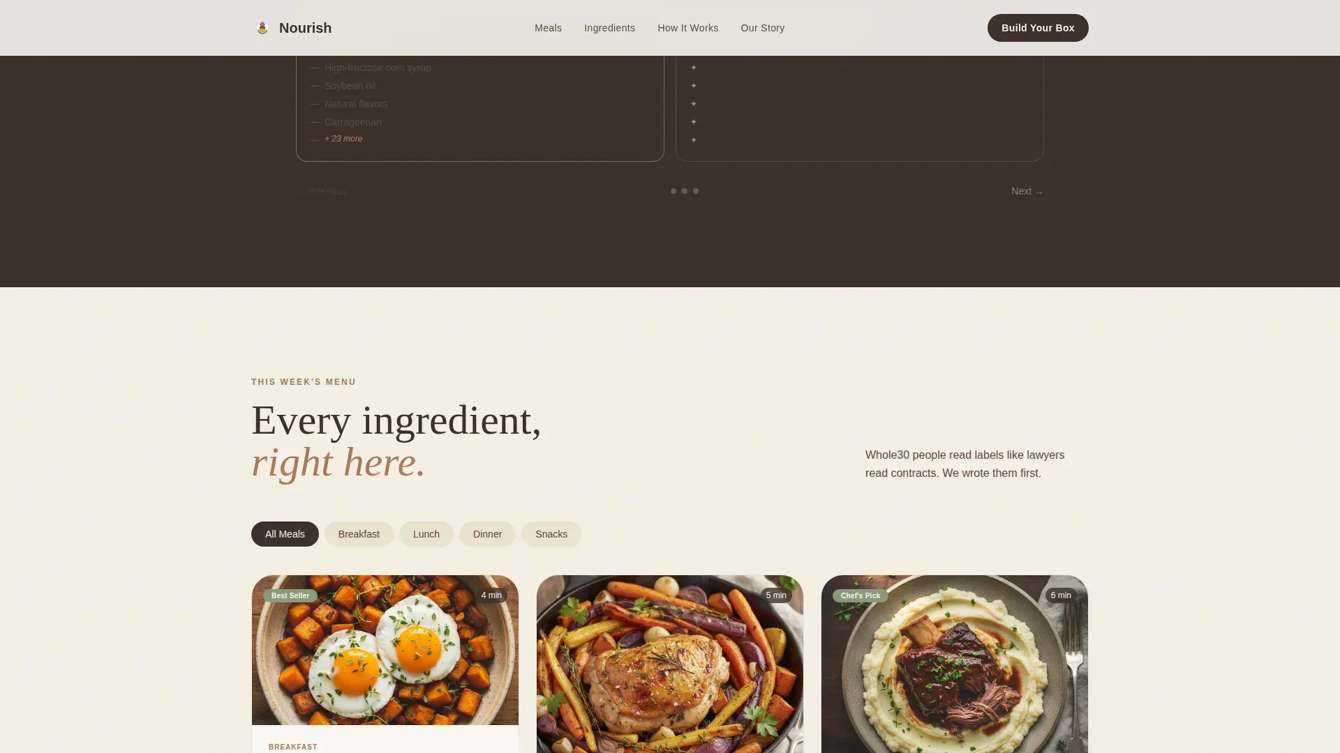
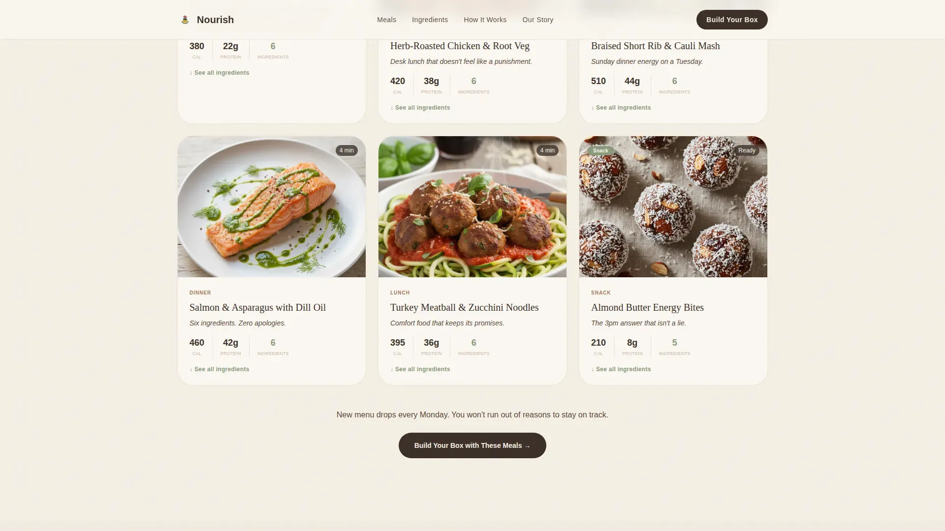
- Expandable visual meal grid with full ingredient panels, a Who It's For section with three audience cards, and a step-by-step Build Your Box flow
Feature list
This landing page template delivers a focused set of tools that support a healthy food brand at every stage of the visitor journey, from first impression to confirmed delivery window.
Hand-Illustrated Mascot Hero
The hero section features a small, stoic bison rendered in a single charred-bone ink line. The bison stands on generous negative space and holds a tiny sage sprig. A subtle CSS vapor breath animation is the only movement on the page, making the stillness feel intentional. The headline "Frozen. Not Compromised." loads with a slow fade-in that sets the brand tone immediately.
Interactive Before/After Reveal Sliders
Each reveal section splits the screen between a "before" state and a fresh Nourish version of the same meal moment. Visitors drag a slider across paired images to see the contrast. Sections escalate from breakfast through dinner to a full lifestyle fridge reveal. The final panel shows an empty shelf on one side and a fully stocked Nourish freezer door on the other, making the transformation feel real.
Expandable Visual Meal Grid
The meal grid displays every recipe as a visual card. Each card expands to show the full ingredient panel. Short ingredient lists and recognizable food items reinforce the nutrition promise. Visitors can explore all meals and favorites before making any decisions, which is critical for a program audience that treats ingredients like a contract.
Guided Build Your Box Flow
The box-building session walks visitors through four steps: pick a Whole30 start date from a calendar picker, choose a box size (solo, duo, or family), select the first week's meals from a visual grid, and confirm a recurring delivery window. A secondary path captures email and start date for visitors not ready to commit today. Delivery frequency and quantity are clearly displayed at each step so there is no guessing about cost or cadence.
Who It's For Audience Cards
Three distinct audience cards address the Whole30 challenger, the new parent, and the dedicated meal prepper directly. Each card uses honest, specific copy rather than generic wellness language. Visitors self-identify quickly and feel seen, which increases confidence and reduces drop-off before the call to action.
Arc Browser Split Footer
The footer uses a two-column Arc Browser Split layout. The brand logo and tagline sit on the left. Navigation links and supporting content sit on the right. The layout is clean, minimal, and consistent with the Luxe Minimal design system used across the full page.
Page sections overview
| Section | Purpose |
|---|---|
| Hero with Bison | Introduces brand voice and primary call to action |
| Before/After Reveal | Shows food contrast through interactive drag sliders |
| Meal Grid | Displays recipes with expandable ingredient panels |
| Who It's For | Connects with three specific audience profiles |
| Build Your Box | Guides visitors through a four-step ordering session |
| Arc Split Footer | Closes the page with logo, tagline, and navigation links |
Design & branding system
The visual identity follows a Luxe Minimal theme built on a Warm Stone color system. Backgrounds alternate between honed travertine and charred bone. Type lives in charred bone throughout. Whitespace carries most of the visual weight, keeping the page feel grounded and unhurried.
- Core palette: honed travertine (#D5C4A1), kiln-fired clay (#A67B5B), charred bone (#3B3028), and crushed sage (#8A9A7B) reserved for compliant-badge icons and call-to-action hover states
- Matte-finish packaging aesthetic flows directly into the page design, so the brand feels consistent from the freezer to the screen
- Typography is set in charred bone on warm backgrounds, creating a ceramic-and-linen warmth that signals quality without decoration
Mobile & speed optimization
The landing page is designed with a mobile-first layout so it performs well for the majority of visitors who browse and order from smartphones. Every interactive element, including the drag sliders and the box-building flow, is touch-friendly and easy to navigate on small screens.
- The Build Your Box session, calendar picker, and meal grid are all optimized for one-handed use, which is especially relevant for postpartum mothers browsing with a son or daughter in the other arm
- High-quality food imagery is placed intentionally to load above the fold on mobile without slowing the initial render
- The page layout stacks cleanly at all breakpoints, keeping user-friendly navigation intact across devices
How this template helps you convert
Healthy food delivery services that emphasize convenience and nutrition convert better when trust is built before the ask. This template earns each micro-commitment through a logical content sequence that feels generous rather than pushy.
- Ingredient transparency first: the page shows every recipe's food list before displaying any pricing or sign-up prompt, so visitors feel allowed to explore freely and decide on their own terms
- Clear, tiered calls to action: "Build Your First Box" starts the guided ordering session for ready buyers, while "Send Me a Sample Menu" captures email and Whole30 start date for visitors who need more time before they join
- Visual proof at every scroll: the before/after slider, the meal grid, and the audience cards all work together to make the healthy eating promise feel specific and real rather than aspirational
Other information about this template
This page template is a strong fit for the nourish whole30 frozen meal delivery landing page template use case. Beyond the core layout, there are several practical details worth knowing before you set up your own version.
- Subscription management copy is built into the Build Your Box flow, where visitors can see options to pause, skip, or cancel at any time, which protects buyer confidence and reduces friction at sign-up
- The meal grid supports a rotating menu display so you can add new recipes each week and keep the food selection fresh for returning visitors
- Sustainability messaging can be placed in the meal card content area, where details about eco-friendly packaging such as recyclable trays and biodegradable gel packs fit naturally alongside ingredient panels
- Freezing and reheating instructions, including shelf life details, can be added to each meal card or to a dedicated frequently asked question section so visitors know exactly what to expect after delivery
- Using leftovers and planning around scraps can help subscribers save money, and the meal grid layout makes it easy to share this kind of practical meal planning guidance directly on the page
- The template can support vegan-adjacent or allergy-specific labeling within the meal card format, and unsweetened or additive-free callouts can be added as badge icons using the crushed sage accent color
- Potatoes and other compliant staples that sometimes confuse new challengers can be called out clearly in individual recipe cards, so visitors get confident about what is allowed before they decide
- The feedback loop is built into the secondary call to action: visitors who sign up via "Send Me a Sample Menu" provide their Whole30 start date, giving the brand useful data for making follow-up content more relevant
- The page does great work as a trust-building tool for a lot of brands in the clean food space, not just frozen meal delivery, because the section structure is flexible enough to support similar direct-to-consumer food programs
- A pricing calculator or delivery frequency selector can be added within the Build Your Box session to display meal delivery quantity and cost clearly before checkout
Theme
Luxe Minimal
Creative direction
Before/After Reveal
Color system
Warm Stone
Style
Full-Width Immersive
Direction
Booking/Scheduling
Page Sections
Bison Mascot Hero with CSS Animation
Interactive Before/after Drag Sliders
Expandable Visual Meal Grid
Guided Build Your Box Session
Three-profile Audience Cards
Arc Browser Split Footer
Related questions
Can I customize the meal cards and ingredient lists?
How does the before/after slider work for my own food brand?
What options does the Build Your Box flow support?
How are freezing and reheating details shown to visitors?
Is this template suitable for a family-friendly Whole30 meal plan?



