Anesthesiology Support Community Landing Page Template
Numb is a split-screen landing page built for an anesthesiology peer-support community. It leads with credential badges and outcome statistics, then earns the click through alternating panels of published evidence, redacted testimonials, and a full-width crisis-support section. The design uses a Medical Clarity palette that feels clinical but never cold, guiding professionals toward a free membership registration.
by Rocket studio
Quick summary
Numb is a 50/50 split-screen landing page for an anesthesiology support community. It opens with award badges and a quiet photograph, then scrolls through outcome-led statistics, peer testimonials, and a pattern-breaking crisis-support section. Every detail is calibrated to earn trust from attending anesthesiologists, Certified Registered Nurse Anesthetists (CRNAs), and first-year residents before asking for a single click.
Who this template is for
This template speaks directly to anesthesia professionals who carry weight that most colleagues cannot fully understand. It is designed for communities, organizations, or platform builders serving this specific clinical audience.
- Attending anesthesiologists managing overnight call fatigue who need credible peer connection
- CRNAs navigating scope-of-practice tensions looking for a safe, anonymous space
- CA-1 residents in their first clinical year who are processing burnout and professional identity
What problem this template solves
Anesthesia professionals often lack a dedicated, credentialed space for honest peer support. Generic medical forums feel impersonal. General wellness platforms lack clinical context. This template addresses that gap directly.
- It establishes institutional-grade credibility before asking for any personal commitment
- It separates emotional support content from professional development content using alternating visual panels
- It breaks the layout deliberately at the crisis section to signal that some conversations deserve a different kind of attention
What you get with this template
You get a complete, single-page layout structured to convert skeptical clinical professionals into registered community members. Every section is purposeful and pre-built.
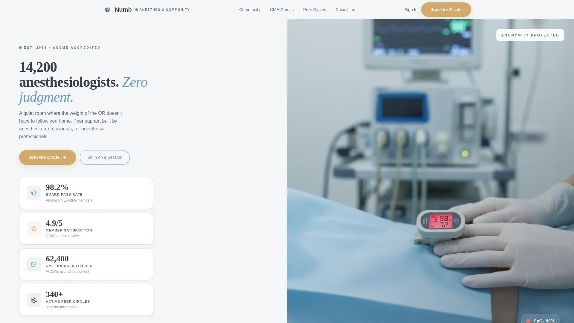
- A hero split screen with credential badge column on the left and a still, anonymous photograph on the right
- A scroll-driven stats sequence where each major outcome figure appears before its supporting narrative
- A full-width crisis-support section that intentionally breaks the 50/50 pattern for emotional emphasis
Feature list
This section describes the core built-in capabilities that come with the Numb template.
Split Screen Hero with Credential Badges
The header opens with a 50/50 layout. The left panel stacks beveled credential and recognition badges covering board pass rates, member satisfaction, CME (Continuing Medical Education) hours delivered, and active peer support circles. Each badge shows a precise stat figure beneath it. The right panel holds a single still photograph of gloved hands resting on a draped knee, with a pulse oximeter glowing on one finger and the anesthesia machine blurred softly in the background. A headline fades in over the composition.
Stats-First Scroll Sequence
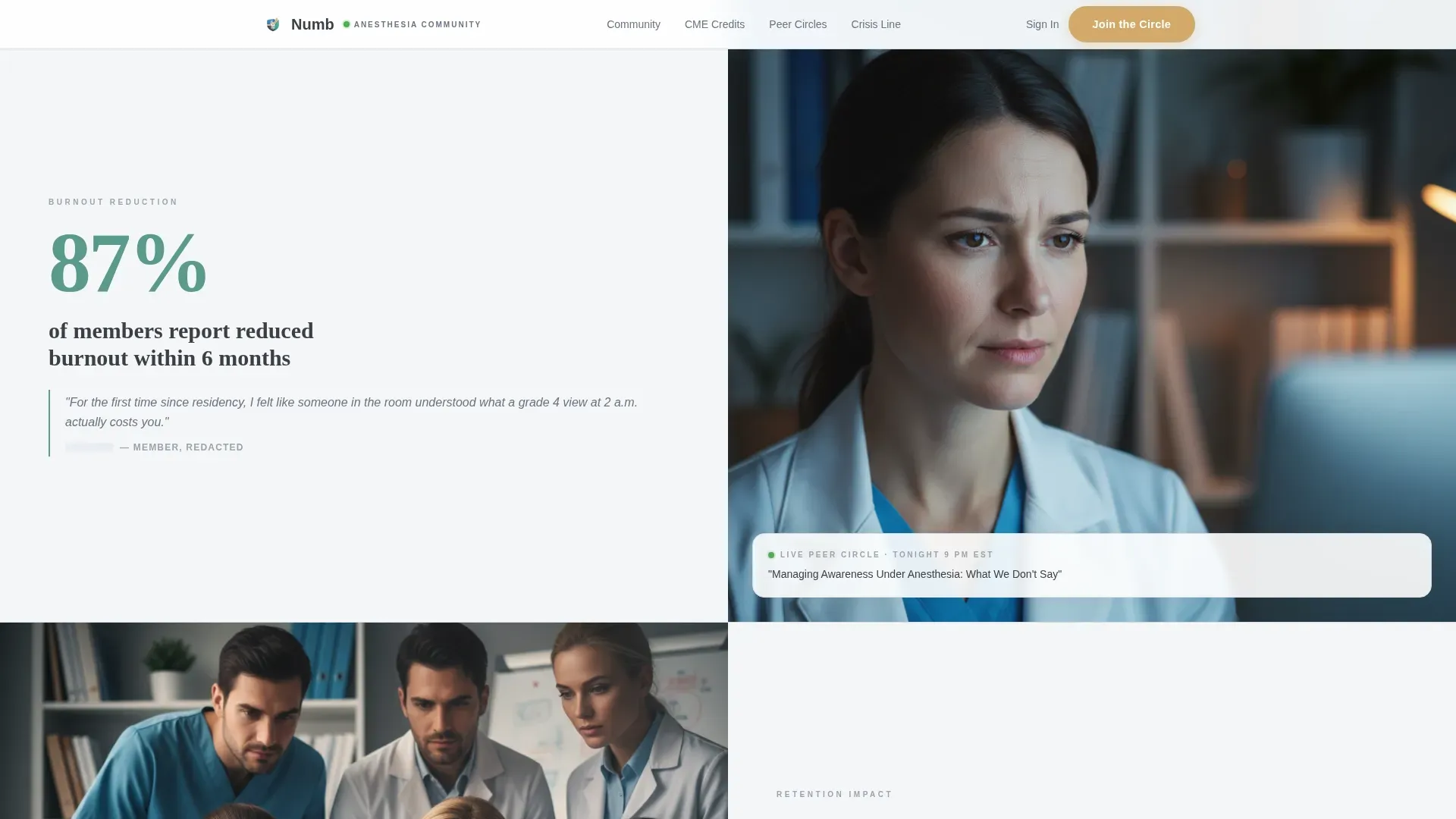
Each scroll transition leads with a number before any narrative text. The 87 percent burnout reduction stat appears alone for a beat, then supporting content slides in from the opposite panel. The rhythm alternates which side carries the statistic and which carries the human context, mimicking the steady pace of monitor beeps.
Alternating Evidence Panels
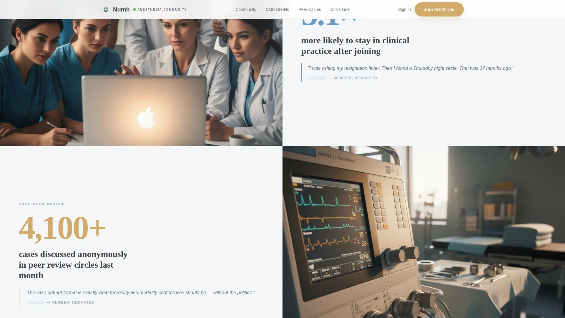
The split layout rotates panel roles across four content sections. One side carries a redacted forum screenshot or short looping video of a peer circle. The other carries a testimonial fragment or published outcome figure. The alternation keeps visual momentum without repeating the same pattern twice in a row.
Full-Width Crisis Support Section
The fifth content section drops the split layout entirely and goes full-width. This deliberate break in the established pattern signals to visitors that this content carries a different kind of weight. It is a structural design decision, not a decorative one.
Magnetic Call-to-Action System
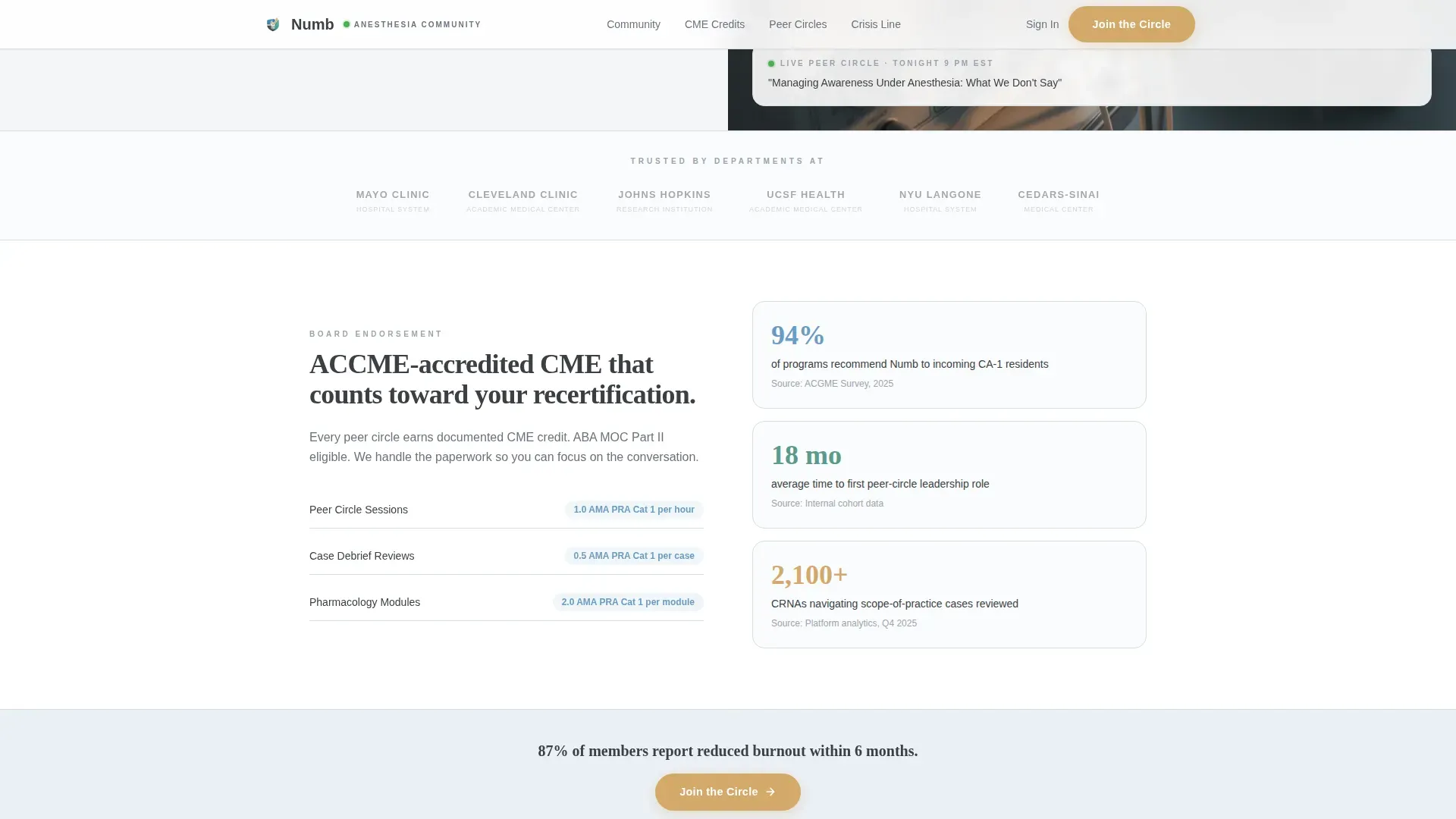
The primary call to action, labeled "Join the Circle," appears three times: at the hero header, mid-scroll after the burnout reduction stat, and anchored at the bottom. A secondary text link labeled "Sit In on a Session" offers a recorded peer-circle preview for visitors who are not yet ready to commit. Both calls to action use hover states and a magnetic effect.
Scroll-Linked Stat Reveals
Outcome statistics fade in as the visitor scrolls into each panel. The staggered reveal gives each figure room to register before the supporting paragraph slides in from the opposite side. This animation sequence is built with CSS-first transitions for smooth, reliable playback.
Page sections overview
| Section | Purpose |
|---|---|
| Hero Split Screen | Opens with badges and photograph; headline overlay establishes credibility and community scale |
| Stats Impact Panels | Alternating 50/50 panels lead with outcome figures before narrative context slides in |
| Proof and Partnerships | Displays hospital system associations, board-endorsed CME credits, and published outcomes |
| Testimonials Panel | Redacted forum screenshots and peer circle video clips provide anonymous social proof |
| Crisis Support Section | Full-width layout break signals emotional weight and peer safety resources |
| Footer Row | Minimal single-row footer closes the page with no distraction from the primary call to action |
Design & branding system
The visual identity follows a Medical Clarity theme built around the Soft Mist color system. The palette feels like the cool air of a pre-op holding bay at dawn: fluorescent but not harsh, sterile but not cold.
- Core colors: clinical fog white (#F4F6F8) for backgrounds, pulse-ox blue (#6B9CC4) for interactive elements, scrub cap teal (#5A9A8C) for section accents, and quiet charcoal (#3B3F45) for all body text
- Accent warmth: muted amber (#D4A96A) is reserved exclusively for call-to-action buttons and notification badges, giving those elements immediate visual priority
- Typography: DM Sans handles body copy for clean clinical readability, while Fraunces provides headline serif weight for emotional resonance in key moments
Mobile & speed optimization
The template is built desktop-first, reflecting the reality that anesthesiologists most often encounter this page between cases on a workstation. A mobile fallback is included so the layout remains functional on any device.
- The hero uses a static image layer so the first paint is fast regardless of connection quality
- Images outside the initial viewport use lazy loading so the page does not load unnecessary assets upfront
- All animations are driven by CSS-first transitions, avoiding heavy JavaScript dependencies for smooth scroll-linked reveals
How this template helps you convert
Every layout and content decision on this page is aimed at moving a skeptical clinical professional from curiosity to a confident click.
- The credential badge section at the top front-loads institutional evidence, so visitors feel they are joining a credentialed community before reading a single sentence of community description.
- The repeating "Join the Circle" call to action at three scroll positions ensures the primary action is always within reach without feeling aggressive, and the secondary "Sit In on a Session" link captures visitors who need more evidence before committing.
- The full-width crisis section resets the emotional register of the page just before the final call to action, leaving visitors with a sense of genuine care rather than a sales pitch.
Other information about this template
This template is particularly well suited to community platform builders, healthcare professional associations, and wellness-focused SaaS products targeting the anesthesiology niche. It is built for a Health and Medical category audience where credibility signals must lead the experience.
- The page uses no on-page form; the call to action click routes directly to a streamlined signup on a separate registration page
- The anonymous photograph in the hero is a deliberate creative choice; no faces appear anywhere in the template, reinforcing the community's anonymity promise
- The "Numb" concept name and the moment-between-induction-and-incision tone are baked into the pacing of the scroll experience, not just the copy
- This template suits organizations building anesthesiology support group and community platforms where peer trust is the primary conversion currency
Theme
Medical Clarity
Creative direction
Stats-First Impact
Color system
Soft Mist
Style
Split Screen (50/50)
Direction
Click-Through
Page Sections
Split Screen Hero with Credential Badges
Stats-first Scroll Sequence
Alternating Evidence Panels
Full-width Crisis Support Section
Magnetic Call-to-action System
Scroll-linked Stat Reveals
Related questions
Does this template include a signup form?
Can I update the credential badge statistics in the hero?
Is the split-screen layout usable on mobile devices?
How many times does the primary call to action appear on the page?
Who is this template designed to serve?



