Senior Care Email Marketing Agency Landing Page
Nurture is a dark-themed bento grid landing page built for senior care email marketing agencies. It pairs a Photo Grid Mosaic header with an Award and Recognition scroll experience to build trust through real campaign results. The Void and Violet color system creates a quiet, premium atmosphere that speaks directly to senior living marketers worried about census numbers and empty beds.
by Rocket studio
Quick summary
Nurture is a single-page bento grid template designed for agencies that write email campaigns for senior living communities, home health networks, and hospice marketing teams. It leads with proof, earns attention through campaign wins, and closes with a low-friction content download. The dark visual identity feels premium and deliberate, matching the emotional weight of the audience it serves.
Who this template is for
This template is built for a specific kind of agency. If your work sits at the intersection of healthcare marketing, emotional storytelling, and measurable census results, this is your page.
- Senior care email marketing agencies presenting work to community operators and marketing directors
- Boutique healthcare marketing studios that lead with campaign results rather than service lists
- Consultants and small teams pitching to senior living communities, home health networks, or hospice programs
What problem this template solves
Senior care marketing directors have seen open rates fall while beds sit empty. A generic agency portfolio page does nothing to earn their trust. Nurture solves the credibility gap by showing specific results before asking for anything in return.
- Most agency landing pages describe services without proving outcomes, losing skeptical buyers early
- Senior care marketers need to see that an agency understands their census problem, not just email marketing in general
- The gap between a cold visit and a booked call is best closed with a content offer that delivers real value upfront
What you get with this template
The template delivers a fully structured single-page layout organized around proof and progressive trust. Every section is designed to move a cautious buyer closer to downloading your playbook or booking a conversation.
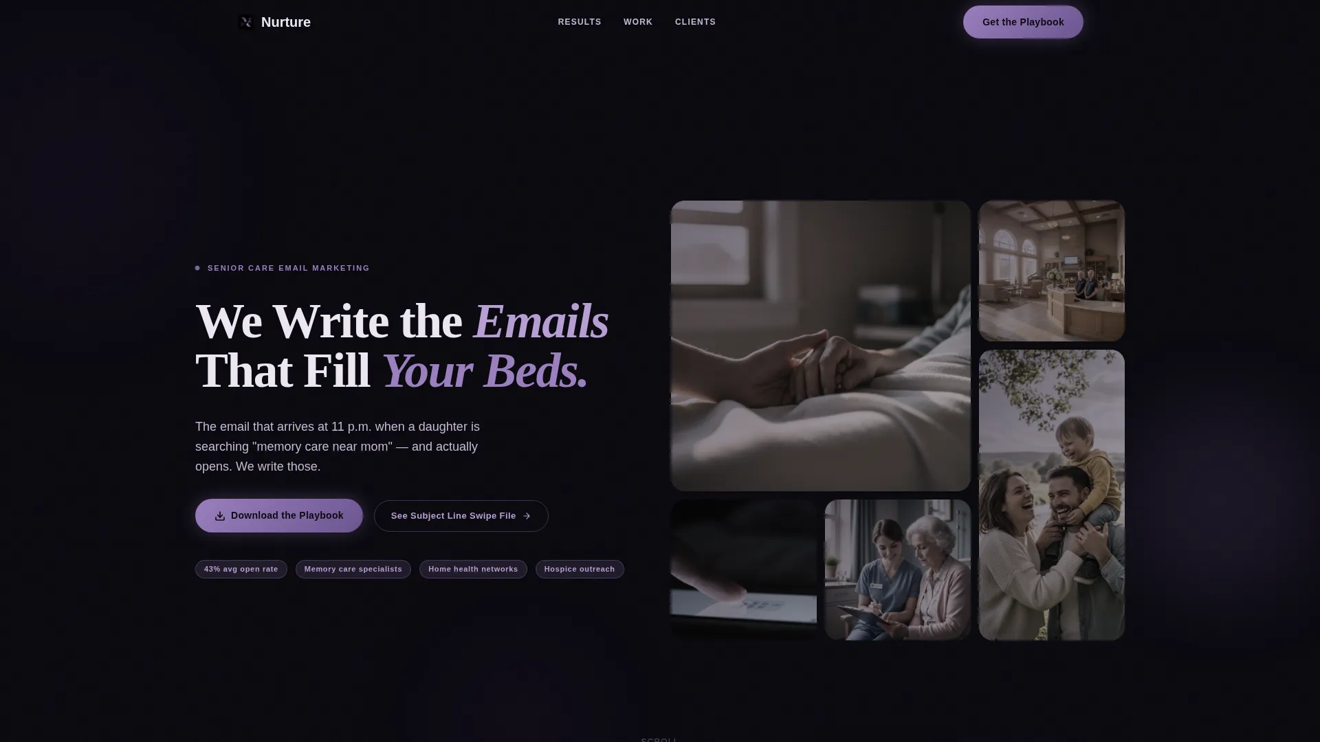
- A staggered Photo Grid Mosaic header with overlaid headline copy and a primary call-to-action button
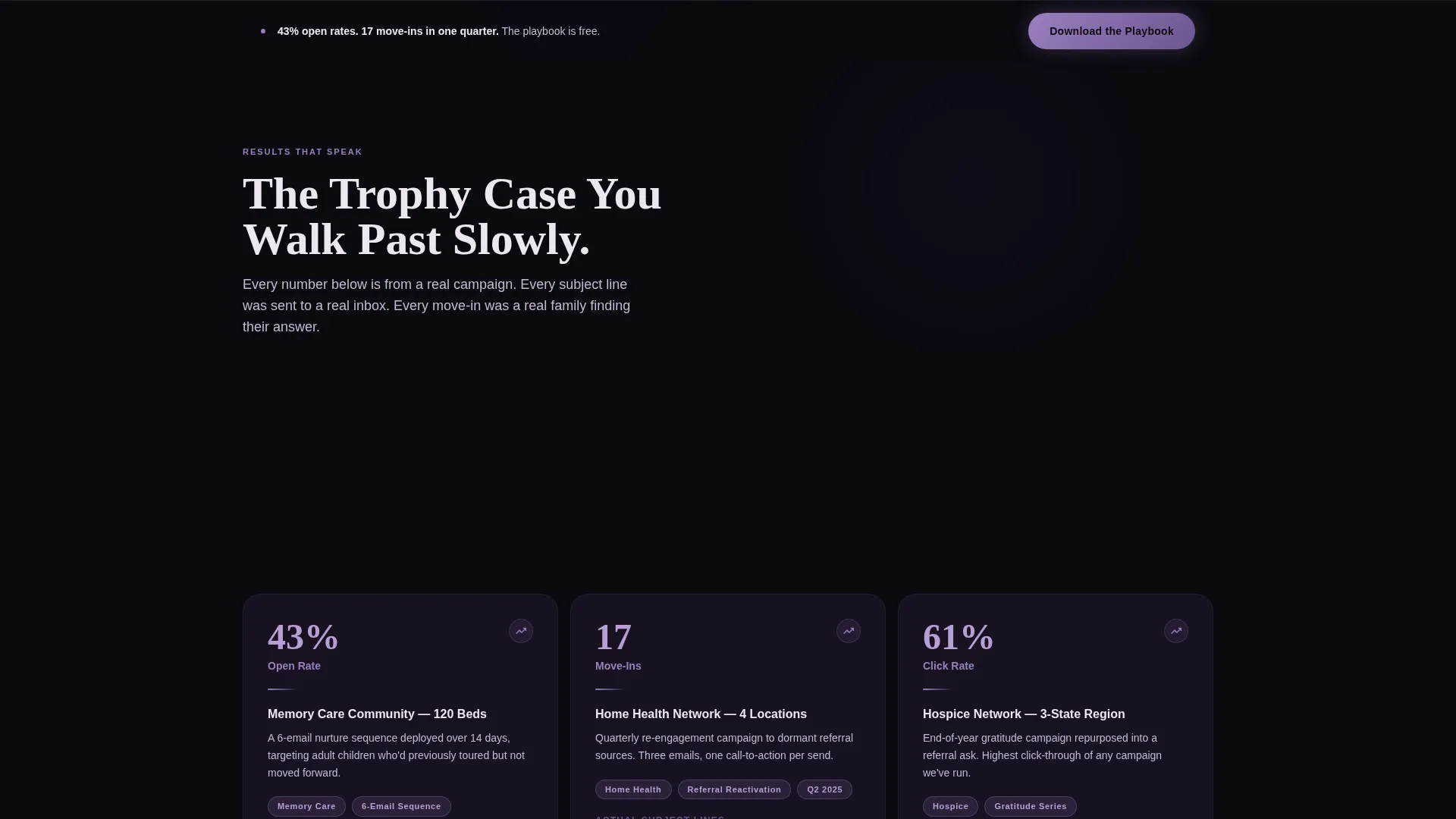
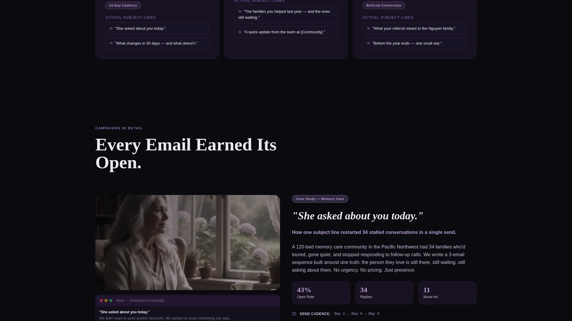
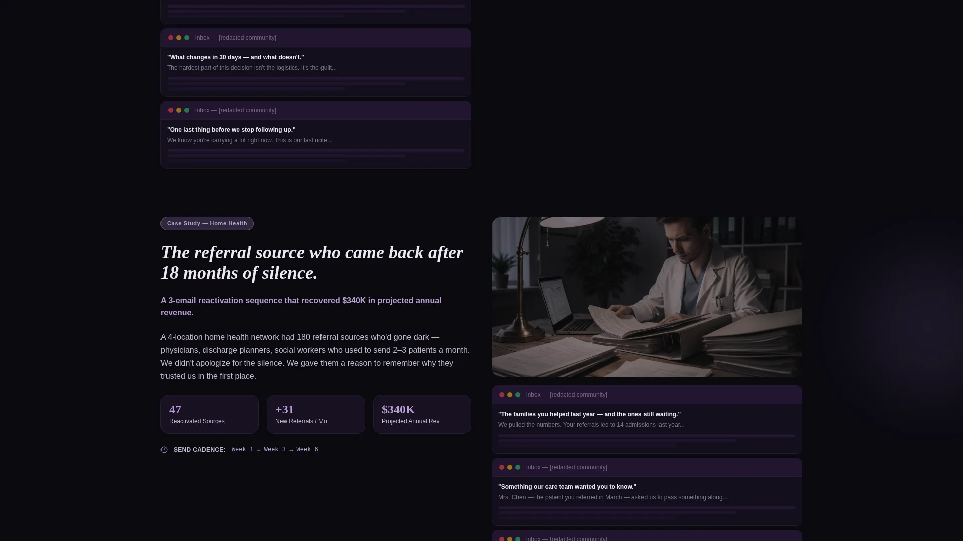
- An Award and Recognition scroll engine featuring campaign stat cards, pull-quote testimonials, and email screenshot mosaics
- A two-path conversion system with a primary content download form and a secondary lower-commitment subject line swipe file offer
Feature list
This section covers the core built-in capabilities delivered through the Nurture template layout.
Bento Grid Photo Header
The header uses a staggered bento tile arrangement of real senior care moments. Images are desaturated with violet color grading and each tile parallaxes at a different speed, creating depth without distraction. The primary call-to-action button sits inside the grid, visible before any scrolling begins.
Award and Recognition Scroll Sections
Each scroll section spotlights a specific campaign result. Metric callouts appear in violet pill badges. Sections alternate between case study cards, pull-quote testimonials from marketing directors, and small mosaic grids of redacted email screenshots. The rhythm builds proof progressively as the visitor scrolls.
Dual-Path Conversion System
The primary path captures first name, community name, and number of communities managed through a three-field form gating the Senior Care Email Playbook download. The secondary path offers a subject line swipe file behind an email-only gate, giving lower-commitment visitors a reason to convert without pressure.
Persistent Bottom-Bar Call to Action
After the third scroll section, a fixed bottom bar repeats the primary download offer. It stays visible as visitors continue reading, reducing the chance that a motivated buyer loses the conversion path mid-page.
Void and Violet Color System
The palette uses bottomless black (#0B0A10) as the base, muted elderberry (#2D1B3D) for depth layers, soft wisteria (#9B7FBF) for accent typography and hover states, and pale lavender-white (#EDE7F3) for body text. The result is a dark, premium feel that reads clearly at low screen brightness.
Anonymized Campaign Evidence Blocks
The template includes layout slots for anonymized subject lines, send cadence callouts, and metric badges drawn from real campaign results. These blocks are pre-structured so agencies can swap in their own numbers without redesigning anything.
Page sections overview
| Section | Purpose |
|---|---|
| Photo Grid Mosaic Header | Anchors visual identity and surfaces the primary download call to action immediately |
| Primary call to action Block | Places the email playbook download form above the first scroll section |
| Campaign Win Card 1 | Spotlights a specific open-rate result with metric badge and anonymized subject line |
| Pull-Quote Testimonial | Builds human credibility through a marketing director voice |
| Email Screenshot Mosaic | Shows redacted real emails to ground the agency's work in tangible proof |
| Campaign Win Card 2 | Escalates proof with a second result, such as move-in volume per quarter |
| Pull-Quote Testimonial 2 | Reinforces trust with a second practitioner voice |
| Swipe File call to action Block | Offers the lower-commitment subject line download gated by email only |
| Persistent Bottom Bar | Repeats the primary playbook download offer after the third scroll section |
Design & branding system
The visual identity is built on the Void and Violet color system, designed to feel like a luxury product opened at midnight. Every design choice prioritizes quiet authority over visual noise.
- Colors: bottomless black (#0B0A10) base, muted elderberry (#2D1B3D) depth layers, soft wisteria (#9B7FBF) accents, and pale lavender-white (#EDE7F3) body text
- Typography: large, tracked-out wisteria headline type for the hero overlay, with clean body type that floats against dark backgrounds for easy reading
- Imagery: desaturated, violet-graded photos of authentic senior care moments with no staged stock photography
Mobile & speed optimization
The bento grid layout is structured to reflow cleanly on smaller screens without losing the visual hierarchy that makes the page persuasive. Parallax behavior is applied per tile so it can be adjusted or disabled based on device context.
- Bento grid tiles stack in a logical reading order on mobile, keeping the headline and primary call-to-action button visible without scrolling
- The persistent bottom bar remains accessible on mobile viewports, keeping the download offer reachable at any point in the scroll
- Image tiles use muted, compressed color grading that keeps file weight manageable without sacrificing the dark visual atmosphere
How this template helps you convert
Nurture earns conversion by showing proof before making a request. The layout is structured so that every step a visitor takes deepens their confidence in the agency.
- The header grid surfaces the primary download offer immediately alongside compelling campaign imagery, so visitors see both what the agency does and what they can take away before reading a single service description.
- The Award and Recognition scroll builds a progressive proof stack, each section more specific than the last, so that by the time a visitor reaches the three-field form they have already seen multiple campaign results that match their exact census problem.
- The dual-path offer structure means visitors who are not ready for the full playbook can still convert on the subject line swipe file, keeping the agency's list growing from both high-intent and early-stage prospects.
Other information about this template
This template was built under the Dark Immersive theme using the Award and Recognition creative direction. It is one of a curated set of bento grid templates designed for high-trust, results-first agency presentations in specialized niches.
- The template style is Bento Grid with a Content and Resource landing-page direction, meaning the layout is optimized for lead generation through a content asset rather than a direct service inquiry
- The header concept is Photo Grid Mosaic, a distinct visual approach that uses multiple image tiles rather than a single hero image, giving the page an editorial, evidence-based feel from the first moment
- This template is suited for agencies whose clients include senior living communities, home health networks, and hospice marketing programs that evaluate vendors based on proven email marketing outcomes
- The color system, typography treatment, and section rhythm are all pre-coordinated, so customization focuses on swapping in your own campaign metrics, testimonial quotes, and email screenshots rather than rebuilding the design from scratch
Theme
Dark Immersive
Creative direction
Award & Recognition
Color system
Void & Violet
Style
Bento Grid
Direction
Content/Resource
Page Sections
Bento Grid Photo Mosaic Header
Award and Recognition Scroll Engine
Dual-path Conversion System
Persistent Bottom-bar Offer
Void and Violet Color System
Anonymized Campaign Evidence Blocks
Related questions
Can I adapt this template if my agency works across multiple senior care niches?
How many form fields does the primary conversion form include?
Is this template suitable for an agency that is still building its case study portfolio?
What makes the dark color system appropriate for a senior care marketing audience?
Where does the persistent bottom bar appear on the page?



