Babysitter Landing Page Template for Childcare Teams
Nurture is an editorial-style landing page template built for small babysitting businesses. It leads with oversized serif headlines, magazine-style sitter profiles, and a warm Cloud Canvas color palette. The layout guides parents from first impression to booking with a trust-first structure, face-by-face introductions, and a clear "Meet Your Sitter" call to action.
by Rocket studio
Quick summary
Nurture is a single-page, editorial-style landing page designed for a small babysitting business. It opens with a giant left-anchored headline, then walks parents through individual sitter profiles in a magazine page-turn rhythm. The Cloud Canvas palette and Educational Guide theme create a warm, trustworthy feel that nudges curious parents toward the booking calendar.
Who this template is for
This template is built for small babysitting teams who want to present themselves as trusted professionals, not a generic service listing. It works best for sitter businesses serving busy urban families who need more than a phone number before they say yes.
- Babysitting teams or solo sitters running a small, personal service business
- Childcare professionals building a first online presence for their bookings
- New-to-town or service-focused sitters who want parents to know their faces before opening the door
What problem this template solves
Most babysitter listings feel cold. A short bio and a star rating do very little to earn a parent's trust. Nurture fixes that by making the sitters themselves the story, so parents feel like they already know the person arriving at their door.
- Parents hesitate to book sitters they cannot picture with their child
- A standard directory listing gives no sense of personality, training, or warmth
- Busy dual-income households need a fast, reassuring path to booking without lengthy back-and-forth
What you get with this template
You get a fully structured editorial landing page that introduces each sitter as a real person, explains your vetting process in clear typographic sections, and moves parents toward a booking click with minimal friction.
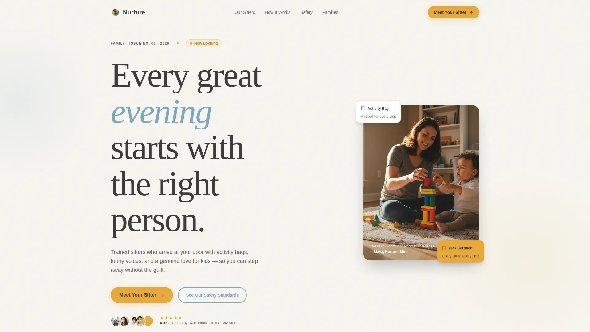
- A header section with a giant serif headline and a candid editorial photo layout
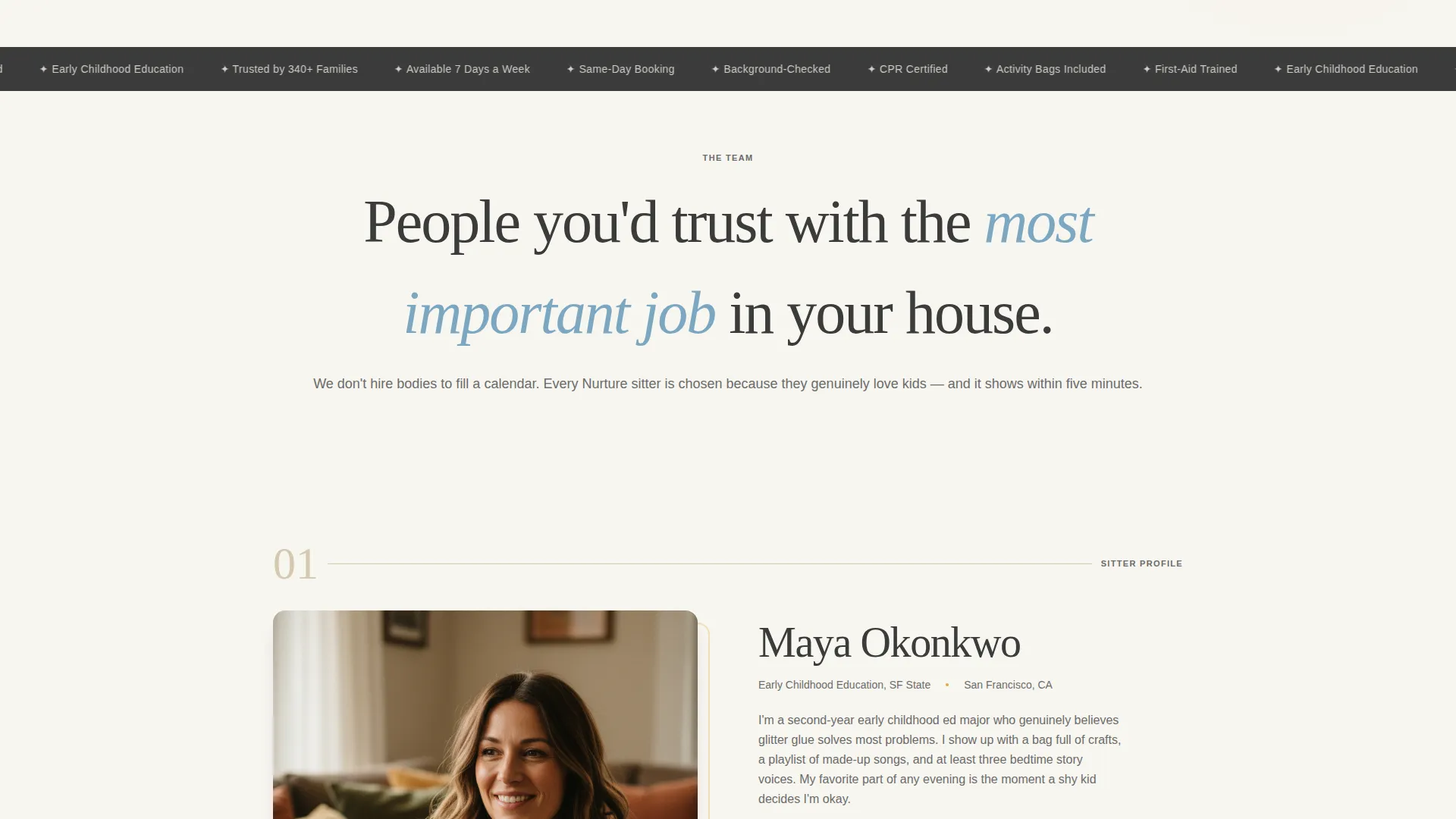
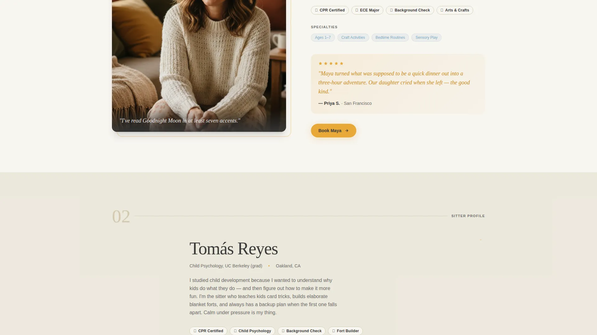
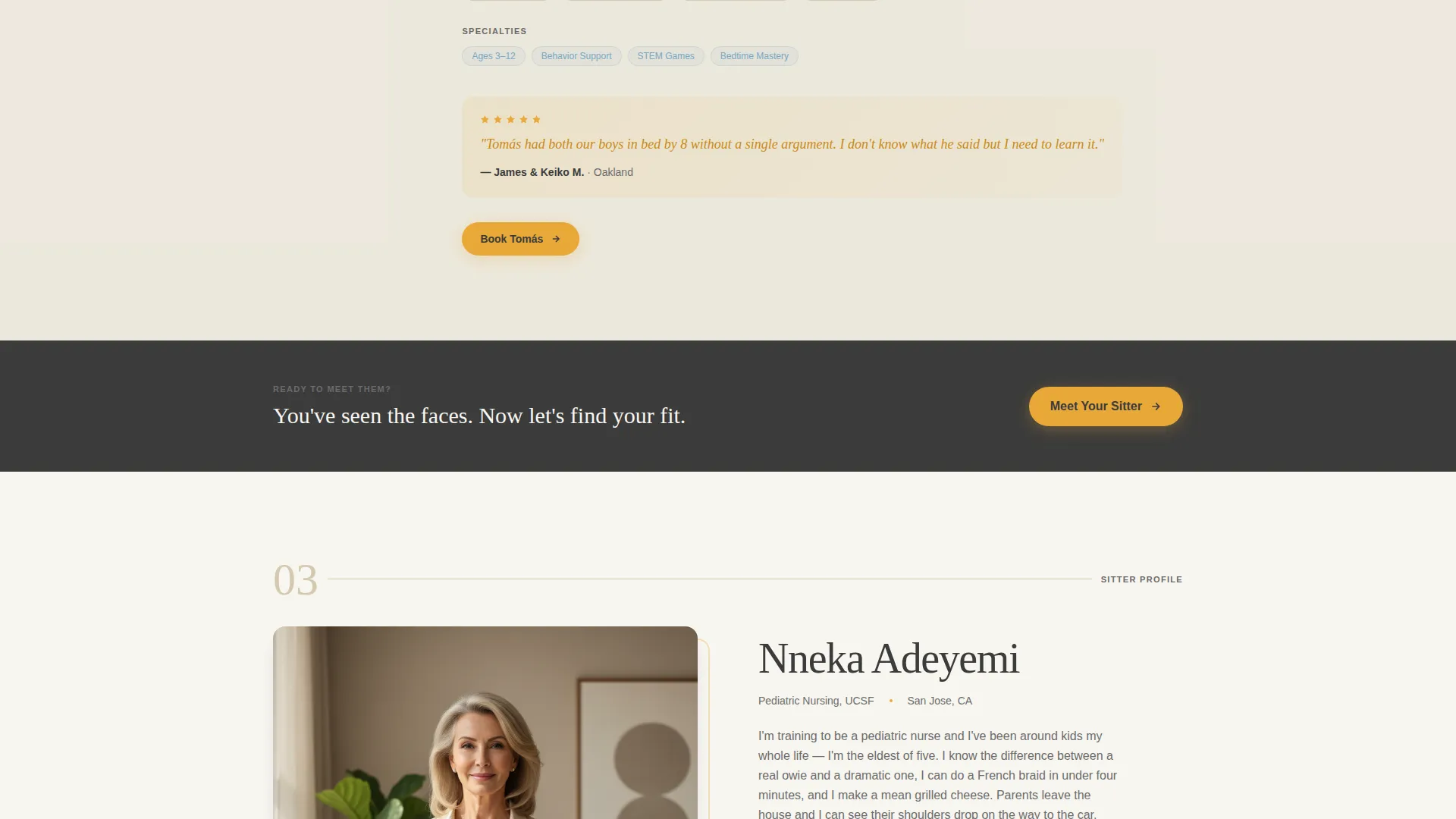
- Individual magazine-style sitter profile blocks with portrait, first-person bio, certification badges, and pull-quote testimonials
- A dual call-to-action flow guiding parents to either book directly or review safety standards first
Feature list
This template packs editorial design and practical conversion structure into a single, focused landing page. Every section earns its place.
Giant Headline Header Layout
The header anchors an enormous serif headline to the left two-thirds of the viewport. The right third holds a candid editorial photo of a sitter and child together. Late-afternoon light and a relaxed composition set an immediate tone of calm and competence.
Magazine-Style Sitter Profiles
Each sitter gets a full editorial spread: a large portrait, a first-person short bio, illustrated certification badges, and a parent pull-quote highlighted in marigold. Profiles alternate photo-left and photo-right, creating a natural reading rhythm as parents scroll.
Typographic Vetting Interstitials
Between sitter profiles, editorial typographic spreads explain the vetting process, training standards, and booking flexibility. These sections present trust information as earned editorial content rather than a bullet-point sales pitch.
Dual Call-to-Action Path
The primary call to action, "Meet Your Sitter," appears beneath the header and repeats after every second profile. A secondary path, "See Our Safety Standards," offers cautious parents a reassurance stop before they commit to booking.
Availability Checker Entry Point
Clicking the primary call to action leads to a simple availability checker. Parents enter their zip code, preferred date, and number of children to find a match. The flow is short and focused, reducing drop-off between interest and booking.
Cloud Canvas Color System
The palette uses soft chalk white, warm oatmeal, muted storybook blue, and marigold reserved for buttons, pull-quotes, and interactive highlights. Backgrounds alternate between chalk white and oatmeal. Every marigold accent feels deliberate, like a gold star placed with intention.
Page sections overview
| Section | Purpose |
|---|---|
| Editorial Header | Introduces the brand with a giant serif headline and candid photo |
| Primary call to action Block | Invites parents to meet a sitter immediately after the hero |
| Sitter Profile One | Builds trust through portrait, first-person bio, and testimonial |
| Vetting Interstitial | Explains the screening and training process in editorial style |
| Sitter Profile Two | Continues the magazine rhythm with an alternating photo layout |
| Repeat call to action Block | Reinforces the booking path after two profiles have been seen |
| Safety Standards Path | Offers a secondary reassurance route for cautious parents |
| Booking Entry Point | Collects zip code, date, and child count to check availability |
Design & branding system
The visual identity follows an Educational Guide theme. Every design choice connects back to the warmth and tactile comfort of a beloved children's book, not the sterile look of a typical service directory.
- Cloud Canvas palette: chalk white (#F7F5F0), oatmeal (#D4C9B0), storybook blue (#7BA7C2), and marigold (#E8A838) used sparingly for accents
- Oversized, unhurried serif typography for headlines; quiet charcoal (#3B3B3B) for body text to maintain calm readability
- Alternating chalk white and oatmeal backgrounds create visual rhythm without introducing extra colors
Mobile & speed optimization
The editorial layout is structured to translate cleanly from a wide desktop spread to a focused single-column mobile scroll. Sitter profiles, call to action blocks, and typographic interstitials each reflow without losing their hierarchy.
- Portrait images and pull-quotes stack vertically on smaller screens, preserving the profile storytelling order
- The availability checker entry form remains prominent and easy to tap on touch-screen devices
How this template helps you convert
Every section of Nurture is ordered to reduce the distance between a parent's first doubt and their decision to book. The layout treats trust-building as the product.
- The editorial header immediately communicates warmth and professionalism, giving parents a reason to scroll rather than leave.
- Repeated, contextually placed "Meet Your Sitter" calls to action feel natural rather than pushy because each appearance comes after new trust has been built through a profile.
Other information about this template
Nurture suits any small childcare or babysitting business that relies on personal relationships and word-of-mouth credibility. The template is particularly well-suited to operators building their first dedicated online presence for their babysitter business website.
- Template style is Editorial/Magazine, aligning with the Team and People creative direction for maximum sitter visibility
- The Click-Through landing page direction means every section has one job: move the parent one step closer to the booking calendar
- The Giant Headline Left header concept is designed to work with high-quality candid photography for the strongest first impression
- This template is a strong starting point for any babysitter online presence that needs to stand apart from generic listing platforms
Theme
Educational Guide
Creative direction
Team & People
Color system
Cloud Canvas
Style
Editorial/Magazine
Direction
Click-Through
Page Sections
Giant Headline Header with Editorial Photo
Magazine-style Sitter Profile Blocks
Typographic Trust Interstitials
Dual Call-to-action Structure
Availability Checker Entry Flow
Cloud Canvas Accent System
Related questions
Can I use this template for a solo sitter rather than a team?
Do I need professional photography to make this template look right?
How many sitter profiles can the template accommodate?
What happens after a parent clicks Meet Your Sitter?
Is this template only for babysitting businesses?



