Disability Support Landing Page Template
Nurture is a warm, human-centred landing page template built for intellectual disability support services. It uses a zigzag layout to introduce real support workers by name, photo, and family quote, building trust section by section. The design feels like a worn dining table conversation, not a clinic brochure, guiding exhausted carers toward one clear next step: meeting their support team.
by Rocket studio
Quick summary
Nurture is a single-page template for disability support organisations. It introduces support workers as real people, not job titles, using alternating photo-and-story sections, a soft watercolor hero illustration, and two carefully placed calls to action. The entire page is built to earn trust before it asks for a click.
Who this template is for
This template is made for disability support services that work with families raising children or adults with intellectual disabilities. It suits organisations that want to lead with their people, not their paperwork, and whose clients navigate the National Disability Insurance Scheme (NDIS) while managing daily care at home.
- Parents and primary carers who need hands-on, daily support and want to see who will be in their home
- Adult siblings or family members who have taken on a care role and are finding their footing with NDIS plans
- Self-advocates seeking more independence, their own routines, and practical support toward personal goals
What problem this template solves
Families in disability support are making deeply personal decisions. Generic service pages with stock photography and credentialing language do not build the trust that those decisions require. This template solves the gap between a family's need for reassurance and the cold, clinical presentation most service pages still use.
- Visitors arrive exhausted and sceptical; the page needs to show real people before it shows a form
- The zigzag layout stops passive scrolling and re-engages the reader with each new worker profile
- Two distinct calls to action address different visitor readiness levels, so no one is pushed before they are ready
What you get with this template
You get a complete, single-page layout with seven structured sections, each designed to do one clear job. The page moves from emotional connection in the hero through growing trust across worker profiles and into a confident, earned call to action.
- A hero section with a custom watercolor illustration, a headline, and floating trust signals
- Three alternating worker profile sections, each with a portrait, a personal story, and a family quote
- A peer support banner between profiles, a primary call to action block after the third profile, and an Arc Browser Split footer
Feature list
This template is built with specific design and layout choices that serve families in disability support. Every feature listed here comes directly from the template brief.
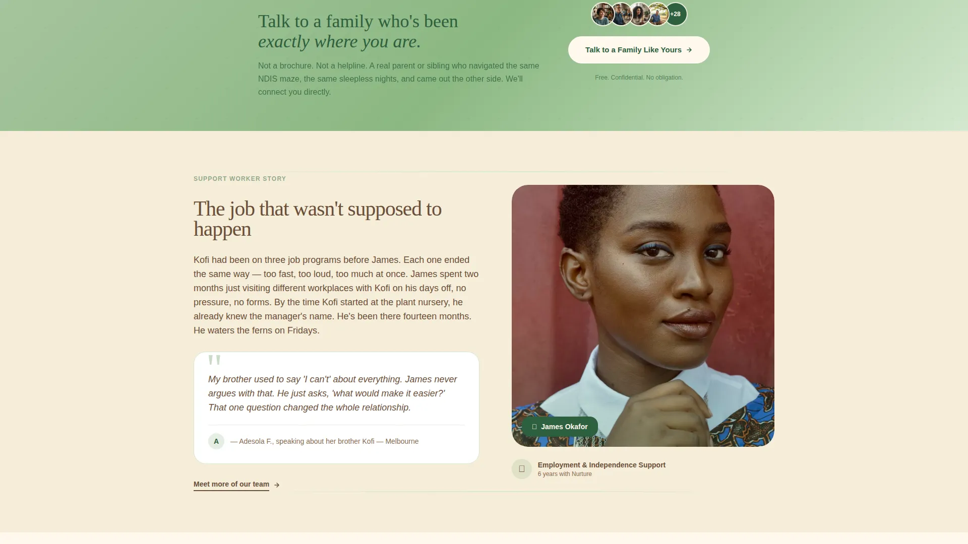
Zigzag Worker Profile Layout
Each support worker is introduced in an alternating left-right section. Photo and name appear on one side; their story and a family quote appear on the other. Alternating sides keeps the eye active and makes each person feel like a distinct, individual introduction rather than a repeated card.
Watercolor Hero Illustration
The header opens with a wide, hand-drawn watercolor scene. A support worker and a young adult walk through a neighbourhood together, passing a café, a bus stop, and a front garden. The line work is loose and human, so every visiting family can picture themselves in it.
Peer Support Banner
A soft fern-coloured banner sits between worker profiles. It carries the secondary call to action: "Talk to a Family Like Yours." This gives visitors who are not yet ready to book a lower-pressure path to connection through peer support contacts.
Dual Call to Action Structure
The primary call to action, "Meet Your Support Team," appears after the third worker profile. The secondary call to action appears mid-page in the peer support banner. The two placements serve visitors at different stages of readiness without competing with each other.
Scroll Animation System
The template uses medium-weight animations including blur reveals, staggered scroll entry, and parallax layers on the illustration. Hover states on worker cards and a magnetic primary call to action button add tactile interactivity without overwhelming the warm visual tone.
Forest Trust Colour System
The palette uses eucalypt green, bark brown, soft fern, and sunlit cream across every section. Green anchors headings and trust signals. Brown warms body text. Fern highlights cards and hover states. Cream fills generous spacing between sections so the page never feels clinical.
Page sections overview
| Section | Purpose |
|---|---|
| Hero with illustration | Opens with warmth, headline, and floating trust cards |
| Worker Profile: Maya | Introduces first support worker with photo and family quote |
| Peer Support Banner | Secondary call to action for visitor peer connection |
| Worker Profile: James | Introduces second support worker, layout flipped |
| Worker Profile: Priya | Introduces third support worker with photo and family quote |
| Primary call to action block | "Meet Your Support Team" intake click after trust is built |
| Arc Browser Split footer | Closes the page with structure and navigation |
Design & branding system
The visual language here is deliberately unhurried. Typography uses Fraunces for serif headings and DM Sans for body text, a pairing that feels literary and grounded rather than corporate. The illustration style uses loose, expressive watercolor textures rather than clean vector graphics.
- Colour palette: eucalypt green (#2D5F3E), bark brown (#6B4F3A), soft fern (#A8C5A0), and sunlit cream (#FFF8ED) as the primary background
- Headings and trust signals use eucalypt green; body text uses bark brown; fern activates on card highlights and hover states; cream creates breathing room between every section
- The creative direction is Team and People: candid photos taken in real environments such as kitchens, parks, and workplaces replace polished studio portraits
Mobile & speed optimization
Carers browse on phones late at night, often between other tasks. The template is built mobile-first so the most important information reads clearly on a small screen without horizontal scrolling or pinching.
- Scroll animations use Server Components for static sections and Client Components only where scroll interactions require them, keeping the page light on lower-powered devices
- The zigzag layout reflows cleanly on mobile so worker photos and story text stack in a natural reading order
- The magnetic call to action button and hover states are adapted for touch interaction on smaller screens
How this template helps you convert
Trust is the conversion mechanism on this page. Every design and layout decision is ordered to reduce hesitation before the primary call to action appears.
- The page shows faces, names, and family quotes before it shows any form or credential, so visitors feel they already know the team before they click
- The peer support banner mid-page captures visitors who are researching but not yet ready, giving the organisation a second touchpoint without pressure
- The primary call to action appears only after three full worker profiles have been seen, so clicking "Meet Your Support Team" feels like a natural next step rather than a cold commitment
Other information about this template
This template is part of a broader library of community and nonprofit landing page templates. It sits at the intersection of disability and inclusion nonprofit work, specifically within the intellectual disability support niche.
- The template style is Zigzag/Alternating with a Family First theme
- The header concept uses a Custom Illustration approach rather than photography or video
- The landing page direction is Click-Through, with intake matching as the conversion destination
- Australian English is used throughout, with NDIS terminology applied where relevant to the target audience
- The footer uses an Arc Browser Split pattern, providing a structured close to the page


Theme
Family First
Creative direction
Team & People
Color system
Forest Trust
Style
Zigzag/Alternating
Direction
Click-Through
Page Sections
Zigzag Worker Profile Layout
Watercolor Hero Illustration
Peer Support Banner
Dual Call to Action Structure
Scroll Animation System
Forest Trust Colour System
Related questions
Can I change the worker names and photos in this template?
Is this template suitable for NDIS-registered providers?
How many calls to action does this template include?
Does this template work for organisations supporting adults as well as children?
Can I adapt this template if my organisation works outside Australia?


