Wedding Officiant Booking Website Template
Officiant is an editorial-style wedding officiant landing page built for one purpose: turning curious couples into booked clients through beautifully crafted copy and a frictionless click-through flow. The layout pairs a commanding serif headline with a magazine-style FAQ structure, guiding visitors from their very first question to a confident booking decision.
by Rocket studio
Quick summary
Officiant is a single-page, editorial landing page for a wedding officiant business. It opens with an architectural serif headline, moves through a magazine-style FAQ scroll, and closes with a full-width booking call to action. Every design and copy decision is built to remove hesitation and let the right couples click through with confidence.
Who this template is for
This template is made for wedding officiants who rely on personality and trust to win clients. It suits solo practitioners who want their voice to feel present before a single call is booked.
- Established officiants ready to replace a generic site with something that feels like their actual style
- Destination wedding specialists who need to earn trust with couples coordinating remotely
- Second-marriage officiants who serve couples wanting warmth and wit without heavy tradition
What problem this template solves
Most officiant websites look like every other vendor page. They list credentials, post a price range, and wait. This template solves the gap between "we found you online" and "we already feel like we know you."
- Couples arrive with unspoken questions and leave without getting real answers
- Generic layouts create friction right before the booking decision
- A wall of text or long contact form stops the click before it happens
What you get with this template
You get a fully structured, single editorial landing page designed around a FAQ-driven scroll and a click-through booking strategy. No form fields appear on the landing page itself. The writing does the qualifying, and the clicks lead directly to a calendar booking page.
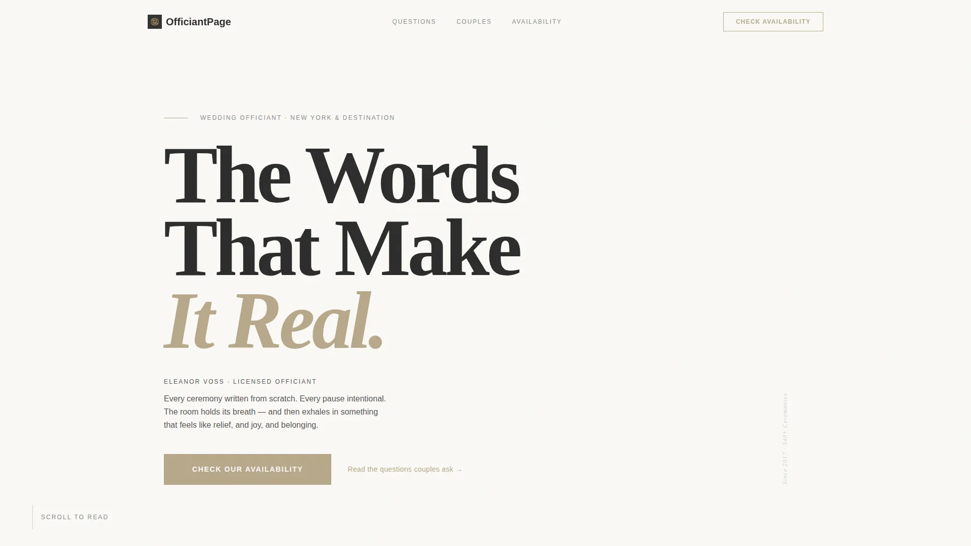
- A Giant Headline Left header with a commanding serif typeset flush-left on vellum white
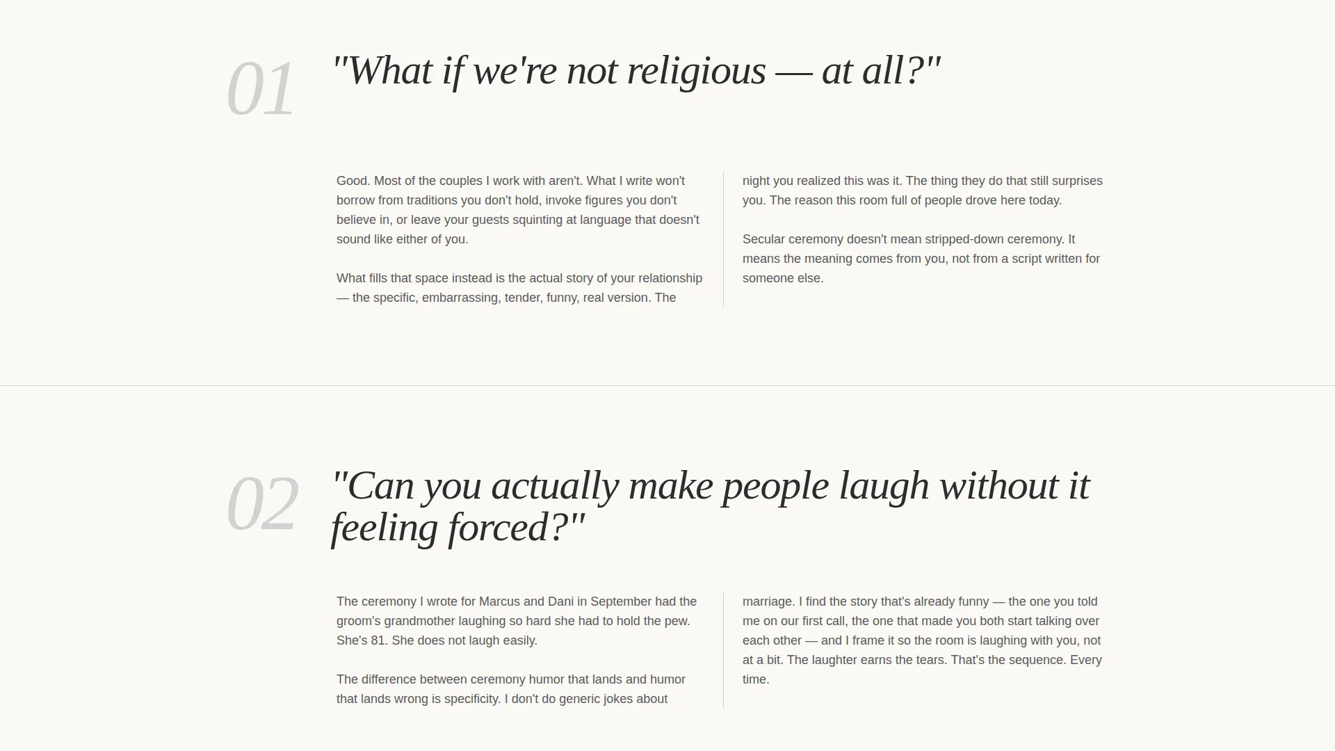
- A full FAQ-driven content section styled as magazine pull quotes with two-column answers
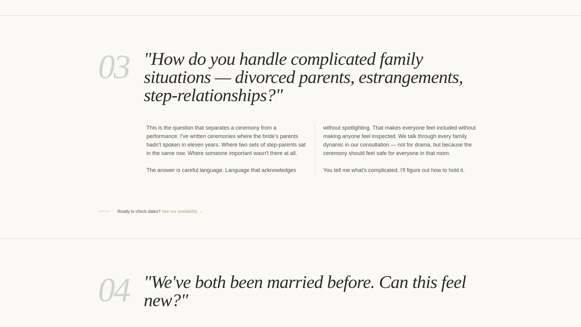
- Two call-to-action placements: a gold text link after the third FAQ and a full-width button at the close
Feature list
A brief paragraph introducing the features: each element of this template serves the single goal of moving a curious couple from first impression to booking decision.
Architectural Serif Header
The header opens with an enormous flush-left serif headline scaled so large the letterforms feel structural. A single-line subtitle in small caps sits beneath, carrying the officiant's name and city. The right half of the viewport holds empty space with only a thin gold rule guiding the eye downward.
Magazine-Style FAQ Scroll
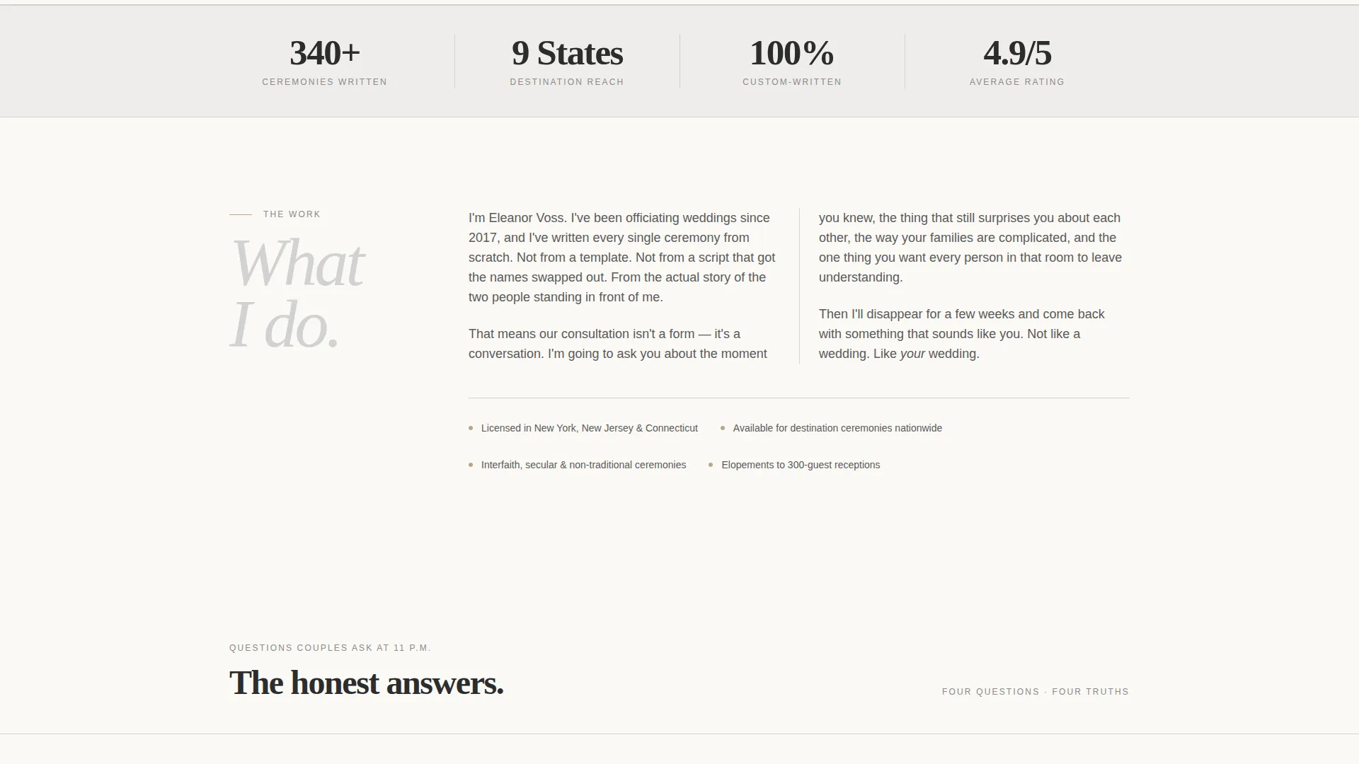
Each question appears as a full-width pull quote in the editorial style of a print magazine. A short, conversational answer follows, typeset in two elegant columns. The rhythm of ask, breathe, and answer builds trust and personality with every scroll.
Frictionless Click-Through Flow
There are no form fields on this landing page. The entire page is built to qualify visitors through copy alone. When a couple is ready, a gold text link or full-width button takes them directly to the booking calendar.
Dual Call-to-Action Placement
The first call to action appears as a gold-text link after the third FAQ section. The second appears as a full-width button at the very bottom of the page. Both read "Check Our Availability" and point to the same calendar booking destination.
Monochrome Steel Color System
The palette uses charcoal ink, brushed platinum, vellum white, and a single muted gold accent. Gold is reserved exclusively for links, pull quotes, and calls to action. The overall effect feels like a premium cotton-fiber invitation: restrained, confident, and unmistakably intentional.
Two-Column Answer Typography
FAQ answers are typeset in two elegant columns beneath each pull-quote question. This layout gives the page a print editorial feel and makes longer answers easier to read without feeling dense or exhausting.
Page sections overview
| Section | Purpose |
|---|---|
| Serif headline header | Establishes tone and identity immediately |
| Officiant name subtitle | Personalises the page with name and city |
| Gold rule divider | Draws the eye into the scroll |
| FAQ pull quote block | Poses the couple's real question |
| Two-column answer | Answers conversationally, builds trust |
| Mid-page call to action link | Offers the booking path after question three |
| Full-width call to action button | Closes the page with a clear booking prompt |
Design & branding system
The visual identity follows an Executive Suite theme built on the Monochrome Steel color system. Every color choice serves restraint and authority. There are no competing images in the header, just typography, space, and one precise gold accent.
- Charcoal ink (#2C2C2C) for primary text, brushed platinum (#D2D2D2) for structural elements, and vellum white (#FAF9F6) as the page base
- Muted gold (#B8A88A) appears only on links, pull quotes, and calls to action, never as a background fill
- Large serif typefaces handle headlines and pull quotes; small caps handle labels and subtitles for a layered editorial hierarchy
Mobile & speed optimization
The editorial layout is structured to translate cleanly from desktop to smaller screens. Single-column stacking keeps the reading rhythm intact, and the FAQ format remains easy to follow without horizontal scrolling.
- The two-column FAQ answer layout collapses to a single readable column on mobile viewports
- The full-width call to action button and gold text link remain clearly tappable at all screen sizes
- The sparse, image-light design keeps the page lean and fast to load on any connection
How this template helps you convert
This template is conversion-built from the first headline to the final button. Every section reduces a reason not to click.
- The FAQ-driven scroll answers the exact questions couples ask privately before they ever contact a vendor, so objections are resolved before the call to action appears.
- By removing all form fields from the landing page, the template eliminates the friction point that stops most couples mid-decision and routes them straight to a booking calendar.
- Two strategically placed calls to action catch couples who are ready early and those who need the full scroll, making sure no confident reader leaves without a clear next step.
Other information about this template
This template was designed specifically for the wedding officiant niche within the broader professional services category. It is built as a single-page editorial landing page, not a multi-page site, so all content lives in one focused, scrollable experience.
- The creative direction is FAQ-driven, meaning the page structure is built around real questions couples ask, not a traditional services list
- The booking flow is click-through only: the landing page links to an external calendar booking page rather than embedding a form
- This template fits officiants at any career stage but works especially well for those who have a distinctive voice and want the page to reflect it
Theme
Educational Guide
Creative direction
Stats-First Impact
Color system
Monochrome Steel
Style
Comparison Table
Direction
Booking/Scheduling
Page Sections
Architectural Serif Header
Magazine-style FAQ Scroll
Dual Call-to-action Placement
No-form Frictionless Strategy
Monochrome Steel Color Palette
Two-column Answer Layout
Related questions
Can I update the FAQ questions to match what my couples actually ask?
Does this template include a booking calendar?
Is this template suitable for a non-religious or interfaith officiant?
Can this template support multiple ceremony styles or client types?
Does the landing page display well on mobile devices?



