Travel Consulting Directory Website Template
Offset is a single-page landing page template built for travel sustainability consultancies. It uses a zigzag case study layout, a monochrome steel color system, and a credential-first header to build credibility fast. The design guides sustainability directors, DMO managers, and airline CSR leads toward a clear call to action, without relying on lifestyle photography or emotional appeals.
by Rocket studio
Quick summary
Offset is a travel sustainability consultancy landing page template designed around evidence, not atmosphere. A credential-badge header, three escalating case study sections, and a metric bar build a compounding argument for your audit services. Every layout decision supports one goal: turning informed visitors into confident clicks through to your methodology page.
Who this template is for
This template suits consultancies that need to project authority before a visitor reads a single word of body copy. It is built for service providers whose clients arrive already skeptical and time-pressured.
- Sustainability consultancies auditing hotel chains, tour operators, or airlines against recognized environmental standards
- Travel compliance professionals working with mid-tier hotel groups, destination management organizations, or airline CSR teams
- Independent auditors or boutique firms who need a polished, credibility-first page without a large design budget
What problem this template solves
Many sustainability consultancies lose high-value clients before the conversation starts. Their pages look like every other professional services site: vague promises, stock photography, and no proof. Offset fixes this by leading with verified credentials and structured case study evidence.
- Visitors arrive doubting whether your firm can handle regulatory complexity at scale
- Generic layouts fail to communicate the precision that ISO 14001 and GSTC audit work demands
- Without a clear click-through path, high-intent researchers leave before discovering your methodology
What you get with this template
You get a fully structured single-page layout that functions like a curated dossier. Every section is purpose-built to move a skeptical sustainability buyer from first impression to confident action.
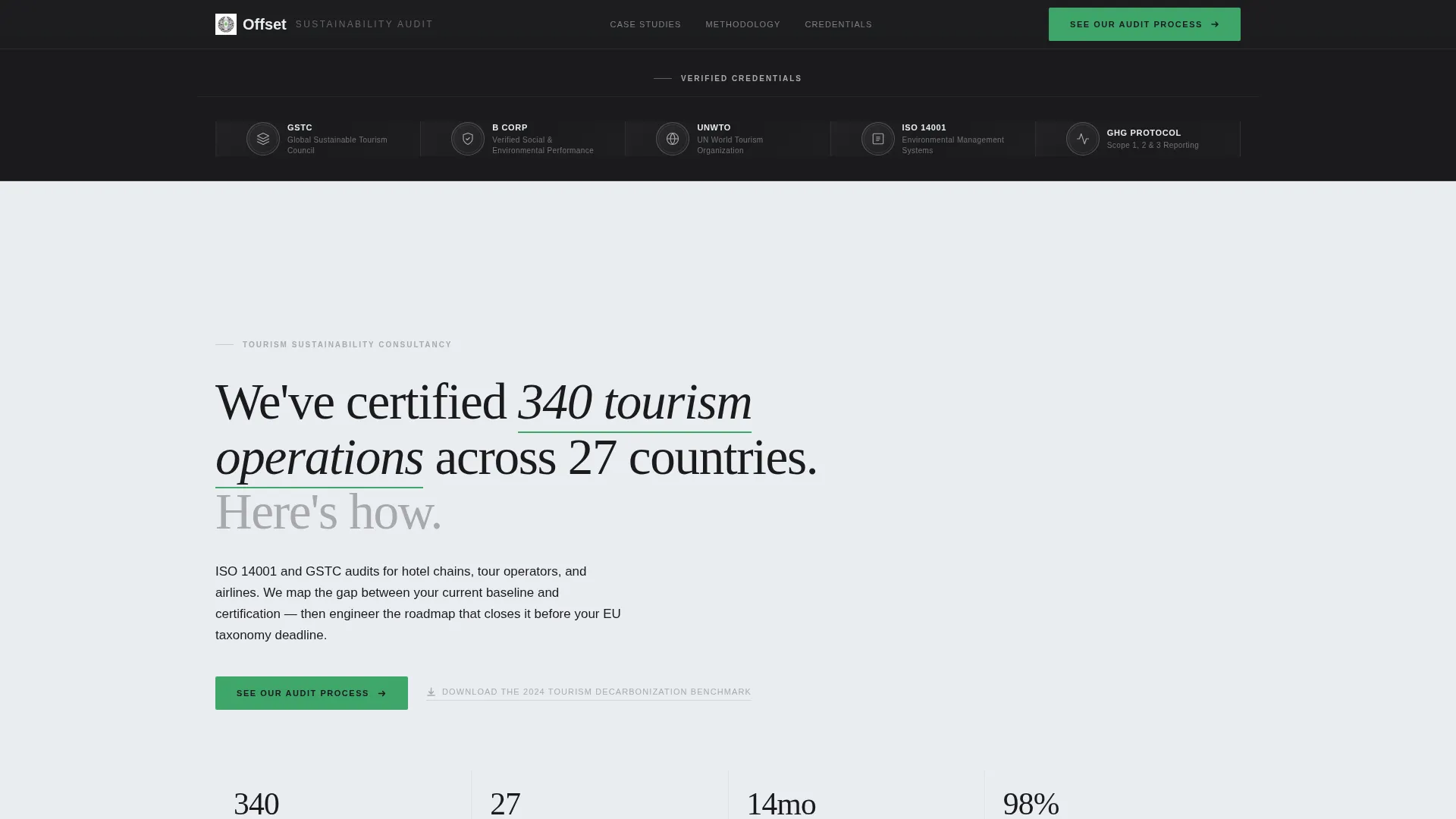
- A horizontal award badge header featuring credential seals in monochrome steel, arranged symmetrically across the viewport
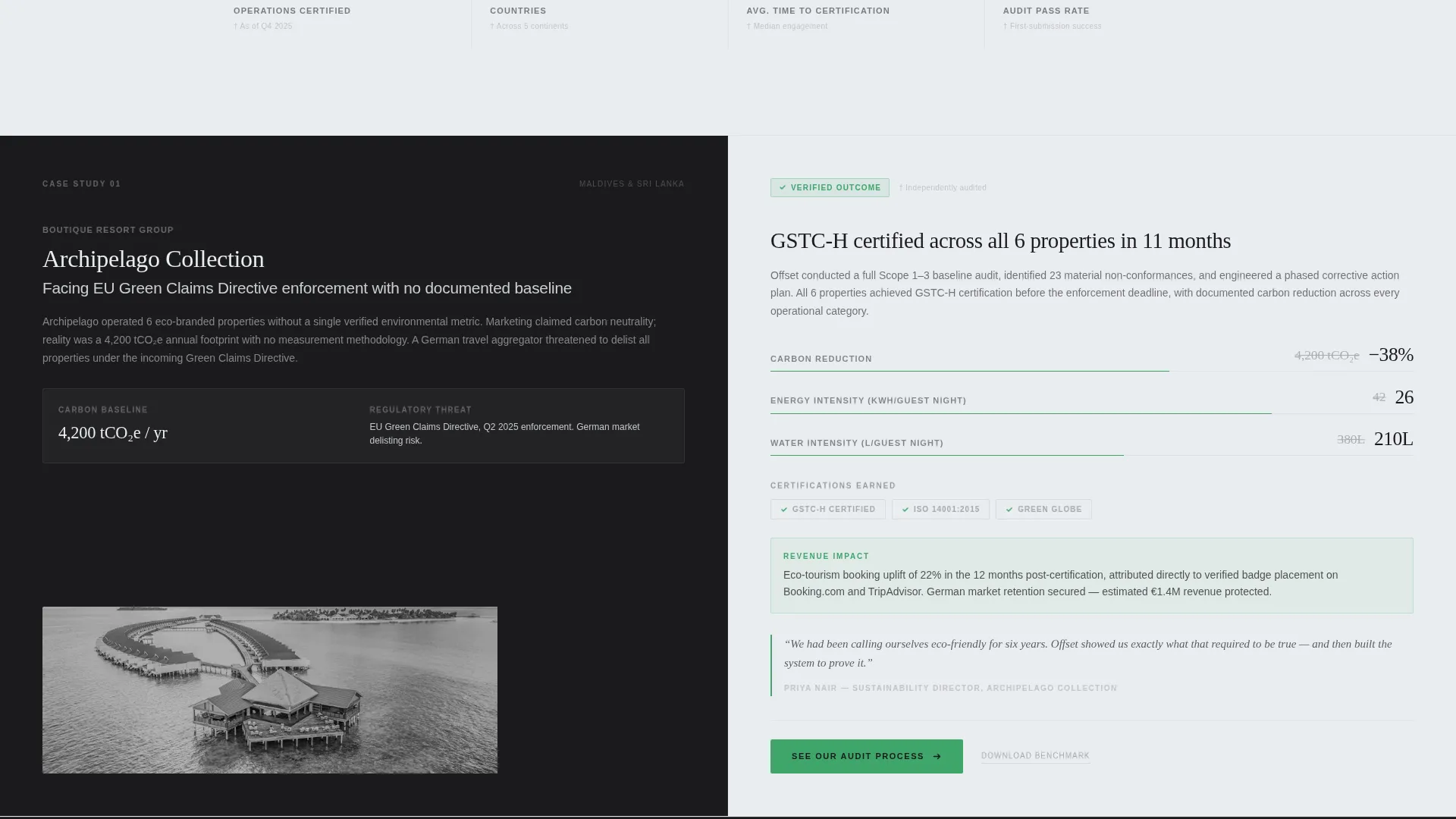
- Three alternating zigzag case study blocks, each pairing a client problem on one side with verified outcomes on the other
- A repeating audit-pass green call-to-action button and a secondary benchmark download text link placed strategically throughout the page
Feature list
A paragraph introducing the core features: each component in this template is load-bearing. Nothing is decorative, and every design choice directly supports the consultancy's argument that its work is rigorous, documented, and repeatable.
Credential Badge Header Band
A full-width horizontal band opens the page with symmetrically arranged professional seals rendered in monochrome steel with subtle metallic texture. The header replaces lifestyle photography entirely, letting institutional credentials do the persuasion work before any headline is read.
Zigzag Case Study Layout
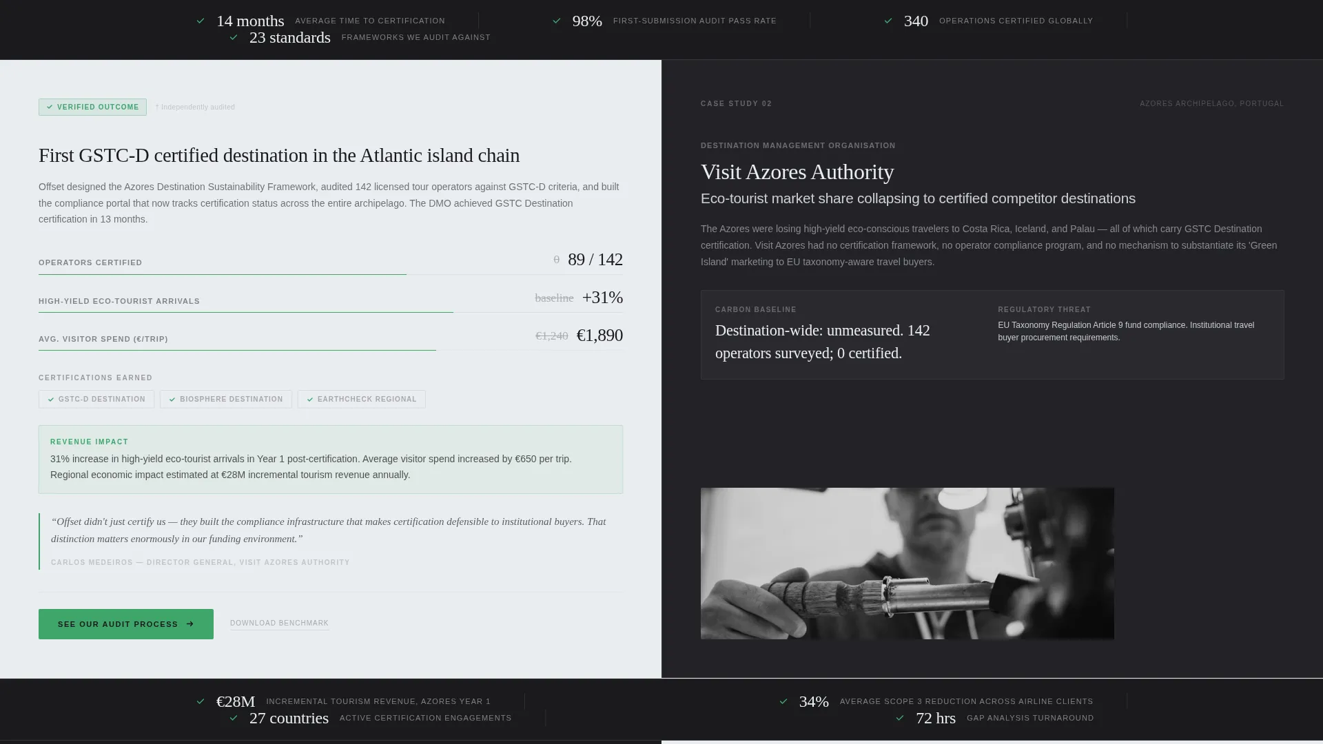
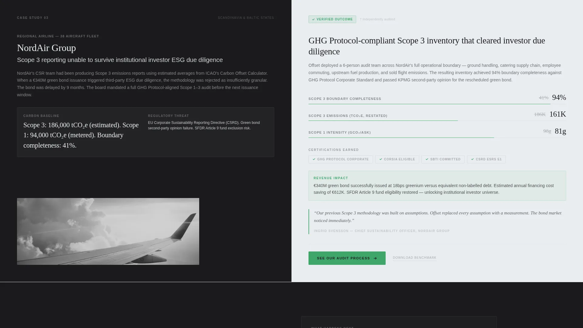
Three alternating left-right content blocks each tell one complete client story. The left column presents the problem, including the client type, carbon baseline, and regulatory threat. The right column presents the verified outcome, including percentage reductions, certification logos earned, and revenue impact.
Escalating Complexity Narrative
The three case studies increase in scale deliberately: a boutique resort, then a national destination management organization, then a full airline fleet audit. This progression builds an airtight argument that compounds with each scroll, moving the visitor from curiosity to conviction.
Metric Bar Dividers
Between each case study, a single-line brushed aluminum metric bar slides into view displaying a key verified statistic. This pacing device reinforces the evidence rhythm and keeps the page from feeling like a wall of text.
Dual Call-to-Action System
The primary call to action, "See Our Audit Process," appears first beneath the header badges and again anchored to the bottom of each case study block. A secondary text link offering a benchmark download captures high-intent researchers who are not yet ready to engage directly.
Monochrome Steel Typography System
The headline is set in a single sans-serif typeface in forge black on cool white. Audit-pass green is reserved exclusively for checkmarks, verified badges, and the primary call-to-action button, ensuring the accent color always signals trust and forward motion.
Page sections overview
| Section | Purpose |
|---|---|
| Award Badge Header | Opens with credential seals to establish institutional authority immediately |
| Hero Headline Block | Delivers the core proof statement in a single restrained sans-serif line |
| Case Study One | Boutique resort problem and certified outcome in alternating columns |
| Metric Bar One | Single verified statistic dividing case study blocks |
| Case Study Two | National DMO client story with destination-level outcome data |
| Metric Bar Two | Second statistic reinforcing the evidence rhythm |
| Case Study Three | Airline fleet audit at full regulatory complexity |
| Metric Bar Three | Third statistic closing the compounding proof sequence |
| Primary call to action Block | Audit-pass green button directing visitors to the methodology page |
| Benchmark Download Link | Secondary text link for researchers seeking the decarbonization report |
Design & branding system
The visual identity follows a Service Utility theme. The palette feels like a stainless-steel instrument tray: sterile, functional, and communicating that every element is structural, not decorative.
- Core colors are forge black (#1B1B1E), brushed aluminum (#A8A9AD), and cool white (#EAEDF0), with audit-pass green (#3EA66B) used exclusively for checkmarks, verified badges, and the primary call-to-action
- Typography uses a single sans-serif typeface throughout, keeping hierarchy clear and visual noise to an absolute minimum
- No hero images or lifestyle photography appear anywhere on the page; institutional badge seals and structured data carry all visual weight
Mobile & speed optimization
The template layout is designed to restack cleanly at smaller screen sizes. The zigzag alternating columns adapt to single-column flow on mobile without losing the problem-outcome pairing that makes each case study readable.
- The metric bar dividers remain visible and legible as single-line elements at all viewport widths
- The dual call-to-action system, both the primary button and the secondary text link, stays accessible and clearly positioned on mobile screens
- Badge elements in the header band reflow symmetrically to avoid crowding on narrower displays
How this template helps you convert
The page is built as a click-through landing page with one conversion goal: earning the click to the methodology page. Every structural decision reduces doubt and raises intent before the visitor reaches the call to action.
- The credential badge header removes the first objection instantly. Visitors see recognized seals before reading a word, establishing that this firm operates at institutional level.
- The escalating case study sequence builds a compounding proof argument. By the third case study, the visitor is not asking whether this consultancy can deliver; they are asking how quickly.
- The secondary benchmark download link captures high-intent researchers who need one more data point before engaging, keeping them in the funnel even if they are not ready to click through today.
Other information about this template
This template is categorized under Professional Services and Travel Consulting, with a niche alignment toward travel compliance consultancy work. It is built as an editorial-style, stats-first layout optimized for content and resource-led conversion rather than lead capture forms.
- The page intentionally carries no contact form; the conversion event is the click to the audit methodology page, keeping the experience frictionless and focused
- The template style draws from editorial and magazine layout principles, using structured information hierarchy rather than visual decoration to communicate expertise
- This layout suits consultancies working across ISO 14001 environmental management audits, Global Sustainable Tourism Council criteria assessments, and EU taxonomy reporting requirements
- The 2024 Tourism Decarbonization Benchmark download mentioned in the template is a placeholder content slot; you supply the actual report asset when publishing
- The stated credential of 340 certified tourism operations across 27 countries is a headline copy placeholder drawn from the source brief; replace it with your firm's verified figures before launching
Theme
Educational Guide
Creative direction
Stats-First Impact
Color system
Navy Authority
Style
Editorial/Magazine
Direction
Content/Resource
Page Sections
Credential Badge Header Band
Zigzag Case Study Layout
Escalating Complexity Narrative
Metric Bar Dividers
Dual Call-to-action System
Service Utility Color System
Related questions
Does this template include a contact form or lead capture?
Can I replace the award badge seals with my own credentials?
How many case study sections does this template include?
Is this template suitable for a solo sustainability consultant?
What do the metric bars between case studies display?



