Warm Artisan Sushi Restaurant Landing Page Template
Omakase is a warm artisan sushi restaurant landing page template built as an immersive gallery walk. It guides visitors through five courses with parallax dish photography, Japanese brush typography, and a dark Citrus Burst color system. Two clear conversion paths let guests reserve the counter or order a takeaway box without ever leaving the page.
by Rocket studio
Quick summary
Omakase is a gallery-style sushi restaurant landing page template designed for fine-dining omakase counters. It moves visitors through a curated five-course visual journey before presenting two conversion paths: a counter reservation form and a takeaway marketplace. The design is editorial, lantern-lit, and deeply sensory.
Who this template is for
This template fits restaurants and independent chefs who want their landing page to feel as considered as the meal itself. It is built for omakase-format sushi counters where the chef decides, not a menu.
- Date-night couples and food-obsessive travelers seeking an authentic counter experience
- Neighborhood regulars and gift-givers who want to order a curated takeaway sushi box
- Restaurant owners ready to move beyond a static menu page toward a true japanese restaurant landing
What problem this template solves
Most sushi restaurant landing pages present a PDF menu and a phone number. That approach loses guests before they feel anything. This template replaces flat listings with sensory storytelling, so visitors arrive emotionally invested.
- Visitors have no feel for the atmosphere before they click "Reserve," creating hesitation
- A weak landing page forces users to imagine the experience rather than feel it
- Generic layouts cannot communicate the intimacy and craft of an omakase counter
What you get with this template
The template delivers a complete, single-page design with every section pre-built and ready to customize. High-impact illustrations, editorial photography layouts, and scroll-driven animations are all included.
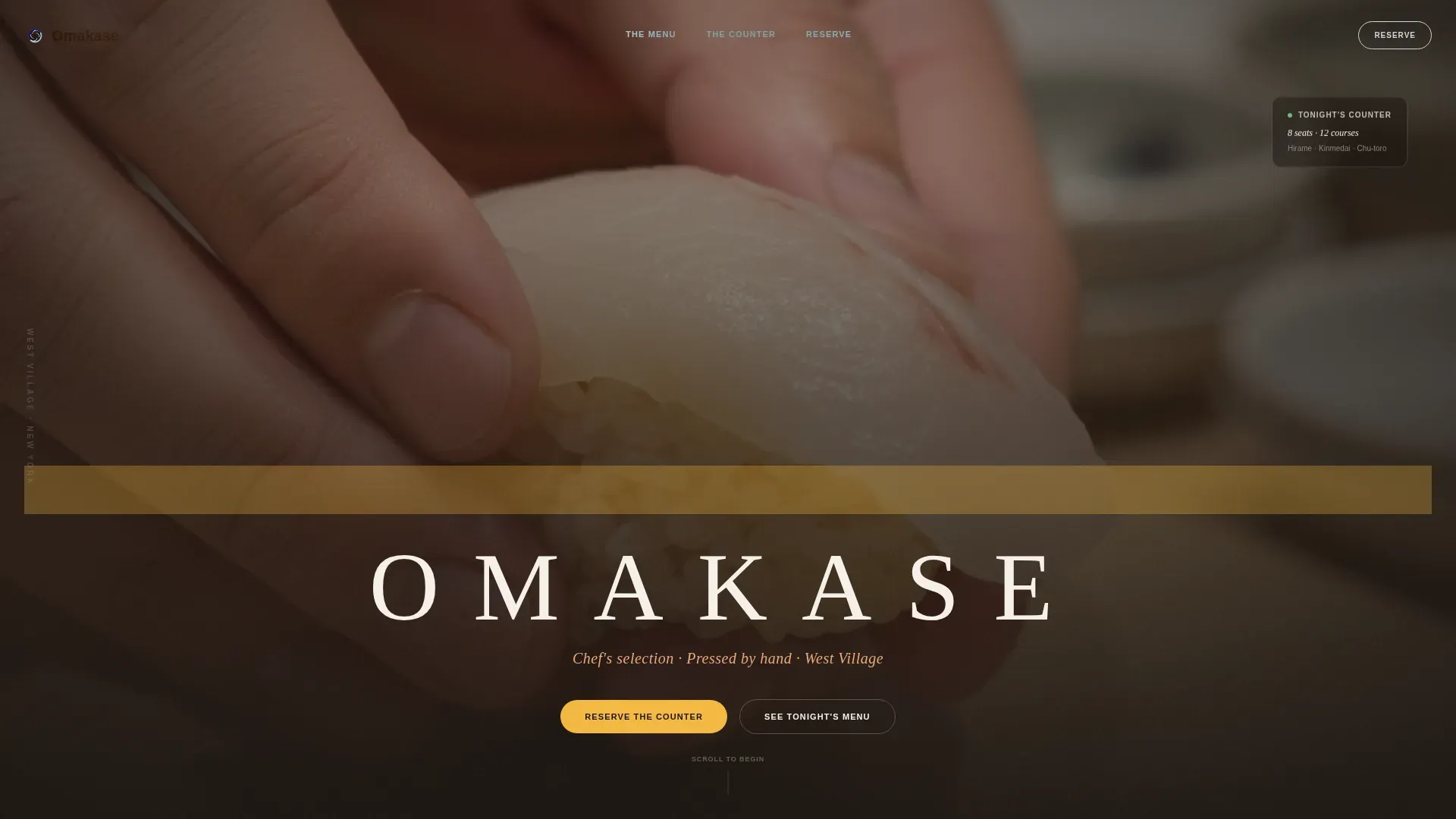
- A full-bleed hero with a slow-tracking restaurant name reveal over a chef-hands photograph
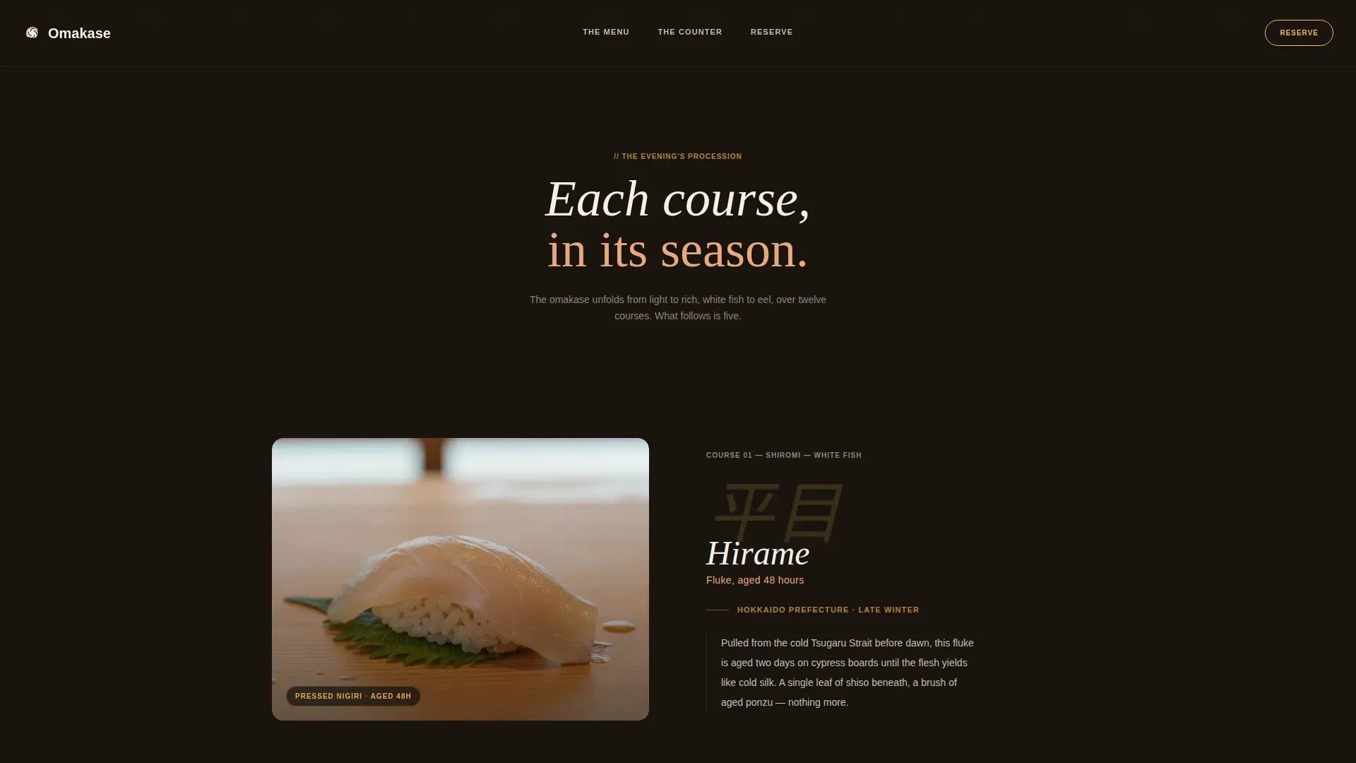
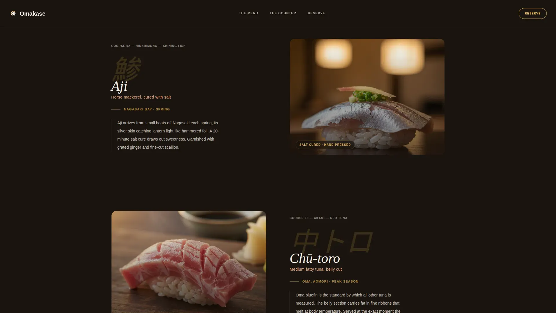
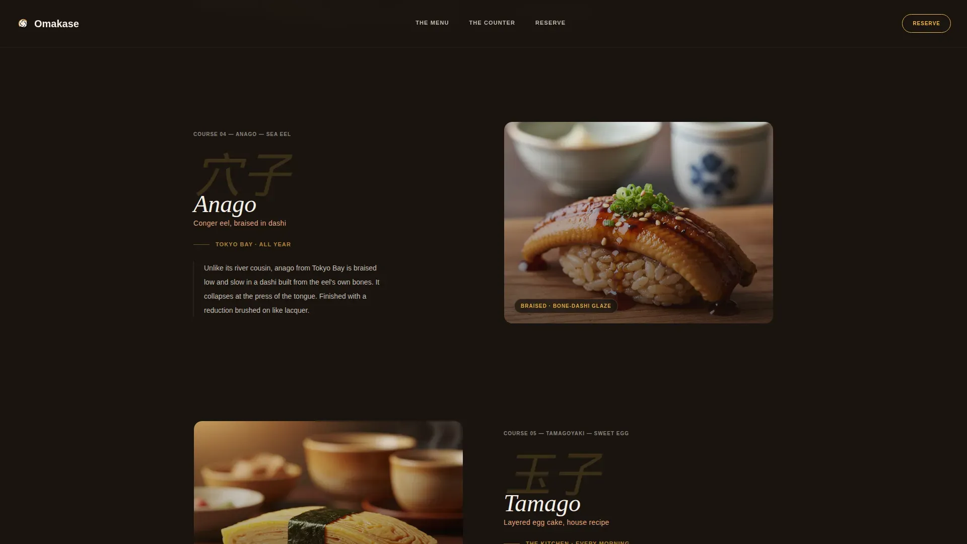
- A five-course gallery walk with parallax scrolling, dish images, Japanese brush typography, and origin descriptions
- A dual-conversion section with a "Reserve the Counter" form and an "Order Omakase at Home" cart
Feature list
This landing page template includes six core design and conversion features drawn directly from the project brief.
Five-Course Parallax Gallery Walk
Each course gets its own full-width section: a large dish photograph on one side and a two-line origin description on the other. Dishes progress from shiromi to tamago, mirroring the rhythm of a real omakase sitting. Parallax layers drift as the user scrolls, slowing the eye deliberately.
Dual Conversion Paths
The template includes two distinct paths built into one landing page. "Reserve the Counter" is a minimal form asking for date, party size, and dietary needs. "Order Omakase at Home" is an inline takeaway marketplace with 8-piece, 12-piece, and chef's-selection preset boxes available to add to cart.
Counter Story Mosaic
A photo mosaic section presents the chef's story alongside four stat callouts: seats, years open, courses per sitting, and rating. This is the landing page's trust anchor, built to highlight sourcing of seasonal, premium ingredients and the chef's technical skill.
Staggered Testimonial Reveal
Three named guest testimonials appear with a staggered scroll-triggered reveal. Each testimonial includes the guest's occupation and neighborhood, with specific dish callouts. This social proof is set to establish credibility around the artisan atmosphere.
Citrus Burst Color System
The design uses a charred hinoki wood background (#1A1410), yuzu zest accent (#F4B942), and rice-paper white (#F5F0E8) for type. Pickled ginger blush (#E8A87C) adds warmth to illustrations and image borders. Fresh wasabi stem (#7CAE7A) activates on hover states and reservation confirmations.
Fixed "Book a Table" Call to Action
A prominent, fixed reservation button remains visible as users scroll the entire landing page. This keeps the primary call to action easy to reach at every stage of the guest's journey.
Page sections overview
| Section | Purpose |
|---|---|
| Full-Bleed Hero | Chef hands photograph, slow restaurant name reveal |
| Five-Course Gallery | Parallax dish procession from shiromi to tamago |
| Counter Story Mosaic | Chef narrative, four stat callouts, ingredient sourcing |
| Voices from Counter | Three staggered guest testimonials with dish callouts |
| Two Conversion Paths | Reservation form plus inline takeaway cart |
| Minimal Dark Footer | Horizontal footer with essential links |
Design & branding system
The design language reflects a warm artisan, lantern-lit editorial restraint. Every visual choice reinforces the intimacy of a real omakase counter. The typography pairing of Fraunces serif display with DM Sans body keeps the landing page legible and elegant.
- Dark, grounding backgrounds in charred hinoki (#1A1410) with warm earthy color tones and generous white space
- Yuzu zest (#F4B942) ignites on buttons and image borders; illustrations carry pickled ginger blush for warmth
- Japanese brush typography labels each dish in the gallery walk, reinforcing the artisan gallery visual language
Mobile & speed optimization
The template is desktop-first, reflecting the wide-viewport intimacy of a counter seat. Responsive design considerations are built into the layout so the landing page remains accessible on smaller screens.
- Native CSS smooth scroll and Intersection Observer power all staggered reveals and scroll-linked dish transitions
- Images, parallax layers, and hover states are structured for efficient rendering without heavy external dependencies
- The layout adapts so users on mobile devices can still complete the reservation form and cart flow with ease
How this template helps you convert
The landing page is structured to guide guests through an intimate journey that ends in a reservation or a cart checkout. Minimalism, sensory storytelling, and effortless conversion are the three design principles at work.
- The five-course gallery walk builds emotional investment before any call to action appears, so clicking "Reserve the Counter" feels like a natural next step rather than a decision.
- The inline takeaway cart gives a second path for users who are not ready to commit to a counter seat, keeping the session valuable for every visitor type.
Other information about this template
This template is easy to adapt for any omakase warm artisan gallery sushi restaurant landing page template use case, whether you are launching a new counter or refreshing an existing japanese restaurant landing page. The design is set up so every section can be edited in tools like Sketch, Figma, and Adobe XD, making it easy to swap illustrations, update descriptions, and tailor color values to your brand.
- Included color tokens, type scales, and component states make it easy to apply your own branding consistently
- The template is built to support a japanese restaurant landing experience across both desktop and mobile devices
- Description copy, placeholder illustrations, and image layout grids are all included and ready to replace with your own content
Theme
Warm Artisan
Creative direction
Gallery Walk
Color system
Citrus Burst
Style
Gallery + Detail
Direction
Marketplace/Multi
Page Sections
Five-course Parallax Gallery Walk
Dual Conversion Paths
Fixed Reservation Call to Action
Counter Story and Social Proof
Citrus Burst Color and Type System
Scroll-driven Animation System
Related questions
Can I add my own dish photography and illustrations?
Does the template include the reservation form and the takeaway cart?
Is this landing page template suitable for a smaller sushi counter or pop-up?
How is the Citrus Burst color system applied?



