Japanese Pop-Up Restaurant Landing Page Template
Omakase is a single-column restaurant landing page template built for exclusive Japanese pop-up dining experiences. It combines a drifting UGC photo wall, a sensory course-by-course scroll, visceral guest quotes, and a visual booking form into one atmospheric, reservation-driven page. The design follows a Neo-Retro Fire and Earth palette that pulls visitors straight into the experience before a single word loads.
by Rocket studio
Quick summary
Omakase is a landing page template designed for reservation-driven Japanese pop-up restaurant experiences. It guides visitors through a seven-course sensory scroll, builds scarcity through a live visual calendar, and drives seat reservations with a sticky call-to-action button. Every design detail earns trust before asking for the click.
Who this template is for
This template serves operators of exclusive, limited-seat dining events where scarcity and atmosphere are the product. It is equally useful for food entrepreneurs, private chef collectives, and culinary pop-up producers who want a landing page that matches the quality of the experience they sell.
- Pop-up restaurant operators running limited-night sushi or omakase events in unconventional spaces
- Private chefs and culinary producers who need a high-converting restaurant landing page without writing code from scratch
- Food and hospitality brands launching short-run dining events that require advance reservations and a waitlist system
What problem this template solves
Most restaurant landing page designs treat every visitor the same. A pop-up omakase experience is fundamentally different: the food is scarce, the space is temporary, and the story is the main reason people book. A generic restaurant website fails to communicate any of that.
- Standard restaurant pages display a static menu and a phone number, leaving visitors with no emotional reason to act
- Without built-in scarcity signals, potential guests cannot see how few seats remain or how fast dates sell out
- Building a bespoke, high-design landing page from scratch requires significant development effort and design skill
What you get with this template
You get a fully structured, single-column landing page built around the complete dining journey. Every section serves a specific conversion purpose, from the first atmospheric image to the final booking form confirmation.
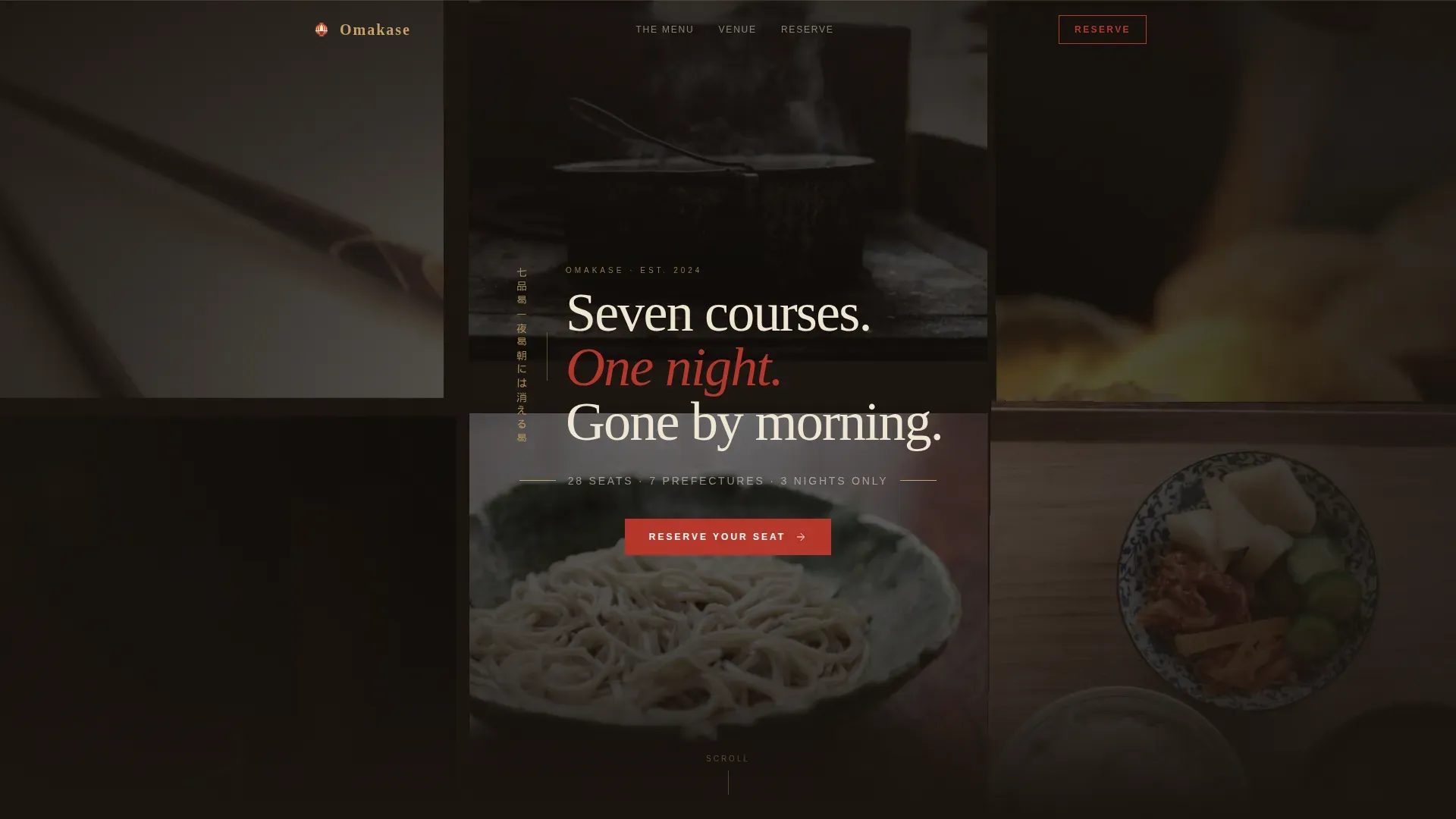
- A drifting UGC photo wall hero with a delayed bilingual tagline fade-in, setting tone before any text loads
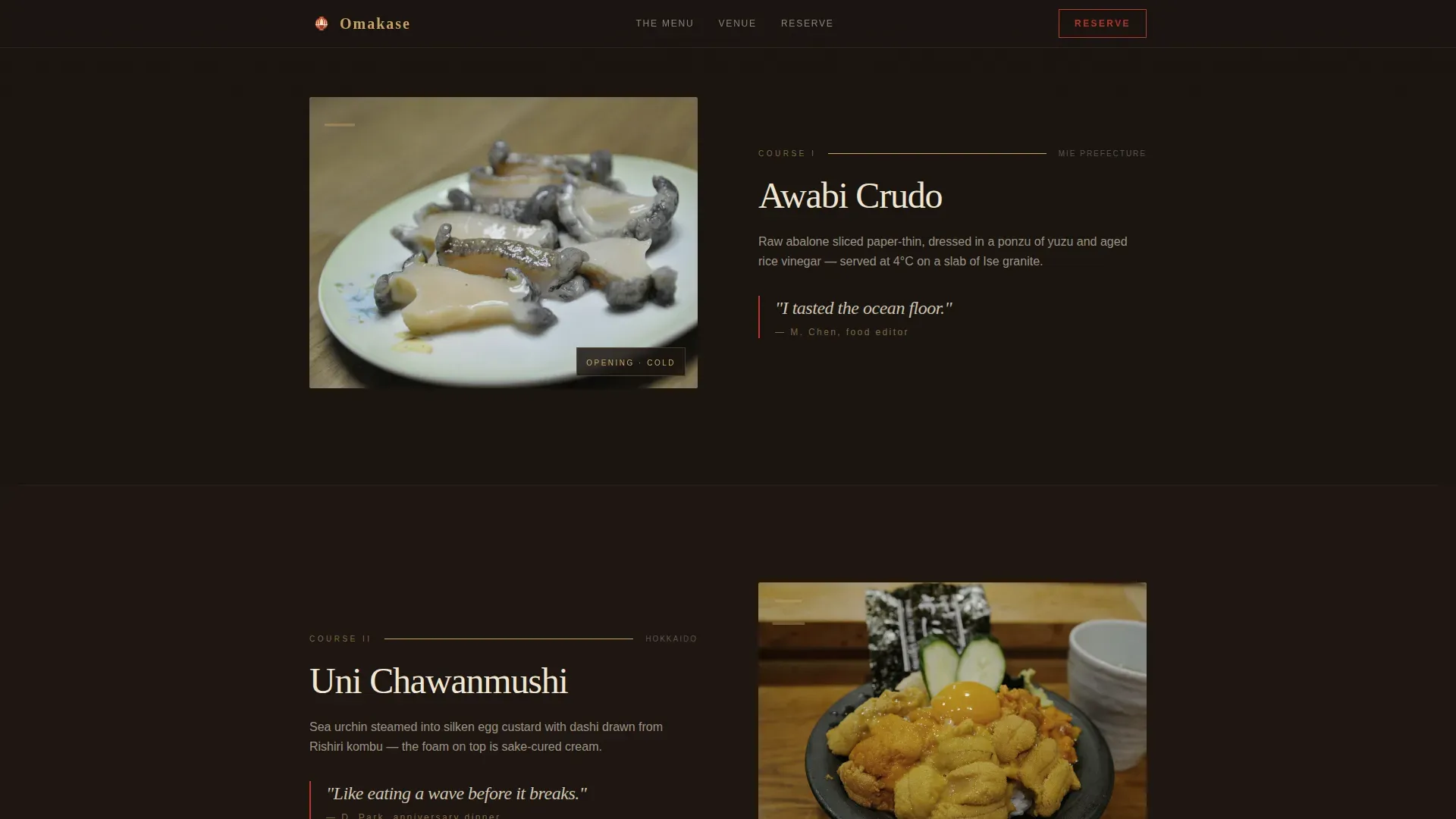
- A seven-course sensory scroll with warming scroll-linked backgrounds, course photography, and handwritten-style guest quotes between each reveal
- A visual reservation calendar showing only available pop-up nights, a party-size selector for one to four guests, a dietary preferences field, and a secondary waitlist path for sold-out dates
Feature list
This landing page template is engineered for atmosphere, clarity, and conversion. Each built-in feature addresses a specific challenge that a pop-up restaurant landing page faces.
Drifting UGC Photo Wall Hero
The header opens with a slowly drifting mosaic of guest photos shot under low amber light. Images are desaturated with added grain, evoking the texture of a 1970s Shinjuku izakaya photobook. After two seconds, vertical Japanese typography and its English translation fade in from the center, creating an entrance that feels discovered rather than advertised. This design approach creates a hidden sense of arrival that rewards visitors who stay on the page.
Sensory Course-by-Course Scroll
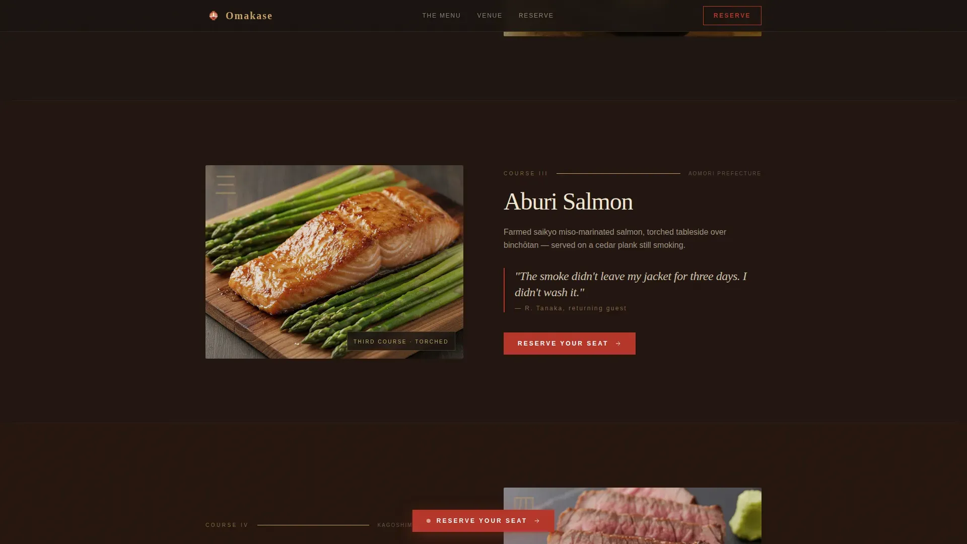
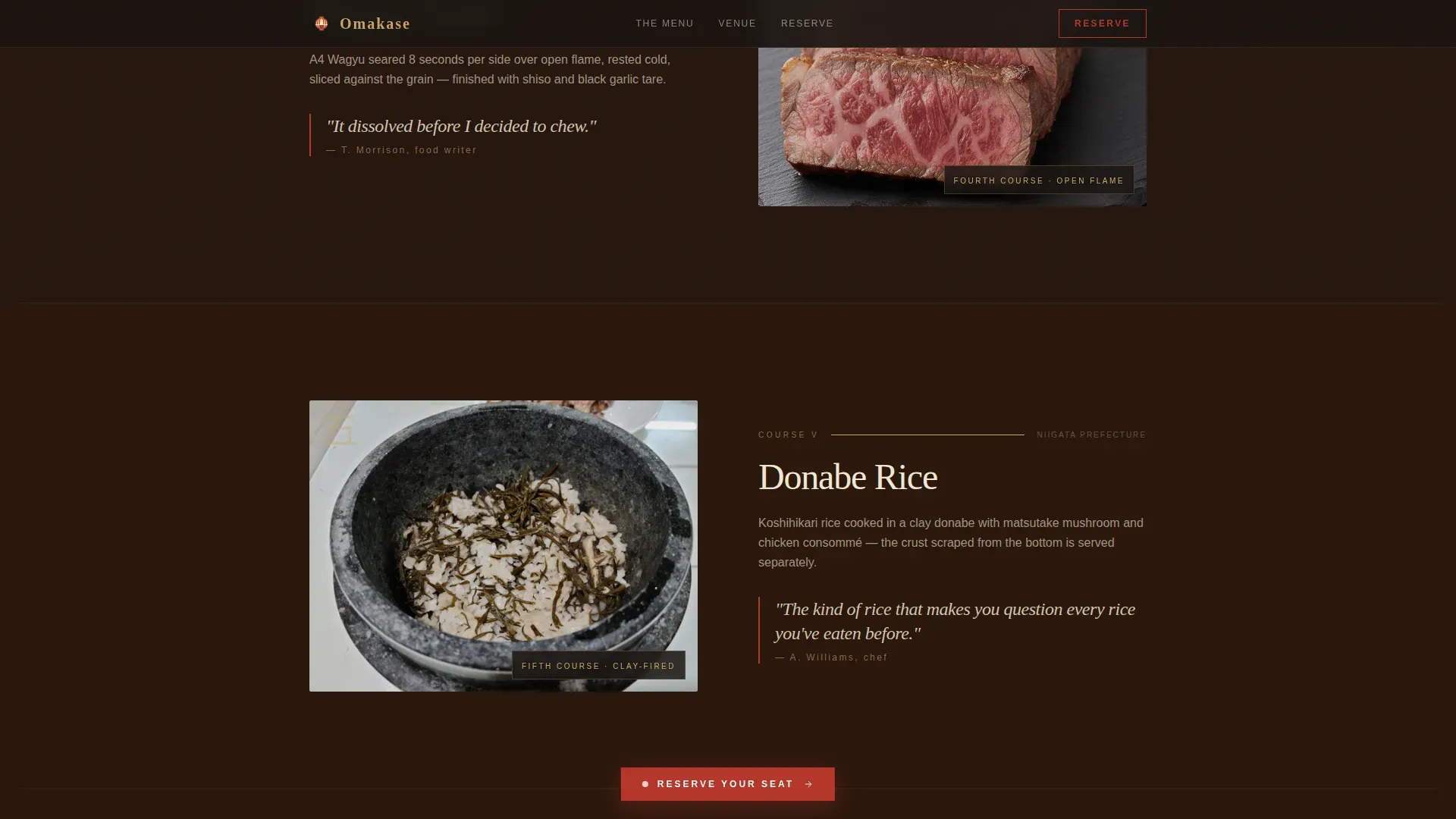
Seven course sections unfold in sequence down the single-column layout. Each section pairs a close-up food photograph with one sentence naming the ingredient origin and the cooking technique applied. As visitors scroll deeper, the background shifts from cool charcoal tones toward deep ember hues, mimicking the temperature escalation of an actual omakase progression from raw crudo to open-flame dishes. This scroll structure keeps users engaged and reinforces the chef-led story.
Handwritten Guest Quote Carousel
Between each course reveal, a visceral guest quote appears in handwritten-style type. These are not service reviews. They are sensory reactions: reactions that place potential diners inside the experience before they book. Authentic testimonials displayed this way build far more trust than a standard star-rating system, and they appear precisely when conversion hesitation is highest.
Visual Reservation Calendar and Booking Form
The booking form uses a visual calendar that displays only available pop-up nights. Sold-out dates appear grayed out, providing built-in scarcity proof without any additional marketing copy. The form collects party size from one to four guests and a free-text dietary restrictions field. Users can confirm a seat or, on sold-out dates, join a waitlist by submitting a phone number for SMS alerts.
Sticky Reserve-Your-Seat Button
The primary call-to-action button, labeled "Reserve Your Seat," appears first after the third course reveal and then remains pinned gently at the bottom of the viewport as visitors continue scrolling. Placing the conversion trigger above the fold and repeating it at the bottom of the landing page ensures no visitor reaches the end without a clear next step.
Venue Reveal and Upcoming Dates Card
A dedicated section displays the current venue location alongside the next three scheduled pop-up dates. This section reinforces the temporary, site-specific nature of the experience and gives visitors concrete details to evaluate before committing to a reservation. The outcome is a reduction in pre-booking hesitation because guests know exactly where and when the restaurant appears.
Page sections overview
| Section | Purpose |
|---|---|
| UGC Photo Wall Hero | Opens with drifting guest photos and a delayed bilingual tagline fade-in |
| Course Sensory Scroll | Reveals all seven courses with photography, origin text, and warming background shift |
| Guest Voices Quotes | Displays handwritten-style visceral reactions between course reveals |
| Reserve Your Seat | Hosts the visual calendar, booking form, party size, dietary field, and waitlist path |
| Venue and Dates | Shows current pop-up location and the next three scheduled event nights |
| Ultra-Minimal Footer | Provides a clean horizontal flow footer with essential links only |
Design & branding system
The template uses a Neo-Retro visual style built on a Fire and Earth color system. Every color choice references the physical textures of traditional Japanese ceramics and open-fire cooking, giving the landing page a warmth that generic restaurant website templates cannot replicate.
- Charcoal black (#1A1410) as the dominant background, kiln-fired red (#B5362A) on headlines and hover states, toasted sesame (#C4A265) for accent borders and section dividers, and unglazed ceramic white (#F0E6D3) for body text and card surfaces
- DM Serif Display for headings and Japanese typographic mood, paired with Manrope for body text and all user interface elements
- Scroll-linked background temperature shifts, staggered course reveal animations, and CSS-transform-only motion keep the design consistent and performant across every device
Mobile & speed optimization
The template is built desktop-first with full mobile parity, so the intimate viewport experience holds on every screen size. Mobile visitors evaluate quickly and abandon pages the moment friction appears, so this landing page is designed to load and respond without delay.
- Intersection Observer handles all reveal animations, avoiding heavy JavaScript libraries that slow loading on mobile devices
- CSS transforms power all motion effects, keeping the page light and responsive regardless of the device used to access it
- The sticky call-to-action button and the booking form are fully accessible on small screens, ensuring mobile users can confirm reservations without pinching or zooming
How this template helps you convert
High-performing landing pages connect message, proof, offer, and action into a flow that feels obvious to the buyer. This template builds that flow using the omakase dining narrative itself as the conversion engine.
- Scarcity is visible from the first scroll: the grayed-out calendar dates and the party-size limit of four seats per booking make the limited nature of the experience concrete. Visitors do not need to read a line of persuasive copy to understand that seats are rare. Emphasizing scarcity triggers urgency and a genuine fear of missing out, which moves visitors toward the booking form faster than any promotional discount could.
- Trust is distributed across every course section: guest quotes appear near decision moments, close-up food photography creates an emotional connection before any service detail is mentioned, and the venue reveal section gives guests detailed information about where the restaurant will stand on the nights they are considering. This distribution of social proof and practical detail supports conversion readiness without overwhelming users.
Other information about this template
This template sits at the intersection of luxury hospitality design and focused landing page development. Several well-known restaurant landing page examples illustrate the principles baked into this template. Pages like those built on the Goma website template demonstrate that a focused restaurant landing page allowing visitors to explore menus, chef highlights, reservations, and events in one cohesive flow consistently outperforms a scattered multi-page site for conversion. Other strong restaurant landing examples include Dishoom, which keeps visitors focused on essential location and booking details, and Hoppers, which loads quickly on mobile and places prominent call-to-action buttons at every stage. Colibri offers a detailed menu display alongside prominent booking prompts, while Dhamaka and Gramercy Tavern use social proof and evocative copy to help visitors picture their own experience at the table. These examples share one outcome: a single conversion goal, clearly framed.
The Omakase template applies the same logic specifically to Japanese pop-up sushi and omakase dining. It supports restaurant operators who want a landing page that performs without requiring deep coding skills or collaboration with a development agency. The template is built so that each section can be updated independently, making it straightforward to swap in new course photography, updated venue details, and fresh calendar dates for each new pop-up run.
- This template is suited for any pop-up food concept that relies on advance reservations, including sushi omakase nights, tasting menu events, chef collaboration dinners, and curated food and beverage experiences
- The booking form and waitlist system support discovery of new dates by collecting phone numbers for SMS alerts, turning sold-out visitors into future customers
- The landing page design style, color system, typography, and scroll behavior are all editable to match your specific restaurant brand without structural changes to the layout
Theme
Neo-Retro
Creative direction
Taste & Aroma
Color system
Fire & Earth
Style
Single Column Flow
Direction
Booking/Scheduling
Page Sections
Drifting UGC Photo Wall Hero
Seven-course Sensory Scroll with Warming Background
Handwritten Guest Quote Sections
Visual Reservation Calendar and Booking Form
Sticky Reserve-your-seat Call-to-action
Venue Reveal and Upcoming Dates Card
Related questions
Can I use this template for a sushi omakase restaurant that runs on a regular schedule, not just as a pop-up?
How does the waitlist feature handle sold-out dates?
Does this template require a developer to launch?
What type of food photography performs best with this design?
Can I change the color palette and fonts to match my restaurant brand?



