HR Software & Platform Booking Website Template
Onboard is a dark-mode, command-center HRIS landing page template built for B2B SaaS platforms replacing duct-taped HR stacks. It opens with a live employee counter ticker, moves through a pain-first comparison table, and closes with a three-week implementation timeline, all designed to drive demo bookings with near-zero friction.
by Rocket studio
Quick summary
Onboard is a single-page, comparison-table landing page template for HRIS platforms. It leads with a live-counting employee ticker, walks buyers through a before-and-after tool comparison, and ends with a fast-track implementation timeline. Every section is built to make the cost of staying on spreadsheets feel immediate and personal.
Who this template is for
This template is built for teams selling HR software to mid-sized companies that have outgrown patched-together people-ops tooling. It speaks directly to buyers who make tooling decisions under real operational pressure.
- Series B operations leads evaluating replacements for multi-tool HR stacks
- HR directors at companies around 200 employees who need a single employee record of truth
- CFOs and people-ops teams who have experienced headcount reporting errors or compliance failures
What problem this template solves
Growing companies often manage payroll, time-off requests, and employee records across three or more disconnected tools. The result is audit risk, reporting errors, and hours of manual reconciliation every month. This template frames that pain clearly before offering the solution.
- Fragmented HR tools create compliance gaps and inaccurate headcount data
- Scattered approval workflows slow down routine people-ops tasks
- No single comparison page shows the real cost difference between the old stack and one unified platform
What you get with this template
You get a fully structured, dark-mode landing page built around a Problem-to-Solution narrative arc. Every section earns the next scroll by making the buyer's current situation feel recognizable, then costly, then fixable.
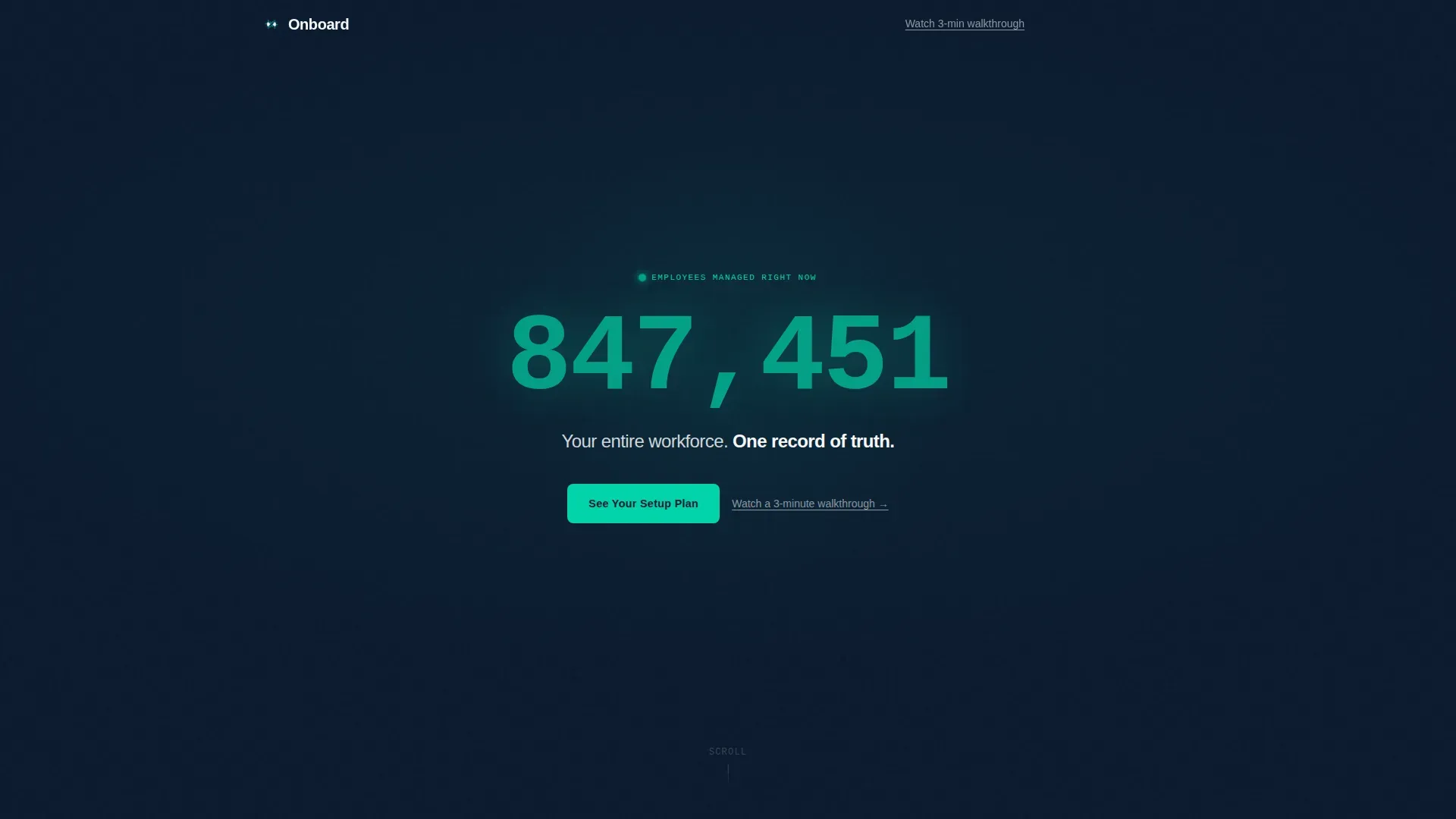
- A hero section with an animated live employee counter ticker and a single-line headline
- An animated comparison table grid pitting the old tool stack against the platform across six dimensions
- A three-week velocity timeline and a full-width call-to-action banner wired to a demo-booking flow
Feature list
This template is built around five tightly scoped functional components. Each one is designed to do one job extremely well.
Live Employee Counter Ticker
A large, monospaced number in electric teal counts upward in real time against the deep navy background. The counter uses comma-formatting that ticks into place as thousands roll past. It is the first thing a visitor sees, and it functions as proof of scale before a single word of copy is read.
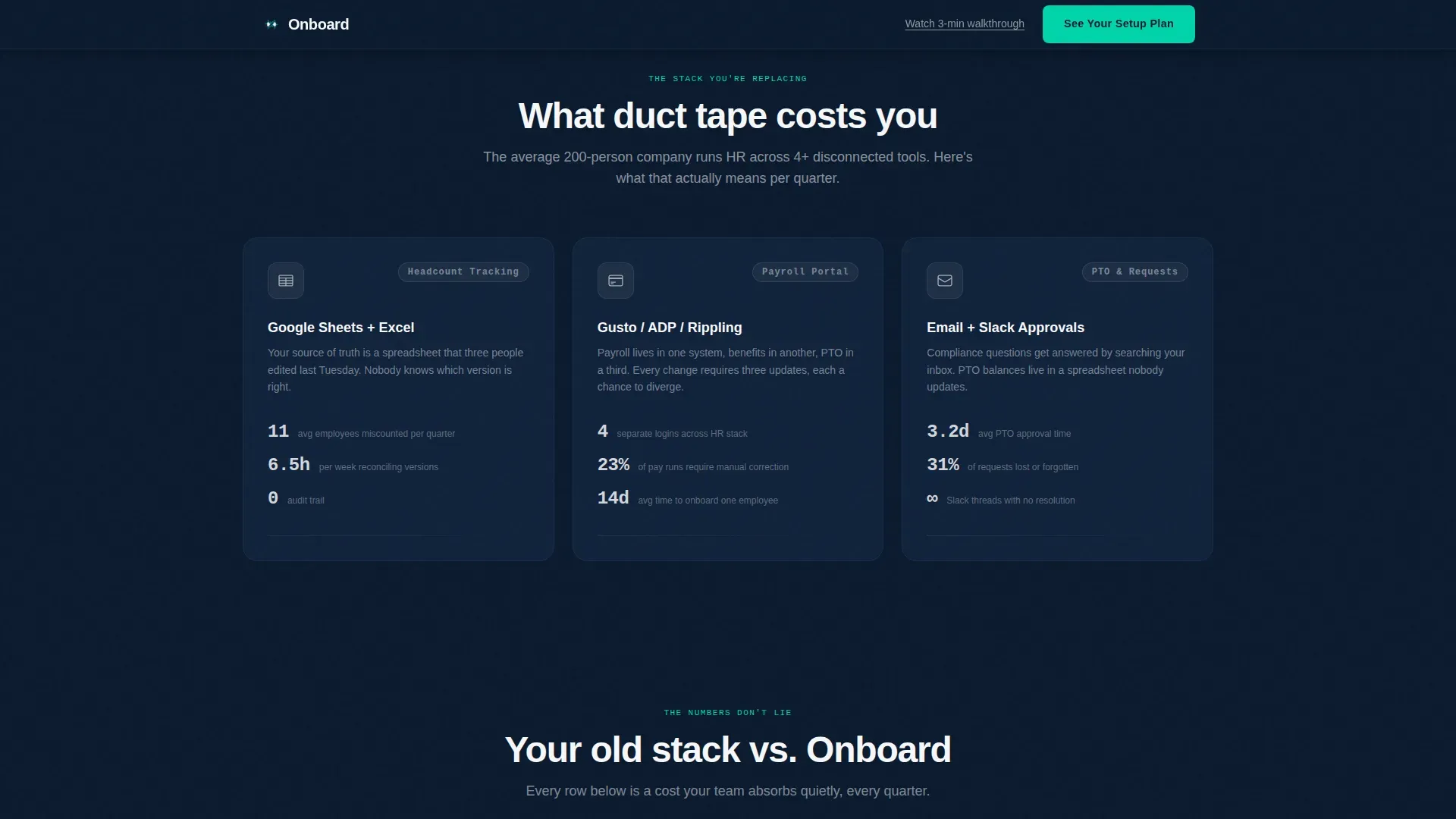
Pain Section with Friction Stats
Directly below the hero, a three-column "Before" row shows the actual tools companies typically stitch together, with real friction statistics beside each one. This section names the buyer's exact situation without asking them to self-identify.
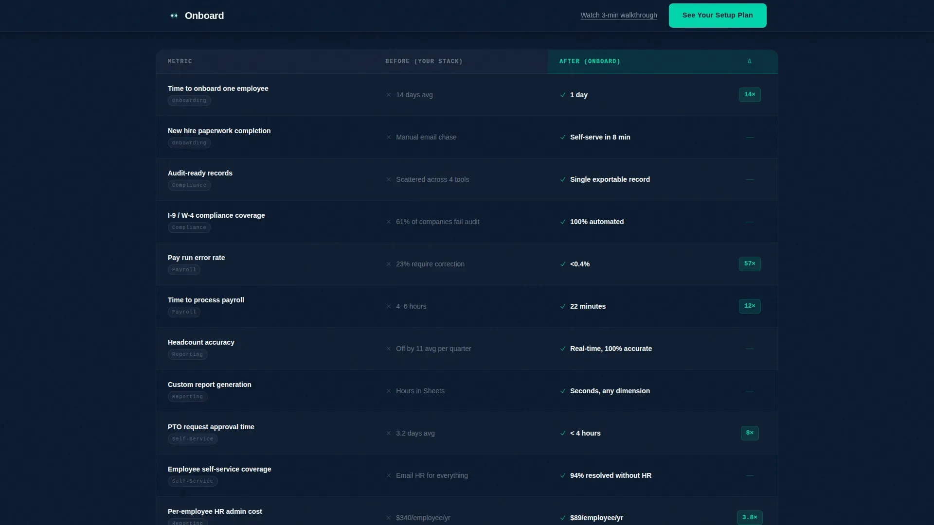
Animated Comparison Table
A filterable grid compares the old stack against the platform across six dimensions: onboarding time, compliance coverage, reporting accuracy, per-employee cost, and more. Each "After" column row animates a beat after its "Before" counterpart, letting the performance gap land with weight.
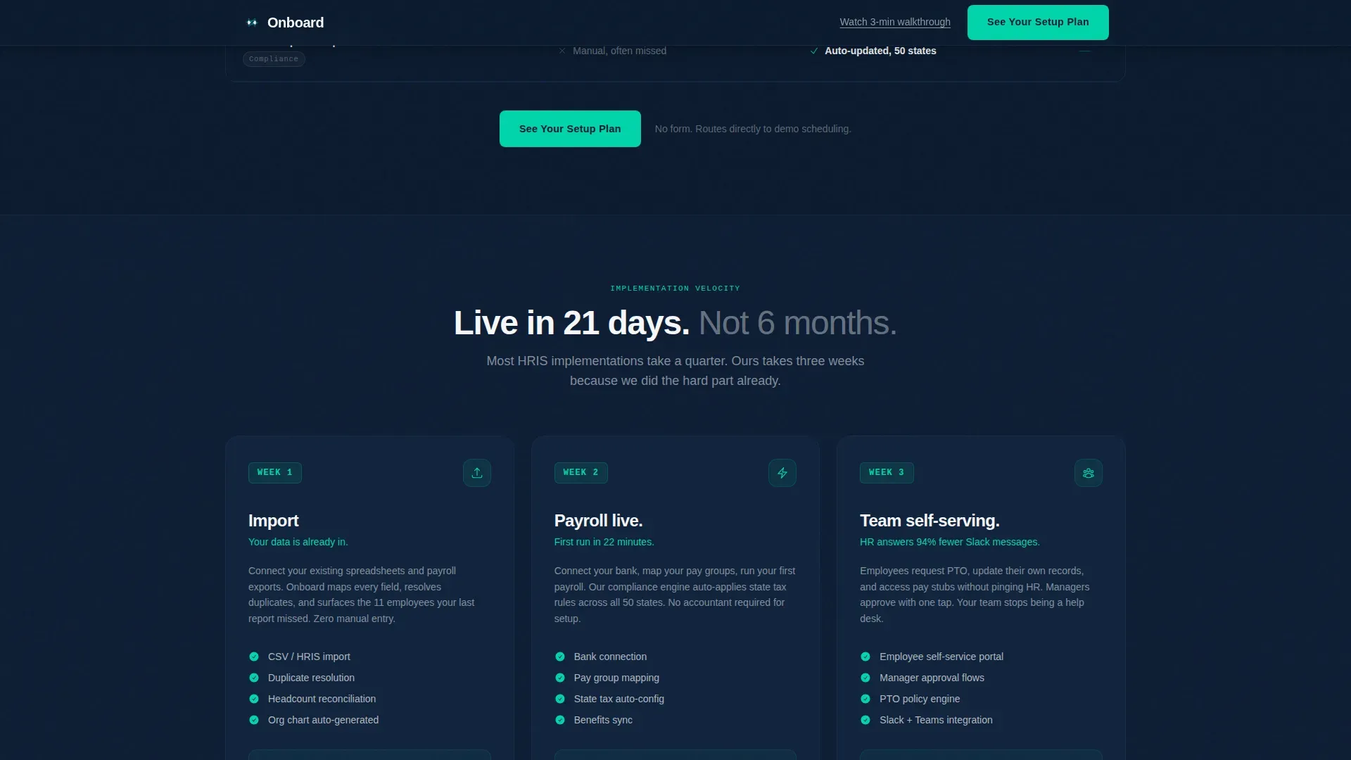
Three-Week Velocity Timeline
A dedicated section lays out the implementation path week by week. Week 1 covers data import, Week 2 brings payroll live, and Week 3 puts the team in a self-serving state. Speed becomes a closing argument, not an afterthought.
Sticky Call-to-Action System
The primary call to action, "See Your Setup Plan," appears in the sticky header after the first scroll, anchors below the comparison table, and repeats as a full-width banner after the timeline. A secondary text link, "Watch a 3-minute walkthrough," provides a lower-commitment path. There is no form on the page.
Page sections overview
| Section | Purpose |
|---|---|
| Hero Ticker | Display live employee count and core headline |
| Pain Before Row | Show friction stats for three legacy tools |
| Comparison Table | Animate before-and-after stack across six metrics |
| Velocity Timeline | Communicate three-week implementation speed |
| Call-to-Action Banner | Drive demo bookings with full-width prompt |
| Footer | Close with linear single-row site links |
Design & branding system
The visual identity follows a Startup Velocity theme using a Navy Authority color system. The palette is designed to make data glow against dark backgrounds, signaling precision and operational confidence.
- Deep command-center navy (#0B1A2E) dominates all backgrounds and section dividers; tactical slate (#1E3A5F) carries card surfaces and secondary text; clean-room white (#F7F8FA) opens up content blocks
- Electric teal (#00D4AA) is reserved exclusively for calls to action, active states, and data-positive indicators, functioning like a status light that confirms systems are go
- Typography pairs JetBrains Mono for all counter and data display with DM Sans for body copy, keeping data legible and prose approachable
Mobile & speed optimization
The template is built desktop-first, reflecting the reality that operations leads and HR directors typically review tooling decisions on a full-size screen. The layout prioritizes data density and table readability at wider viewports.
- Server Components handle all static sections, keeping initial load lightweight while Client Components power the live counter and filterable table
- GSAP ScrollTrigger drives the staggered table row animations and the counter, ensuring smooth, hardware-accelerated motion without janky reflows
- The sticky call-to-action header and all interactive elements are scoped to Client Components, keeping the rest of the page fast and stable
How this template helps you convert
Every structural decision in this template is aimed at moving a skeptical operations buyer from recognition to action. The page eliminates form friction entirely and replaces it with two commitment levels.
- The comparison table makes inaction calculable by surfacing cost-per-employee deltas and compliance gaps side by side, giving buyers a business case they can screenshot and share internally.
- The "See Your Setup Plan" call to action appears three times across the page in escalating context, each placement timed to catch the buyer at peak persuasion after a data-heavy section.
- The "Watch a 3-minute walkthrough" text link captures visitors who are not ready to book a demo, keeping them in the funnel without forcing a high-commitment action.
Other information about this template
This template was designed specifically for HRIS platform providers competing in a market where buyers arrive already exhausted by their current tooling. The page does not rely on stock photography or illustration. The live counter is the only hero element, and its job is to signal real scale.
- Built for USA localization with USD pricing conventions and MM/DD/YYYY date formatting throughout
- The comparison table supports filtering, making it useful for buyers who want to isolate specific dimensions like compliance coverage or reporting accuracy
- The footer follows a linear single-row pattern, keeping the page exit clean and uncluttered
- This template is well suited for HRIS platforms looking to differentiate against legacy tools by making the switching argument visual and immediate
Theme
Startup Velocity
Creative direction
Problem→Solution Arc
Color system
Navy Authority
Style
Comparison Table
Direction
Click-Through
Page Sections
Live Employee Counter Ticker
Three-column Pain Section
Animated Comparison Table
Three-week Velocity Timeline
Sticky Multi-placement Call to Action System
Related questions
What type of page is this template?
Do visitors need to fill out a form to take action?
Can the comparison table dimensions be customized?
Who is this template best suited for?
What makes the hero section different from a typical landing page?


