Oncology Medicine Reviews Website Template
The Clarity template is a split-screen oncology patient education landing page built for digital libraries that translate peer-reviewed research into illustrated treatment guides. It pairs a diagnostic-style checklist with live guide preview cards, uses a warm Forest Trust color system, and guides patients, caregivers, and nurse navigators from first question to confident, informed decision in one scrollable session.
by Rocket studio
Quick summary
Clarity is a 50/50 split-screen landing page template designed for oncology patient education platforms. It pairs a scroll-linked checklist with illustrated guide preview cards, earning visitor trust before asking for a single email address. The design blends clinical authority with genuine warmth, giving newly diagnosed patients, caregivers, and nurse navigators a calm, reliable place to find answers at any hour.
Who this template is for
This landing page is built for a specific, high-stakes audience. It serves people who need medically credible, easy-to-read content delivered with care and clarity.
- Newly diagnosed cancer patients who arrive with printouts, questions, and anxiety, and need plain-language answers about staging, treatment options, and what to expect next week.
- Caregivers and family members building question binders before appointments, looking for reliable online resources they can trust and share with doctors.
- Nurse navigators and healthcare providers who need a vetted link to send potential patients after hours, when the clinic is closed and someone still needs support resources right now.
What problem this template solves
Oncology patients face a flood of complex medical information at the worst possible moment. Most medical website designs are built for institutions, not for people sitting in a waiting room at 9 PM, terrified and seeking answers.
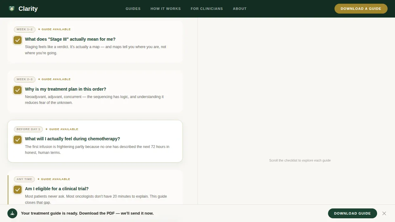
- Information overload without structure. Patients cannot distinguish reliable clinical data from noise. This landing page organizes content into a progressive checklist that mirrors how a newly diagnosed person actually thinks, moving from "What is my diagnosis?" through to "What happens next week?"
- Trust gaps that prevent engagement. Without visible proof of medical expertise, visitors leave. The template surfaces peer-review seals, named doctor reviewers, last-updated dates, and patient comprehension scores on every guide card, so patients and caregivers can verify credibility at a glance.
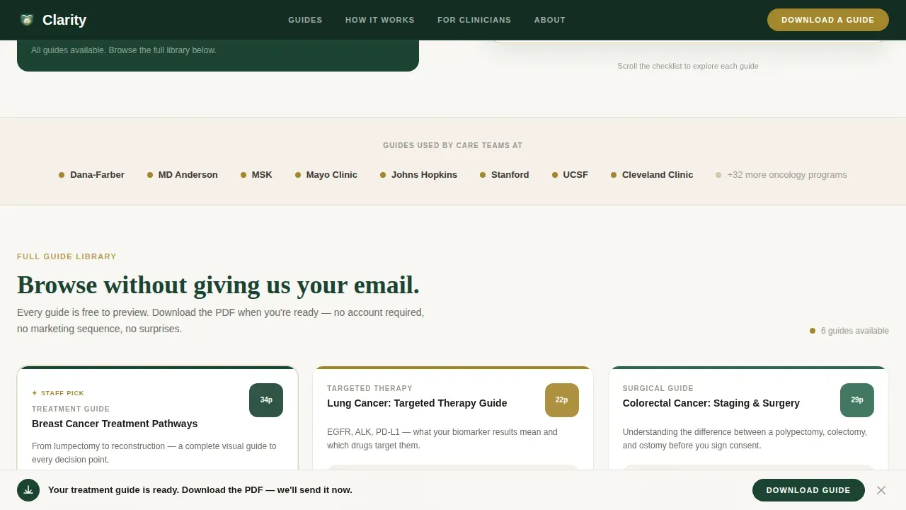
- Barriers between patients and useful content. Many healthcare website designs hide content behind aggressive forms. This template lets visitors browse the full guide library ungated first, then offers a single-field email gate only when they are ready to download, reducing bounce rates and building genuine confidence.
What you get with this template
You get a thoughtfully crafted, single-page layout that earns trust through proof rather than promises. Every section is designed to guide users forward without pressure or confusion.
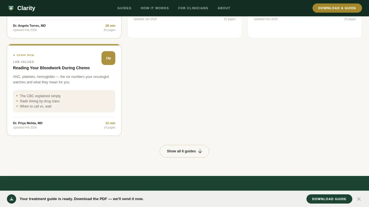
- A 50/50 split-screen hero section with a scroll-linked diagnostic checklist on the left and illustrated guide preview cards on the right, including real tables of contents, named doctor reviewers, reading times, and last-updated dates.
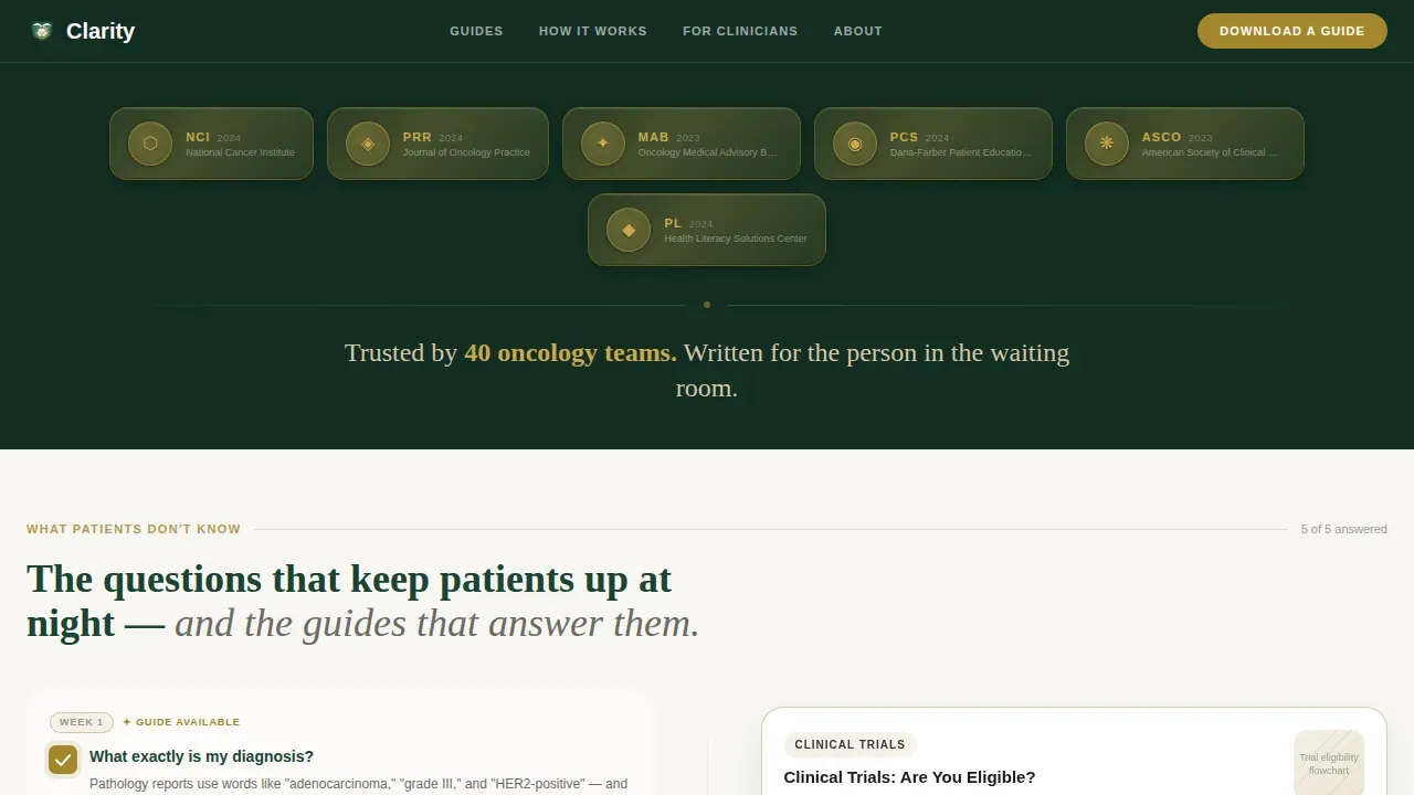
- A full Award Badge header band displaying peer-review seals, medical advisory board endorsements, and citation marks as tactile metallic emblems against deep evergreen, each with micro-text naming the granting body and year.
- A five-section page architecture covering the hero experience, a trust strip, an ungated guide library preview, a three-step "How It Works" flow, and a gated call-to-action section with a sticky bottom bar that appears after first scroll.
Feature list
This landing page template comes with a focused set of built-in features. Each one is grounded in what oncology patients, caregivers, and healthcare professionals actually need from a medical website.
Scroll-Linked Checklist Animation
The left panel presents a diagnostic-style checklist of common patient knowledge gaps: staging, treatment sequencing, side-effect timelines, and clinical trial eligibility. As visitors scroll, empty checkbox icons fill with gold marks. The page transforms from an anxiety inventory into a resolution map, mirroring the cognitive arc of a newly diagnosed patient and keeping user engagement high throughout the session.
Guide Preview Cards with Proof Layers
Each right-panel card shows a real table of contents, a named doctor reviewer, a reading time estimate, and a last-updated date. This approach addresses a core patient need: knowing that information is current and backed by qualified medical professionals. Visual aids like illustrated guide thumbnails help break up dense text and make the content feel approachable rather than clinical and cold.
Award Badge Header Band
The header is a horizontal band of earned authority signals rendered as tactile metallic emblems against deep evergreen. Peer-review seals, medical advisory board endorsements, and patient comprehension study scores are displayed with micro-text identifying the granting body and year. No stock photography appears in this section. The result is a professional design statement that immediately communicates credibility to potential patients and healthcare providers alike.
Ungated Library Browse Path
Visitors can explore the full guide library without entering any contact information. This secondary path encourages users to verify depth and quality before committing. It is one of the most effective strategies for reducing bounce rates on healthcare landing pages, because it lets the content itself build the case for download rather than forcing trust before it is earned.
Single-Field Email Gate with Honest call to action
When a visitor is ready, a single-field email gate opens with the line "We'll send the PDF and nothing else." The call to action is direct and specific, following best practices for effective landing pages in the healthcare industry. A sticky bottom bar pins the primary download prompt after first scroll, ensuring the offer stays visible without cluttering the reading experience.
Three-Step "How It Works" Visual Flow
A dedicated section walks visitors through the process in three clear steps: Diagnosis, Guide Matched, Download PDF. This flow answers the practical question that many potential patients have before engaging: "How does this actually work?" It reassures both patients and healthcare professionals that the path from question to answer is short and trustworthy.
Page sections overview
| Section | Purpose |
|---|---|
| Award Badge Header | Display earned authority signals and set credibility immediately |
| Split Checklist Hero | Mirror patient cognitive arc with scroll-linked checklist and guide cards |
| Trust Strip | Show 40 oncology team logos and citation marks in a horizontal band |
| Guide Library Preview | Let visitors browse ungated guide cards with real tables of contents |
| How It Works | Explain the three-step path from diagnosis question to PDF download |
| Email Gate call to action | Capture one email address with a transparent, low-pressure prompt |
| Sticky Bottom Bar | Keep the primary download call to action visible after first scroll |
| Footer Flow | Close the page with a clean horizontal pattern layout |
Design & branding system
The visual identity follows a Corporate Precision theme that feels like a medical office built inside a national park lodge. It is sterile enough to trust and warm enough to breathe in.
- Forest Trust color system: Deep evergreen (#1B4332) anchors all headers and navigation. Warm birch bark (#D4C5A9) softens card backgrounds and dividers. Clinical white (#F8F7F4) opens up reading space. Quiet gold (#A3862B) appears only on verified badges, active checkmarks, and completed states, making every gold element feel earned rather than decorative.
- Typography pairing: DM Sans handles all body text for clean, high-legibility reading. Fraunces carries display headlines, adding a warm, authoritative voice that pairs well with the clinical content without feeling cold or purely institutional.
- No stock photography or patient faces: Visual aids are illustrated guide thumbnails and earned emblem graphics. This approach humanizes the experience without exploiting patient imagery, aligning with best practices for excellent medical content presentation.
Mobile & speed optimization
A significant portion of healthcare searches happen on mobile devices. With 61.5% of global website traffic now coming from smartphones and tablets, a healthcare website that does not perform well on mobile devices loses a majority of its potential audience before a single word is read.
- Responsive design for all screen sizes: The 50/50 desktop split-screen stacks into a clean single-column mobile layout. Responsive design ensures that the page adapts seamlessly to different devices, from large desktop monitors to small smartphone screens, giving mobile users an equally clear and navigable experience.
- Desktop-first architecture with full mobile stack: The template is built desktop-first for the split-screen experience, then fully responsive for mobile. Intuitive navigation on the mobile stack helps patients find essential resources easily, reducing friction for users who are seeking answers quickly during stressful moments.
How this template helps you convert
This landing page is built around a single conversion principle: prove value first, then ask. Every design and content decision is calibrated to reduce anxiety, build trust, and guide users toward one clear action without pressure.
- Trust is earned before the gate appears. The Award Badge header, named doctor reviewers, peer-review seals, and clinical data displayed on every guide card all work before the email field is ever shown. Visitors arrive as patients seeking answers and leave as informed participants. Patient testimonials and success stories can be incorporated into the guide cards and trust strip to further reinforce credibility with potential patients.
- The scroll experience mirrors real patient thinking. The checklist escalates from basic diagnosis questions to treatment plans and clinical trials eligibility, matching the actual order in which a newly diagnosed person processes information. This alignment with user behavior keeps people on the page longer and encourages users to explore more content naturally, improving improved engagement metrics and lowering bounce rates.
- The call to action is low-friction and honest. A single email field with a transparent promise guides users to claim something already proven valuable, not gamble on an unknown file. This approach reflects best practices for effective landing pages across the healthcare industry: guide users toward one specific action, make that action feel safe, and let the content do the persuading.
Other information about this template
This template is suited to the broader landscape of healthcare digital marketing. It is relevant to web developers, digital marketing teams, and medical practices that want to reach a broader audience with peer-reviewed educational content. The following points provide additional practical context for teams evaluating this template.
- Digital marketing alignment. In the digital age, search engine visibility matters for any healthcare website. The landing page structure supports clean heading hierarchies and logical content flow, which search engines reward. Local SEO strategies can be layered on top of this template to connect with potential patients in specific geographic areas.
- Healthcare industry positioning. The template is positioned for oncology patient education but the underlying structure, a checklist-to-resource model with proof layers and a low-friction gate, applies to other areas of the healthcare industry including wellness programs, virtual care services, and telemedicine options for patients who cannot visit a clinic in person.
- Patient experience across the care journey. The design supports patient services beyond the initial download. Informative articles, online resources, and support resources can be linked from guide cards, extending the patient experience across the care journey. The ungated library browse path also helps healthcare providers share relevant information with patients in just a few clicks, without requiring a login or account.
- Useful for multiple medical practices. Nurse navigators, oncology teams, and independent medical practices can all use this template as a trusted link to share with patients. The named doctor reviewer feature and last-updated date on each guide card signal that clinical data is current, which is essential for patients making healthcare decisions about treatment plans and clinical trials.
- Compatibility with digital marketing goals. The template's structure supports digital marketing campaigns across multiple channels. Patient reviews, success stories, and patient testimonials can be added to the trust strip or guide cards to reinforce credibility with potential patients who arrive through paid search, email campaigns, or referrals from doctors. Patient engagement improves when visitors find a seamless user experience waiting for them, regardless of which channel brought them to the page.
- Broad applicability for healthcare providers. Healthcare professionals evaluating the Clarity trusted oncology patient education landing page template will find that its core architecture, layered trust signals, ungated browse, and honest email gate, transfers well to other patient care scenarios where empower patients principles matter. The template gives healthcare providers a competitive edge by presenting excellent medical content in a user friendly design that respects the emotional state of anyone navigating a serious diagnosis.
- Accessibility and readability standards. The template is designed to use plain language written at a reading level accessible during high-stress moments. All guide content on the platform targets a 7th-to-8th-grade reading level. Layout and accessibility are treated as core requirements, not afterthoughts, because patients who are physically or emotionally fatigued need a user friendly experience that does not demand effort to navigate. A clean, professional design with ample white space and clear visual hierarchy boosts confidence among prospective patients and serves the target audience effectively. The user friendly design also reduces cognitive load, which supports both user satisfaction and patient care outcomes.
- Relevant to e-commerce and resource delivery. While this template is not an e-commerce storefront, the download flow shares structural DNA with e-commerce best practices: prove value, reduce friction, and make the final action feel obvious and safe. Web developers building on top of this template can adapt the email gate modal for other resource-delivery contexts, from guide bundles to schedule appointments flows for virtual care or book appointments integrations in future iterations.
- Target demographic clarity. The target demographic is clearly defined in the design and copy system: newly diagnosed cancer patients, caregivers, and nurse navigators. The target audience benefits from a page that does not try to serve every visitor type at once. Instead, each section serves a specific moment in the patient journey, from first shock at diagnosis through to researching clinical trials and preparing for cancer treatment. This focus helps the landing page perform better for its intended users than a generic medical website would.
Theme
Corporate Precision
Creative direction
Checklist & Audit
Color system
Forest Trust
Style
Split Screen (50/50)
Direction
Content/Resource
Page Sections
Scroll-linked Checklist with Gold Fill Animation
Guide Preview Cards with Named Reviewer Proof
Award Badge Authority Header
Ungated Guide Library Browse Path
Single-field Email Gate with Sticky Call to Action Bar
Three-step How It Works Flow
Related questions
Who is the Clarity template built for?
Can this template support an ungated content browse experience?
How does the scroll-linked checklist animation work?
Is this template responsive for mobile devices?
Can I customize the color system and typography?



