Cancer Center Landing Page Template
A precision oncology landing page template built for cancer centers and oncology hospitals. It uses a Portrait-Centered hero, a Stats-First Impact layout, and a zigzag alternating structure to guide recently diagnosed patients and caregiving families from awareness to appointment scheduling. Every section leads with outcome data before narrative, earning trust through evidence rather than emotion.
by Rocket studio
Quick summary
This is a single-page, click-through landing page template designed for oncology treatment centers and cancer hospitals. It opens with a portrait-centered hero featuring a lead oncologist, moves into large-numeral statistics, then flows through four alternating treatment modality sections. Every section leads with a data point before a story. The destination is a consultation booking click.
Who this template is for
This template is built for healthcare marketing teams and administrators at established cancer centers who need to move a highly anxious audience from research to action. It is most effective when the center has real outcome data, board-certified specialists, and a multidisciplinary tumor board to showcase.
- Oncology hospitals and comprehensive cancer treatment centers seeking new patient consultations
- Marketing leads at health systems handling stage-III referral traffic and second-opinion inquiries
- Digital teams replacing generic hospital templates with a purpose-built, evidence-first patient experience
What problem this template solves
Newly diagnosed patients and their caregivers arrive at a cancer center's web page in a state of controlled fear. They are not browsing. They are evaluating. Generic hospital templates built for broad health systems fail this audience because they lead with brand messaging instead of clinical proof. This template is built specifically for that moment of evaluation.
- Patients and families often abandon pages that feel promotional rather than clinical and calm
- Referring physicians need to see tumor board credentials and specialty depth before they forward a case
- Most health system templates bury survival rates and accreditation details instead of opening with them
What you get with this template
You get a fully structured landing page layout with clearly defined sections, a Medical Clarity visual identity, and a conversion path centered on a single primary action: scheduling a consultation. No form fields appear on this page. Every click routes to an external scheduling portal.
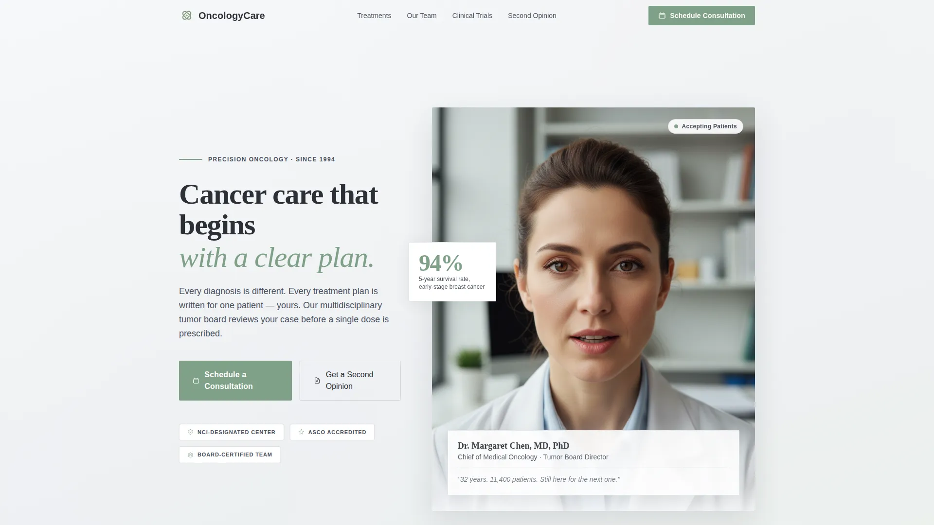
- A portrait-centered hero section with space for oncologist photo, credentials, and a primary call-to-action button
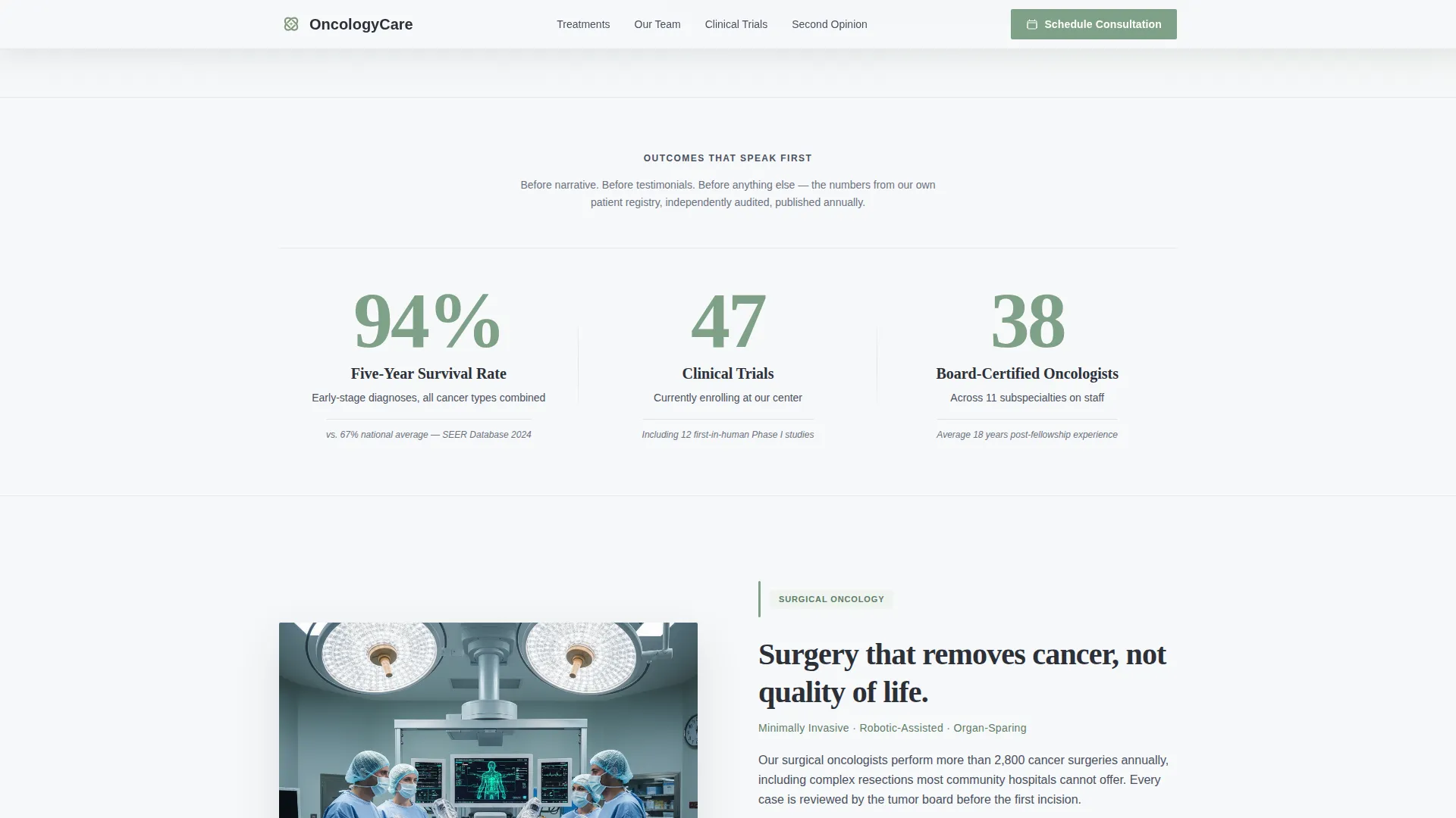
- A three-statistic impact bar displaying five-year survival rates, active clinical trials, and board-certified oncologist count
- Four zigzag alternating treatment modality rows covering surgical oncology, radiation therapy, immunotherapy, and genomic testing
- A tumor board and multidisciplinary care section with a secondary "Get a Second Opinion" pathway
- A persistent bottom call-to-action bar with accreditation seals and a repeated consultation button
Feature list
This template is built around one principle: data earns trust before narrative is earned. Every feature listed below exists in the source brief and serves a specific role in the patient conversion path.
Portrait-Centered Hero Section
The hero opens with a tight chest-up portrait of the lead oncologist looking directly into the lens. Beneath it sits the physician's name, title, and a single credibility line. This is not a stock photo slot. It is designed for an authentic face that carries the weight of clinical experience.
Stats-First Impact Bar
Immediately below the hero, three large-numeral statistics scroll into view using staggered counter animations. Each number is paired with a single explanatory line in deep graphite. The statistics are designed to anchor five-year survival rates, current clinical trial enrollment counts, and total board-certified staff on staff.
Zigzag Alternating Treatment Sections
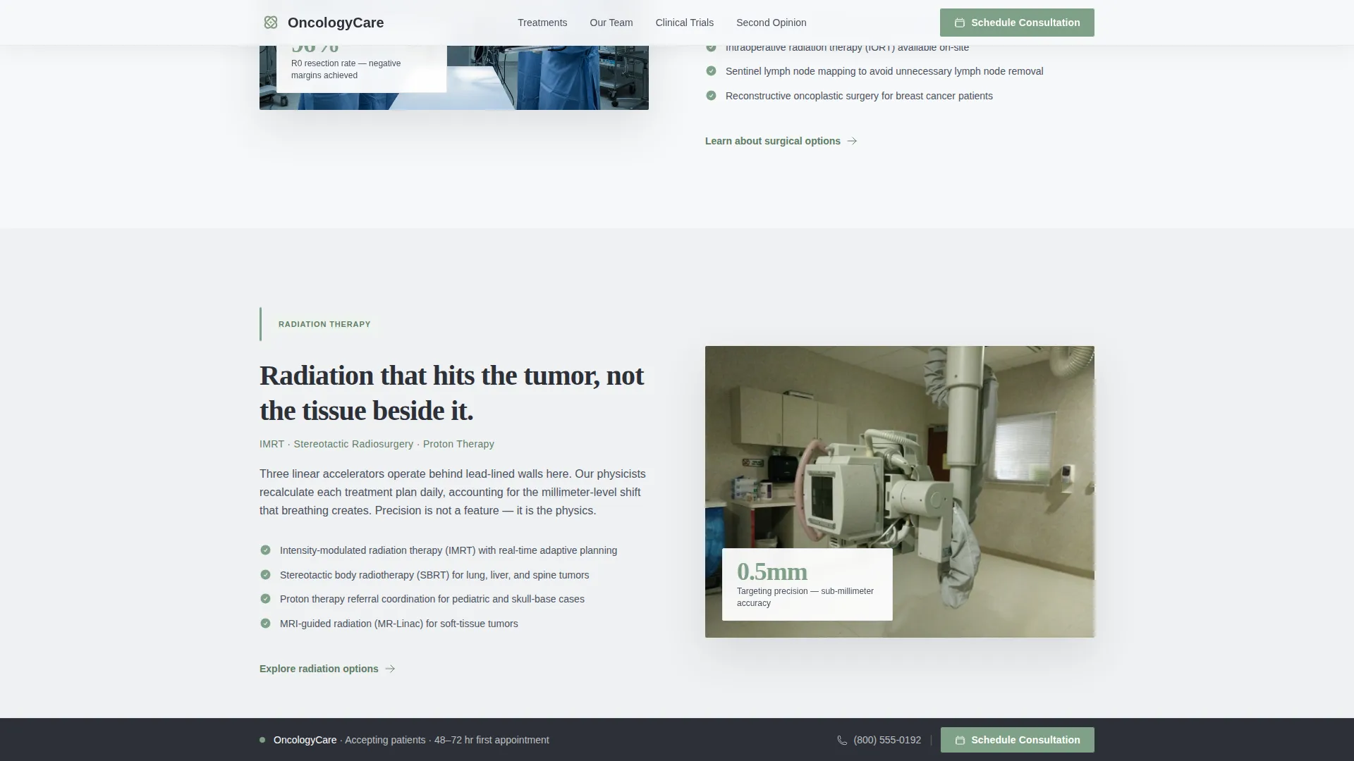
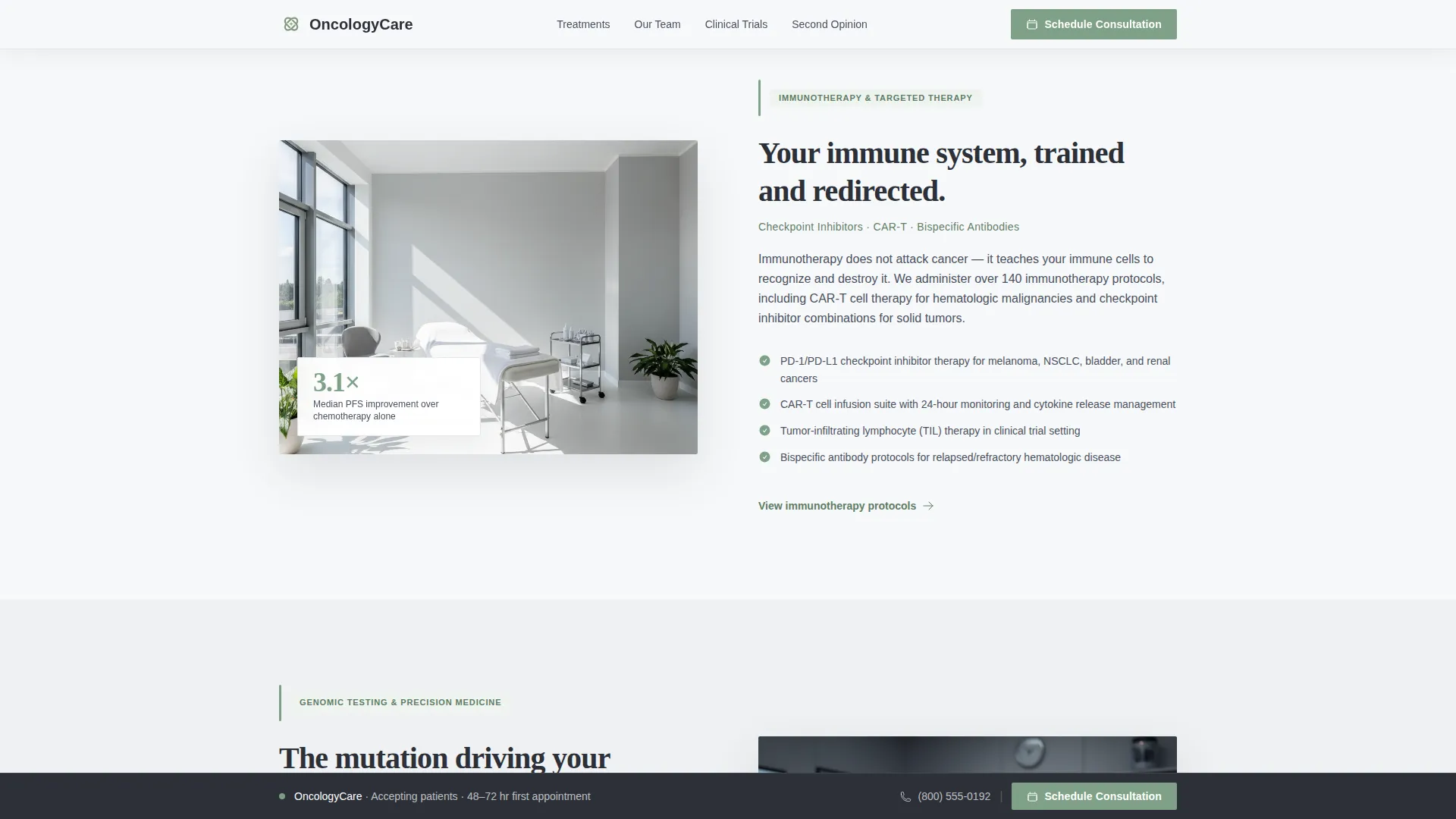
Four treatment modality sections alternate between left-image/right-text and right-image/left-text layouts. Each row covers a distinct discipline: surgical oncology, radiation therapy, immunotherapy, and genomic testing. Every row leads with its own outcome statistic before the descriptive paragraph begins.
Persistent Bottom Call-to-Action Bar
After the second zigzag section, a fixed bottom bar appears and follows the visitor through the remainder of the page. It carries the primary "Schedule a Consultation" button and reinforces accreditation credentials. The bar is designed to stay present without interrupting reading.
Secondary Second-Opinion Pathway
A dedicated midpage prompt surfaces the "Get a Second Opinion" action for the referral segment of the audience. This links to a separate intake flow rather than the primary consultation portal, acknowledging the specific context of patients who have already received a diagnosis elsewhere.
Scroll-Triggered Reveal Animations
Sections enter the viewport through smooth scroll-triggered reveals and staggered animation sequences. Stat counters animate on scroll. Treatment card sections alternate their entrance direction to match the zigzag visual rhythm of the layout.
Page sections overview
| Section | Purpose |
|---|---|
| Hero portrait | Establish oncologist identity and primary call-to-action |
| Stats impact bar | Surface survival rates, trial counts, and staff figures |
| Surgical Oncology row | Introduce surgical discipline with outcome statistic |
| Radiation Therapy row | Present radiation modality with supporting data |
| Immunotherapy row | Cover immunotherapy approach and outcome figure |
| Genomic Testing row | Explain genomic precision with clinical evidence |
| Tumor Board section | Show multidisciplinary team composition and second-opinion path |
| Persistent bottom bar | Repeat consultation call-to-action with accreditation seals |
| Footer | Single-row linear footer with essential links |
Design & branding system
The visual identity follows a Medical Clarity theme using a Cloud Canvas color palette. The goal is to feel like a private consultation room: no bright clinical glare, no dramatic urgency, just organized calm. Typography pairs DM Sans for body text and interface labels with Fraunces serif for headlines and statistics.
- Cirrus white (#F7F8FA) as the dominant background, warm gray (#D4CFC9) on alternating sections for visual rhythm
- Deep graphite (#2C3038) for all body text, grounded and readable at any size
- Muted sage (#7FA187) used exclusively for calls to action, progress indicators, and survivorship statistics
Mobile & speed optimization
This template is built with a mobile-first priority because the target audience includes caregivers researching clinical trials at two in the morning on a phone. The layout responds cleanly across all screen sizes without sacrificing the hierarchy of the desktop experience.
- Portrait hero and zigzag rows reflow to single-column stacked layouts on smaller screens
- Scroll-triggered animations and stat counters are implemented with minimal JavaScript to keep the initial paint fast
- Persistent bottom call-to-action bar adapts to mobile thumb reach, keeping the primary button accessible throughout the scroll
How this template helps you convert
The conversion path in this template is intentional and linear. Every design and content decision is made to move a hesitant, high-stakes visitor toward a single click rather than a form submission or a phone call.
- The hero portrait with physician credentials and the three-statistic bar establish clinical authority within the first viewport, reducing the visitor's first question from "is this place credible?" to "how do I get an appointment?"
- The zigzag treatment sections build a cumulative case for specialty depth. By the time a visitor has scrolled through four modalities, each introduced with its own outcome figure, the center's breadth of expertise has been demonstrated without a single promotional claim.
- The persistent bottom bar and the midpage second-opinion pathway ensure that two distinct audience segments, new patients and referral cases, each have a clear next action waiting for them regardless of where they stop reading.
Other information about this template
This template is designed as a click-through landing page, meaning the conversion event is a click to an external scheduling portal rather than a form submission on the page itself. The brief specifies routing to a HIPAA-compliant scheduling system, though that portal is not part of this template and must be configured separately by the implementing team.
- The footer uses a Pattern 1 linear single-row layout, keeping the bottom of the page clean and uncluttered
- Typography uses DM Sans for all body and interface text alongside Fraunces serif for display headlines and stat numerals
- Animation intensity is set to medium: scroll-triggered reveals, staggered stat counters, and smooth section entrances are included without heavy motion that could feel inappropriate for a medical context
- This template is built for the United States market with English-language copy, date formats in MM/DD/YYYY, and implied USD context
Theme
Medical Clarity
Creative direction
Stats-First Impact
Color system
Cloud Canvas
Style
Zigzag/Alternating
Direction
Click-Through
Page Sections
Portrait-centered Hero with Credentials
Stats-first Impact Bar
Zigzag Alternating Treatment Rows
Persistent Bottom Call-to-action Bar
Secondary Second-opinion Pathway
Scroll-triggered Reveal Animations
Related questions
Who is this landing page template built for?
Does this template include a patient intake form?
Can I use this template if my center focuses on fewer than four treatment modalities?
How does the secondary 'Get a Second Opinion' section work?
Is the oncologist portrait slot intended for stock photography?



