Regional & Specialty Restaurant Professional Website Template
The Pokbowl Artisan Build Your Bowl landing page template is a modular card grid built for fast-casual poke bowl restaurants that want to display their menu beautifully and take pickup orders without friction. Every poke bowl gets its own card. Customers choose, customize, and price their bowls before committing. No login wall. No surprises. Just a clean, artisan experience from first scroll to final order.
by Rocket studio
Quick summary
This template captures the essence of a neighborhood poke bowl counter where every bowl is assembled by hand. It is a single-page, modular card grid designed to display your full poke bowl menu, guide customers through a customization journey, and close pickup orders, all without redirecting to a third-party site or forcing a login.
Who this template is for
This template is built for poke bowl restaurants and fast-casual food brands that want a direct sales landing page. It works equally well for an established street-counter spot and a newer neighborhood concept finding its regular crowd.
- Poke bowl owners who want to display their menu and take pickup orders directly from their website
- Food entrepreneurs creating a fresh digital presence for artisan bowls with a premium feel
- Small restaurant teams who need an easy, polished starting point for online ordering
What problem this template solves
Most poke bowl restaurants send hungry customers to slow, generic ordering platforms. That process adds friction, removes brand life, and makes every bowl feel like a commodity. This template brings the counter experience into the browser.
- Customers can see, customize, and price their poke bowl before they ever tap a pay button
- The design displays your bowls as craft, not inventory, so first-time visitors feel like regulars
- Your whole team gets a site that works as hard during the lunch rush as it does on a quiet Tuesday
What you get with this template
You get a fully structured, ready-to-launch poke bowl landing page built around a modular card grid layout. Each section is intentional. Each element is easy to find and easy to adapt.
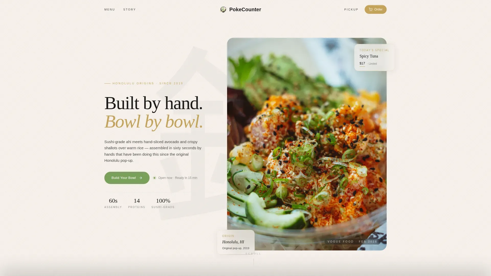
- A hand-illustrated hero section, a scrollable menu grid with customization drawers, a pickup flow, a testimonial scroll, and a minimal footer
- A complete Japanese Zen color system with typography pre-set and ready to match your brand
- A sticky bottom bar that holds the cart and a gold "Place Pickup Order" call to action at all times
Feature list
Every feature in this template was designed to serve poke bowl restaurants specifically. The design choices and interactive components work together to display your menu clearly and convert browsers into buyers.
Modular Bowl Card Grid
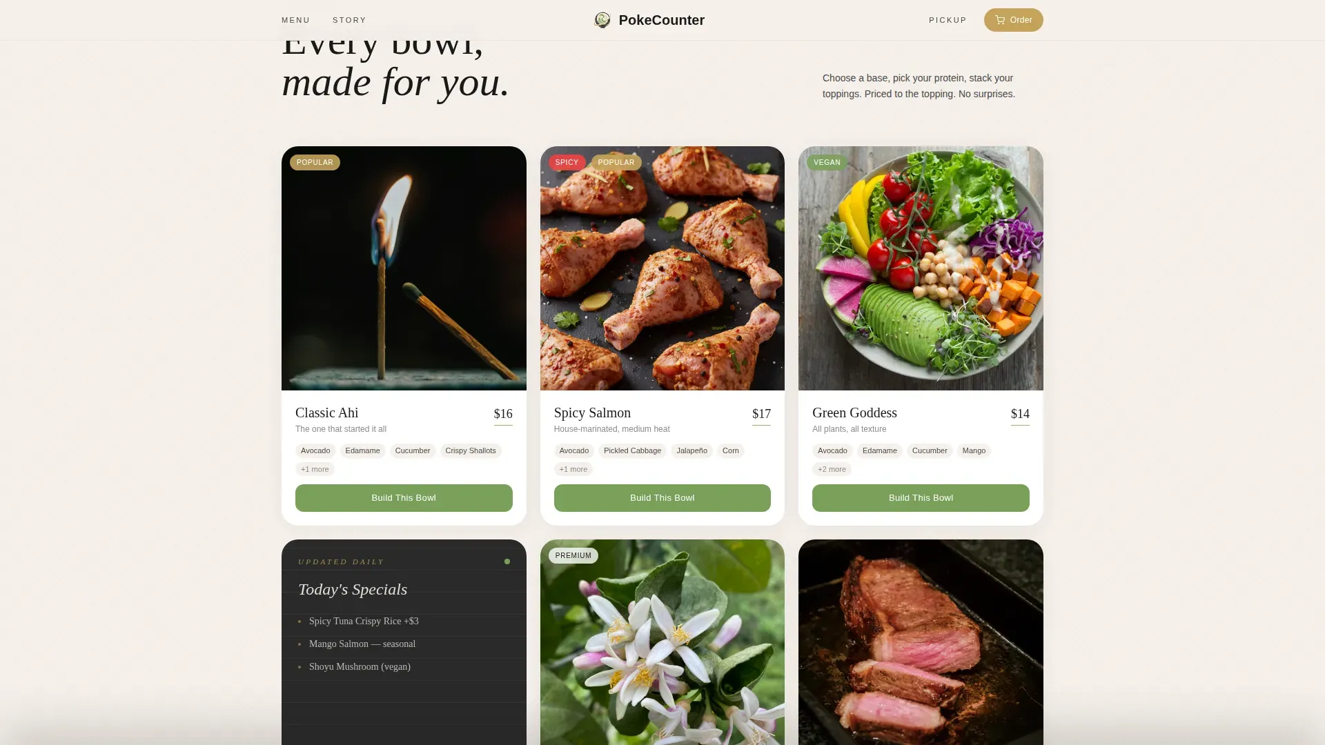
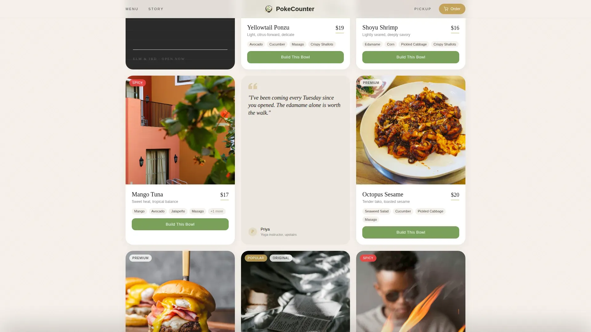
Each poke bowl gets its own card, photographed overhead on a distinct ceramic surface. Cards display the bowl name, key toppings, and a "Build This Bowl" button. The grid is easy to scan and simple to reorder as your menu changes. Using varied bowl card designs helps attract more customers and create a stronger impression of craft.
Interactive Customization Drawer
The "Build This Bowl" button opens a slide-in drawer that guides the customer through base, protein, mix-ins, sauce, and extras. Every choice updates a running total so customers understand exactly what they are paying. This approach presents the customization process as a journey, not a flat list, keeping the artisan experience alive through every selection.
Neighborhood Story Grid Breaks
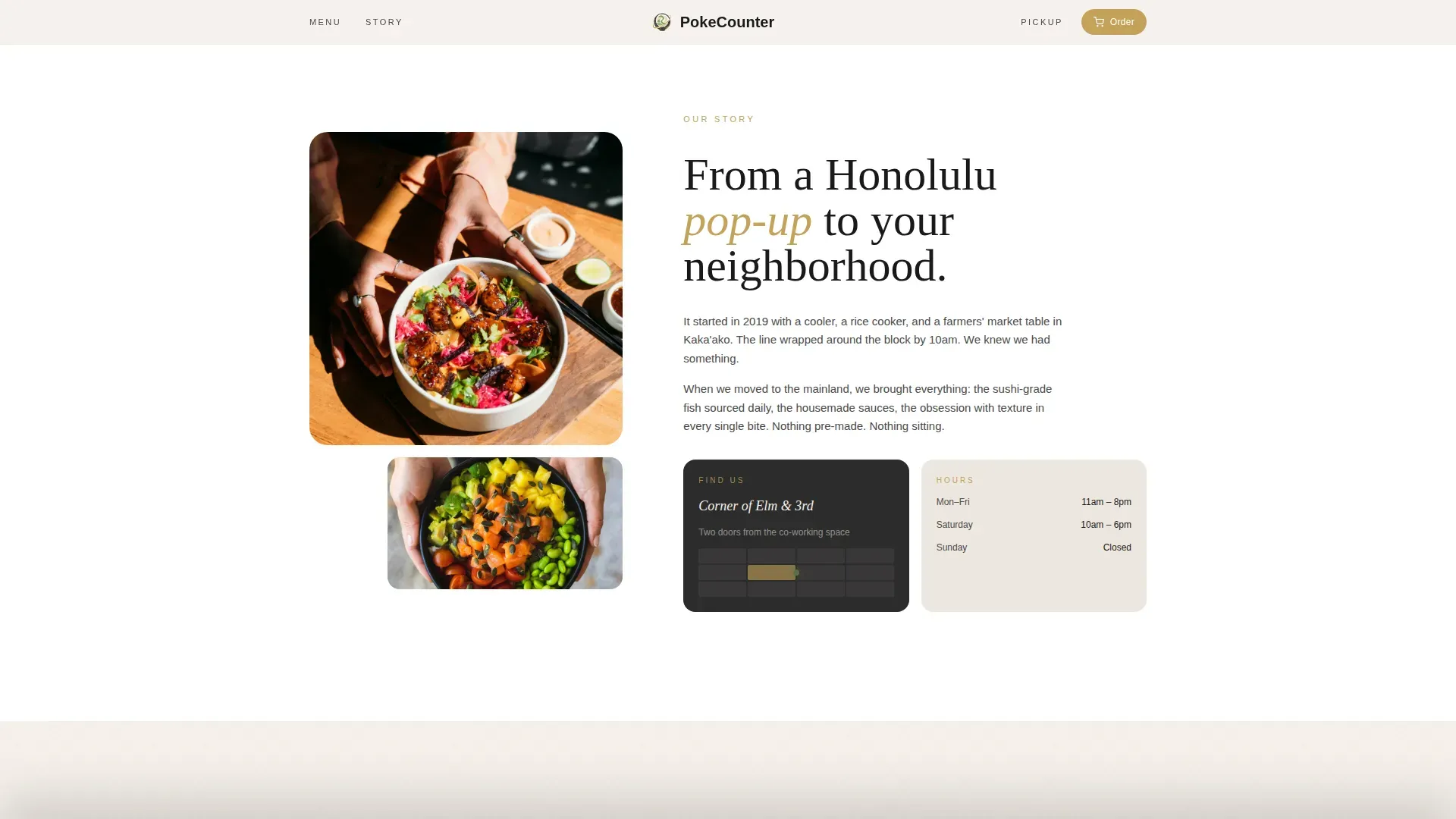
Between menu cards, the grid breaks into story moments: a hand-lettered chalkboard specials card, a small illustrated map showing the cross streets, and a quote card from a regular by first name. These moments add life and neighborhood credibility without slowing the ordering flow.
Sticky Cart Bar
A persistent bottom bar displays the cart count and a tatami gold "Place Pickup Order" button. It is visible at every scroll depth. Customers never need to search for it. The bar makes it easy to move from browsing bowls to placing an order in one tap.
Visual Pickup Flow
A three-card section displays the pickup process: Order, Ready in 15 minutes, Pick Up. The visual clarity removes doubt and sets expectations. First-time visitors who are used to complicated ordering flows find this section reassuring.
Trust and Social Proof Elements
First-name testimonials from regulars are woven directly into the menu grid. These authentic reviews emphasize freshness and the customization experience. The story section can also display local sourcing details and provenance copy, helping build the trust that turns a one-time visitor into a repeat customer.
Page sections overview
| Section | Purpose |
|---|---|
| Hero Illustration | Display a hand-drawn bowl with the brand caption above the fold |
| Neighborhood Story | Convey provenance with an asymmetric layout and illustrated map |
| Menu Card Grid | Show all poke bowls and open the customization drawer per bowl |
| Regulars Testimonial Scroll | Display first-name social proof in a horizontal scroll strip |
| Visual Pickup Flow | Set clear expectations with a three-step order and pickup guide |
| Minimal Footer | Provide contact info, address, hours, and a Google Map link |
Design & branding system
The design follows a Luxe Minimal theme rooted in a Japanese Zen color system. Every color and type choice was made to feel like a handmade raku bowl sitting on a hinoki wood counter: restrained, warm, and confident.
- Four-color palette: ceramic white (#F5F0EB) for backgrounds, shou sugi ban charcoal (#1A1A1A) for all text, tatami gold (#C4A35A) for prices and selections, and wasabi green (#7BA05B) for interactive states and garnish highlights
- Typography pairing: Fraunces serif for display headlines and DM Sans for body and interface text, creating a clear visual hierarchy
- The custom illustration header is a hand-drawn overhead bowl in ink lines with selective watercolor fills, sitting off-center on a linen-textured background
Mobile & speed optimization
The template is built mobile-first because most poke bowl customers place lunch orders on their phones. The layout, card grid, and drawer all respond to smaller screens without losing the design quality.
- The card grid stacks cleanly on mobile, keeping each bowl easy to find and tap without zooming
- The sticky cart bar and "Place Pickup Order" button remain accessible at every screen size, making it easy to complete an order on any device
- Static sections are built as server components and the cart and drawer run as client components, keeping the interactive experience responsive
How this template helps you convert
This template is structured to earn the order before the customer reaches the payment step. Every design and copy decision removes doubt and adds confidence.
- The illustrated hero and a clear call to action set the tone above the fold, so visitors understand immediately that they can build and order a poke bowl right here, without being sent elsewhere
- The customization drawer shows the full price as customers add each item, so there are no surprises at checkout and no reason to abandon the order
- Social proof from named regulars and neighborhood story cards builds trust gradually as the customer scrolls, making the first order feel like a familiar experience
Other information about this template
This template is a strong starting point for any poke bowl brand that wants to bring their counter experience online. It is easy to adapt across different bowl menus, seasonal specials, and local branding needs.
- Research into high-converting food landing pages shows that a prominent call to action like "Customize Your Bowl" placed above the fold significantly improves engagement; this template follows that approach by design
- If you are creating a poke bowl logo to match, keeping the design simple with three or fewer colors and clean fonts produces the most effective result alongside this template's minimal aesthetic; tools like BrandCrowd provide thousands of customizable poke bowl logo options where you can set colors, fonts, and layout to match your palette
- Other bowl menu template resources like Menuzen, Easil, and PosterMyWall offer supplemental tools for creating digital and print marketing materials that can display your poke bowl menu across additional formats
- Visual icons for dietary tags such as Vegan or Gluten-Free can be added to each bowl card within the existing grid design without disrupting the clean layout
- Clear contact information including your address, phone number, operating hours, and a Google Map link should be set in the footer to help customers find you easily; this template's minimal footer is designed to hold all of that information cleanly
- Digital displays and social media content created from your bowl photography can extend the template's visual world beyond the website and bring more life to your brand across channels
- Remember that using varied menu designs and fresh photography helps attract more customers and increase sales; the modular grid makes it easy to refresh individual cards without redesigning the whole page
Theme
Luxe Minimal
Creative direction
Local & Neighborhood
Color system
Japanese Zen
Style
Card Grid (Modular)
Direction
Direct Sales
Page Sections
Modular Bowl Card Grid
Interactive Customization Drawer
Neighborhood Story Grid Breaks
Sticky Pickup Order Bar
Visual Three-step Pickup Flow
Trust and Social Proof Integration
Related questions
Can the whole team edit and update bowl cards without a developer?
Does the customization drawer support per-item pricing?
Is this template ready for mobile ordering?
Can I display dietary tags like Vegan or Gluten-Free on each bowl card?



