Handmade Science Equipment Landing Page Template
Optica is a scroll-reveal landing page template crafted for handmade microscope and science instrument artisans. It blends a warm Citrus Burst color system with a progressive Comparison Journey layout, a visual quiz conversion tool, and a bundle-deal header. Ideal for STEM educators, collectors, and science-focused retailers who need a page that feels as considered as the instruments they sell.
by Rocket studio
Quick summary
Optica is a single-page, scroll-reveal landing page template built for artisan science instrument makers. It guides visitors through a sensory comparison journey, a five-step visual quiz, and a curated bundle offer. The warm Citrus Burst palette and progressive layout work together to build trust and move curious browsers toward a confident purchase.
Who this template is for
Optica is designed for makers and sellers who need their page to communicate craftsmanship, not just catalogue products. It suits anyone whose audience values quality, curiosity, and the tactile experience of a well-made instrument.
- Handmade microscope and science instrument artisans selling direct to consumers
- Independent STEM educators building tactile kit offerings for homeschool or classroom use
- Adult collectors and enthusiast retailers who sell antique-style or brass-finished optical instruments
What problem this template solves
Factory-made product pages use bullet specs and stock photography. They cannot communicate why a hand-ground borosilicate lens resolves detail that a mass-produced acrylic one blurs. Optica solves that specific storytelling gap.
- Visitors arrive unsure which instrument suits them and leave converted after the guided quiz
- The comparison layout builds the case for handcrafted quality without naming a single competitor
- A secondary lead-capture path holds value for browsers who are not yet ready to buy
What you get with this template
Optica delivers a fully structured, single-page layout with distinct scroll-reveal sections, a multi-step quiz component, and a dual conversion path. Every section is purpose-built for a science instrument retail audience.
- A bundle-deal header composition with a calligraphic price banner and layered foreground props
- A progressive Comparison Journey with material close-up reveals across multiple scroll sections
- A five-step visual quiz that ends on a product recommendation with a one-click add-to-cart action
Feature list
Optica's core capabilities are defined by the source brief. Each feature below reflects what is built into the template layout and interaction design.
Scroll-Reveal Progressive Layout
Each section of the page fades or slides into view as the visitor scrolls deeper. This pacing mirrors the experience of slowly focusing a microscope, keeping attention sharp from the header all the way to the final call to action.
Bundle Deal Header Section
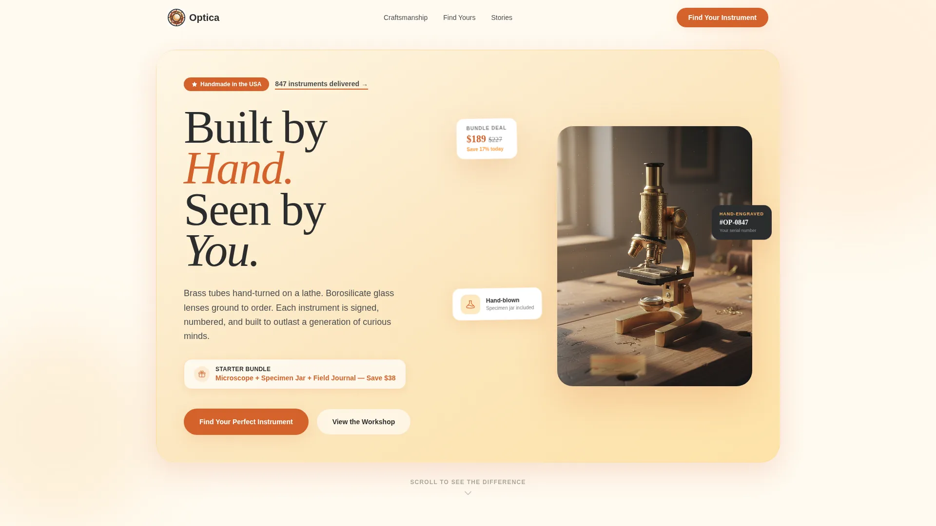
The opening composition arranges three handcrafted instruments on an aged oak surface under a citrus-to-cream gradient glow. A calligraphic price banner floats above the grouping and a prepared dragonfly-wing slide sits slightly out of focus in the foreground, inviting the visitor to look closer.
Comparison Journey Reveal Panels
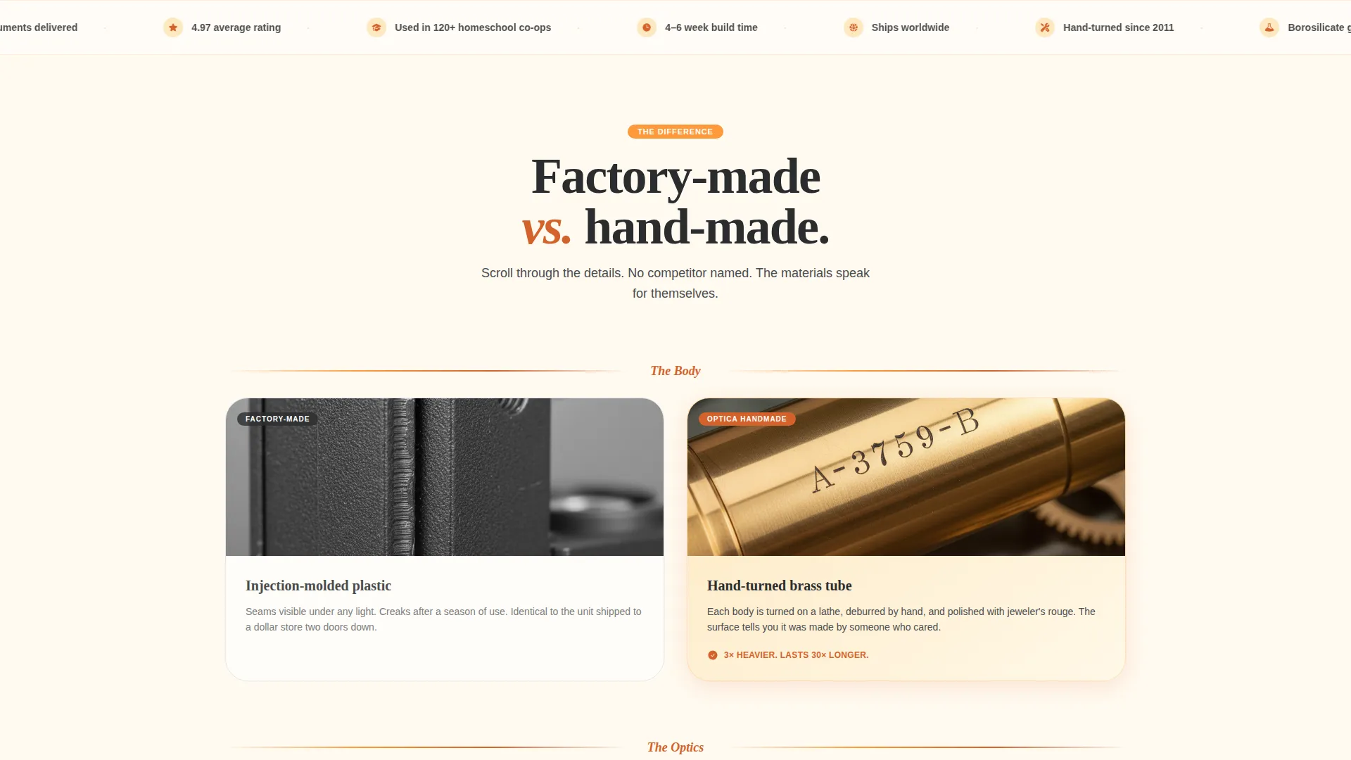
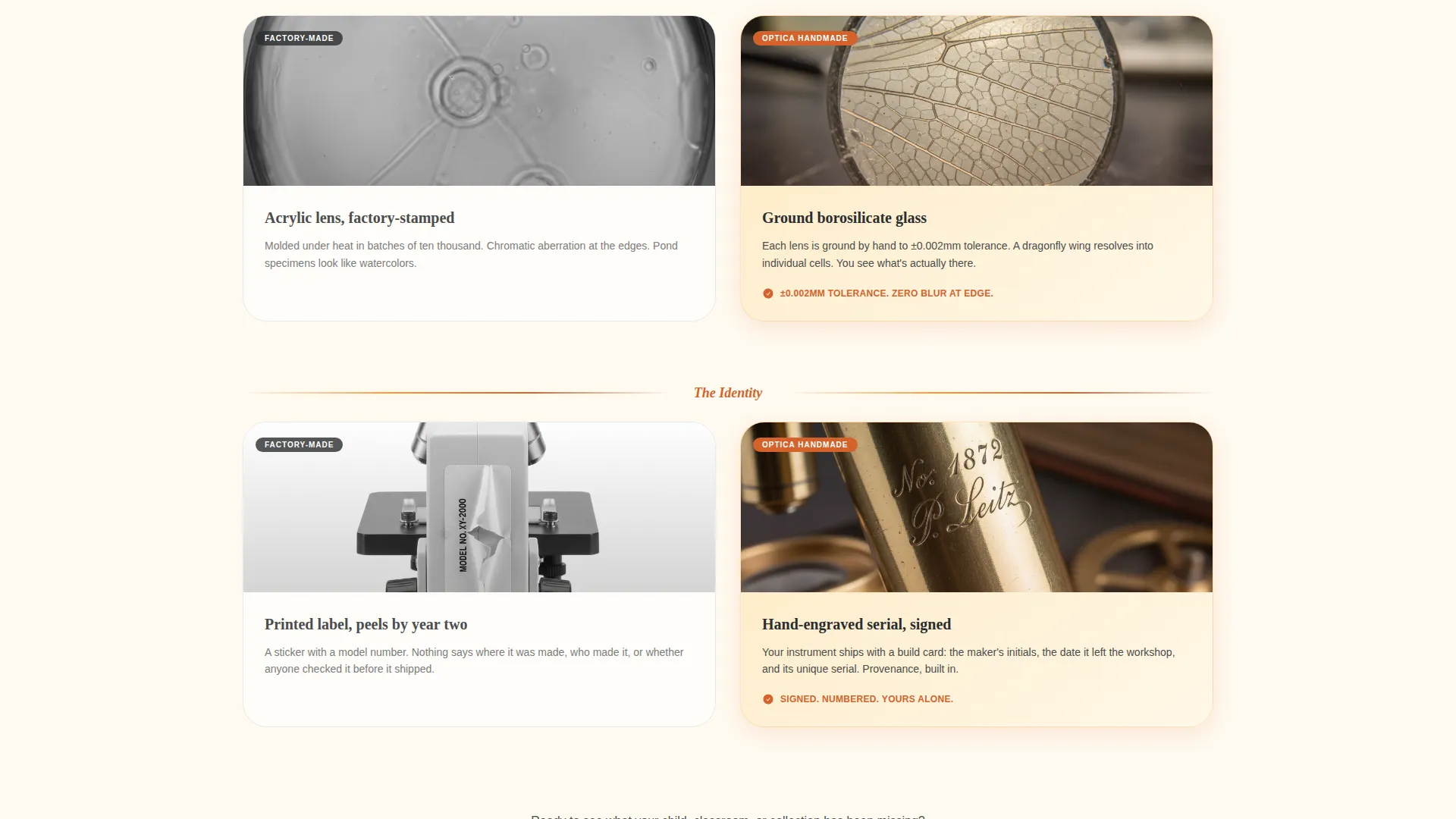
Side-by-side reveal panels place a mass-produced plastic instrument against its handmade brass equivalent. Rather than a simple specification table, each panel zooms into material close-ups: injection-molded seams versus hand-polished joints, printed decals versus hand-engraved serial numbers.
Five-Step Visual Quiz
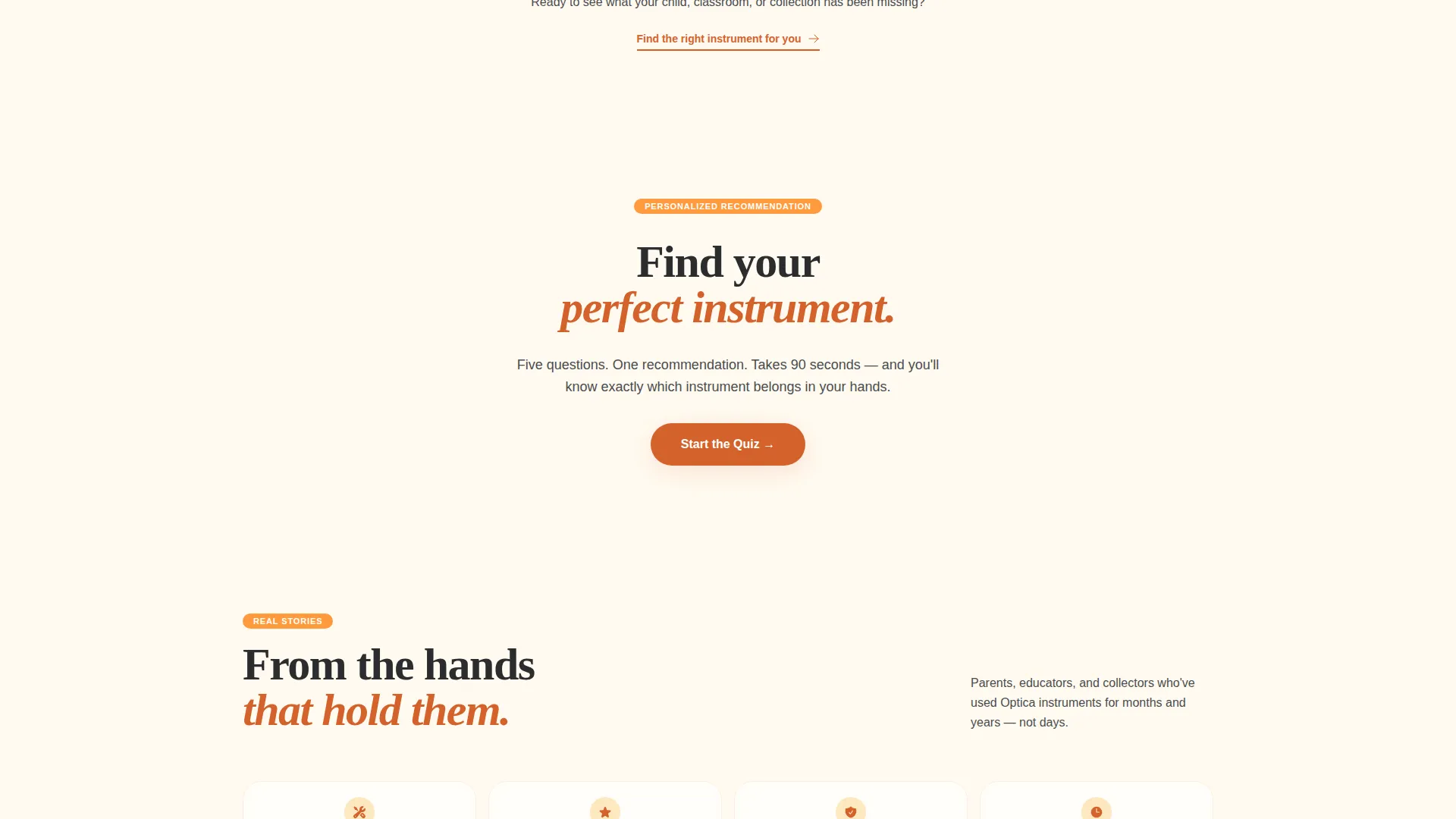
The primary conversion tool walks visitors through five illustrated steps: who the instrument is for, what they plan to observe, magnification comfort level shown as eyepiece views, aesthetic finish preference, and budget range. The result screen recommends a specific instrument or bundle with a single "Add This Kit" button.
Email Lead Capture Path
Visitors who are not ready to purchase are offered a secondary path: "Not sure yet? Download our Beginner's Specimen Guide." This exchange captures an email address before asking for any financial commitment, keeping the relationship warm.
Citrus Burst Color Transitions
Page backgrounds shift from pale sun-bleached linen at the top toward deeper amber and blood orange tones as the visitor scrolls. Hover states and active elements deepen to blood orange, giving interactive moments a satisfying visual response.
Page sections overview
| Section | Purpose |
|---|---|
| Bundle Deal Header | Opens with a three-instrument arrangement, a price banner, and the headline "Built by Hand. Seen by You." |
| Comparison Journey Panels | Progressive reveal of material close-ups contrasting handmade versus mass-produced instruments |
| Quiz Entry Call to Action | Introduces the "Find Your Perfect Instrument" quiz with a clear visual prompt |
| Five-Step Visual Quiz | Guides visitors through five illustrated questions to a personalised instrument recommendation |
| Quiz Result Screen | Displays the recommended instrument or bundle with a one-click "Add This Kit" button |
| Lead Capture Section | Offers a Beginner's Specimen Guide download in exchange for an email address |
Design & branding system
Optica uses a Soft Gradient theme built around the Citrus Burst color system. The palette is warm, shifting, and deliberately analogue in feel, like afternoon light passing through a glass prism onto a wooden workbench.
- Core colors: sun-bleached linen (#FFF8E7), ripe clementine (#FF9A3C), blood orange (#D4622B) for hover and active states, and blackboard slate (#2B2D2E) for all body text
- Backgrounds graduate from pale cream at the top of the page to deeper amber tones as the visitor scrolls further down
- The calligraphic price banner and close-up material photography reinforce the handcrafted, artisan visual identity throughout
Mobile & speed optimization
The scroll-reveal layout and quiz component are structured to work across screen sizes. The progressive reveal pacing adapts to vertical mobile scrolling naturally, and the quiz steps are designed as single-screen illustrated panels.
- Each quiz step is contained in a focused, single-panel view suited to smaller screens
- The comparison panels stack vertically on mobile so material close-ups remain legible without side-by-side compression
- The lead capture form is a minimal single-field input designed to reduce friction on touchscreens
How this template helps you convert
Optica is built around a clear dual conversion strategy. Every section moves the visitor either toward a purchase or toward an email opt-in, with nothing in between left to chance.
- The five-step visual quiz removes buying paralysis by ending on a specific, personalised recommendation with a single action button, reducing the decision from a catalogue browse to one confident choice.
- The secondary lead capture path ensures that visitors who leave without purchasing still exchange value, giving the store owner a direct way to follow up with warm, interested prospects.
Other information about this template
Optica fits neatly into the broader handmade and artisan retail category. It is particularly well-suited to science instrument niches where storytelling and material transparency drive purchasing decisions more than price competition alone.
- The template style follows a Masonry and Pinterest-influenced layout rhythm, allowing close-up photography and instrument detail shots to sit at natural, varied sizes
- The landing page direction is optimized for a single-page marketplace or multi-instrument store front where one curated offer anchors the full experience
- The Comparison Journey creative direction makes this template a strong fit for any artisan product where the manufacturing process itself is a key part of the value proposition
Theme
Soft Gradient
Creative direction
Comparison Journey
Color system
Citrus Burst
Style
Masonry/Pinterest
Direction
Marketplace/Multi
Page Sections
Scroll-reveal Progressive Layout
Bundle Deal Header Composition
Comparison Journey Panels
Five-step Visual Quiz
Dual Conversion Path Design
Citrus Burst Color System
Related questions
Can I adapt the quiz steps for a different type of science instrument?
Does this landing page work as a standalone offer without a full store behind it?
How does the Comparison Journey handle competitor sensitivity?
Can the email capture form connect to a mailing list?
Is this template suitable for a collector audience as well as a buyer audience?



