E-Commerce Consulting Specialist Booking Website Template
Optimize is a zigzag alternating landing page template built for e-commerce management consultants. It opens with a bold manifesto header, flows through diagnostic content sections, and drives leads through a three-step progressive form and a gated PDF download. The layout is clean, authoritative, and designed to turn a visitor's self-recognition into a booked audit.
by Rocket studio
Quick summary
Optimize is a single-page lead generation template for e-commerce consultants who fix what's quietly breaking inside growing online stores. It pairs a manifesto-style header with an alternating zigzag content flow, a logo wall, and a progressive multi-step form. The result is a page that feels like a credible expert sitting across from a founder and telling them exactly what's wrong.
Who this template is for
This template is built for consultants and strategists who work inside the operational layer of e-commerce businesses. It suits professionals who solve real revenue problems, not just marketing surface issues.
- E-commerce management consultants serving direct-to-consumer (DTC) brands in the $1 million to $10 million revenue range
- Operations managers and marketing directors at legacy brands navigating marketplace platforms for the first time
- Independent consultants who need a lead-generation page that positions their expertise before a prospect ever books a call
What problem this template solves
Many consultants struggle to communicate the depth of their work on a single page. A generic service page buries the real value. This template solves the positioning problem head-on.
- Visitors do not immediately understand the difference between a marketing consultant and an operations expert, so they keep scrolling past
- Founders and operations managers often don't know what's broken, so they need a page that diagnoses their situation, not just a list of services
- Traditional landing pages ask for a commitment too early, losing visitors who need more context before they're ready to talk
What you get with this template
You get a fully structured landing page with every major section pre-built and ready to customize with your own content, client logos, proof points, and branding.
- A manifesto header section, a horizontal logo wall, and four to five alternating zigzag teaching sections, each with a framework visual placeholder and a single-stat proof block
- A three-step progressive lead capture form collecting platform context, frustration context, and contact details in sequence
- A secondary lead path featuring a gated PDF download ("The 7 Metrics Killing Your Margins") that captures emails from visitors not yet ready to book an audit
Feature list
This template includes a focused set of built-in components that work together to establish authority and generate qualified leads.
Manifesto-Style Header Block
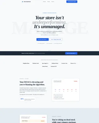
The header opens with an oversized serif quote set on glacial white with zero imagery or gradient. A three-line subhead delivers the consulting thesis in plain language. The emptiness of the layout is intentional and signals confidence.
Zigzag Alternating Section Layout
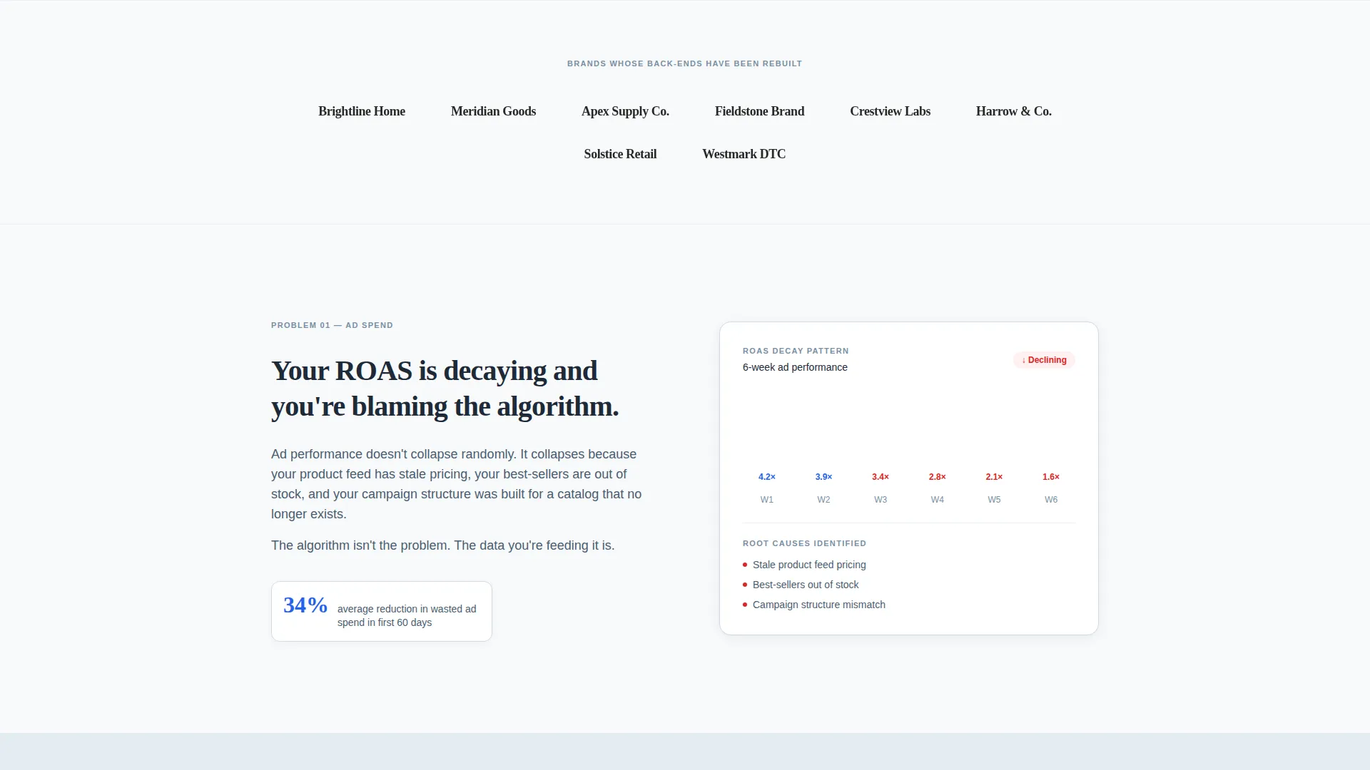
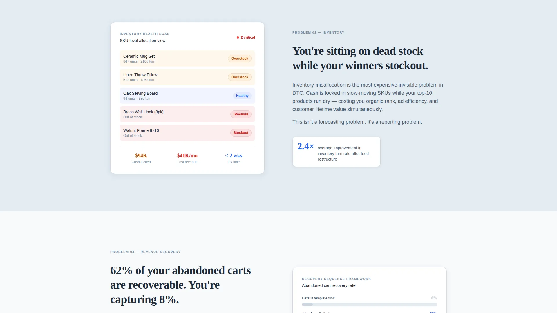
Each content section alternates between left-image/right-text and right-image/left-text orientations. Every section is built around a specific e-commerce failure mode, such as inventory misallocation, channel conflict, or ROAS (return on ad spend) decay. A single-stat proof point closes each section.
Horizontal Logo Wall
A dedicated logo wall section sits immediately after the header. It displays past client brand logos with no testimonial copy attached. The visual weight of recognizable names does the persuasion work silently.
Three-Step Progressive Lead Form
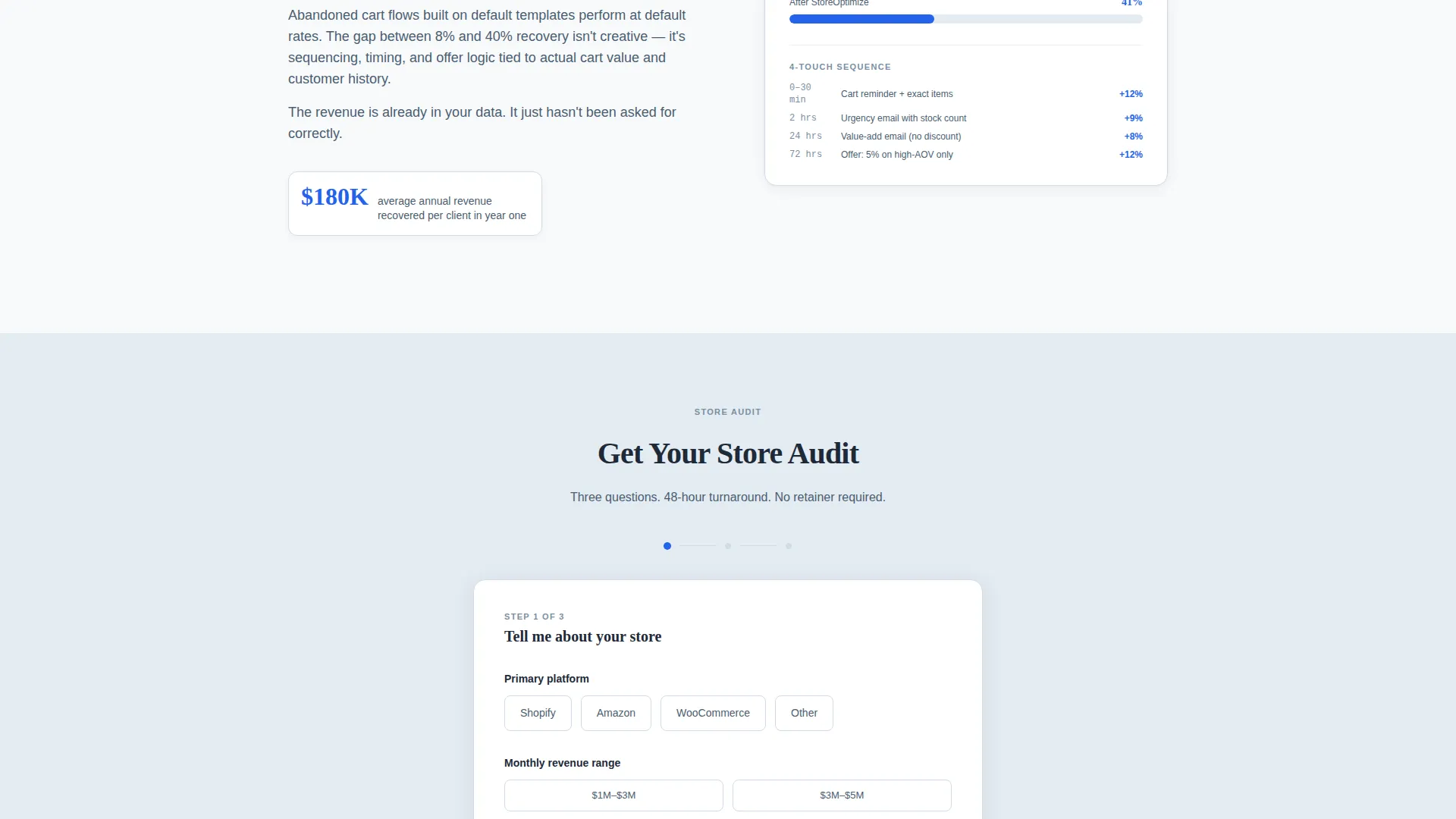
The primary call to action form collects information in three stages. Step one captures monthly revenue range and primary platform. Step two asks for the visitor's biggest current frustration. Step three collects name and email. This sequencing reduces friction and increases completion rates.
Gated PDF Secondary Path
A secondary conversion path offers a free downloadable guide gated behind an email address. This catches visitors who are not ready to book but are ready to learn, keeping them inside the lead funnel.
Sticky Bottom Call-to-Action Bar
After the third content section, a sticky bar anchors to the bottom of the viewport. It repeats the primary "Get Your Store Audit" call to action so the offer stays visible as visitors scroll through the diagnostic content.
Page sections overview
| Section | Purpose |
|---|---|
| Manifesto Header | Opens with a provocative statement that immediately frames the consulting thesis |
| Logo Wall | Displays past client logos to establish silent social proof without testimonials |
| Zigzag Section One | Diagnoses inventory misallocation with a mini-framework visual and a proof stat |
| Zigzag Section Two | Addresses channel conflict between direct-to-consumer and marketplace channels |
| Zigzag Section Three | Covers ROAS decay and ad spend inefficiency with a diagnostic framework |
| Progressive Lead Form | Collects platform context, frustration details, and contact information in three steps |
| PDF Download Gate | Offers a free guide in exchange for an email address as a secondary lead path |
| Sticky call to action Bar | Keeps the primary audit offer visible after the third content section |
Design & branding system
The visual identity follows an Educational Guide theme built on an Arctic White color system. Every design decision prioritizes clarity and authority over decoration.
- Color palette: glacial white (#F8FAFB) as the dominant background, slate charcoal (#1E2A38) for all body text, pale frost (#E3EBF2) for alternating section bands, and a single decisive blue (#2563EB) used exclusively for calls to action and linked proof points
- Typography pairing: oversized serif for the header manifesto line to signal authority, and clean sans-serif for all subheads and body copy to ensure readability
- Layout philosophy: negative space is treated as a design element; no decorative graphics, no gradients, and no visual noise compete with the content
Mobile & speed optimization
The template is structured for a clean single-column experience on smaller screens without sacrificing the authority of the original layout.
- Zigzag alternating sections reflow into a stacked single-column format on mobile so image and text blocks stay readable without horizontal scrolling
- The sticky bottom call-to-action bar is built to remain functional and visible on mobile viewports throughout the scroll
- The three-step progressive form is designed to present one step at a time, reducing cognitive load for users completing the form on a phone
How this template helps you convert
Every layout and copy decision in this template is built to move a skeptical, time-poor founder or operations manager toward a single action: booking a store audit.
- The manifesto header creates immediate self-recognition. A visitor who has ever thought their store is underperforming reads the opening line and feels understood before a single service is named. That emotional hook earns the scroll.
- The zigzag diagnostic sections teach before they sell. Each alternating block describes a specific operational failure with enough specificity that visitors identify their own situation. Recognizing your own problem in someone else's framework is one of the strongest trust signals in professional services.
- The progressive form and secondary PDF path give visitors two exit ramps at different commitment levels. This means the page captures leads from both the ready-to-book founder and the research-mode marketing director who just got handed e-commerce responsibility.
Other information about this template
This template is particularly well-suited for consultants who manage or advise on platform-specific operations, including businesses running on Shopify, Amazon Seller Central, WooCommerce, or similar e-commerce infrastructure.
- The gated PDF section can be swapped for any relevant lead magnet, such as a checklist, a scorecard, or a short video, as long as the email-gate mechanic is preserved
- The logo wall section is designed to hold real client brand logos; placeholder blocks are included in the layout for easy replacement
- The template is categorized under Professional Services, E-Commerce Consulting, and is purpose-built for the E-Commerce Management Consultant niche
Theme
Educational Guide
Creative direction
Logo Wall Authority
Color system
Arctic White
Style
Zigzag/Alternating
Direction
Lead Generation
Page Sections
Manifesto-style Header Block
Zigzag Alternating Section Layout
Horizontal Logo Wall
Three-step Progressive Lead Form
Gated PDF Secondary Path
Sticky Bottom Call-to-action Bar
Related questions
Can I use this template if I specialize in one platform, such as Shopify or Amazon?
Do I need client logos before I launch this page?
What does the three-step progressive form collect?
Can I remove the PDF download section if I do not have a lead magnet ready?
Who is this landing page template designed to attract?



