Fitness Consulting Professional Website Template
Optimize is a single-page landing page template built for fitness operations consultants. It uses a zigzag expert-panel layout to walk gym owners and investors through real operational frameworks, outcome data, and a lead capture form. The design follows a Corporate Precision theme with an Ink and Paper color system, built to convert serious buyers into qualified leads.
by Rocket studio
Quick summary
Optimize is a precision-built landing page template for fitness operations consultants. It pairs a boardroom-ready visual identity with a structured expert-panel layout. Every section introduces a specific operational discipline, builds credibility through real frameworks, and guides high-intent visitors toward two clear conversion points: a downloadable audit resource and a diagnostic call.
Who this template is for
This template is designed for consultants who specialize in turning underperforming fitness businesses into scalable operations. It speaks directly to practitioners who work with serious business clients, not hobbyist gym-goers.
- Fitness operations consultants working with multi-location gym owners and boutique studio founders
- Advisors supporting private equity groups managing newly acquired fitness portfolios
- Independent consultants who need a credibility-first landing page that earns the lead before asking for it
What problem this template solves
Most consultant landing pages lead with credentials and then ask for a meeting. This template flips that structure. It leads with proof, delivers real operational insight in every section, and earns the conversion through demonstrated competence.
- Gym owners and investors arrive skeptical; they need to see operational fluency before they trust a stranger with their business
- Generic service pages fail to address specific pain points like member churn, revenue ceilings, or post-acquisition chaos
- Without a structured content flow, high-intent visitors leave before reaching the call to action
What you get with this template
You get a fully structured single-page layout that functions like a curated operations presentation. Every section has a purpose, and nothing is decorative without being deliberate.
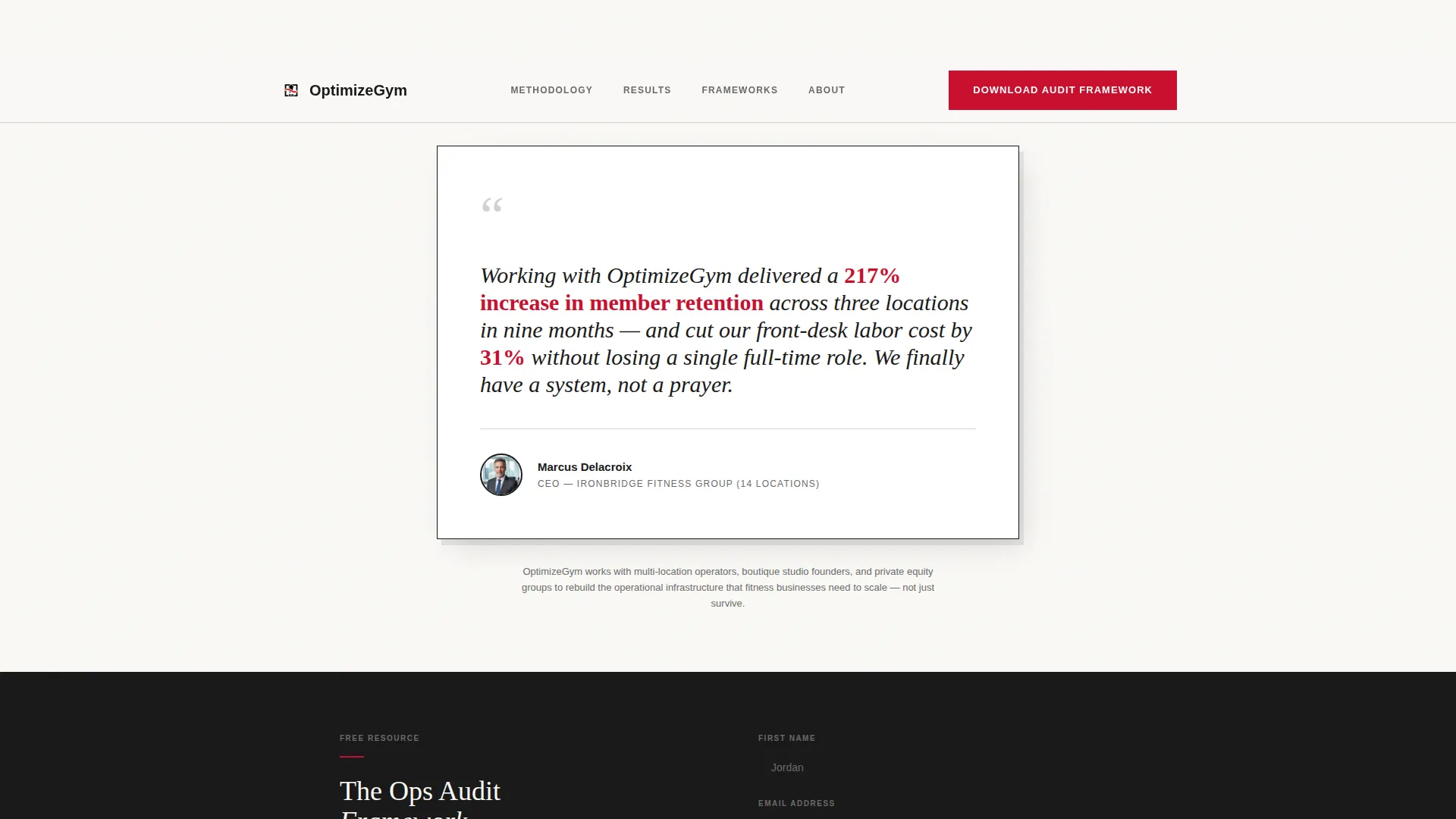
- A testimonial-led header with a named client result, portrait block, and authority positioning line
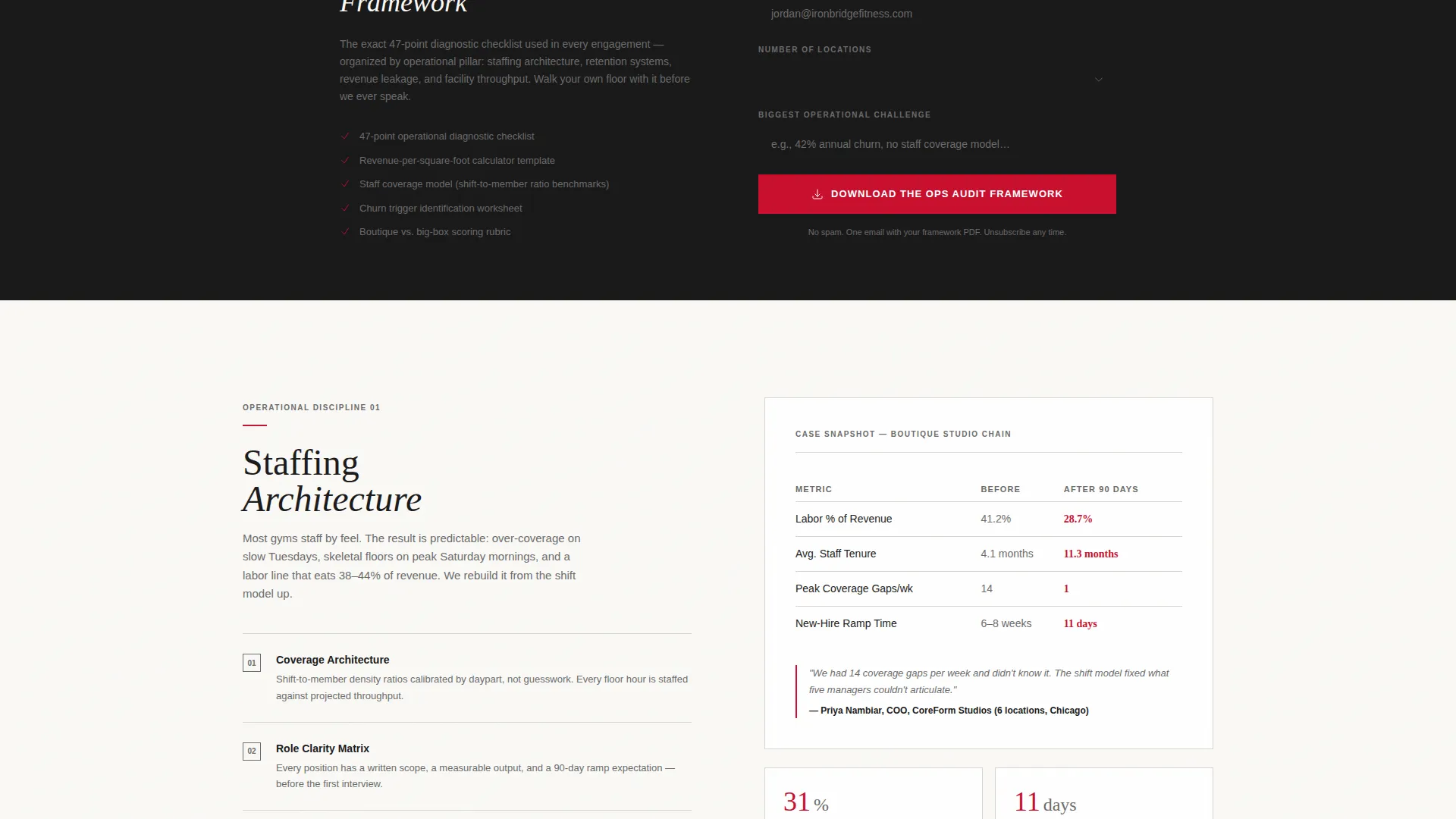
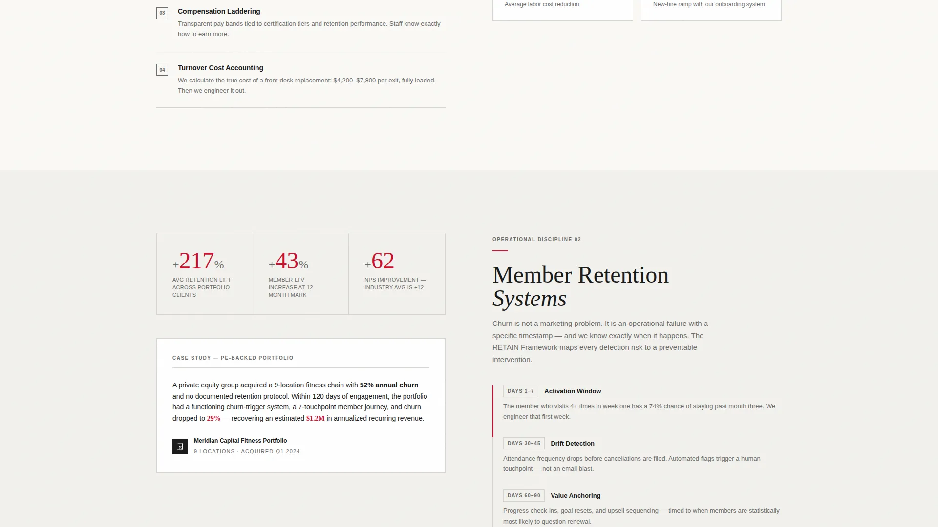
- Alternating zigzag sections pairing methodology breakdowns with client outcome data and before-and-after operational snapshots
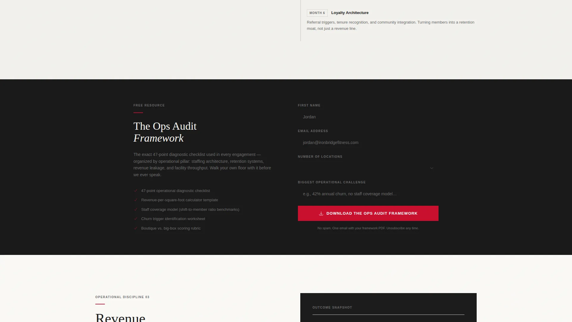
- Two conversion paths: a lead capture form for the downloadable Ops Audit Framework and a booking button for a 30-minute diagnostic call
Feature list
This template is built around a specific set of structural and visual features derived directly from the design brief.
Testimonial Card Header
The page opens with a single oversized quote card centered on the viewport. It displays a specific, numerical client result, a small portrait, the client's name, title, and company. A subtle shadow effect makes the card feel physically placed on the page. A single authority line sits below it to position the consultant immediately.
Zigzag Expert Panel Layout
Each alternating section introduces one operational discipline: staffing architecture, retention systems, revenue optimization, or facility flow. Left-side panels present dense methodology breakdowns with named frameworks. Right-side panels counter with outcome data, mini case studies, and before-and-after snapshots. The scroll experience is designed to escalate credibility with every section.
Dual Conversion Path Structure
The primary call to action is a lead capture form for downloading the Ops Audit Framework. It collects first name, email, number of locations via dropdown, and biggest operational challenge via a short text field. A secondary call to action, a "Book a 30-Minute Diagnostic Call" button, appears in the final section for visitors who scroll to the bottom.
Repeating call to action Placement
The download form is placed first beneath the header testimonial and repeats after every second section. This cadence keeps the primary conversion action visible throughout the scroll without interrupting the content flow.
Corporate Precision Visual System
The Ink and Paper color palette uses deep editorial black for headlines, warm archival white and faint warm gray for alternating backgrounds, notation gray for secondary text and dividers, and a single strategic red reserved exclusively for calls to action and critical data points. The result is a restrained, authoritative design that feels built for a boardroom.
Named Framework Content Blocks
Each methodology section is built to hold real named processes and specific operational language. This structure supports genuine educational content, so the downloadable resource feels like the natural next step rather than a marketing device.
Page sections overview
| Section | Purpose |
|---|---|
| Testimonial Card Header | Opens with a named, numerical client result to establish immediate credibility |
| Authority Positioning Line | Anchors the consultant's expertise beneath the testimonial card |
| Primary call to action Form | Captures lead with download offer directly below the header |
| Staffing Architecture Panel | Presents staffing model methodology on the left side of the zigzag |
| Staffing Outcomes Panel | Counters with client data and before-and-after snapshots on the right |
| Retention Systems Panel | Introduces member retention funnel frameworks with named processes |
| Retention Results Panel | Displays case study outcomes and real retention metrics |
| Revenue Optimization Panel | Covers revenue-per-square-foot frameworks and pricing models |
| Revenue Outcomes Panel | Shows client revenue results and operational before-and-after data |
| Facility Flow Panel | Addresses facility layout and operational flow methodology |
| Facility Results Panel | Closes the discipline with outcome data and a mini case study |
| Repeated call to action Form | Reintroduces download form after every second zigzag pair |
| Diagnostic Call Section | Offers a "Book a 30-Minute Diagnostic Call" button for high-intent visitors |
Design & branding system
The design language is built on the Corporate Precision theme with an Ink and Paper color system. It is intentionally restrained, using contrast and weight instead of color to command authority.
- Color palette: deep editorial black (#1A1A1A) for headlines, warm archival white (#FAF9F6) and faint warm gray (#F2F1ED) for alternating section backgrounds, notation gray (#6B6B6B) for secondary text and dividers, and strategic red (#C8102E) used only for calls to action and critical data points
- Typography and tone: black headlines carry the visual weight of a signed contract; the overall aesthetic references a precisely printed consulting deck left open on a conference table
- Layout rhythm: backgrounds alternate between archival white and warm gray to create section separation without adding visual noise
Mobile & speed optimization
The template is structured for clean rendering across screen sizes. The zigzag layout adapts to a stacked single-column flow on smaller screens, preserving the expert-panel reading order without losing the methodology-to-outcome pairing.
- Alternating sections restack vertically on mobile so left-side methodology panels always appear above their right-side outcome counterparts
- The lead capture form and both call-to-action elements remain fully accessible and prominently placed on all screen sizes
- The restrained color palette and minimal decorative elements support fast visual loading without relying on heavy graphical assets
How this template helps you convert
This template is built as a content-and-resource destination, not a brochure. Every design and structural decision is aimed at reducing skepticism and increasing the perceived value of the downloadable framework.
- The testimonial card opens with a specific numerical result before the consultant ever introduces themselves, which disarms professional skepticism immediately and creates a credibility anchor for everything that follows.
- Each zigzag section delivers a real operational idea, making every scroll feel productive for the reader and making the downloadable Ops Audit Framework feel like the logical, inevitable next step rather than a gated bribe.
- The diagnostic call button appears only at the bottom of the page, which means it is seen almost exclusively by visitors who have read through the full content and self-qualified as high-intent prospects.
Other information about this template
This template is part of the Optimize template collection, designed specifically for professional services consultants operating in the fitness industry. It is built for practitioners who need a landing page that performs like a credentialed sales asset.
- The template style is classified as Zigzag and Alternating, following an Expert Panel creative direction
- The header concept is a Testimonial Card, and the landing page direction is Content and Resource
- The theme is Corporate Precision with an Ink and Paper color system, making it suitable for fitness business consulting, gym turnaround advisory, and fitness portfolio management engagements
- The template supports content from real operational disciplines: staffing architecture, member retention systems, revenue optimization, and facility flow planning
Theme
Corporate Precision
Creative direction
Expert Panel
Color system
Ink & Paper
Style
Zigzag/Alternating
Direction
Content/Resource
Page Sections
Testimonial Card Header
Zigzag Expert Panel Layout
Dual Conversion Path Structure
Repeating Call to Action Placement
Named Framework Content Blocks
Corporate Precision Color System
Related questions
Who is this landing page template designed for?
What are the two conversion paths included in this template?
What information does the lead capture form collect?
Can I adapt this template if I focus on a single fitness niche, like boutique studios?
What makes this template different from a generic consultant page?



