Optometrist Directory Website Template
The Sight optometrist provider directory landing page guides symptom-aware visitors through a warm, multi-step form to matched local eye care providers. Built around a step-by-step visual story with zigzag alternating sections, it connects first-time glasses wearers, parents, and patients overdue for care to in-network optometrists in under two minutes.
by Rocket studio
Quick summary
Sight is a lead-generation landing page for an optometrist provider directory. It opens with a conversational multi-step form, walks visitors through four illustrated guide steps, and closes with a booking call to action. The Forest Trust color system and warm educational tone make the experience feel guided and trustworthy rather than clinical or transactional.
Who this template is for
This template suits directory operators, healthcare marketers, and optometry networks who need to convert anxious, symptom-aware visitors into booked appointments. It is especially well suited for:
- Directory builders matching patients to local optometrists by insurance, location, and specialty
- Healthcare marketers targeting first-time glasses wearers, parents of young children, and patients overdue for retinal exams
- Eye care networks looking to reduce booking friction with a warm, guided intake flow
What problem this template solves
Most eye care directories feel like sterile databases. Visitors land, feel overwhelmed, and leave without booking. This template replaces that cold experience with a guided path that meets people where they are emotionally.
- Removes friction for anxious visitors who are not sure what kind of eye care they need
- Eliminates the common drop-off caused by long, all-at-once intake forms
- Bridges the gap between "I noticed a vision problem" and "my appointment is confirmed"
What you get with this template
You get a fully structured single-page optometrist directory landing page with four content sections, a sticky call to action bar, and a secondary vision quiz path. Every section is prompt-ready and visually connected through a consistent Forest Trust design system.
- Multi-step header form with symptom tile selection, zip code entry, insurance dropdown, and optional callback fields
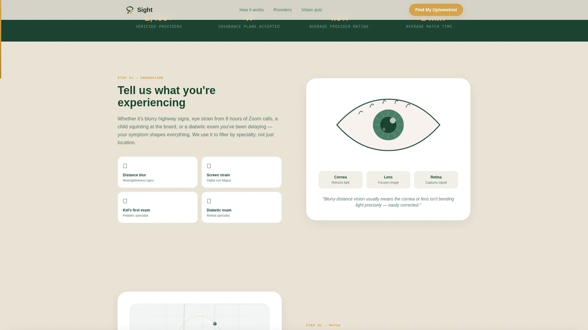
- Four zigzag alternating guide steps covering symptom recap, local matching, provider comparison, and booking
- Secondary micro-assessment path for uncertain visitors, ending in the same provider match result
Feature list
This section covers the core built-in capabilities of the Sight landing page template.
Multi-Step Progressive Form
The header form opens mid-conversation with a single warm question. Visitors select a symptom tile, then answer each follow-up step in sequence. Progressive disclosure keeps the experience light and reduces abandonment compared to showing every field at once.
Symptom Tile Selection with Animation
Four illustrated tiles cover the most common reasons someone searches for an optometrist: blurry distance vision, screen fatigue, a child's first eye exam, and routine checkups. Selecting a tile animates the next question forward, making the intake feel responsive rather than static.
Zigzag Alternating Guide Sections
Four numbered step sections alternate left and right across the page. Each step pairs a clear heading with a supporting illustration or interactive map element, creating a visual story that moves the visitor confidently toward booking.
Amber Progress Bar
A scroll-linked amber progress bar grows along the page edge as the visitor moves through each step. This gives a sense of momentum and shows proximity to the booking step without requiring the visitor to count sections.
Sticky Call to Action Bar
After the visitor scrolls past step two, a persistent bottom bar appears with the primary "Find My Optometrist" call to action in amber. It stays visible without interrupting the reading experience, providing a re-entry point at any scroll position.
Vision Quiz Secondary Path
Uncertain visitors who are not ready to book can take a two-minute vision quiz. The soft-commitment micro-assessment lowers the entry barrier and routes undecided visitors to the same provider match result as the main form.
Page sections overview
| Section | Purpose |
|---|---|
| Header multi-step form | Opens with a symptom question; collects zip, insurance, and contact details progressively |
| Step 1 guide section | Recaps the visitor's symptom selection with an eye anatomy illustration |
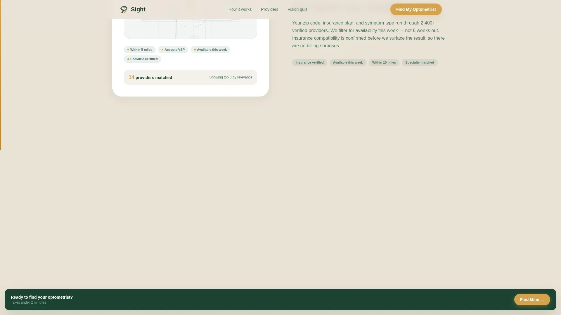
| Step 2 local matching | Explains insurance filtering and distance radius with an animated map visual |
| Step 3 provider comparison | Displays provider cards with differentiators like hours, specialty, and language |
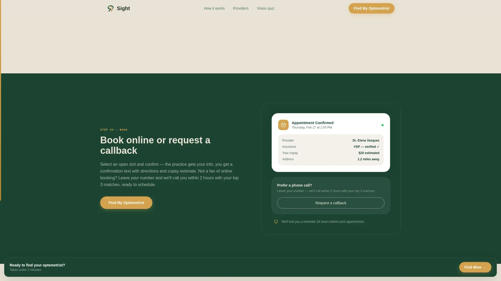
| Step 4 booking action | Closes the loop with booking and callback options plus the vision quiz secondary path |
| Footer linear row | Single-row footer with essential links and social proof elements |
Design & branding system
The visual identity follows an Educational Guide theme built on the Forest Trust color system. The palette feels grounded and calm, like a nature trail with clear wooden signposts at every turn.
- Deep evergreen (#1B4332) and birch cream (#EAE2D6) alternate as section backgrounds across the zigzag layout, while soft fern (#52796F) handles secondary text and iconography
- Amber (#D4A24E) is reserved exclusively for buttons, the progress bar, and call to action elements so the eye always knows where to go next
- Typography uses DM Sans for headings and body text, with JetBrains Mono for accent labels and step numbers, creating a warm yet structured reading hierarchy
Mobile & speed optimization
The template is built mobile-first, reflecting the reality that most visitors arrive late at night on their phones with an eye complaint and a short attention span. Every layout decision prioritizes small-screen readability and fast form interaction.
- Symptom tiles stack vertically on mobile so the selection step remains thumb-friendly without horizontal scrolling
- Static page sections use server components while the interactive form uses client-side rendering, keeping the initial load lean
- The sticky call to action bar is especially effective on mobile, staying reachable without requiring the visitor to scroll back to the top
How this template helps you convert
The entire page is structured as a lead-generation funnel. Every design and content decision serves the goal of moving a hesitant visitor to a confirmed form submission or appointment request.
- The multi-step form removes the intimidation of a long intake sheet by revealing one question at a time, starting with the lowest-commitment choice: selecting a symptom tile.
- The amber progress bar and numbered step sections create a sense of forward movement, making the page feel short even when the visitor is reading through detailed provider comparison content.
- The vision quiz secondary path captures visitors who are interested but not ready to commit, converting hesitation into a soft engagement that still ends with a provider match.
Other information about this template
This template is part of the Health and Medical category, filed under the Optometrist Website subcategory and the Optometrist Provider Directory niche. It is localized for the United States market in English with USD context where relevant.
- Social proof elements are built into the layout and can include provider count statistics, patient testimonials with quoted text, and insurance logo strips
- The intersection match score for this template's category, subcategory, and niche combination is 13, indicating a tight alignment between the directory use case and the lead-generation landing page structure
- Animation complexity is set to medium, covering tile selection transitions, scroll-reveal entry for each zigzag section, the amber progress bar, and the map pin sketch in the local matching step
Theme
Educational Guide
Creative direction
Step-by-Step Guide
Color system
Forest Trust
Style
Zigzag/Alternating
Direction
Lead Generation
Page Sections
Multi-step Progressive Form
Symptom Tile Selection with Animation
Zigzag Alternating Guide Sections
Amber Scroll Progress Bar
Sticky Call to Action Bar
Vision Quiz Secondary Path
Related questions
Who is this landing page template built for?
Can the form collect insurance information from visitors?
Does the template include a path for visitors who are not sure what they need?
How many sections does this landing page include?
What visual style does this template use?



