Dark Immersive Analyst Landing Page Template
Oracle is a dark, immersive analyst landing page template built for industry experts who publish contrarian, high-signal analysis. It features a cinematic full-bleed header, a masonry gallery of past analyses with redacted subscriber-only cards, and a floating "Request Access" waitlist bar. The design uses a void-black and iridescent color system to project quiet authority and intellectual edge.
by Rocket studio
Quick summary
Oracle is a single-page waitlist landing page for industry analysts and thought leaders. It pairs a cinematic full-bleed header with a masonry grid of analysis cards, some open and some intentionally redacted. The floating "Request Access" bar drives signups while the page's dark, iridescent aesthetic signals precision and exclusivity to a discerning audience.
Who this template is for
This template is built for analysts and experts who publish sharp, independent research and want to build a waiting list before going public. It suits professionals whose audience expects signal, not noise.
- Independent industry analysts publishing contrarian or thesis-driven research
- Thought leaders and strategic advisors targeting venture capitalists, C-suite executives, or policy professionals
- Experts building anticipation and waitlist momentum before launching a paid or gated publication
What problem this template solves
Most personal pages for analysts look like digital business cards. They list credentials but never create urgency. Oracle solves the credibility-and-conversion gap for high-stakes intellectual work.
- Generic portfolio pages fail to communicate the depth or exclusivity of serious research
- Visitors leave without acting because there is no structured reason to sign up
- Redacted content and a live waitlist counter give visitors a concrete reason to request access now
What you get with this template
Oracle delivers a complete, ready-to-customize landing page layout designed around waitlist conversion and intellectual authority. Every visual decision reinforces the sense that something important is already happening.
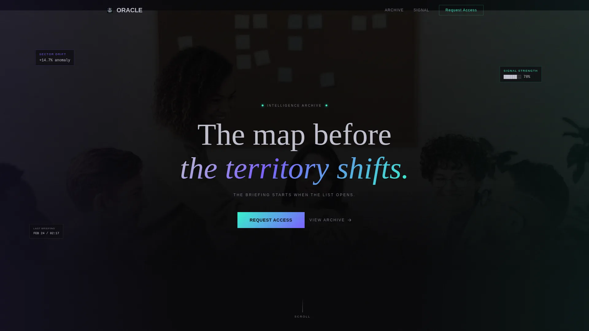
- A full-bleed cinematic header with a silhouetted analyst figure and a single atmospheric headline
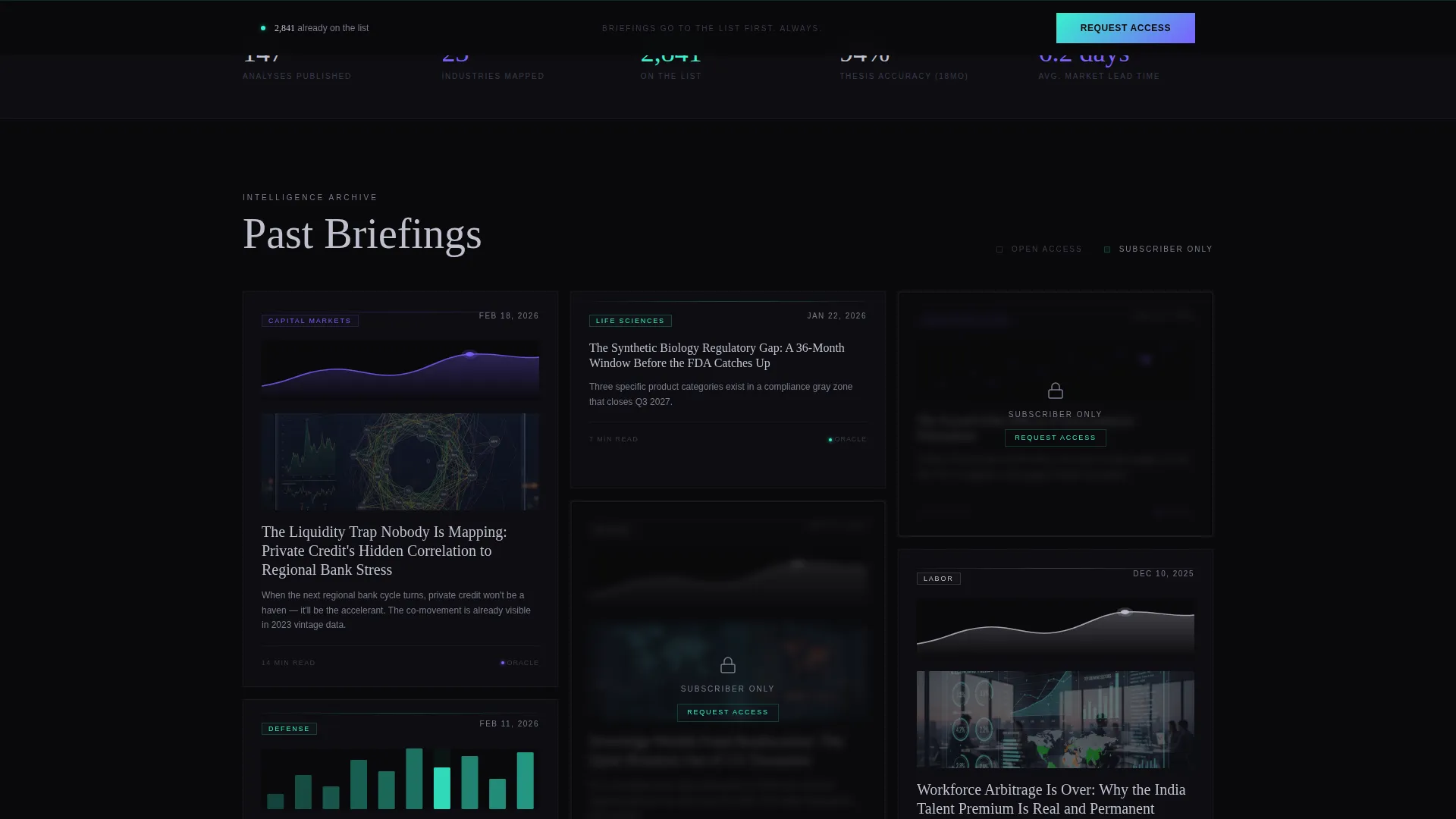
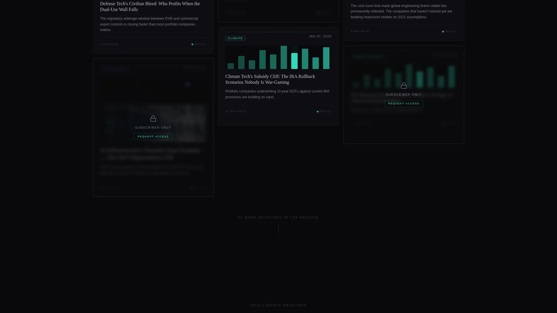
- A masonry grid displaying analysis cards with provocative titles, chart fragments, publication dates, and frosted-glass redacted cards for subscriber-only pieces
- A floating "Request Access" bar pinned to the viewport with a glowing iridescent call-to-action button and a minimal access-request form
Feature list
This section walks through the core built-in components and design decisions that define the Oracle landing page.
Cinematic Full-Bleed Header
The header fills the entire viewport with a photo of the analyst shot from behind, silhouetted against a wall of overlapping screens and data visualizations. Screen light casts spectral color across the edges of the figure and the room. A single headline fades in after a beat: "The briefing starts when the list opens."
Masonry Gallery Grid
The main body uses an asymmetric masonry layout, similar to a curated gallery walk. Each card holds a thesis title, a chart fragment or data visualization, and a publication date. Card sizes vary deliberately, creating the feel of an intelligence archive where some findings carry more weight than others.
Redacted Subscriber-Only Cards
Some cards in the grid are intentionally blurred with a frosted-glass overlay and a lock icon. A label reads "Subscriber Only." This redaction mechanic creates visible scarcity. Visitors can see that restricted content exists, which raises the perceived value of getting on the list.
Floating Waitlist Bar
A "Request Access" bar is pinned to the bottom of the viewport at all times. As the visitor scrolls deeper into the gallery, the bar's iridescent teal glow intensifies. This persistent visual presence keeps the conversion action in sight without interrupting the gallery experience.
Minimal Access-Request Form
Clicking "Request Access" opens a focused form with three fields: a work email input, a dropdown asking "What do you analyze?" with options for markets, policy, technology, culture, and other, and an optional open field asking "What question keeps you up at night?" The form is intentionally short to reduce friction.
Live Waitlist Counter
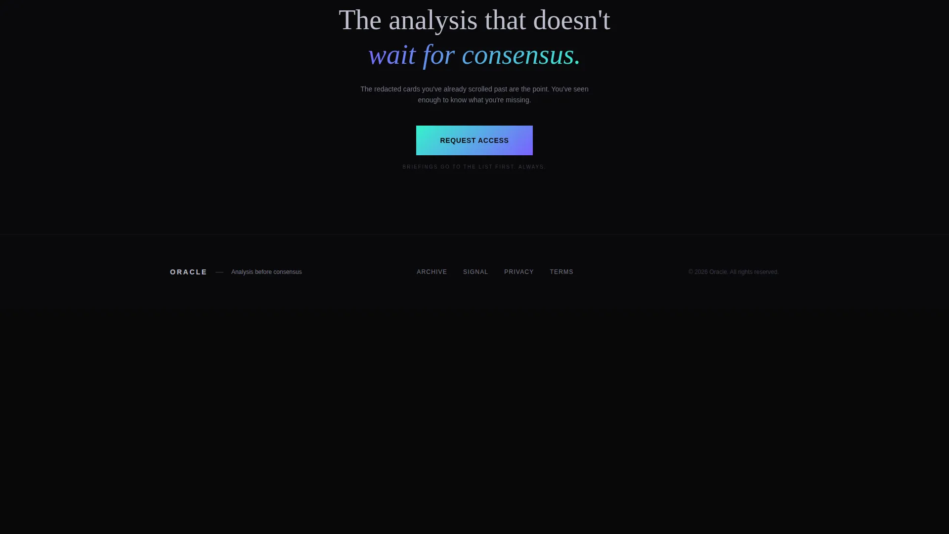
A live counter beneath the form shows how many people are already on the list. A single line of supporting copy reads: "Briefings go to the list first. Always." No launch date is shown, keeping scarcity structural rather than deadline-driven.
Page sections overview
| Section | Purpose |
|---|---|
| Full-Bleed Header | Establishes cinematic presence and reveals the atmospheric headline |
| Masonry Gallery | Showcases past analyses through varied, gallery-style cards |
| Redacted Content Cards | Creates visible scarcity using frosted-glass overlays and lock icons |
| Floating Access Bar | Keeps the waitlist call-to-action anchored throughout scrolling |
| Access Request Form | Captures work email and analyst context with minimal friction |
| Live Waitlist Counter | Reinforces exclusivity with a real-time signup count |
Design & branding system
Oracle uses a Dark Immersive theme built on the AI Iridescent color system. The palette is intentionally restrained: darkness is the default, and color appears only when the visitor interacts with the page.
- Core palette: void black (#09090B) for backgrounds, liquid chrome (#C0C0CF) for body text, spectral violet (#7B61FF) for gradient accents on cards, and holographic teal (#36F1CD) reserved for hover states, interactive accents, and the waitlist button
- Iridescent gradients appear only on cards being hovered, links being activated, and the floating "Request Access" button, making each interaction feel like switching something on
- The overall visual impression is described in the brief as staring into a black opal: mostly darkness, but impossible colors bloom briefly when light catches the surface
Mobile & speed optimization
The template is structured for a clean mobile experience. The masonry grid and floating bar are designed to adapt to smaller viewports without losing the atmosphere that makes the page work.
- The masonry grid reflows into a single-column layout on mobile, maintaining card variety and redacted states
- The floating "Request Access" bar remains anchored to the bottom of mobile viewports, keeping the primary action reachable at all times
- The access-request form uses minimal input fields by design, keeping interaction fast and low-effort on touch devices
How this template helps you convert
Oracle is built around a specific conversion logic: let redacted content do the persuasion, then make signing up feel immediate and low-risk.
- The masonry grid with blurred, locked cards shows visitors exactly what they cannot access yet, making the value of the waitlist tangible before any text has to explain it
- The floating "Request Access" bar grows more visually intense as the visitor scrolls, reinforcing urgency without using countdown timers or fake deadlines
- The minimal three-field form removes every obstacle between curiosity and conversion, and the live counter adds social proof at the moment the visitor is deciding
Other information about this template
Oracle is categorized under Personal and Resume templates, with a specific focus on the Speaker and Thought Leader subcategory and the Industry Expert and Analyst niche. It is a strong fit for anyone building a high-signal personal brand in research, strategy, or intelligence publishing.
- The template style is Masonry and Pinterest layout, which gives the gallery its asymmetric, exhibition-like rhythm
- The header concept is Full-Bleed Photo, and the landing page direction is Waitlist and Coming Soon, making it purpose-built for pre-launch positioning
- The creative direction is Gallery Walk, meaning the visitor experience is modeled on browsing a curated intelligence archive rather than reading a standard bio page
- This template works well for analysts building anticipation around a paid newsletter, gated research publication, or exclusive advisory practice
Theme
Dark Immersive
Creative direction
Gallery Walk
Color system
AI Iridescent
Style
Masonry/Pinterest
Direction
Waitlist/Coming Soon
Page Sections
Cinematic Full-bleed Header
Asymmetric Masonry Gallery
Redacted Subscriber-only Cards
Persistent Floating Access Bar
Minimal Three-field Signup Form
Live Waitlist Counter with Social Proof
Related questions
Can I customize the analysis cards in the masonry grid?
How does the waitlist form collect signups?
Is a launch date shown anywhere on the page?
Who is this landing page template designed for?
Can I control which cards are locked versus visible?



