Oral Surgeon Reviews Website Template
Oral is a sidebar companion landing page built for oral surgeon provider directories. A multi-step search form guides anxious patients from procedure selection to matched surgeon results in three quick steps. Patient review cards, floating stat callouts, and board-verification trust signals work together to calm uncertainty and move visitors toward clicking through to a surgeon profile.
by Rocket studio
Quick summary
Oral is a single-page, sidebar companion template designed for oral surgeon provider directories. It opens with a procedure-first multi-step form that narrows to matched local surgeons within three steps. A staggered testimonial mosaic, floating social proof stats, and a clear board-verification signal give patients the confidence to move from search to surgeon profile without hesitation.
Who this template is for
This template is built for healthcare directory operators, oral surgery practice networks, and patient-to-provider matching platforms. It targets visitors who arrive with a referral slip, acute dental pain, or a fresh diagnosis and need a trustworthy next step fast.
- Directory operators running an oral surgeon provider directory in the United States
- Practice groups wanting a calm, conversion-focused entry point for new patients
- Platforms serving adults researching wisdom teeth removal, dental implants, jaw surgery, or biopsy procedures
What problem this template solves
Patients searching for an oral surgeon at night face a wall of generic results, unfamiliar names, and no clear path to booking. Anxiety builds when nothing feels verified. This template removes that friction by leading with procedure selection and delivering matched, verified surgeons before doubt has time to settle.
- Unstructured search results leave patients unsure which surgeon is qualified or nearby
- Lack of visible social proof delays the decision to book an appointment
- No guided path means visitors with vague symptoms exit without finding the right procedure
What you get with this template
The template delivers a fully structured, single-page layout with a high-interactivity multi-step form as the hero, a staggered review mosaic as the primary trust engine, and a clear click-through architecture that funnels every interaction toward individual surgeon profiles.
- A three-step search form covering procedure selection, zip code entry, and matched surgeon results
- A testimonial mosaic with star ratings, procedure pill tags, and floating numerical stat callouts
- A "How It Works" section, a Surgeon Spotlight row, a final call-to-action band, and a single-row footer
Feature list
This section covers the core built-in components that define how the template functions and feels.
Three-Step Procedure Matching Form
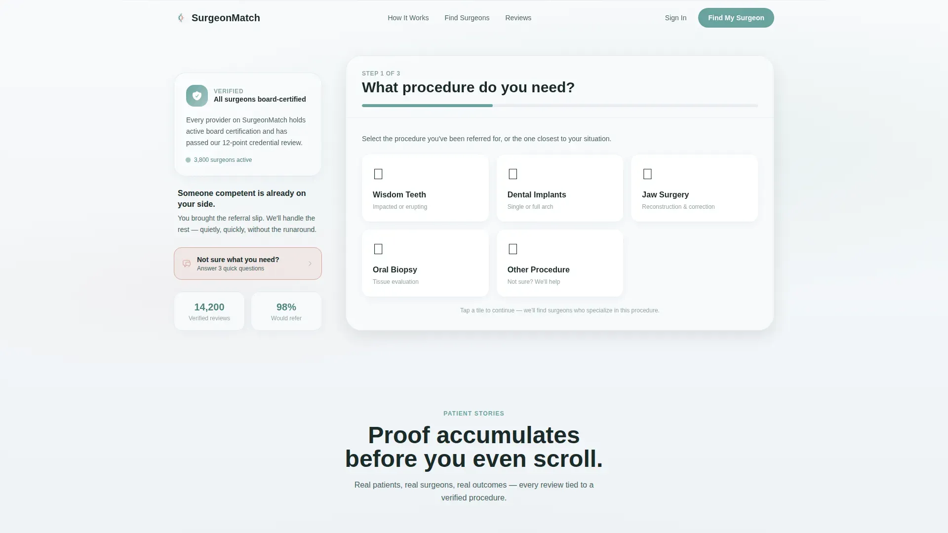
The hero form occupies the right two-thirds of the viewport. Step one presents large illustrated tiles for wisdom teeth, implants, jaw surgery, biopsy, and other. Step two captures zip code with an auto-detecting location prompt. Step three reveals matched surgeon thumbnails as results begin loading, making progress feel immediate.
Board-Verified Sidebar Trust Signal
The left sidebar holds a single line of reassuring copy alongside a soft-gradient shield icon reading "All surgeons board-verified." The sidebar collapses into a top banner on mobile so the trust signal stays visible without disrupting the form flow.
Staggered Testimonial Mosaic
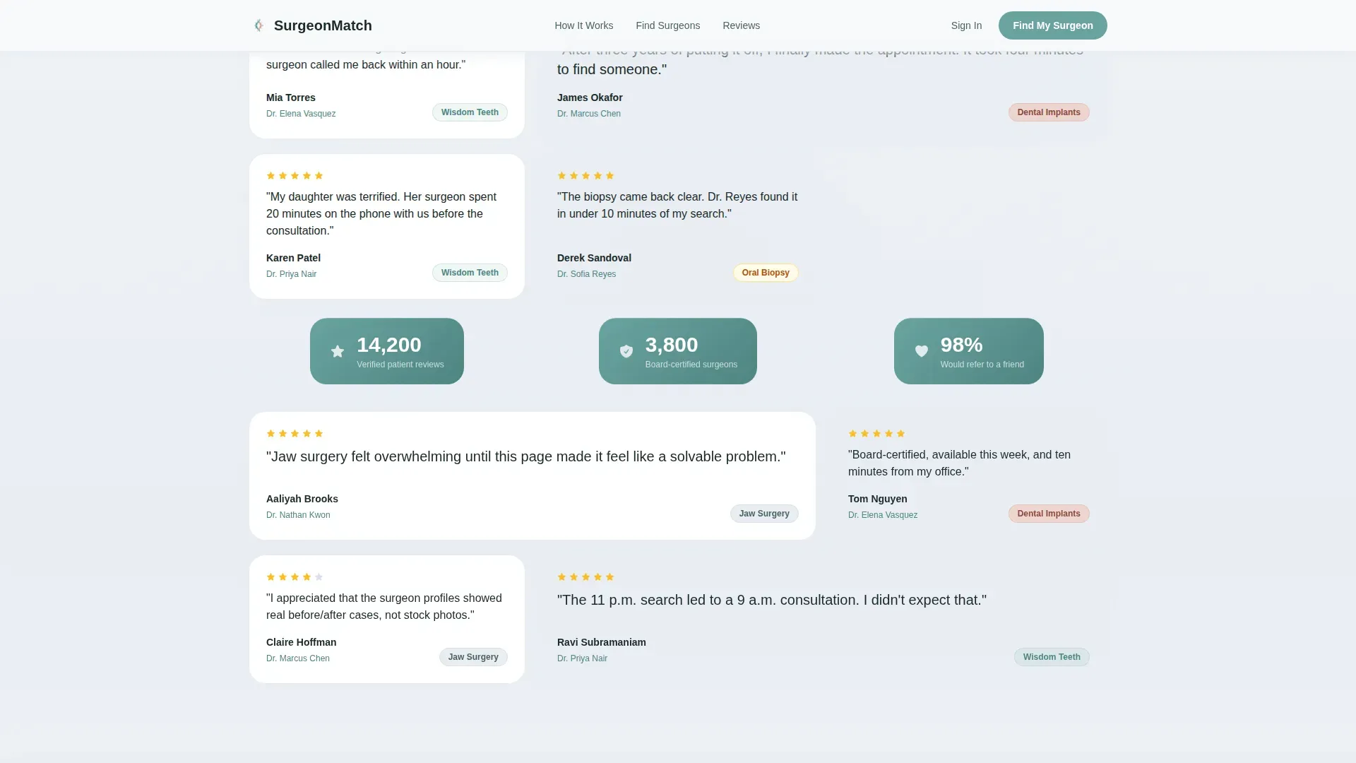
Patient review cards appear in a staggered grid below the form. Each card carries a one-sentence quote, a procedure pill tag, a star rating, and the surgeon's name as a forward link. Every third card is slightly larger to pull the eye diagonally across the section.
Floating Stat Callouts
Between mosaic clusters, teal-colored callout blocks surface key numbers: 14,200 verified reviews, 3,800 surgeons, and a 98% referral rate. These callouts let numerical proof and emotional proof breathe together rather than compete.
Symptom Questionnaire Sidebar Path
Visitors who are unsure of their procedure can tap "Not sure what you need?" to open a guided symptom questionnaire inside the sidebar. This secondary path keeps undecided visitors engaged instead of sending them away.
Sticky Mobile Call to Action
On mobile, a "Find My Surgeon" button remains anchored at the bottom of the screen throughout the scroll. The primary call to action is never out of reach, regardless of which section the visitor is currently viewing.
Page sections overview
| Section | Purpose |
|---|---|
| Hero Multi-Step Form | Matches patients to surgeons via a three-step procedure and zip code search |
| Board-Verified Sidebar | Anchors trust with a shield icon and board-verification copy |
| Testimonial Mosaic | Builds confidence through staggered patient review cards and procedure tags |
| Floating Stat Callouts | Reinforces social proof with numerical highlights between mosaic clusters |
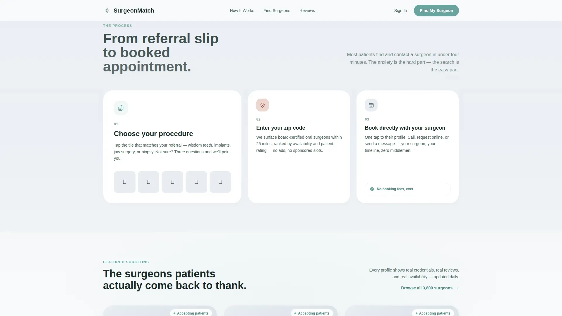
| How It Works | Explains the search, match, and book sequence in an asymmetric three-step layout |
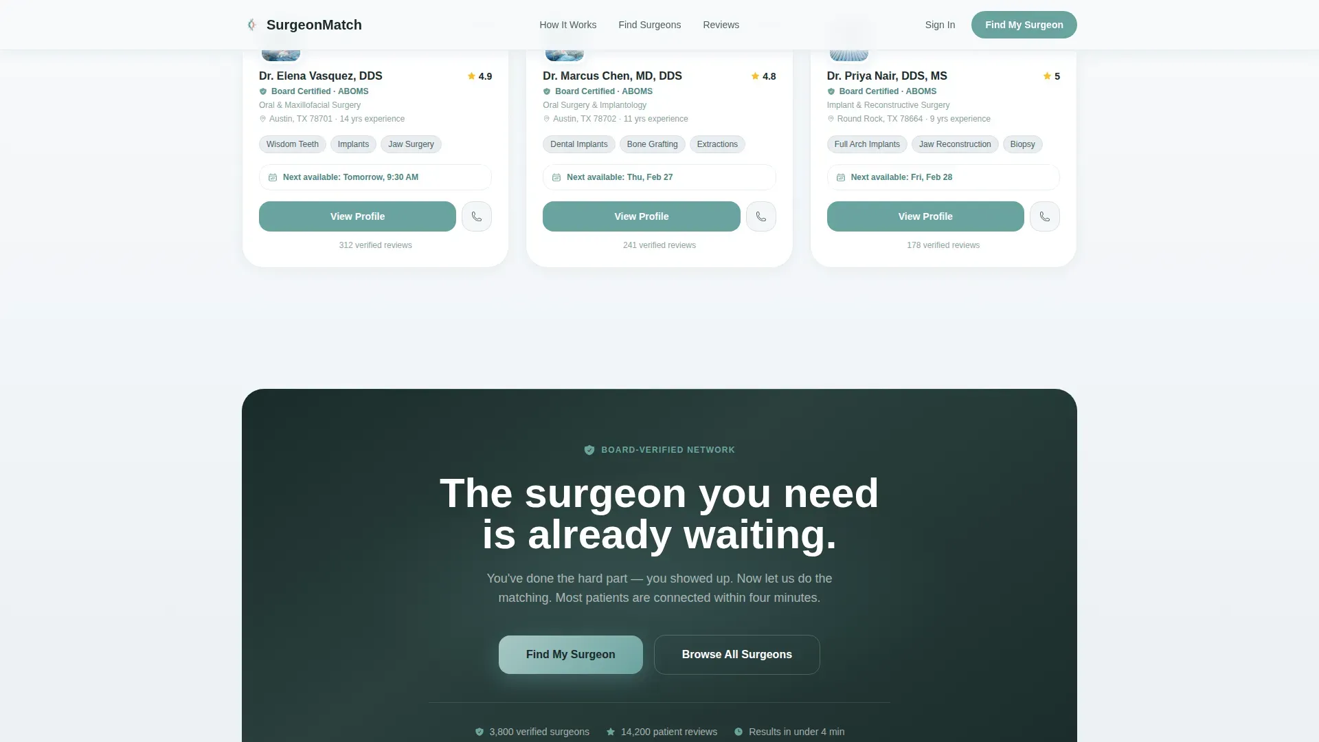
| Surgeon Spotlight Row | Showcases featured provider cards with profile call-to-action buttons |
| Final call to action Band | Repeats "Find My Surgeon" inside a dark reassurance band to close the page |
| Single-Row Footer | Provides minimal navigation in a linear, single-row pattern |
Design & branding system
The visual identity follows a Soft Gradient theme built on an Arctic White color system. The palette is clinical without feeling cold, and every color has a defined role so the interface stays coherent under stress.
- Clinical snow (#F8FAFB) and soft fog (#E8EDF2) shift across subtle vertical background gradients; the sidebar stays anchored in snow white
- Surgical teal (#6BA3A0) appears only on interactive elements such as buttons, active form steps, and floating stat callouts
- Warm reassurance blush (#D4A59A) is reserved for trust signals and highlighted review cards; DM Sans handles headings and Manrope handles body text
Mobile & speed optimization
The layout is built mobile-first. Every structural decision accounts for the reality that most patients searching for an oral surgeon at night are on a phone.
- The sidebar trust signal collapses into a top banner on smaller screens so it appears before the form without consuming scroll space
- The "Find My Surgeon" call to action becomes a sticky bottom button on mobile, always one tap away
- Static page sections use server-rendered components while the form and testimonial mosaic run as client components to keep interaction smooth
How this template helps you convert
Every design and layout decision points toward one outcome: the visitor taps through to a surgeon profile and books.
- The form makes procedure selection the very first action, so visitors feel understood before they read a single word of copy.
- The testimonial mosaic and floating stats surround the choice with layered proof, reducing hesitation right before the click.
- Every surgeon name, "View Profile" button, and form result links directly to an individual surgeon profile page where booking takes place.
Other information about this template
This template was designed specifically for the oral surgery vertical within the broader health and medical category. It is a sidebar companion layout, which means the sidebar is a structural element rather than supplementary navigation.
- The template is localized for United States markets, using zip codes, USD pricing references, and MM/DD/YYYY date formatting
- No stock photography of patients is used; the multi-step form is the visual hero of the page
- Animation is set to a medium level: the mosaic reveals with a staggered entrance, form step transitions are smooth, and the floating stat callouts pulse gently
- The template supports the oral surgeon website and oral surgeon provider directory use case out of the box without requiring custom structural changes
Theme
Soft Gradient
Creative direction
Testimonial Mosaic
Color system
Arctic White
Style
Sidebar Companion
Direction
Click-Through
Page Sections
Three-step Procedure Matching Form
Board-verified Sidebar Trust Signal
Staggered Testimonial Mosaic
Floating Numerical Stat Callouts
Guided Symptom Questionnaire Path
Sticky Mobile Call-to-action Button
Related questions
Who is this landing page template designed for?
Does the template include a way to handle visitors who do not know what procedure they need?
How does the social proof section work?
Can the sidebar be used on mobile devices?
What procedures does the search form cover?



