Orthopedic Surgeon Comparison Website Template
Orthoclarity is a single-page billing and insurance landing page built for orthopedic surgery practices. It translates prior authorizations, deductible structures, and payer coverage into plain language patients can actually use. With a live comparison table, expert-panel sections, and a two-path lead generation form, the page turns billing confusion into confident next steps.
by Rocket studio
Quick summary
Orthoclarity is a calm, information-first billing landing page for orthopedic surgery practices. It presents insurance coverage across major plan types in a clear comparison table, walks patients through the verification timeline in plain language, and closes with a focused lead generation form. The design feels clinical but approachable, built to earn trust before asking for contact details.
Who this template is for
This template is built for orthopedic surgery practices that want to reduce billing anxiety before a patient even walks through the door. It works especially well for practices treating patients who are unfamiliar with high-deductible health plans, Medicare Advantage networks, or the prior authorization process.
- Orthopedic surgeons and practice managers who handle a high volume of elective and reconstructive procedures
- Billing coordinators and financial counselors who want a transparent, patient-facing resource that answers common coverage questions
- Practices serving older adults, retirees, and working adults navigating complex insurance decisions for the first time
What problem this template solves
Most billing pages are written for coders, not patients. A person facing a total knee replacement should not have to decode procedure codes and payer matrices just to find out what they owe. This template closes that gap.
- Patients leave consultations unsure of their out-of-pocket costs, leading to delayed decisions and canceled procedures
- Insurance coverage differences across HMO, PPO, Medicare, and Workers' Compensation plans are rarely explained side by side in plain language
- Practices lose qualified leads because patients in the research phase have no low-commitment way to ask a coverage question
What you get with this template
You get a fully structured, single-page layout designed around the three things billing-anxious patients need most: clear numbers, honest comparisons, and a simple way to ask for help. Every section is authored from a specific practice voice, so the page feels like a conversation rather than a policy document.
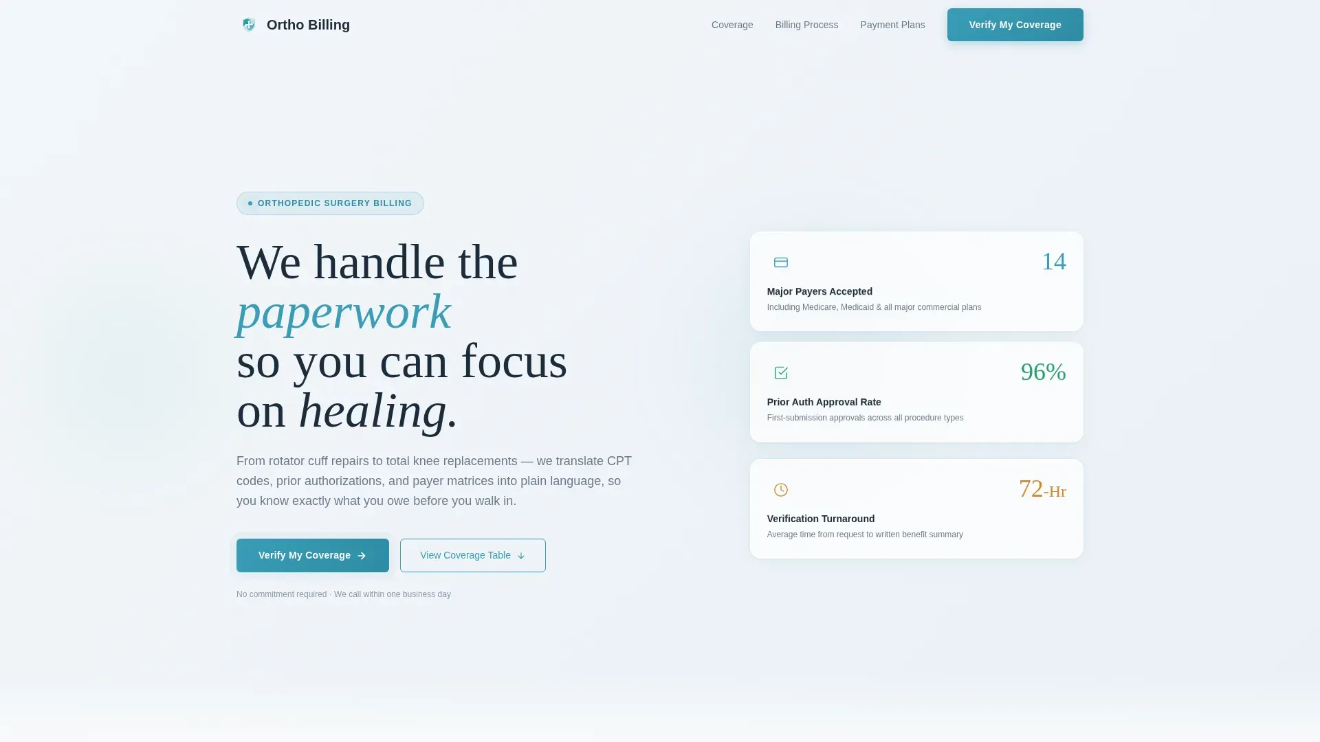
- A hero section with three oversized metric cards displaying payer count, prior authorization approval rate, and verification turnaround time
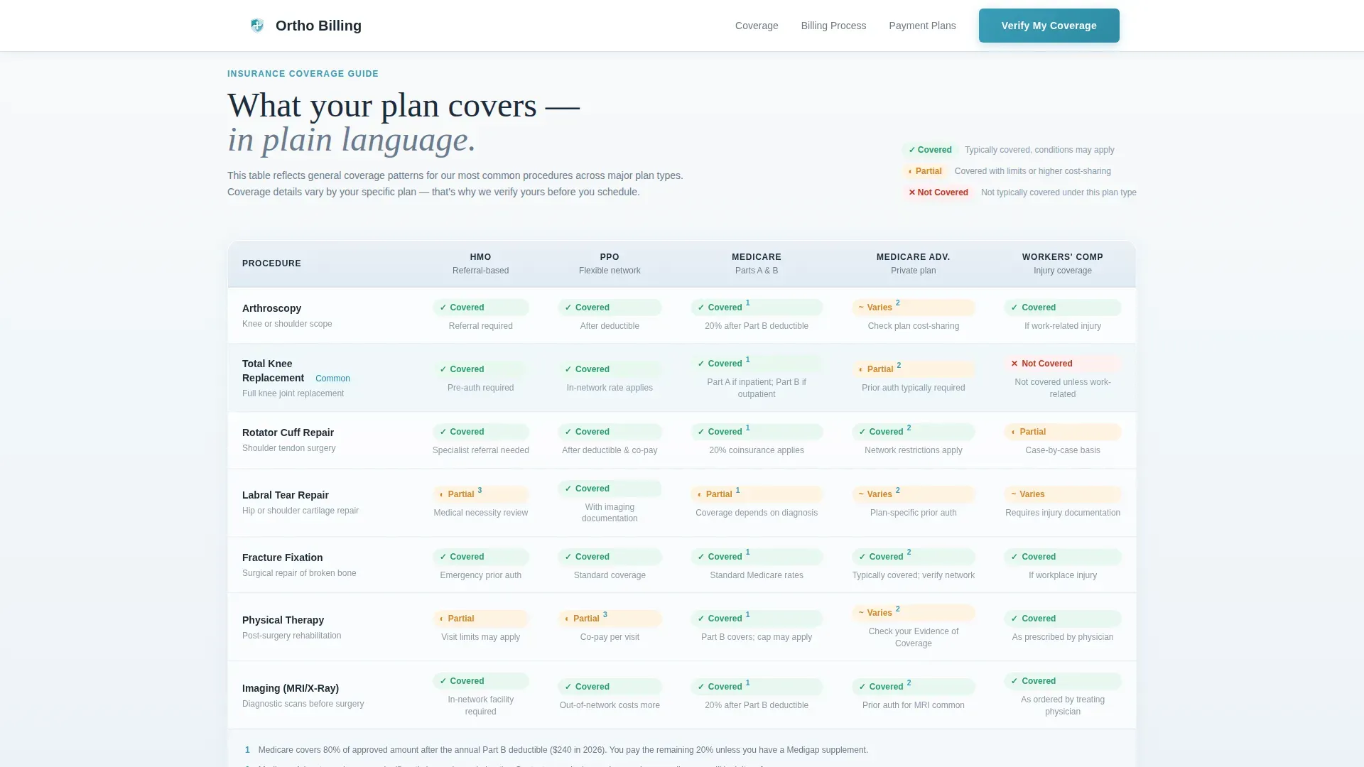
- A procedure-by-plan comparison table covering HMO, PPO, Medicare, and Workers' Compensation across arthroscopy, joint replacement, and fracture fixation
- Two lead generation paths: a "Verify My Coverage" form for ready patients and a "Download Our Insurance Guide" email capture for patients still researching
Feature list
This template was designed to do specific, practical work for orthopedic billing pages. Each feature reflects a real need identified in the patient journey from diagnosis to scheduling.
Header Stats Panel
Three floating metric cards open the page with concrete reassurance. The figures, 14 major payers accepted, a 96 percent prior authorization approval rate, and an average 72-hour verification turnaround, are set in light, generous type that reads as credible rather than promotional.
Insurance Comparison Table
The core of the page is a procedure-by-plan matrix. Rows cover common orthopedic procedures in plain language. Columns map to HMO, PPO, Medicare, and Workers' Compensation plan types. Coverage status is shown with clear visual indicators and footnotes that actually explain the exceptions.
Expert Panel Sections
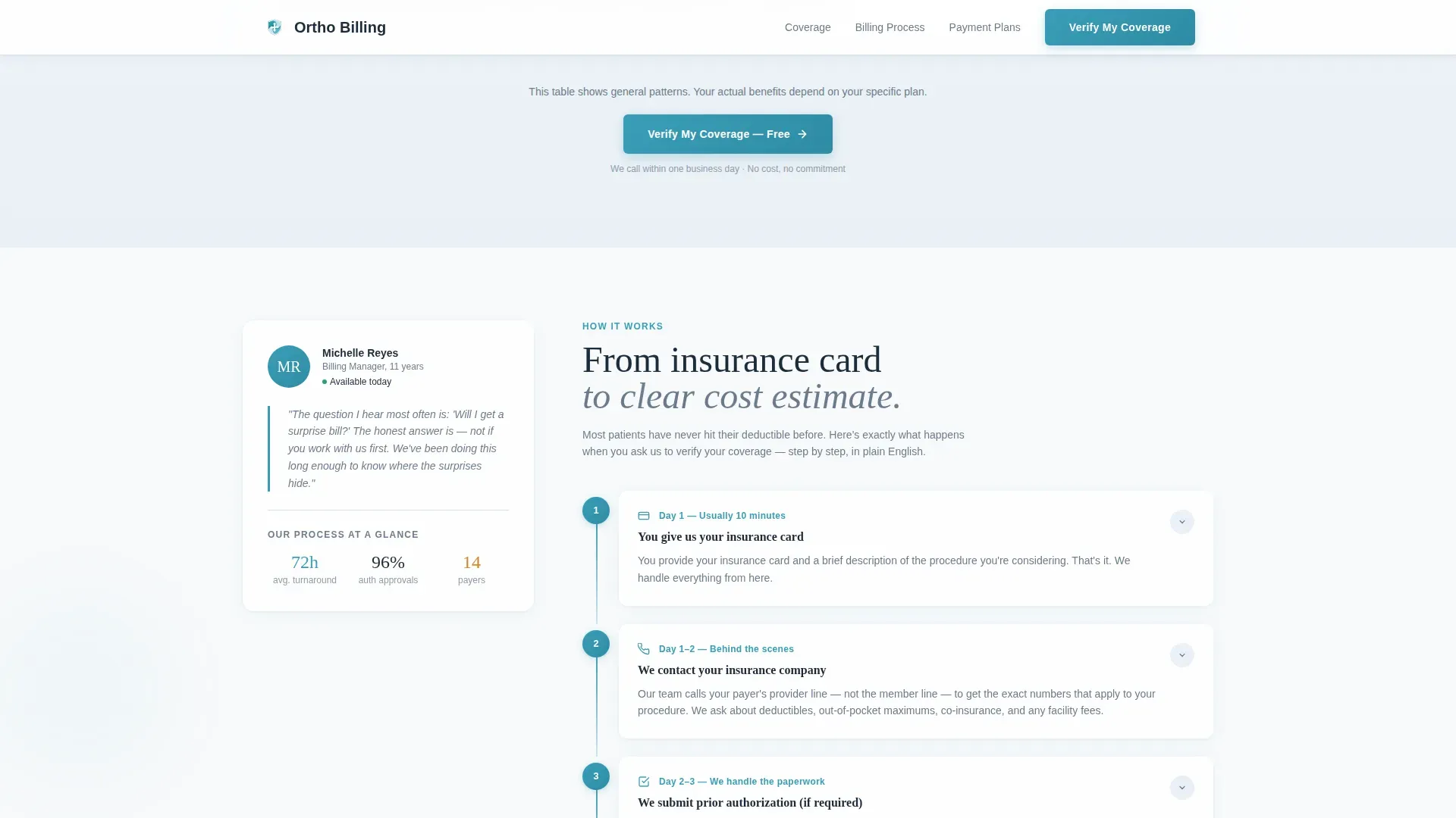
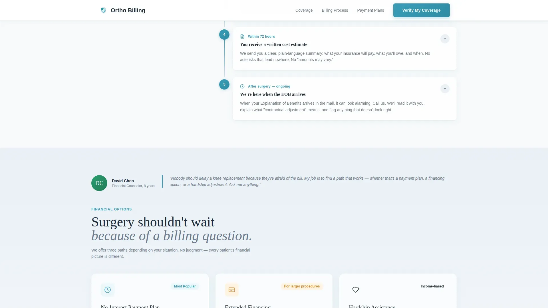
Two named-voice panels give the page human authorship. The billing manager explains the insurance verification timeline step by step using an accordion-style layout. The financial counselor section addresses payment plans, surgical cost estimates, and high-deductible health plan guidance in plain terms.
Dual-Path Lead Generation Form
The primary form collects insurance carrier via dropdown, plan type, the procedure the patient is considering in plain language, and a phone number with a clear callback promise. A secondary path captures an email address for patients who want a downloadable insurance guide instead.
Soft Gradient Visual System
The page uses a carefully restrained color palette that moves between clinical white and pale glacier blue. Teal is used only for interactive elements and call-to-action buttons, keeping the visual hierarchy clear and the tone calm throughout.
Page sections overview
| Section | Purpose |
|---|---|
| Hero Stats Panel | Opens with three key metrics to establish immediate credibility |
| Insurance Comparison Table | Compares plan types against procedures with clear coverage indicators |
| Billing Timeline Panel | Billing manager voice walks through the verification process step by step |
| Financial Counselor Panel | Addresses payment plans, surgical estimates, and high-deductible plan guidance |
| Lead Generation Form | Collects carrier, plan, procedure, and contact details via two separate paths |
| Footer | Arc Browser Split layout with logo and tagline left, navigation links right |
Design & branding system
The visual identity is built on a Soft Gradient theme using an Arctic White color system. The palette is designed to feel sterile enough to trust and soft enough to reduce anxiety, a combination that matches the emotional state of a patient researching surgical billing.
- Color palette moves from clinical white (#F8FAFB) into pale glacier blue (#EAF0F6), with steel (#6B7B8D) for body text and teal (#3A9DB8) reserved for buttons, active table rows, and interactive states
- Typography pairs Fraunces serif headings for authority and trust with DM Sans body text for readability and clarity
- Scroll animations use staggered fade-in-up transitions, floating card movement in the hero, and hover highlight states on comparison table rows
Mobile & speed optimization
The template is built desktop-first for the comparison table, which carries complex data best viewed on a wider screen. It is fully responsive for mobile, recognizing that many patients research insurance questions from a waiting room or kitchen table.
- The hero stats panel and lead generation form reflow cleanly for smaller screens without losing the metric card hierarchy
- The comparison table adapts for mobile viewing so patients can still access coverage information on a phone or tablet
- The page avoids heavy hero images by using the metric numbers themselves as the primary visual, keeping the initial load lightweight
How this template helps you convert
The page is structured so that patients receive useful, honest information before they are ever asked for their contact details. By the time a visitor reaches the form, they have already been answered on coverage, costs, and process.
- The header stats and comparison table answer the most common billing questions upfront, so patients arrive at the form already informed and less hesitant
- The dual-path form design removes friction by offering both an immediate callback option and a lower-commitment email capture for patients who are not yet ready to schedule
Other information about this template
This template is categorized under Health and Medical, specifically within the Orthopedic Surgeon Website subcategory. It is designed for United States practices and uses US insurance terminology throughout, including terms like prior authorization, deductible, Medicare Advantage, and Workers' Compensation. All currency references are in USD and date formats follow the MM/DD/YYYY standard.
- The template style is Comparison Table, making it well suited to practices that want to present coverage data in a structured, scannable format
- The creative direction follows an Expert Panel approach, where each content section carries a distinct authorial voice from within the practice
- The header concept is Stats and Metrics, leading with numbers rather than imagery to establish clinical credibility immediately
- The lead generation direction is primary, with the "Verify My Coverage" form as the conversion goal and the insurance guide download as a secondary capture path
Theme
Soft Gradient
Creative direction
Expert Panel
Color system
Arctic White
Style
Comparison Table
Direction
Lead Generation
Page Sections
Header Stats Panel with Metric Cards
Procedure-by-plan Comparison Table
Expert Panel Sections with Named Voices
Dual-path Lead Generation Form
Interactive Comparison Table States
Soft Gradient Arctic White Design System
Related questions
What types of insurance plans does this template cover in the comparison table?
Can I update the payer list and procedure names to match my practice?
Who is the primary audience this landing page is designed for?
Does the template include both a form and an email capture path?
Is this template suitable for a practice with a high volume of surgical patients?



