Luxe Minimal Italian Dining Landing Page Template
Osteria is a hero-dominant Italian restaurant landing page template built for candlelit neighborhood dining. It pairs a hand-drawn mascot illustration with full-viewport food photography, a Parchment and Rust color system, and three conversion paths: table reservations, pantry provisions, and Sunday Supper bookings. Designed for food-literate diners and anniversary couples, the page feels as warm as the restaurant itself.
by Rocket studio
Quick summary
Osteria is a Luxe Minimal Italian restaurant landing page template designed to turn atmosphere into action. It uses cinematic dish photography, a vintage mascot illustration, and a three-path conversion layout to move visitors toward reservations, pantry orders, and communal dinner bookings. The mood is candlelit and unhurried, and the structure keeps that feeling intact from hero to footer.
Who this template is for
This template is designed for Italian restaurant owners and operators who want their website to feel as carefully crafted as their food. It suits establishments where the experience matters as much as the menu.
- Upscale neighborhood osterie and Italian restaurant dining rooms seeking a polished online presence
- Restaurant operators who sell provisions such as jarred sauces, fresh pasta, or house olive oil alongside reservations
- Food-forward venues running ticketed communal events or tasting dinners
What problem this template solves
Most Italian restaurant landing page designs fail to communicate atmosphere. Visitors land on a cluttered page, lose the mood, and leave before booking. This template solves that by putting immersive visuals first and reducing friction at every conversion point.
- A minimal three-field reservation form removes the effort of booking a table
- Full-viewport dish photography lets the food speak before a single word is read
- Separate conversion paths for dining, provisions, and events keep every visitor type on board
What you get with this template
You get a fully structured, single-page layout designed to highlight what makes your restaurant worth visiting. Every section is purposeful and ready to customize.
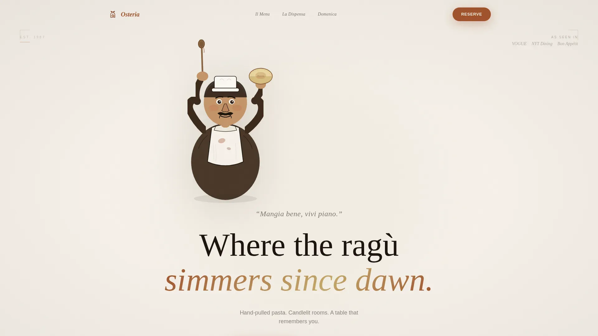
- A hero section featuring a hand-drawn mascot illustration against a parchment void with atmospheric serif type
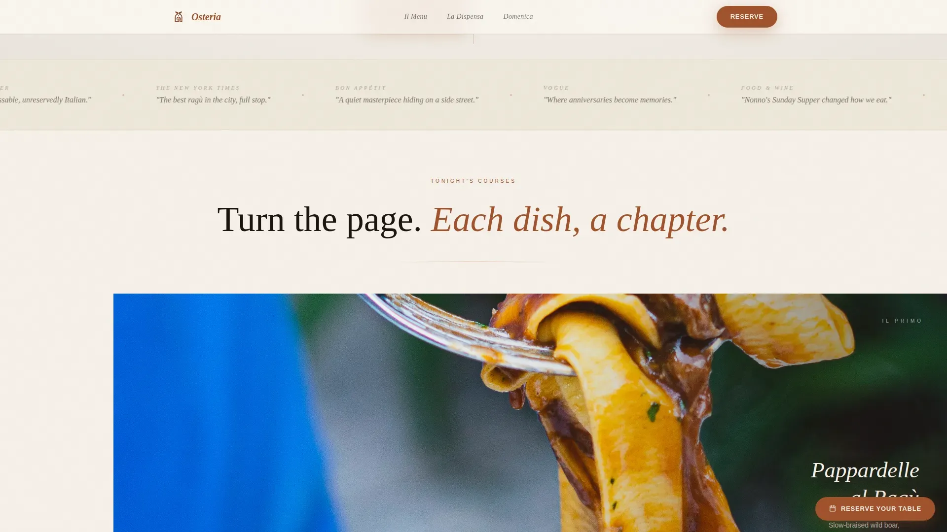
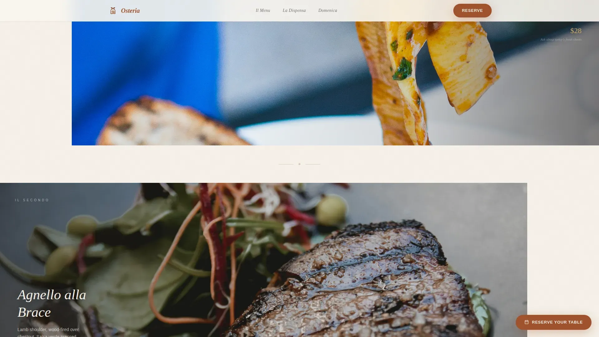
- Full-viewport moody food photography sections for pasta and secondi courses, each with a whisper-text margin
- A pantry provisions grid, a Sunday Supper booking section, and a minimal reservation form
Feature list
This template includes carefully considered features built around the needs of an upscale Italian restaurant website.
Mascot Hero Illustration
The hero fills the full viewport with a hand-drawn Nonno character rendered in visible ink texture. The style sits between a vintage Italian grocery label and a fine editorial cover. It sets the restaurant's personality before any text is read.
Immersive Dish Photography Layouts
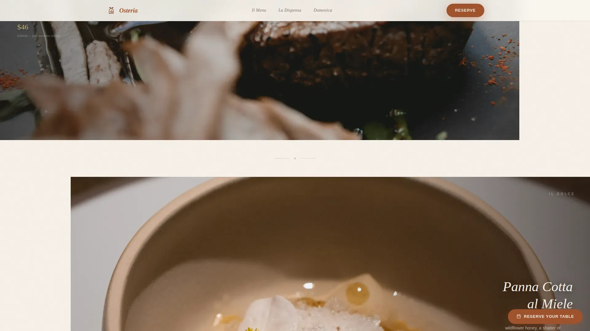
Each course section is designed so food photography fills ninety percent of the viewport. Whisper-weight menu text and pricing float in the remaining margin. The scroll pace deliberately slows between sections, matching the rhythm of a real Italian meal.
Three-Path Conversion Layout
The page is designed with three distinct conversion goals: table reservations, pantry provisions, and Sunday Supper bookings. Each path has a dedicated section and a clear call to action, so no visitor type is left without a next step.
Minimal Reservation Form
The reservation section asks only for date, party size, and first name. Three fields, one interaction. This keeps the booking experience as effortless as the restaurant itself while giving you the information you need.
Pantry Provisions Grid
A dedicated section highlights jarred ragù, fresh pasta bundles, and house olive oil as purchasable products. The grid is designed to board the interest of home cooks and food-literate visitors who want to bring the restaurant experience home.
Persistent Call-to-Action Pill
A rust-colored "Reserve Your Table" pill stays pinned to the bottom-right corner throughout the page. It is always visible but never intrusive, so visitors can act at any moment without scrolling back to the top.
Page sections overview
| Section | Purpose |
|---|---|
| Hero, Nonno Mascot | Establish atmosphere and brand identity with illustrated character and tagline |
| The Courses | Showcase signature dishes through full-viewport moody food photography |
| Shop the Pantry | Convert provisions interest into orders via a product grid |
| Sunday Supper Booking | Highlight the twelve-seat communal tasting event with a booking call to action |
| Reserve a Table | Capture reservation intent with a minimal three-field form |
| Footer | Display essential restaurant information with horizontal dot-separator layout |
Design & branding system
The visual identity is built on a Parchment and Rust color system that feels like a linen tablecloth stained with wine and candlewax. Every color choice is deliberate and restrained.
- Aged parchment (#F5F0E8) dominates all backgrounds; charred wood (#1C1410) carries body text; rust (#A0522D) marks dividers and selected states
- Muted olive oil gold (#C4A96A) appears only on hover states and price accents, so it reads as a reward for interaction rather than decoration
- Typography pairs Fraunces serif display headings with DM Sans body text, mirroring the refined type hierarchy expected of an upscale, wine-forward menu
Mobile & speed optimization
The template is designed desktop-first to honor the full-viewport photography that defines its character. Moody food images demand large screens, and anniversary planners typically browse on desktop. Responsive behavior is still built into every layout.
- All dish photography sections and the provisions grid reflow cleanly for tablet and mobile viewports
- The persistent reservation pill and three-field form are designed for single-tap interaction on any screen size
- Section spacing and type scales are set to remain readable and well-proportioned across device types
How this template helps you convert
Successful restaurant websites guide visitors toward a clear action without interrupting the mood. This template is designed to do exactly that.
- The persistent rust pill keeps the reservation call to action visible at all times, so visitors never have to hunt for the booking path regardless of where they are on the page.
- The "Shop the Pantry" gold-outlined button appears after the pasta course section, catching visitors at peak appetite and directing them toward provisions without pulling them away from the dining narrative.
- Social proof elements including real guest quotes and editorial mentions are woven into the layout to build trust before any form is filled.
Other information about this template
This template draws on well-established principles from Italian restaurant website design. It is worth knowing how those principles are reflected here and how the template fits within the broader landscape of restaurant website tools.
- Generous white space is used throughout the layouts to signal luxury and let each dish image breathe on its own
- The page is designed to highlight culinary storytelling, with room for notes on imported ingredients, local produce, and the philosophy behind the food
- The template is well-suited for restaurant operators who want to manage their website independently without needing extensive technical knowledge, since the section structure is clear and organized
- The Osteria theme, as a cafe and bistro concept designed for businesses that want to stand out online, aligns with this template's goal of helping a restaurant impress the right audience at first glance
- Other upscale restaurant layouts such as Grandline share a similar refined, minimalist sensibility, which confirms that this type of restrained, moody aesthetic resonates with high-end dining audiences
- The template is also designed with room for an embedded map widget, operating hours, and reservation details, covering the essential information that diners expect from any great Italian restaurant landing page
Theme
Luxe Minimal
Creative direction
Immersive Visual
Color system
Parchment & Rust
Style
Hero-Dominant (90/10)
Direction
Marketplace/Multi
Page Sections
Mascot Hero Illustration
Immersive Dish Photography Layouts
Three-path Conversion Layout
Minimal Reservation Form
Pantry Provisions Grid
Persistent Reservation Pill
Related questions
Can I customize the colors and typography in this template?
Does the template support online provisions ordering?
How does the reservation form work?
Is this template suitable for a restaurant that also runs ticketed events?
Can this design work for a smaller neighborhood Italian restaurant?



