Opera & Symphony Waitlist Landing Page Template
Overture is a storybook single-page landing page built for opera and symphony venues. It uses a Neo-Retro Electric Indigo palette to guide visitors through a scroll-driven seasonal journey. Each chapter reveals one upcoming performance, building anticipation before closing with a waitlist form that asks only for an email and a favorite evening.
by Rocket studio
Quick summary
Overture is a full-page, scroll-driven landing page designed for opera and symphony concert halls. It guides visitors through the upcoming season one performance at a time, using cinematic visuals and sensory copy. The page closes with a minimal waitlist form, turning passive interest into a committed reservation request.
Who this template is for
This template is built for performing arts organizations that want their digital presence to feel as compelling as the stage itself. It suits venues that already have a season lineup and want to build early audience commitment before tickets go on sale.
- Opera and symphony concert halls launching a new season
- Performing arts marketing teams building a pre-sale waitlist
- Venue directors who want donor and patron engagement baked into the page flow
What problem this template solves
Most event venue pages list shows in a table and ask visitors to buy now. That approach skips the emotional work entirely. Overture solves the gap between discovering a venue online and actually feeling compelled to attend.
- Visitors leave generic event pages without connecting to the experience on offer
- Season announcements often fail to convey atmosphere, making them easy to ignore
- Collecting early audience interest usually requires a separate tool or awkward form placement
What you get with this template
You get a complete, single-page layout that doubles as a seasonal story and a waitlist engine. Every visual and copy element works together to make the visitor feel the season before they have ever entered the hall.
- A dark full-bleed header with a conductor photograph and a serif fade-in headline
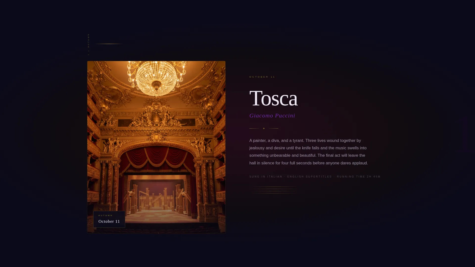
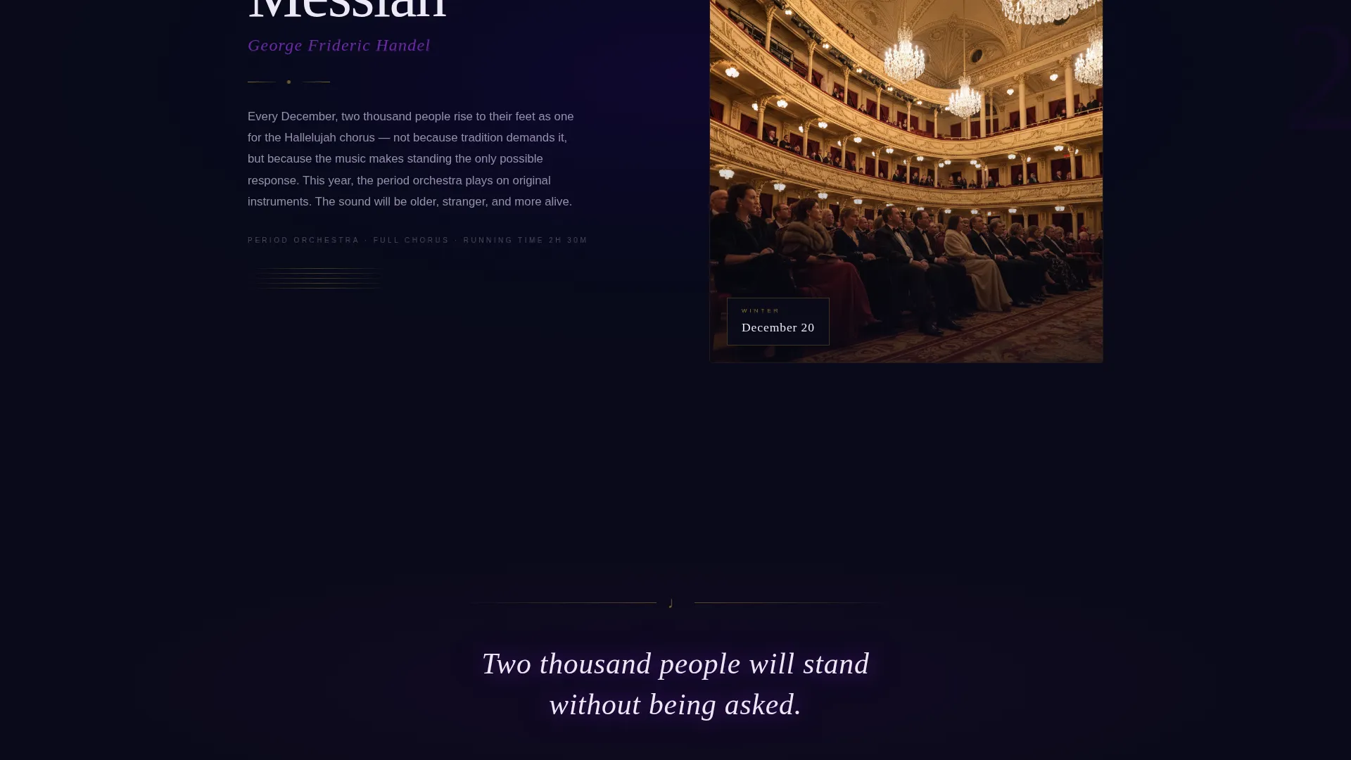
- Scroll-driven seasonal chapters, each tied to a specific performance date and shifting background tone
- A fixed glowing call-to-action button that appears after the second chapter, plus a full-page closing form moment
Feature list
A brief overview of the core capabilities this template delivers from first load to final form submission.
Scroll-Driven Seasonal Chapters
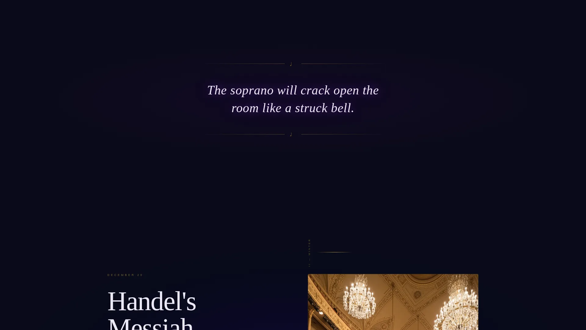
Each full-page scroll stop presents one dated performance from the upcoming season. Background tones shift subtly from autumn amber to winter frost to spring violet, while the Electric Indigo glow persists as a visual throughline. Between chapters, a single sensory sentence lingers on screen to build anticipation.
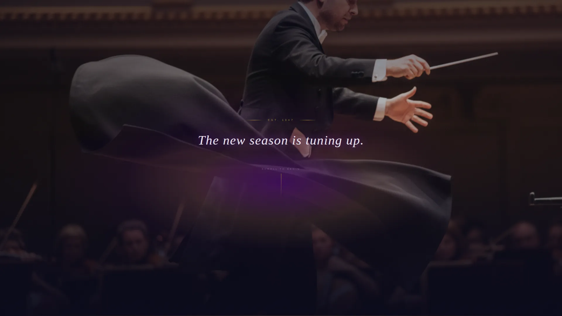
Cinematic Dark Full-Bleed Header
The page opens with a nearly black photograph of a conductor mid-downstroke, shot from behind so the visitor sees the hall as the orchestra does. A single indigo-to-gold glow emanates from the score on the music stand. A luminous serif headline fades in with no navigation visible on load.
Glowing Fixed Call-to-Action Button
A fixed button labeled "Reserve My Seat in the Dark" appears after the visitor passes the second seasonal chapter. It stays present through the remainder of the scroll, offering a low-friction path to the waitlist at any point during the journey.
Minimal Waitlist Form with Chapter Selection
The closing form section asks only for an email address and one choice: which evening called to you. The season chapters are presented as clickable cards that glow indigo on selection, keeping the signup feel personal rather than transactional.
Secondary Patron Gifting Path
A secondary call-to-action offers a "Gift a Season" option for patrons. This path sits alongside the primary waitlist form, acknowledging the donor and gift-buyer audience without disrupting the main conversion flow.
Neo-Retro Electric Indigo Visual System
The entire page uses a four-color palette: deep curtain black, electric indigo, gilded champagne, and soft limelight white. Typography is serif-led. The result feels like a vintage playbill lit by a neon marquee, blending old-world grandeur with electric energy.
Page sections overview
| Section | Purpose |
|---|---|
| Dark Header | Opens with cinematic conductor photograph and fade-in serif headline |
| Chapter One | Presents the first dated performance with autumn amber tone |
| Sensory Interlude | Single lingering sentence between chapters to sustain atmosphere |
| Chapter Two | Presents the second performance and triggers the fixed call to action button |
| Chapter Three | Final seasonal chapter with spring violet background shift |
| Waitlist Form | Closes the page with email input and glowing chapter-card selection |
| Patron Gift Path | Secondary option for gifting a season to another attendee |
Design & branding system
The visual language is Neo-Retro: old-world performing arts grandeur expressed through a modern, high-contrast digital palette. Every color choice has a clear role, and the typography reinforces the drama without becoming decorative noise.
- Deep curtain black (#0B0A1A) as the dominant background, gilded champagne (#D4AF37) on accent lines and ticket iconography, and soft limelight white (#EDE8F5) for body text
- Electric indigo (#4B0082) radiating from headlines, hover states, and selected form cards to create a consistent focal glow
- Serif typefaces throughout, referencing the elegance of a printed playbill while remaining highly legible on dark backgrounds
Mobile & speed optimization
The storybook scroll structure is built with mobile viewing in mind. Full-bleed sections and chapter cards are designed to reflow gracefully at smaller screen widths so the cinematic quality of the experience carries through on any device.
- Full-page chapter sections adapt to portrait orientation without losing their tonal atmosphere
- The fixed glowing call-to-action button is sized and positioned for comfortable thumb reach on mobile screens
- The closing form keeps its two-field structure on all screen sizes, avoiding layout shifts that would interrupt the conversion moment
How this template helps you convert
The page is designed so that by the time a visitor reaches the form, they already feel emotionally invested in attending. Conversion is earned through atmosphere, not pressure.
- The scroll journey moves visitors through three distinct seasonal moments before they ever see a form, so the waitlist feels like a natural next step rather than an interruption.
- The chapter-card selection inside the form gives each signup a personal dimension, increasing the likelihood that visitors complete rather than abandon the form.
- The "Gift a Season" secondary path captures patron-level intent that a single call-to-action button would miss entirely.
Other information about this template
Overture is categorized under Media and Entertainment, specifically within the Theater and Performing Arts niche, with a focus on opera and symphony venues. It is well-suited for organizations running seasonal programming with a defined premiere calendar.
- The template style is Storybook and Full-Page, meaning each scroll stop is designed as a complete visual moment rather than a traditional content section
- The creative direction is Seasonal and Moment-led, making it particularly effective for announcing a new concert season before general ticket sales open
- The header concept is Dark Full-Bleed with Glow, a design choice that immediately sets the page apart from standard event listing layouts
- The landing page direction is Waitlist and Coming Soon, so the primary goal is email capture and early audience commitment rather than direct ticket purchase
Theme
Neo-Retro
Creative direction
Seasonal/Moment
Color system
Electric Indigo
Style
Storybook/Full-Page
Direction
Waitlist/Coming Soon
Page Sections
Scroll-driven Seasonal Chapter Layout
Cinematic Dark Full-bleed Header
Fixed Glowing Call-to-action Button
Minimal Two-field Waitlist Form
Secondary Patron Gifting Path
Neo-retro Electric Indigo Palette
Related questions
Can I update the seasonal chapters with my own performance dates?
Does the page support more than three seasonal chapters?
Is the waitlist form connected to an email platform?
Can the 'Gift a Season' path be removed if I do not need it?
What makes this different from a standard event listing page?


