Franchise Business Reviews Website Template
The Coat landing page template is a Luxe Minimal, card-grid franchise opportunity page built for painting franchise brands. It combines a cinematic full-bleed hero, modular flip-card comparison sections, franchisee testimonial cards, and a persistent gold call-to-action button to move qualified prospects toward a territory availability tool, with no form on the page itself.
by Rocket studio
Quick summary
The Coat landing page template is a single-page, card-grid franchise opportunity layout designed for painting franchise businesses. It uses a cinematic full-bleed photo header, a modular comparison journey, franchisee testimonial cards with gold pull-quotes, and a persistent primary call-to-action button. Every section of this landing page is built to move serious, qualified prospects toward one clear destination: the territory availability tool.
Who this template is for
This landing page template is built for painting franchise brands that need to attract serious, investment-ready prospects. The target audience is not casual browsers. These are people who have spent years climbing corporate ladders and are now ready to own something tangible. The landing page speaks directly to mid-career professionals with significant savings, couples transitioning from corporate management to crew management, and serial franchisees evaluating their next recession-proof vertical. If your franchise needs a landing page that commands respect and earns a qualified click, this template is the right fit.
This page template suits:
- Mid-career professionals with $100,000 or more in savings who want to own a local business with national infrastructure behind it
- Corporate managers and couples ready to swap boardroom life for building crews and managing real territories
- Serial franchisees scanning for a proven, scalable business model in a recession-resistant service category
What problem this template solves
Most landing pages for franchise opportunities fail at the moment that matters most. They bury the financial proof, lead with buzzwords instead of data, and ask for commitment before they have earned trust. The result is low-quality clicks, poor conversion rates, and prospects who bounce before they ever reach the disclosure page. This landing page template solves that directly by front-loading financial metrics, letting the comparison cards do the selling, and routing only qualified, high-intent visitors to the next step.
The problems this page template addresses head-on:
- Franchise landing pages that dilute their value proposition with too many messages and no clear call to action
- Pages that ask for a form submission before they have demonstrated the financial upside, which kills conversion rates for high-ticket offers
- Generic web page layouts that feel impersonal to serious investors and fail to build the social proof and credibility that a six-figure decision demands
What you get with this template
This landing page template delivers a complete, production-ready painting franchise opportunity page. Every section is intentional. The layout is modular, which means each card, row, and section can be adapted to your franchise's specific territory data, financial metrics, and franchisee stories. You get a high converting landing page structure that has been designed to stack proof progressively, so the landing page earns trust before it ever makes an ask.
Included in the template:
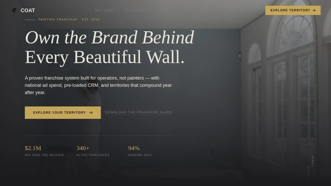
- A cinematic full-bleed hero section with a fade-in bold headline and a primary "Explore Your Territory" call-to-action button
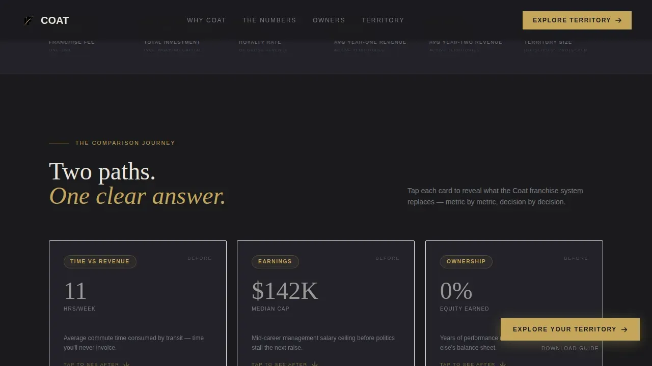
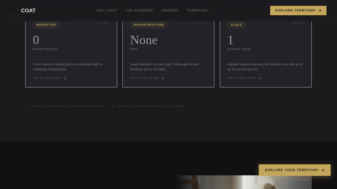
- Modular flip-card comparison rows contrasting corporate life metrics against franchise owner results, and solo painter limitations against the franchise system's infrastructure
- An irregular bento-grid testimonial section with franchisee job-site photos and gold pull-quote text, plus a persistent sticky gold call-to-action button and a slide-up modal for a secondary "Download the Franchise Guide" email capture
Feature list
This landing page template includes the following main features across its modular card-grid structure.
Cinematic Full-Bleed Hero Section
The hero image occupies the entire viewport at full width. The shot is framed inside a grand room mid-transformation: one wall already finished in a rich, saturated color, painter's tape crisp on the trim, and a crew member in branded blacks working with quiet precision. Natural light through tall windows catches the wet sheen of the fresh paint. The composition is slightly desaturated except for the paint itself, which glows against the dark surroundings. A clean sans-serif bold headline fades in over the background image: "Own the Brand Behind Every Beautiful Wall." The primary call-to-action button appears inside the hero immediately, giving the landing page its first conversion moment before the prospect even begins to scroll.
Modular Comparison Card Grid
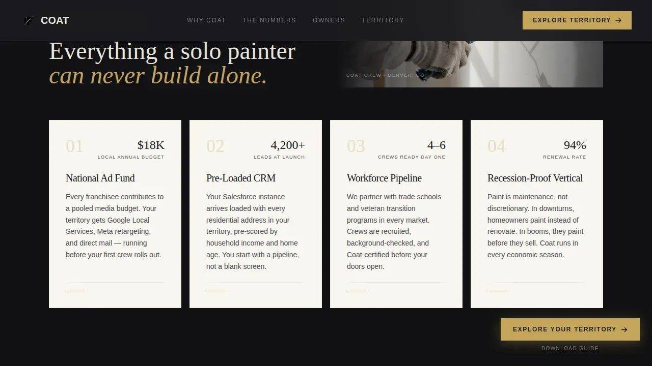
The comparison journey is the structural core of this landing page template. Modular cards present two realities side by side across two rows. The first row places corporate grind metrics, commute hours, capped earnings, someone else's logo, directly against franchise owner metrics like territory size, average ticket value, and year-two revenue. The second row compares a solo painter's limitations, no brand, no leads, weekend quoting, against the franchise system's infrastructure: a national advertising fund, a pre-loaded customer relationship management system, and crews hired before launch day. Each card flips or slides to reveal the "after" data as the visitor scrolls, rewarding engagement with escalating proof. This format is one of the key elements that separates this landing page from generic franchise web pages. The progressive reveal structure is designed to boost engagement and create urgency at exactly the right moment in the scroll journey.
Irregular Bento Testimonial Grid
Social proof lands differently when it feels human rather than manufactured. This landing page template breaks the card grid at irregular intervals with testimonial cards from real franchisees. Each card features a job-site photograph and pull-quote text rendered in gold. The irregular rhythm of the bento grid keeps the page unpredictable and personal. Unlike most landing pages that push client testimonials to the bottom of the page after the prospect has already lost interest, this template weaves testimonial cards into the financial proof section, so social proof reinforces the numbers at the same moment they appear.
Persistent Gold Call-to-Action Button
The primary call to action, "Explore Your Territory," appears first inside the hero section and then repeats as a persistent sticky bar button as the visitor scrolls. This sticky call-to-action bar ensures that no matter how deep into the comparison cards or testimonial grid a prospect goes, the next step is always visible without needing to scroll back to the top. The gold button color, drawn from the Obsidian and Gold color system, provides strong visual contrast against the deep charcoal-black background, making the call to action impossible to miss even during fast scrolling on mobile devices.
Slide-Up Email Capture Modal
Not every site visitor is ready to explore a territory. Some are still in the research phase. This landing page template handles that gracefully with a secondary text link, "Download the Franchise Guide," that triggers a slide-up modal. The modal contains a single email field, capturing lighter-intent visitors without cluttering the main landing page with form fields. This approach respects the page's click-through direction while still giving the brand a way to capture leads from prospects who need more information before committing to the territory tool.
Territory-Routed Click-Through Flow
This is a pure click-through landing page. There is no primary form on the page itself. Every primary call-to-action click routes the prospect to a territory availability tool where they enter their zip code and view an interactive map. This approach keeps the landing page lean, fast, and focused entirely on one goal: moving a qualified, high-intent prospect one step closer to a franchise disclosure conversation. The absence of a form on the main page is a deliberate design choice that removes friction and respects the seriousness of the investment decision.
Page sections overview
| Section | Purpose |
|---|---|
| Hero Full-Bleed | Opens with cinematic photo, bold headline fade-in, and primary call-to-action button |
| Financial Proof Cards | Modular flip cards comparing corporate metrics against franchise owner results |
| System versus. Solo Cards | Before-and-after cards contrasting solo painter limitations with franchise infrastructure |
| Franchisee Testimonials | Irregular bento grid with job-site photos and gold pull-quote social proof |
| Territory Call-to-Action | Final conversion section with primary call to action and secondary guide download modal |
| Footer Single-Row | Linear single-row footer with brand links and secondary navigation |
Design & branding system
The visual identity of this landing page template follows a Luxe Minimal theme. The palette is restrained, purposeful, and built to communicate credibility to a target audience that has spent careers in boardrooms and knows what confidence looks like. The page design feels like a matte-black business card with a single foil-stamped accent line. It never raises its voice, yet it commands every space it enters.
The design and branding system includes:
- Obsidian (#1A1A1D) as the primary background color across the entire page, creating the deep charcoal-black canvas that makes every gold accent and gallery-white card surface pop with striking visuals
- Warm brushed gold (#C5A55A) for all accents, interactive hover states, pull-quote text, and the persistent call-to-action button, paired with gallery white (#F7F5F0) for card surfaces and muted graphite (#4A4A4F) for body text
- DM Sans for user interface and body text paired with Fraunces for editorial headings, a typographic combination that balances modern readability with a premium editorial feel suited to this high-ticket franchise offer
Mobile & speed optimization
This landing page template is desktop-first by design, reflecting the fact that financial decision-makers at the investment level this franchise targets tend to research on desktop. However, the template includes full mobile support so the landing page performs well across all screen sizes, including mobile devices and tablets. The card-grid modular structure adapts cleanly from a multi-column desktop layout to a single-column mobile stack without losing the comparison card's visual impact.
Mobile and performance considerations built into the template:
- The modular card-grid layout reflows gracefully for mobile devices, keeping comparison cards readable and the persistent gold call-to-action button accessible at all scroll depths
- Server components handle static content rendering, while client components manage the animated card flips, sticky call-to-action bar, and slide-up modal, keeping the interactive elements smooth without sacrificing the static sections
How this template helps you convert
This landing page template is engineered around a single conversion goal: routing qualified, high-intent prospects to the territory availability tool. It does not try to convert everyone. It is designed to self-select the right prospects by making the financial upside clear early, rewarding scroll depth with escalating proof, and keeping the call to action permanently visible.
Here is how the conversion structure works in practice:
- The hero section captures user's attention immediately with a cinematic full-bleed image, a fade-in bold headline, and the primary "Explore Your Territory" call to action, giving the highest-intent visitors a way to convert within the first few seconds of landing on the page
- The modular comparison cards build a progressive case across two rows, stacking financial metrics, system proof, and franchisee social proof in a sequence that mirrors the way a serious investment prospect evaluates an opportunity, making the landing page feel like a well-structured sales pitch rather than a brochure
- The persistent sticky gold call-to-action button and the secondary slide-up modal work together to drive conversions from both high-intent and lighter-intent visitors, ensuring that no site visitor leaves the page without a clear path forward
Other information about this template
This landing page template was built on the same design philosophy that shapes the best landing pages in high-ticket franchise marketing. The comparison journey format is one of the most effective landing page structures for offers where the prospect needs to visualize a before-and-after transformation. Landing page design examples across industries show that when financial proof and social proof are layered together progressively, conversion rates improve significantly. A well-optimized landing page of this type can boost conversion rates by up to 300% compared to generic franchise web pages that lead with a form.
The about us page approach matters here even within a single-page click-through format. A good about us page in the broader franchise web presence establishes connection and trust, highlights brand values, and gives newcomers a reason to root for the brand. The Coat landing page template takes that same philosophy and applies it within a single-page structure, using the brand story embedded in the comparison cards and franchisee testimonials to communicate who the franchise is and why it matters. An about us page for a franchise brand should include team photos and social proof, and this template carries that same thinking into its testimonial section with job-site photos and gold pull-quotes.
For broader context on the brand behind this template: COAT Paints was founded by Rob and Rob as a direct-to-consumer paint brand. COAT Paints is recognized as the world's first Climate Positive and B Corp certified paint company. COAT is carbon positive, using eco-friendly, water-based, and low-VOC formulas. Every tin of COAT paint is freshly made to order, ensuring no old stock and minimal waste. COAT provides 100% recyclable packaging and offers uniquely designed recycling programs for leftover tins. COAT also features an interactive visualizer that shows how specific colors look under various lighting conditions, and COAT Paints features an AI Room Colour Visualiser so customers can see colors in their own rooms before committing. COAT replaced traditional messy tester pots with adhesive peel-and-stick color swatches that can be moved around a room. COAT offers next-day delivery, and the brand's website provides curated color collections and Colour Tales to inspire users in their selection process.
Landing page template best practices this build follows closely:
- High-converting landing pages maintain a consistent message throughout the user journey, and this template keeps the "own something real" narrative thread from the hero image all the way to the territory call-to-action section
- The about us page principle of telling your brand story by detailing how the business started, what challenges were faced, and why the company's core values matter is reflected throughout the comparison card content
- An about us page should embody the brand's personality, and this template embodies the franchise's identity through its Obsidian and Gold palette, its Fraunces editorial headings, and its cinematic photography direction
- Telling your company's story through an about us page framework helps potential customers understand not just what you sell but who you are, and the Coat landing page uses its comparison cards as a form of structured brand story
- A good about us page includes social proof, such as customer testimonials or media coverage, and this template applies that principle with its irregular bento testimonial grid featuring real franchisee voices
- The us page approach of including team photos or a short company video to build trust is reflected in this template through the job-site franchisee photography that anchors every testimonial card
- An about us page should direct visitors to a next action, and every section of this landing page directs site visitors toward either the territory tool or the guide download modal
- Updating your about us page regularly with new milestones and team updates also applies here: the modular card-grid structure of this landing page template makes swapping in new franchisee stories or updated financial metrics straightforward without a full redesign
- Including a clear value proposition on an about us page sets the brand apart, and this template's comparison cards make the franchise's value proposition impossible to miss
- A well-structured about us page should use readable fonts and avoid long paragraphs, a principle this landing page template follows across all of its modular card sections
- The us page examples that perform best in franchise marketing are those that feel personal without being informal, and this template threads that needle with its mix of editorial typography, cinematic imagery, and behind-the-scenes franchisee photography
- Behind the scenes content like job-site team photos and real financial metrics makes this landing page feel more credible than polished-but-vague franchise page examples
- The landing page template includes built-in responsive design for optimal performance across devices, including mobile devices, so the page works for potential clients researching on any screen size
- The COAT landing page template allows for rapid deployment, enabling marketing teams to launch pages in hours rather than weeks
- Using video on landing pages can increase engagement and drive conversions by as much as 80%, and while this template leads with a cinematic still hero image and a video background option is compatible with the full-bleed header concept, the primary design uses the static cinematic photo for maximum visual impact
- A short video embedded in the hero or a secondary section can boost engagement further for franchisors who want to add motion to the landing page experience
- The focus on a single value proposition and clear calls to action in this template is proven to increase engagement and lead generation for franchise opportunity pages
- Landing page design examples like the Beazer real estate landing page and the Williams-Sonoma B2B landing page show that a straightforward design with a clear value proposition outperforms cluttered pages, and the Coat template follows that same principle
- Page examples from top-performing franchise brands show that personal story and company history woven into the comparison section create a deeper connection with the prospect than a traditional bullet-point spec list
- The best landing pages use social proof not as decoration but as structural evidence, and this template's irregular bento testimonial grid does exactly that
- The about us page principle of regularly refreshing company history and milestones applies to the Coat landing page template's modular structure, which is designed to make content updates fast
- A personal story or brand started narrative embedded in the comparison cards helps new visitors feel that the franchise has humble beginnings and a genuine mission statement rather than a corporate sales pitch
- A mission statement for the franchise can be embedded inside the hero headline or the comparison card section to reinforce core values and brand values for potential customers who need that emotional anchor before they click
- The navigation bar in this template is minimal, keeping the focus on the primary call to action rather than offering site visitors multiple ways to leave the landing page
- A sticky bar with the gold call-to-action button ensures the primary conversion path stays visible as the user scrolls past the hero, the comparison cards, and the testimonial section
- This template's page design also works well as a product launch vehicle for a new franchise territory rollout, a regional expansion announcement, or a new service category introduction within an existing franchise system
- High-converting landing pages often employ A/B testing to determine which elements perform best, and the modular card-grid structure of this template makes A/B testing individual card copy, headline variants, or call-to-action button labels straightforward
- The average conversion rate for landing pages is around 6.6%, but top performing landing pages in high-ticket franchise marketing can significantly exceed that benchmark when financial proof and social proof are layered effectively
- Using visuals effectively on a landing page can make a huge difference in how quickly site visitors understand the value being offered, and this template's cinematic hero image and job-site franchisee photos serve exactly that purpose
- The about us page best practice of directing visitors to a next action is baked into this template's structure at every section: from the hero call to action to the sticky button to the final territory call-to-action section
- This landing page template can be deployed using an AI-powered platform that handles backend setup and code generation, making it accessible to marketing teams and solopreneurs who want to build landing pages without traditional programming, with free tools and paid plans available depending on the platform used
- The business model for platforms that support templates like this is often subscription-based, with a free trial available so teams can test before committing to a paid plan
- Behind the scenes details about franchise operations, such as crew hiring timelines and national ad fund structure, can be added to the comparison cards to deepen trust with potential clients who are evaluating multiple franchise systems
Theme
Luxe Minimal
Creative direction
Comparison Journey
Color system
Obsidian & Gold
Style
Card Grid (Modular)
Direction
Click-Through
Page Sections
Cinematic Full-bleed Hero Section
Modular Flip-card Comparison Grid
Irregular Bento Testimonial Grid
Persistent Sticky Gold Call-to-action Button
Slide-up Email Capture Modal
Click-through Territory Routing Flow
Related questions
What type of business is this landing page template designed for?
Does this landing page template include a lead capture form?
Can I update the comparison cards with my own franchise financial data?
How does the social proof section work on this landing page?
Is this landing page template optimized for mobile devices?



