Restaurant Consulting Comparison Table Landing Page
Palate is a single-page restaurant consulting landing page built around a comparison table format. It profiles real turnaround engagements with before-and-after metrics, an editorial serif design in charcoal and sky blue, and two clear conversion paths: a "Book a Table Read" scheduling form and a free downloadable menu audit checklist.
by Rocket studio
Quick summary
Palate is a bold, editorial landing page for a restaurant strategy consultant. It uses a side-by-side comparison table structure to show real client results, cover counts, food cost percentages, and Yelp ratings, before and after the engagement. The design feels like a serious food journal: ink-heavy, confident, and built to convert skeptical restaurateurs into booked consultations.
Who this template is for
This template is designed for restaurant consultants who have real turnaround results and want a page that lets the evidence do the talking. It speaks directly to the consultant's ideal clients without softening the message.
- Independent restaurateurs watching their profit margins shrink month over month
- First-time owners who have mastered their recipes but struggle with pricing and cost control
- Small hospitality groups whose newer locations are hurting the performance of the original flagship
What problem this template solves
Most consulting pages bury the proof. They lead with credentials, pile on testimonials, and make the visitor work to understand what actually changes. This template flips that approach entirely.
- It surfaces the hard numbers first, food cost percentage, weekly covers, staff turnover, so visitors see results before they read a single claim
- It removes the gap between "I'm curious" and "I'm ready to talk" by offering a free menu audit checklist as a low-commitment entry point
- It gives the consultant a page that feels as credible as the work itself, without relying on inflated copy or vague promises
What you get with this template
The template delivers a focused, single-page layout organized around proof, then action. Every section earns its place by moving the visitor one step closer to booking.
- A manifesto-style header that opens with a single direct line setting the tone for everything that follows
- Three comparison table case study sections, each pairing before-and-after metrics with a one-sentence owner portrait
- Two conversion paths: a primary booking form labeled "Book a Table Read" and a secondary lead capture offering a downloadable menu audit checklist
Feature list
This section walks through the core built-in components that define the Palate template.
Manifesto Header Block
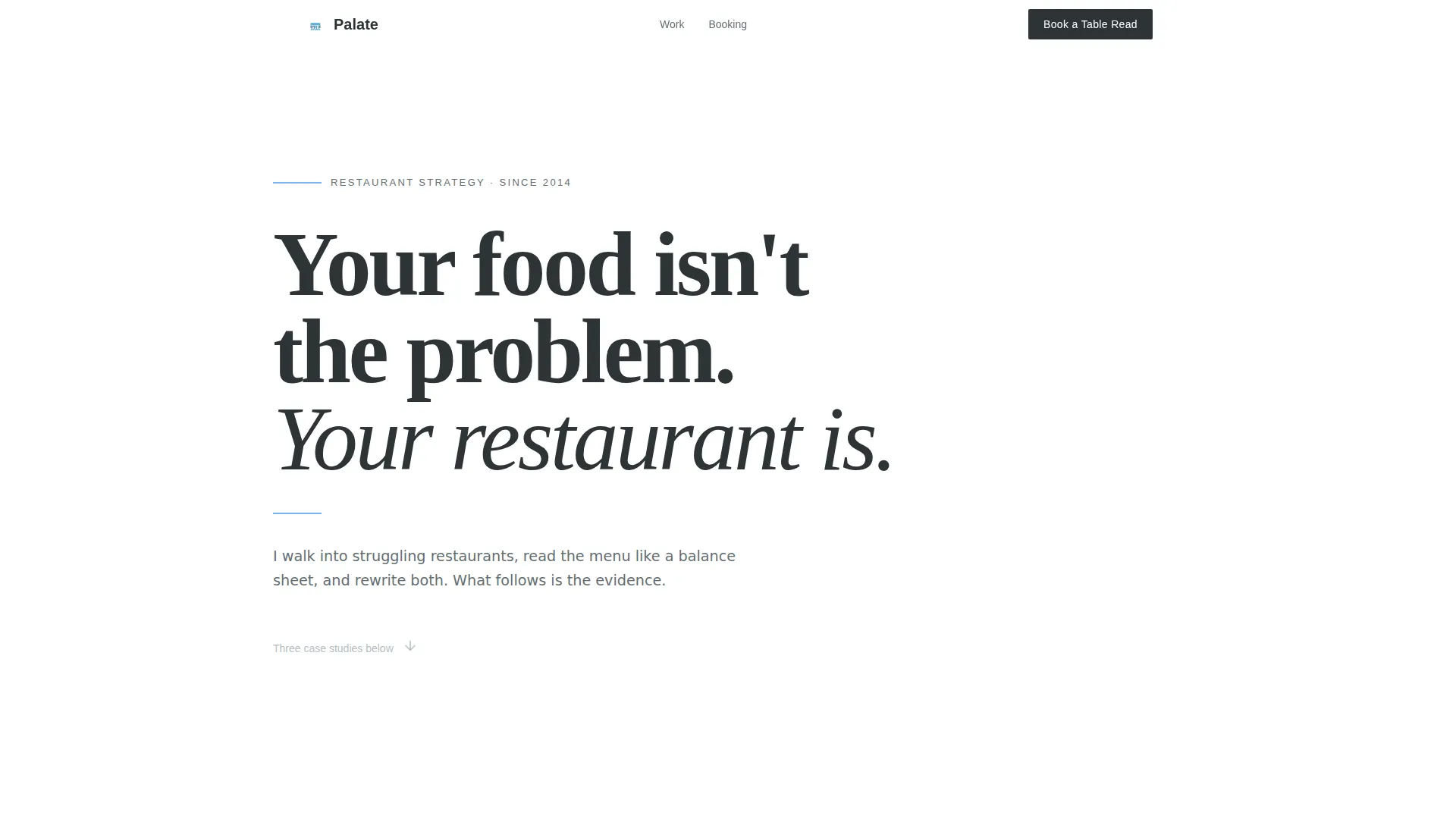
The header opens with one oversized editorial line set in a sharp serif typeface. It sits on a clean white field with a thin sky-blue rule beneath it. No image, no animation, just a sentence designed to stop the scroll.
Before-and-After Comparison Tables
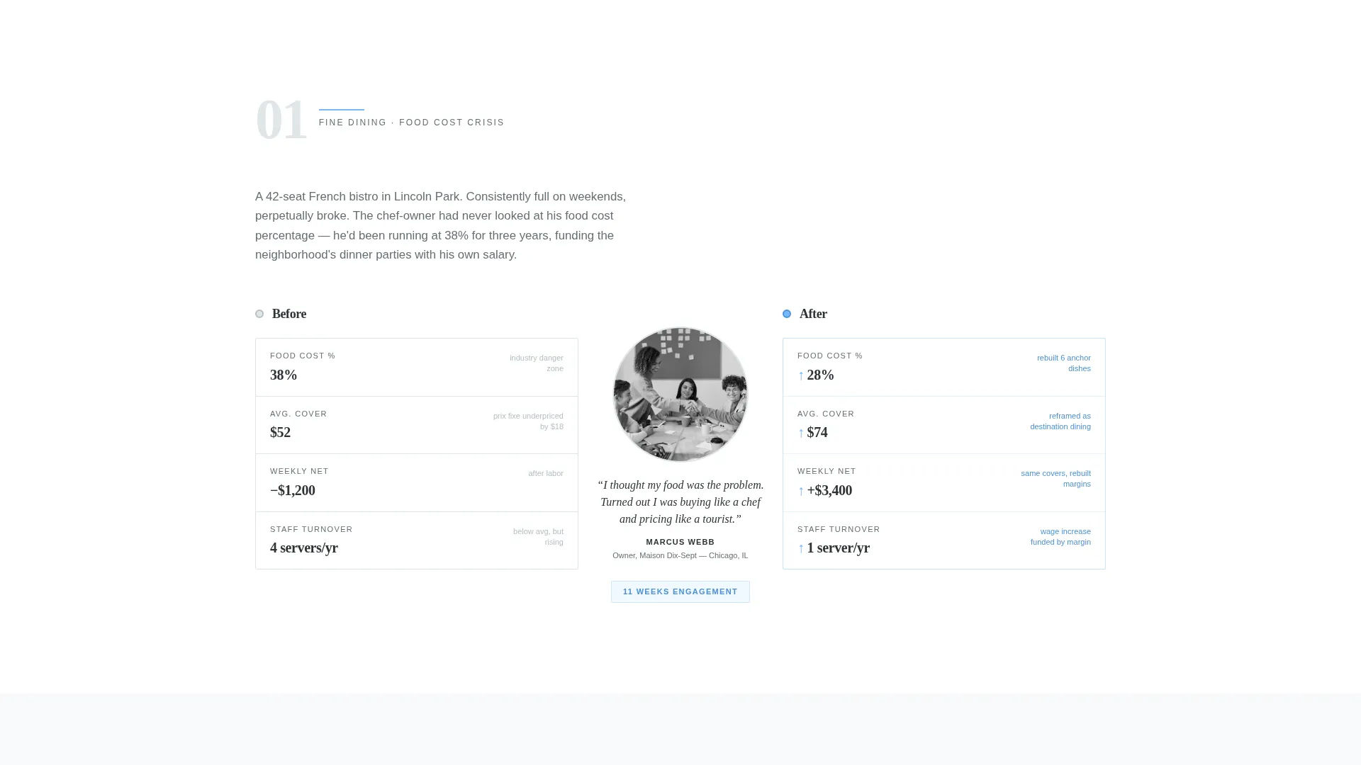
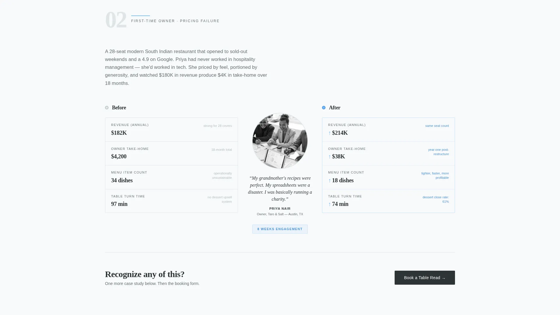
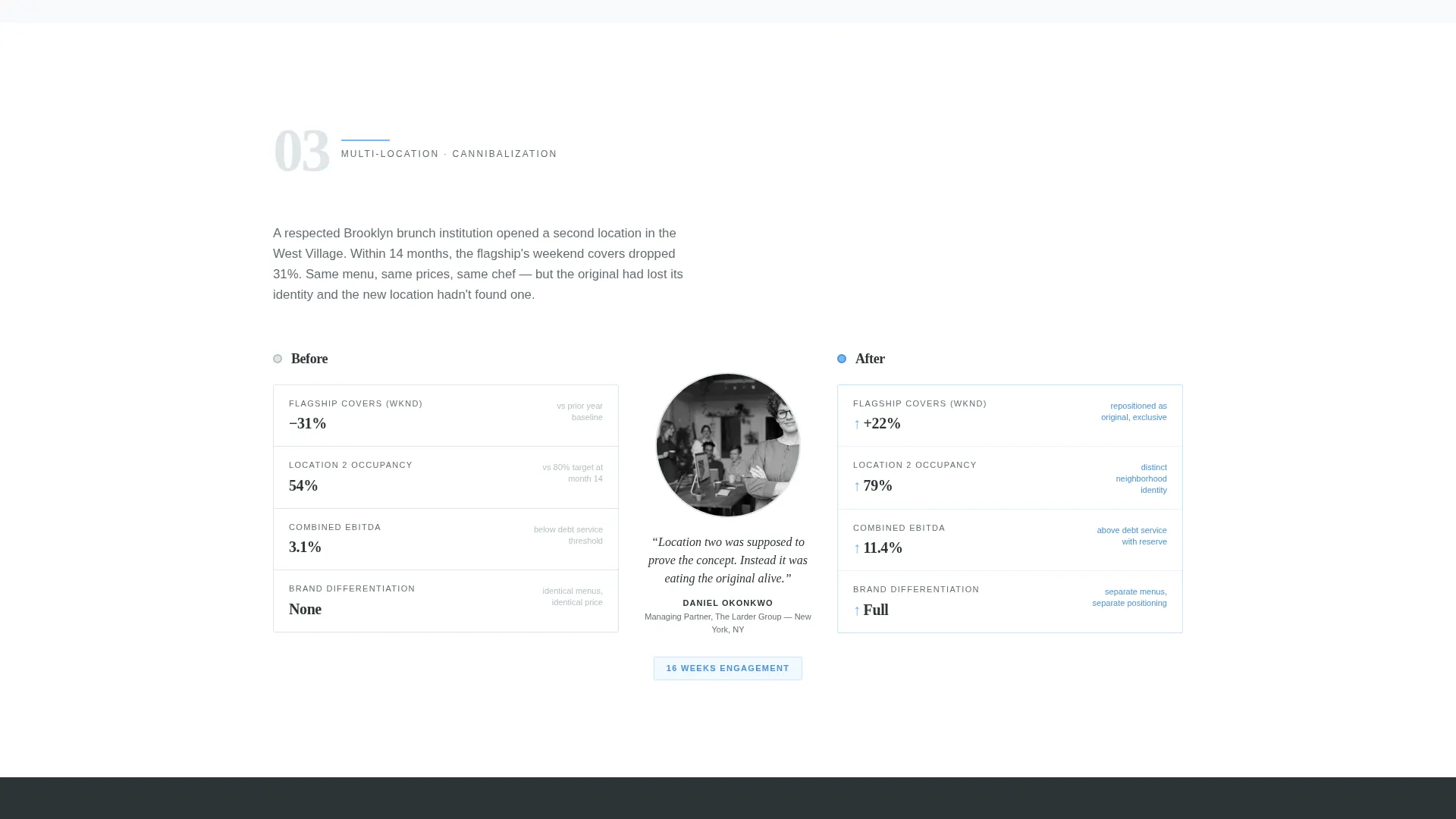
Each case study section uses a two-column table layout. The left column shows the before metrics, average cover count, food cost percentage, staff turnover rate, and Yelp rating. The right column shows the after. A portrait and one-sentence owner quote sit between the two columns, grounding the data in a real person's experience.
"Book a Table Read" Scheduling Form
The primary call to action appears after the third case study and again in the footer. The form collects the restaurant name, current weekly cover count, and one open-ended field asking what is keeping the visitor up at night, keeping the ask specific and honest.
Menu Audit Checklist Lead Capture
A secondary conversion path offers a free downloadable menu audit checklist in exchange for an email address. This catches visitors who are not yet ready to schedule a call but are ready to engage with the consultant's thinking.
Editorial Magazine Visual Layout
The page is structured to feel like flipping through a feature spread in a serious food publication. Each comparison table section functions as its own magazine spread, with the evidence accumulating naturally as the visitor scrolls.
Page sections overview
| Section | Purpose |
|---|---|
| Manifesto Header | Opens with a single bold editorial statement that frames the consultant's positioning |
| Case Study One | First before-and-after comparison table with owner portrait and quote |
| Case Study Two | Second restaurant engagement profiled with key performance metrics |
| Primary call to action Block | "Book a Table Read" form placed after the third case study |
| Case Study Three | Third turnaround profile completing the evidence sequence |
| Checklist Lead Capture | Secondary opt-in offering the free menu audit checklist |
| Footer call to action | Repeated booking form anchor closing the page |
Design & branding system
The visual identity follows an editorial magazine direction built on a four-color Slate and Sky palette. The result feels like a serious food journal left open on a zinc bar top: ink-heavy and confident, with enough open space to make every element feel deliberate.
- Deep editorial charcoal (#2D3436) anchors headlines and table borders; weathered slate (#636E72) carries body text; open-sky blue (#74B9FF) marks interactive states and key metric callouts; cloud white (#DFE6E9) provides the generous margins that give the layout room to breathe
- Typography centers on a sharp editorial serif for headlines, creating the confident, unhurried tone the manifesto header demands
- The overall aesthetic avoids decoration, no background images, no gradients, no animation, keeping reader attention fixed on the data and the copy
Mobile & speed optimization
The comparison table layout is structured to restack cleanly on smaller screens. Before-and-after columns shift to a vertical sequence so the data reads in order without horizontal scrolling.
- The owner portrait and quote remain visible between the two metric columns on mobile, preserving the human context for each case study
- The booking form and checklist lead capture are both designed as compact, single-column inputs that work naturally on a phone screen
How this template helps you convert
The page is built around a deliberate evidence sequence. By the time a visitor reaches the primary call to action, they have already seen three complete turnaround stories with real numbers attached.
- The manifesto header creates immediate positioning clarity, the visitor knows within seconds whether this consultant is speaking to their situation, reducing bounce from the wrong audience and increasing engagement from the right one.
- The comparison table structure converts skepticism into curiosity by showing specific before-and-after metrics rather than vague claims, making the booking decision feel lower-risk.
- The two-path conversion design, booking form plus checklist opt-in, means visitors at different readiness levels both have a clear next step, reducing the number of people who leave without taking any action.
Other information about this template
This template is a single-page layout, not a multi-page website. It is purpose-built for one specific conversion goal: getting a restaurant owner to either book a consultation or download the audit checklist.
- The "Book a Table Read" label is a deliberate double meaning, referencing both the scheduling action and the consultant's practice of reading a menu the way a financial analyst reads a balance sheet
- The page works equally well for an independent consultant operating solo and for a small consulting firm that wants to lead with client results rather than team credentials
- The comparison table format is flexible enough to accommodate more or fewer case study sections depending on how many completed engagements the consultant wants to feature
- The free menu audit checklist functions as a standalone lead magnet, giving the consultant a second list of warm contacts separate from direct booking inquiries
Theme
Legal Shield
Creative direction
Logo Wall Authority
Color system
Cloud Canvas
Style
Comparison Table
Direction
Booking/Scheduling
Page Sections
Manifesto Header with Editorial Serif
Before-and-after Comparison Tables
"book a Table Read" Scheduling Form
Menu Audit Checklist Lead Capture
Scrolling Case Study Magazine Layout
Related questions
Can I add more than three case study sections to the page?
What does the booking form ask visitors to fill in?
How does the menu audit checklist lead capture work?
Is this template a good fit for consultants who work with multi-location restaurant groups?
Does the template work for a consultant who is just starting to build a client portfolio?



