Color Analyst Blog Website Template
Drape is a split-screen landing page template built for color analysts who want to present their service area and location with quiet authority. It pairs an interactive map header with a transparent, step-by-step session walkthrough, a seasonal palette gallery, and a gated self-assessment lead capture, all styled in a warm, editorial Cloud Canvas palette.
by Rocket studio
Quick summary
Drape is a single-page template designed for color analysts offering in-person consultations. The 50/50 split-screen layout opens with a data-driven map header, then guides visitors through the session process, a seasonal palette gallery, and two well-timed calls to action, earning trust before asking for a booking.
Who this template is for
This template is built for independent color analysts and image consultants who need a credible, location-specific landing page. It suits practitioners working in smaller cities as well as those looking to grow a client list in a defined service radius.
- Color analysts promoting in-person draping sessions in a specific region
- Image consultants adding color analysis as a sub-practice
- Analysts targeting women in their thirties and forties, as well as brides planning a wedding palette
What problem this template solves
Most service providers lose potential clients before they can explain what a color analysis session actually involves. Visitors arrive curious but skeptical, unsure what they will experience, what to bring, or what they will leave with. This template solves that trust gap directly.
- It shows the full session process before asking for a booking, removing hesitation
- It captures interested visitors who are not yet ready to book via a gated self-assessment lead magnet
- It communicates service area and proximity clearly, so local searchers can immediately confirm the analyst is within reach
What you get with this template
The template delivers a fully designed, single-page layout ready to be adapted for any color analyst's service area. Every section has a defined role in moving the visitor from curious to confident.
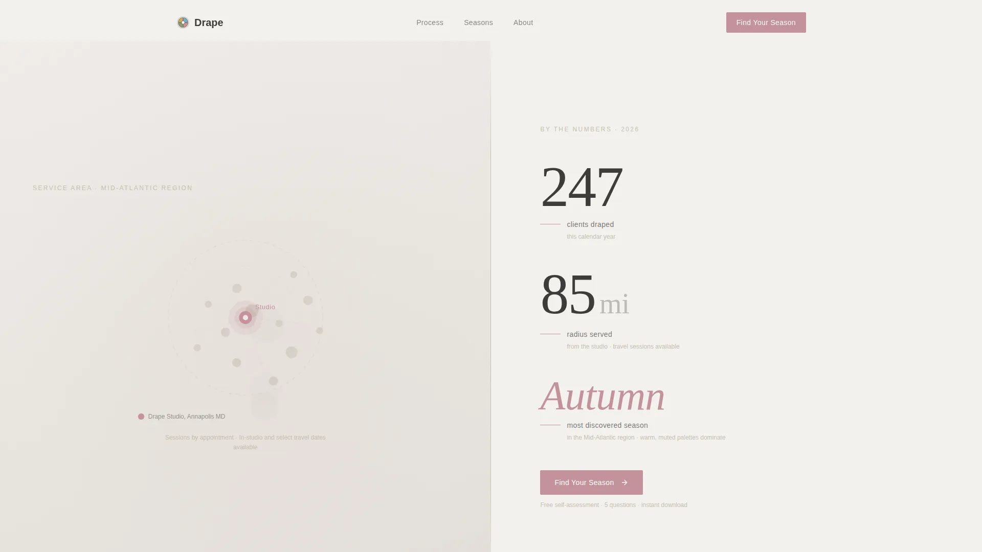
- A data storytelling header with a service area map, a warm rose studio pin, and three editorial data points in large typography
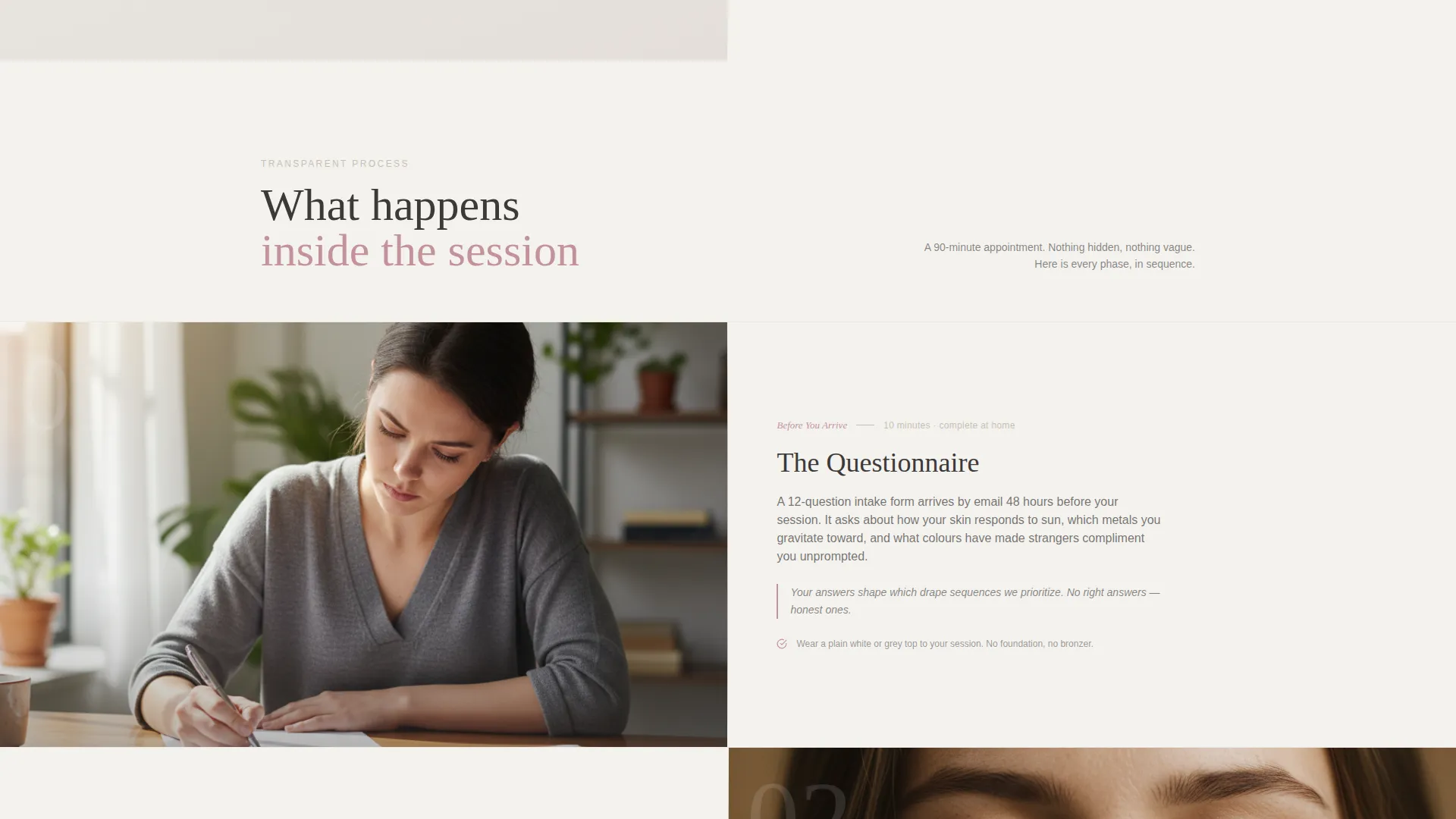
- A scroll-driven, step-by-step session walkthrough with alternating left-right splits and smooth slide transitions
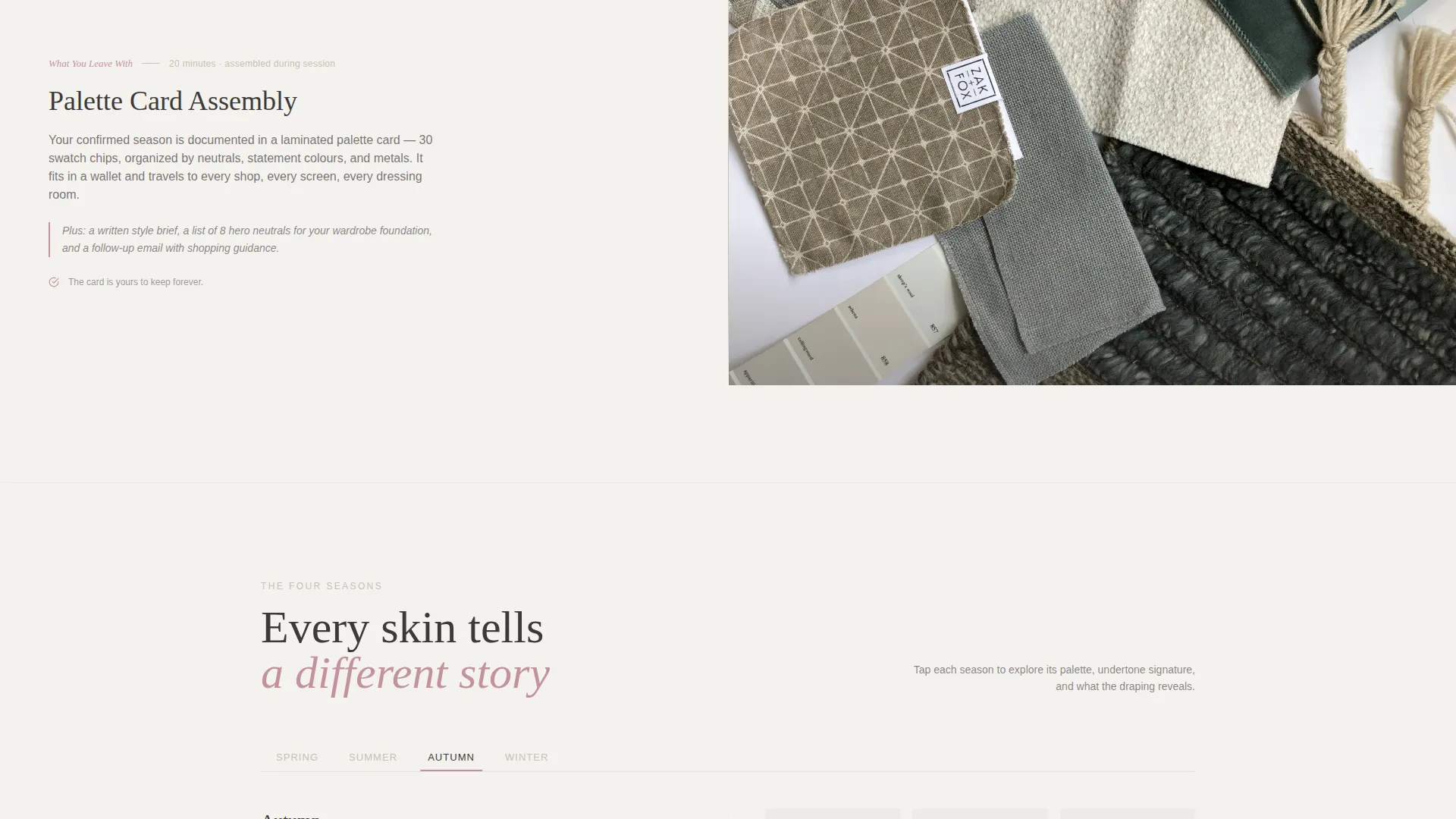
- A seasonal palette gallery where visitors can tap Spring, Summer, Autumn, or Winter to reveal swatch fans and example transformations
- A gated "Find Your Season" lead capture form collecting first name and email in exchange for a downloadable self-assessment PDF
- A secondary "Book a Draping" call-to-action placed strategically after the full process walkthrough
Feature list
This section covers the five core capabilities built into the Drape template.
Data Storytelling Map Header
The opening split screen places an elegant service area map on the left panel. Location dots pulse gently across the region, and the analyst's studio is marked with a warm rose pin at center. The right panel displays three editorial data points, clients draped this year, radius served in miles, and the most commonly discovered season locally, rendered in large, magazine-style typography.
Transparent Process Walkthrough
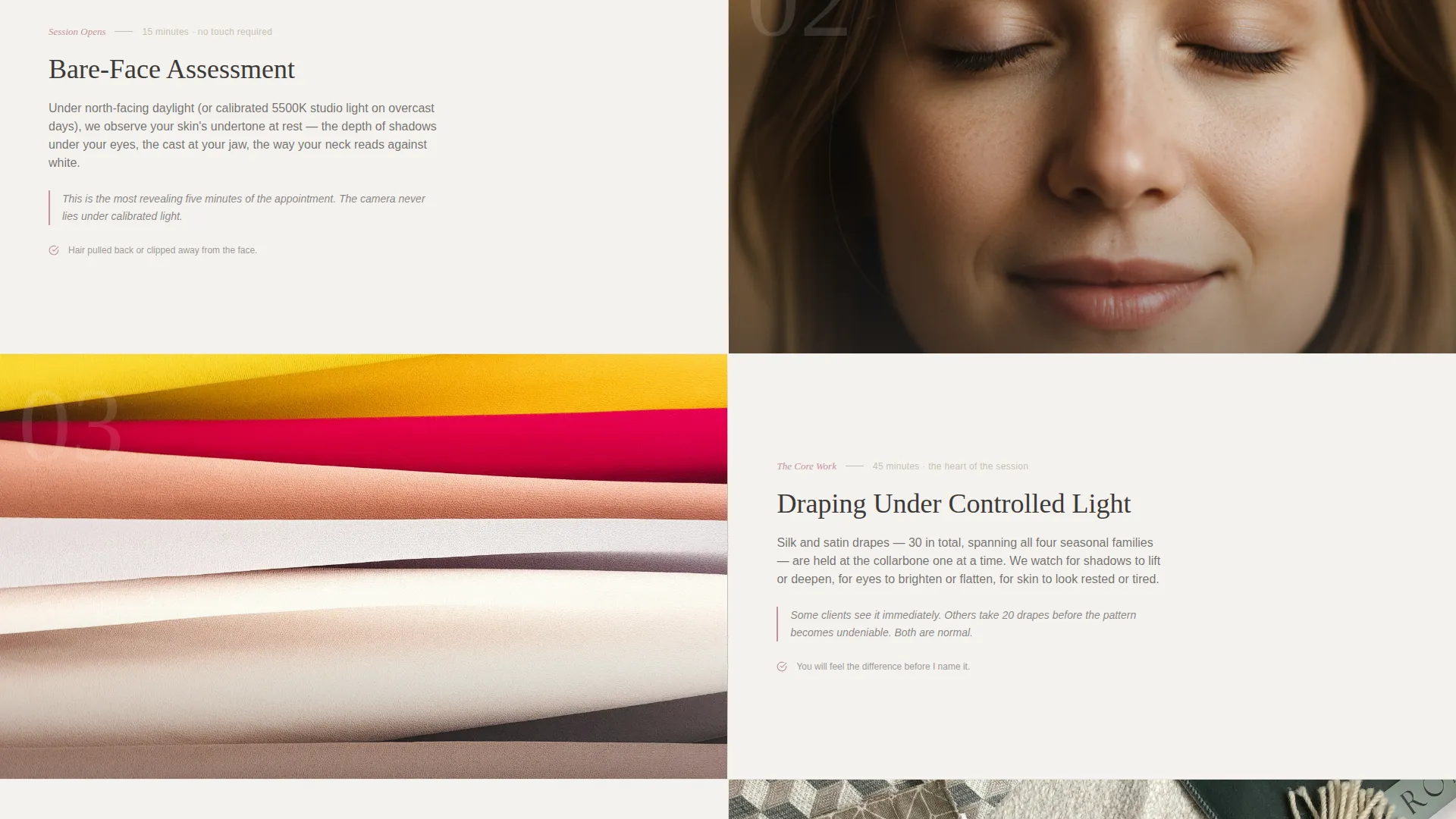
Scrolling past the header reveals a step-by-step account of the draping session. Each step pairs a close-cropped visual of the phase, questionnaire, bare-face assessment, draping under controlled light, palette card assembly, with a plain-language explanation on the opposite panel. Timing, what to wear, and what the client will leave with are all stated clearly, building confidence with every scroll.
Seasonal Palette Gallery
Midway through the page, the split layout inverts. The left panel becomes an interactive seasonal palette gallery. Visitors can tap Spring, Summer, Autumn, or Winter to view real swatch fans and example client color transformations, turning a passive scroll into an engaging, personally relevant experience.
Gated Lead Capture Form
The primary call to action, "Find Your Season," connects to a downloadable self-assessment PDF. The PDF asks five undertone questions with photo references. Access is gated behind a short form collecting the visitor's first name and email address, creating a low-commitment entry point for visitors who are not yet ready to book.
Strategically Timed Booking Button
The secondary call to action, "Book a Draping," does not appear at the top of the page. It is placed only after the full process walkthrough, at the precise moment the visitor understands the session, the deliverable, and the analyst's approach. This sequencing respects the visitor's decision-making process.
Page sections overview
| Section | Purpose |
|---|---|
| Split Map Header | Establish location, service area, and credibility through data |
| Editorial Data Points | Display clients served, radius, and regional season at a glance |
| Process Walkthrough | Guide visitors step by step through a real draping session |
| Palette Gallery | Let visitors explore seasonal swatches and client examples interactively |
| Lead Capture Form | Gate the self-assessment PDF behind a first-name and email field |
| Booking Call to Action | Present the booking prompt after trust has been fully established |
Design & branding system
The template uses a Cloud Canvas color system built around four carefully chosen tones. The palette is warm enough to feel welcoming while staying neutral enough that every swatch, skin tone, and seasonal example reads clearly against it.
- Base tones: soft overcast white (#F4F2EF) and warm greige (#C7BFB2) form the background layers, evoking a north-facing photographer's studio
- Text and structure: muted charcoal (#3D3A38) handles all body copy, headings, and map geography for clear contrast without harshness
- Accent: dusty rose (#C4929B) is used exclusively for buttons, map pins, and hover states, keeping the accent meaningful and visually precise
Mobile & speed optimization
The split-screen layout is structured to adapt gracefully to smaller screens, stacking the 50/50 panels vertically so each section remains readable and purposeful on a phone or tablet.
- Panel stacking ensures map, data points, process steps, and palette gallery all read clearly at mobile widths
- Scroll-driven step transitions are designed to feel smooth and intentional without adding unnecessary load weight
- The lead capture form is kept minimal, first name and email only, so it functions cleanly on any screen size
How this template helps you convert
Drape is built around a content-first conversion sequence. Every design decision prioritizes visitor education before visitor action, which is why the layout earns clicks rather than demanding them.
- The map header immediately answers the first question every local visitor has: "Is this analyst near me?" Proximity and credibility are established before a single word of service copy is read.
- The process walkthrough removes the single biggest barrier to booking a color analysis session, which is not knowing what it involves. By the time the "Book a Draping" button appears, the visitor already knows the light temperature used, the number of drapes tested, and the exact palette card they will take home.
- The gated self-assessment PDF captures visitors who are interested but not yet ready to commit, giving the analyst a permission-based way to continue the conversation after the visit.
Other information about this template
This template is categorized under Professional Services, specifically within the Color Analyst Online Presence subcategory. It is purpose-built for the Color Analyst Service Area and Location Page niche, with a Service Utility theme and a Content/Resource landing-page direction.
- The template style is Split Screen (50/50), following a Transparent Process creative direction and a Data Storytelling header concept
- The Cloud Canvas color system was chosen specifically to avoid visual competition with the seasonal swatches and skin-tone references that are central to a color analysis service
- No stock photography is used in the map header section; the data points and geography serve as the visual, consistent with an editorial infographic aesthetic
- The template is designed for a single-page, section-led flow and is categorized as a landing page, not a multi-page website
Theme
Service Utility
Creative direction
Transparent Process
Color system
Cloud Canvas
Style
Split Screen (50/50)
Direction
Content/Resource
Page Sections
Data Storytelling Map Header
Scroll-driven Process Walkthrough
Interactive Seasonal Palette Gallery
Gated Self-assessment Lead Capture
Strategically Timed Booking Prompt
Cloud Canvas Color System
Related questions
What kind of business is this template designed for?
Can I customize the map, data points, and service area details?
Do I need to create the self-assessment PDF separately?
How does the split-screen layout work on mobile devices?
Is this template suitable for covering multiple service locations?



