Interior Design Studio Professional Website Template
Palette is a color consulting landing page template built for professionals who diagnose rooms with precision. It opens with a stats-first authority wall, guides visitors through interactive color exploration sections, and closes with a focused lead generation form. The design uses deep navy, muted sage, and warm linen to mirror the calm confidence of a skilled color consultant.
by Rocket studio
Quick summary
Palette is a single-page color consulting landing page template designed to turn curious visitors into booked clients. It leads with hard statistics, walks users through an interactive color diagnosis journey, and ends with a clear call to action. Every section builds trust through expertise before asking for anything in return.
Who this template is for
This template was built for color consulting professionals who need a page that earns credibility fast. It suits practices that work with residential and commercial clients across renovation, staging, and design sign-off projects.
- Independent color consultants serving homeowners mid-renovation
- Interior designers offering color scheme validation to other design professionals
- Real estate stagers who use color strategy to increase property value before listing
What problem this template solves
Most service pages for consultants lead with a portfolio or a generic hero image. That approach fails with color consulting because it skips the "why." Visitors arrive skeptical, not yet convinced they need professional help. This template flips the script by opening with data and then proving its point through interaction.
- Visitors see statistical proof of the cost of guessing before they see a single sales message
- Each interactive section teaches the visitor something real about color, building trust organically
- By the time visitors reach the form, they feel they have already started the consultation
What you get with this template
You get a fully structured, single-page layout with a logical persuasion flow built in from the first section to the last. The page handles both primary and secondary conversion paths without feeling cluttered.
- A stats-first header section with navy background and large serif typography
- Three interactive mid-page sections covering room orientation, style mood, and before-and-after comparisons
- A dual conversion layer including a lead form and a gated downloadable guide
Feature list
This template includes purpose-built sections and interaction patterns drawn directly from the color consulting brief. Each feature serves a specific role in the visitor journey.
Stats-First Authority Header
The page opens against a deep navy background with three key statistics displayed in large, airy serif type. Sage underlines animate in as the eye travels down the page. There is no stock photography here, only the weight of evidence on a dark field.
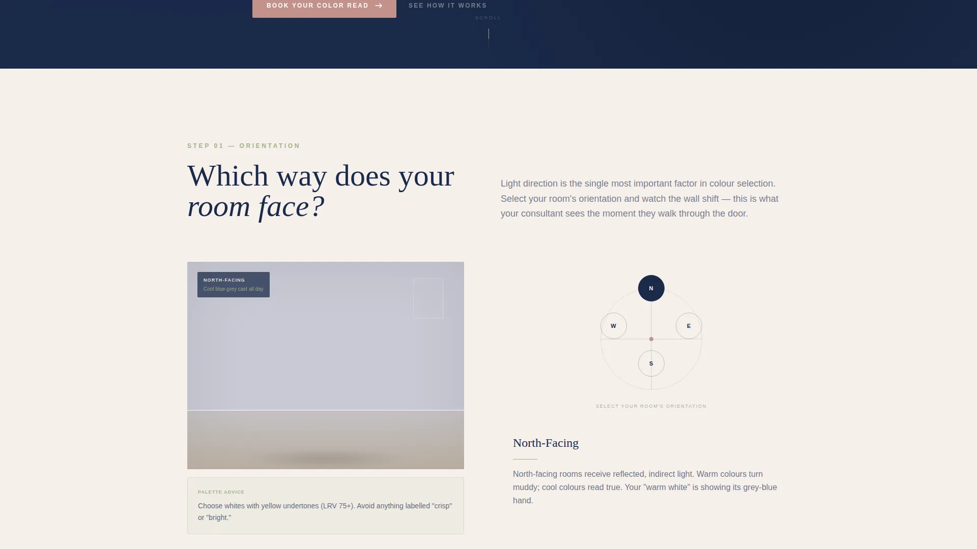
Room Orientation Color Selector
Visitors click a compass-style selector to choose north, south, east, or west room orientation. The sample wall panel shifts undertone in real time to reflect how natural light direction affects color perception. This section teaches the core principle that color is physics, not preference.
Style Mood Palette Slider
A horizontal slider lets visitors move between "Collected" and "Contemporary" style modes. As the slider moves, a palette preview adjusts to reflect the shift in aesthetic direction. The interaction makes abstract style language feel tangible and specific.
Before-and-After Room Reveal
This section presents room transformation images in a hover-reveal format. Hovering over an image reveals the consulted version of the space. The contrast demonstrates the visible impact of professional color guidance without requiring any explanation.
Dual Conversion Form
The primary lead form asks three deliberate questions: room type via dropdown, light direction via compass graphic, and a photo upload field. A secondary path offers a free downloadable PDF gated behind an email capture. Both paths appear on the same page without competing for attention.
Sticky Navigation with Primary Call to Action
A persistent navigation bar carries the "Book Your Color Read" button in dusty rose throughout the scroll experience. The button is always visible without interrupting the content flow. This keeps the conversion path accessible at every stage of the journey.
Page sections overview
| Section | Purpose |
|---|---|
| Stats authority header | Opens with credibility through data |
| Sticky navigation bar | Keeps primary call to action accessible |
| Room orientation selector | Teaches light and undertone interactively |
| Style mood slider | Helps visitors identify their palette direction |
| Before and after reveal | Shows real transformation through hover interaction |
| Primary lead form | Captures room type, light direction, and photo |
| Downloadable guide gate | Collects emails via secondary conversion path |
Design & branding system
The visual identity follows a Pastoral Calm theme expressed through a Navy Authority color system. The palette feels like a well-edited country house library: serious and considered, with one warm accent catching the eye.
- Deep commanding navy (#1B2A4A) anchors the header and high-contrast sections as the primary background color
- Muted sage (#A3B18A) and warm linen white (#F5F0EB) alternate across mid-page sections to create breathing space
- Dusty rose (#C2918A) is reserved exclusively for buttons, interactive highlights, and calls to action
Mobile & speed optimization
The zigzag alternating layout is structured to translate cleanly to narrower viewports. Interactive elements are designed with touch input in mind so the consultation journey works as intended on mobile devices.
- Alternating section backgrounds maintain visual rhythm without relying on side-by-side columns
- The sticky navigation button remains accessible at the top of the screen on mobile throughout the scroll
- The compass graphic and room orientation selector are built to respond to tap interactions on touch screens
How this template helps you convert
The page is structured as a persuasion sequence, not a brochure. Each stage of the scroll moves the visitor one step closer to booking without feeling like a sales push.
- The stats header establishes authority before any service description appears, so visitors arrive at the copy already primed to trust the practice
- The interactive color diagnosis sections create a sense of participation, making visitors feel they have already begun working with the consultant before they submit the form
- The dual conversion layer captures both high-intent visitors ready to book and lower-intent visitors who want to learn first, maximizing the return from every page visit
Other information about this template
Palette is suited to color consulting practices at any stage, from a solo consultant launching their first professional web presence to an established studio refreshing an outdated page. The template structure supports the full client acquisition funnel within a single scrollable page.
- The downloadable PDF path ("The Undertone Guide: Why Your White Looks Pink") provides a low-friction entry point for visitors who are not yet ready to book
- The room type dropdown covers living room, bedroom, kitchen, and whole home consultation scopes
- The template is designed for the Real Estate and Property category with a focus on the Interior Design Studio subcategory
- It is well suited to practices that serve renovation clients, design professionals seeking peer sign-off, and stagers preparing properties for sale


Theme
Luxe Minimal
Creative direction
Stats-First Impact
Color system
Charcoal & Amber
Style
Gallery + Detail
Direction
Direct Sales
Page Sections
Stats-first Authority Header
Room Orientation Color Selector
Style Mood Palette Slider
Before-and-after Hover Reveal
Dual Conversion Layer
Sticky Call-to-action Navigation
Related questions
Who is this landing page template designed for?
What interactive elements are included in the template?
Does the template include a lead capture form?
Can I use this template if I offer whole-home consultations?
What makes this template different from a standard interior design page?


