Bold Freemium Design Marketplace Landing Page Template
Palette is a bold freemium design marketplace landing page template built around a side-by-side comparison table. It serves freelance creators, Etsy sellers, and startup designers who need a clean, conversion-focused page that proves the value of a free tier before asking for anything. No credit card. No long forms. Just honest, abundant design.
by Rocket studio
Quick summary
Palette is a single-page landing page template designed for design and creative marketplaces running a freemium model. It leads with a giant animated headline, walks visitors through a scroll-triggered stats cascade, and anchors the page around a three-column comparison table. The free tier speaks for itself. The page earns the signup before it asks for one.
Who this template is for
This landing page template is built for creators and marketplace operators who sell design assets directly to buyers. It fits anyone who needs to communicate a freemium offer clearly and convert visitors without a hard sell.
- Freelance parents and Etsy sellers who need a professional product landing page that loads fast on a phone
- In-house startup designers stretching a tight monthly creative budget across digital products and asset packs
- Marketplace founders and independent creators who want to build landing pages that prove free-tier value upfront
What problem this template solves
Most product landing pages for design marketplaces bury the free offer or make it look like a teaser. Visitors land, feel uncertain about what they actually get, and leave. This page template solves that by putting the evidence first and the ask second.
- New visitors often distrust freemium offers because the free tier looks limited or misleading on the landing page
- A good landing page for a design marketplace needs to show the product before requesting an email, not after
- Comparison tables often feel cold or corporate; this template makes the Free versus Studio versus Family layout feel warm, skimmable, and genuinely useful
What you get with this template
You get a fully structured, single page layout with every section you need to launch a freemium design marketplace landing page. The template covers the hero, the stats proof, the comparison table, the free asset grid, and the social proof row, all in one clean design.
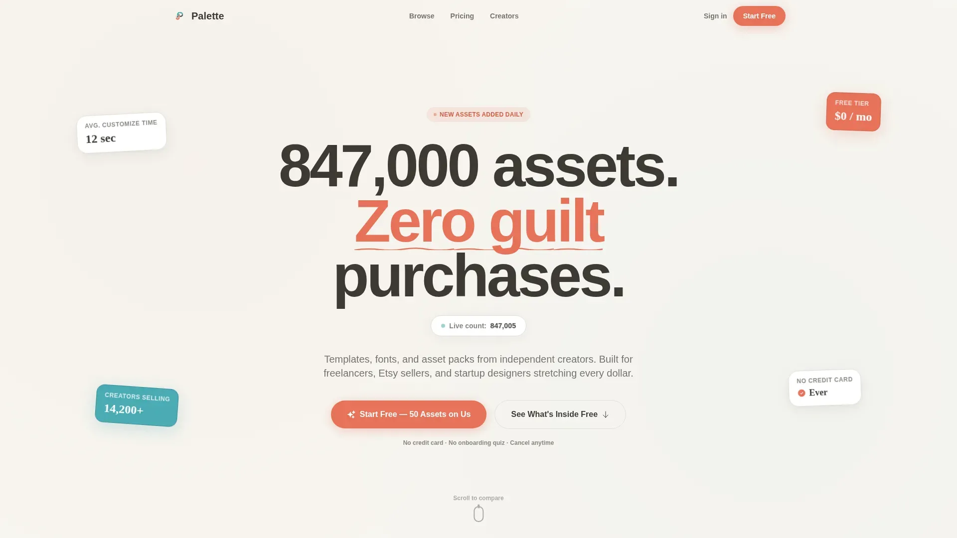
- A hero section with an oversized bold headline and a real-time animated asset counter that builds immediate visual impact
- A three-column comparison table with coral and teal checkmarks, a pinned call to action, and row-level capability labels rather than vague feature names
- A live-filterable free asset grid showing all fifty included assets so visitors can browse before they commit
Feature list
This page template includes a focused set of built-in components designed to increase conversions for freemium creative marketplaces. Each feature below is grounded in the sections described in the source brief.
Animated Hero Headline with Real-Time Counter
The hero opens with a giant centered bold headline set in a rounded sans-serif typeface at viewport-filling scale. Oversized typography like this serves as a visual anchor that communicates brand confidence immediately. Below the headline, a micro-animation counts upward in real time as new assets are added to the marketplace, giving new visitors a live proof point the moment they land on the page.
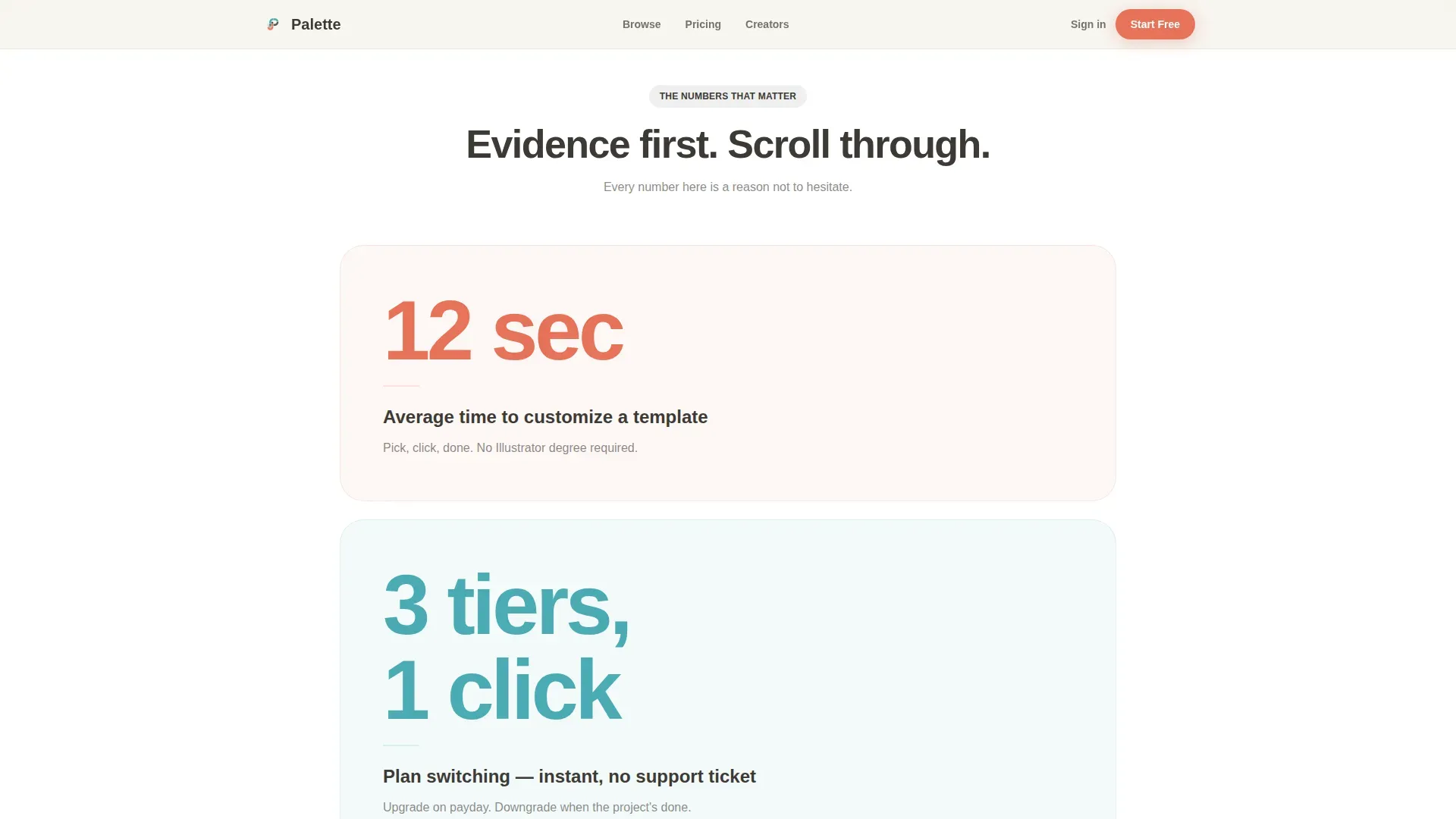
Scroll-Triggered Stats Cascade
Three isolated bold numbers appear as visitors scroll: twelve seconds to customize a template, three tiers and one click to switch plans, and zero dollars for fifty assets per month. Each stat is a standalone evidence card. This layout keeps compelling copy brief and specific, removes the need for long product descriptions, and guides the visitor's eye naturally toward the comparison table below.
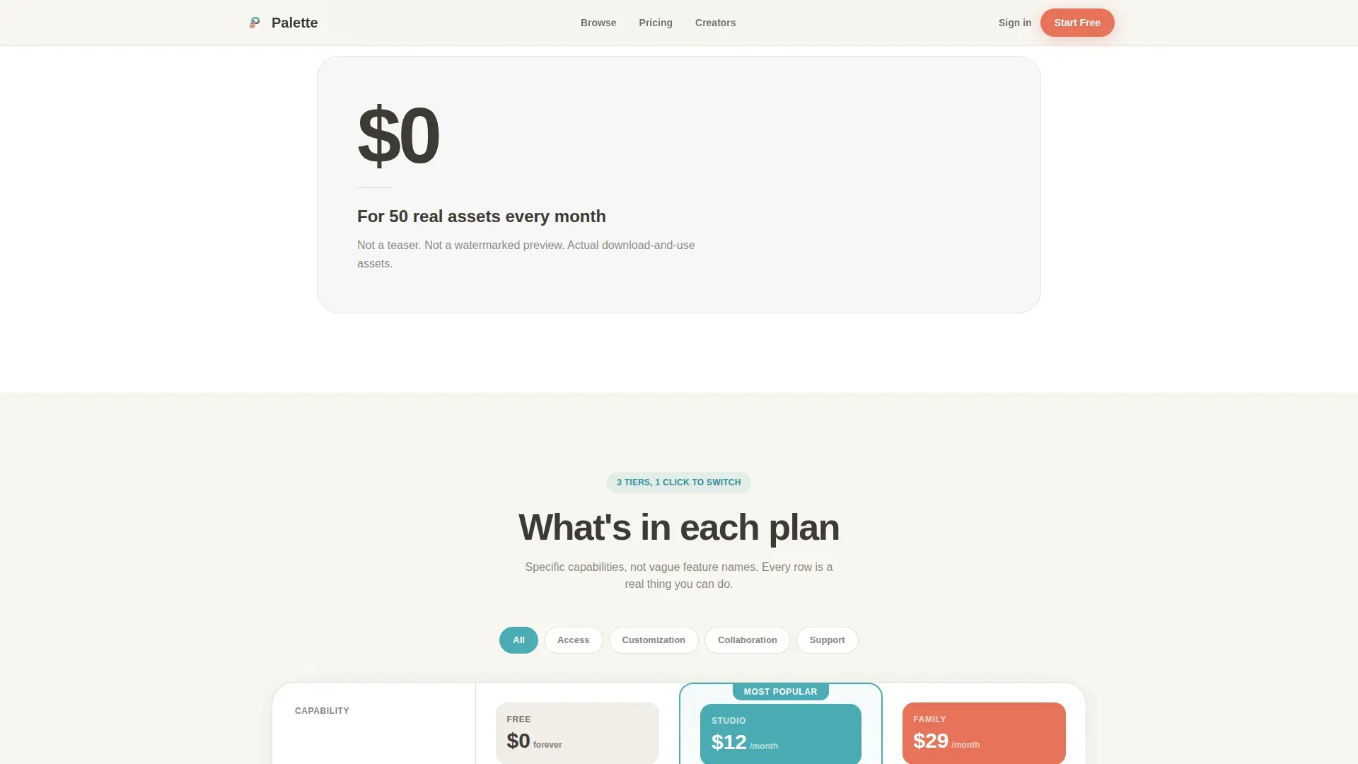
Three-Column Freemium Comparison Table
The comparison table is the heart of this landing page design. Free, Studio, and Family tiers sit side by side with coral checkmarks for included features and teal highlights for the active column. Every row names a specific capability rather than a vague label. A pinned call to action reading "Start Free, 50 Assets on Us" sits below the table, and a floating sticky bar with the same message appears after sixty percent scroll. Action-oriented calls to action like these clearly differentiate between free and paid options, which is one of the key product features for any freemium landing page.
Live-Filterable Free Asset Grid
A secondary path below the comparison table displays all fifty free-tier assets in a live-filterable grid. Visitors can browse by category using filter tabs before they ever touch the signup form. Showing the free product directly on the page builds trust more effectively than any amount of compelling copy alone. Including a free trial or demo option like this is one of the essential elements of a high converting product landing page.
Persona-Matched Social Proof Row
Three testimonials appear above the sticky call to action bar, each matched to a specific buyer persona: an Etsy seller, a startup designer, and a freelance parent. Visual trust signals like real testimonials and user stats build credibility in ways that product descriptions alone cannot. Social proof placed this way helps build trust at the exact moment a visitor is deciding whether to sign up.
Floating Sticky Call to Action Bar
After sixty percent scroll, a sticky bar slides into view with the primary freemium offer. It contains a single-field email signup form, no credit card required, no onboarding quiz. This converts visitors who are convinced but need one more nudge. The bar is dismissed easily and never blocks content, keeping the experience clean rather than pushy.
Page sections overview
| Section | Purpose |
|---|---|
| Hero Headline | Viewport-filling bold headline with animated asset counter and primary call to action |
| Stats Cascade | Scroll-triggered isolated numbers proving speed, simplicity, and free-tier value |
| Comparison Table | Free versus Studio versus Family columns with row-level capabilities and pinned call to action |
| Free Asset Grid | Live-filterable fifty-asset grid letting visitors browse before signing up |
| Social Proof Row | Persona-matched testimonials building credibility above the sticky bar |
| Floating call to action Bar | Single-field email signup bar revealed at sixty percent scroll |
| Footer | Linear single-row footer with minimal links |
Design & branding system
The color scheme follows a Cloud Canvas system built on four intentional colors. Choosing the best color combinations for a landing page design is a strategic move that shapes perception and directly impacts conversion rates. This template applies the 60-30-10 color rule: warm white dominates backgrounds at roughly sixty percent, warm graphite carries body text at thirty percent, and coral and teal share the remaining ten percent for calls to action and interactive states.
- Cumulus white (#F7F5F0) covers all background colors, graphite (#3D3A35) handles all body text, and the high contrast between them keeps reading effortless
- Crayon-box coral (#E8735A) marks every call to action button and price callout; finger-paint teal (#4AABB3) underlines toggled states and active comparison columns
- Typography uses DM Sans bold for all headlines and Manrope for body text, creating a warm sketchbook feel without sacrificing a modern design standard
Mobile & speed optimization
Mobile-first design is central to this template because most creative discovery now happens on mobile devices. The target audience includes freelance parents browsing between school runs and Etsy sellers shopping on their phones. A fully responsive layout ensures the page adapts cleanly across different devices without losing visual hierarchy or interactivity.
- The comparison table, asset grid, and sticky call to action bar are all built to reflow cleanly on small screens without horizontal scrolling
- Client-side components are limited to the animated counter, the filter tabs, and the sticky bar reveal, keeping the rest of the page static and lightweight
- Generous white space is preserved on mobile so the layout never feels cluttered; breathing room is part of the design, not a desktop-only luxury
How this template helps you convert
This landing page template is structured around one conversion goal: a free email signup with no financial risk. Every section removes a reason to hesitate before a visitor reaches the signup form. A well-structured layout that guides the visitor's eye is one of the most reliable ways to improve conversion rates on product landing pages.
- The stats cascade and animated headline build immediate credibility, so new visitors trust the offer before they read a single bullet point or product description
- The comparison table makes the free tier look genuinely useful rather than artificially limited, and the pinned call to action captures visitors the moment they reach the end of the evidence
- The free asset grid and persona-matched social proof combine to convert visitors who need to see the product before they commit, removing the last friction point before the single-field email signup
Other information about this template
This template is part of a broader set of modern landing pages designed for freelance and gig marketplaces. It can also serve digital agencies, online course creators, and small businesses that need a clear freemium or free-landing offer page without building from scratch. The page template is built with easy customization in mind, and the source code is organized so you can swap the color scheme, update the copy, and adjust the layout without breaking the structure.
- The template design supports seasonal promotions through the stats cascade section, which can be updated to highlight time-limited offers or countdown timer elements for product launches
- The color scheme, bright colors, and high contrast ratio follow the 60-30-10 rule and can be adapted to match your brand identity without a full redesign
- The template is fully responsive across different devices and follows a clean design approach that removes navigation bars to keep visitors focused on the primary offer
- This page template supports web design workflows for saas landing pages, product launches, and more landing pages in the same freemium or premium landing category
- The template built here uses a minimalist design approach in the hero and footer while delivering a stylish design overall through the warm sketchbook color palette
- The page is structured to be seo friendly, with a simple design hierarchy that search engines can parse without complex JavaScript blocking the initial page render
- The template can support ai tools for copy generation in the headline and comparison table rows; updating product descriptions and compelling copy in those areas is straightforward
- Template features like the sticky bar and comparison table toggling are good landing page design examples for anyone studying high converting landing pages or building their first product landing page
- Free updates to the template are included, covering adjustments to the layout, background colors, and other features as the design system evolves

Theme
Family First
Creative direction
Stats-First Impact
Color system
Cloud Canvas
Style
Comparison Table
Direction
Freemium/Trial
Page Sections
Animated Hero with Live Asset Counter
Scroll-triggered Stats Evidence Cascade
Three-column Freemium Comparison Table
Live-filterable Free Asset Grid
Persona-matched Social Proof Row
Single-field Floating Call to Action Bar
Related questions
Does this template require coding skills to customize?
Can I use this template for product launches or other campaign types?
Is the comparison table mobile-friendly?
What makes this different from a generic pricing page template?
Can I replace the asset grid with a different product display?


