Interior Color Consulting Landing Page Template
Palette is a single-column landing page template built for interior color consultants. It opens with an editorial manifesto header, moves through a stats-first impact sequence, and guides visitors toward a focused booking form. The design uses a restrained parchment-and-charcoal palette with a terracotta accent, giving the page the quiet authority of a shelter magazine spread.
by Rocket studio
Quick summary
Palette is a single-column landing page template for interior color consulting practices. It pairs an editorial manifesto header with a data-driven persuasion sequence, transformation galleries, and a streamlined booking form. The restrained Cloud Canvas color system and oversized serif typography signal expertise before a single portfolio image appears.
Who this template is for
This template is designed for color consultants who need a page that communicates authority quietly and converts visitors who are already overwhelmed. It suits independent practitioners and boutique specialty consulting practices that work directly with residential and commercial clients.
- Interior color consultants serving renovation-fatigued homeowners and couples staring down dozens of paint swatches
- Real estate stagers who need listings photographed with confidence and consistency
- Boutique hotel owners and commercial clients where the wrong color choice costs real bookings
What problem this template solves
Most color consultants lose potential clients at the very first scroll. Visitors arrive skeptical that a consultation is worth it, so the page has to earn the booking before it asks for one. Palette solves this by leading with industry data, not portfolio imagery.
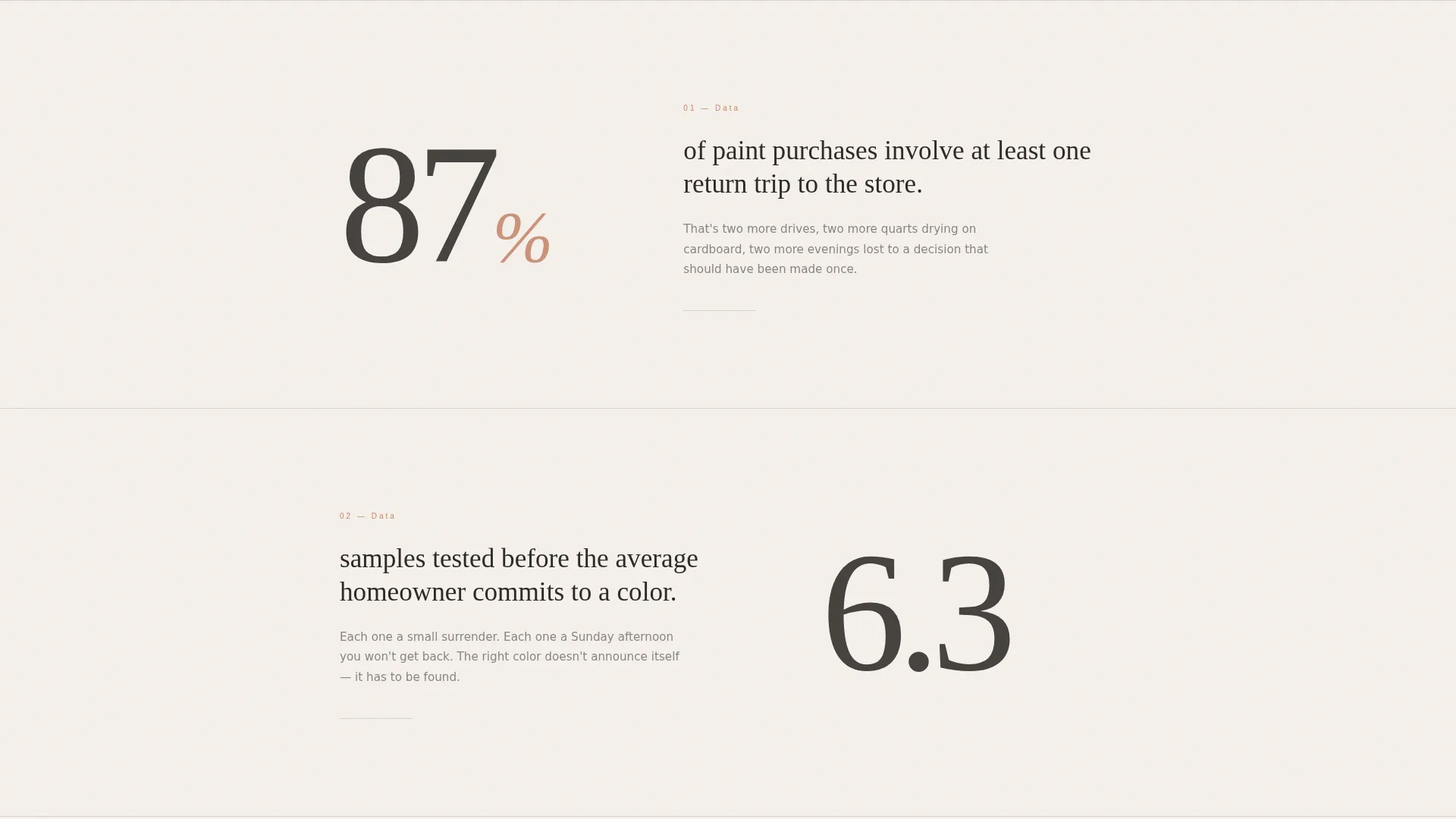
- Visitors see the cost of indecision immediately, through stat-driven sections showing how many paint purchases involve return trips and how many samples the average homeowner tests before committing
- The page sequences trust-building content before the call to action, so the booking form appears only after the data has made the case
- A secondary lead magnet path captures visitors who are not yet ready to book, keeping them in reach for follow-up
What you get with this template
You get a complete, ready-to-customize single-column landing page built around a deliberate editorial structure. Every section has a defined purpose, and the layout moves the visitor through a specific emotional and logical journey from doubt to decision.
- A Quote/Manifesto header, a Stats-First Impact sequence, editorially composed before-and-after transformation galleries, and a focused booking form with a secondary lead magnet option
- A fully defined Cloud Canvas color system with exact hex values, an editorial serif and tracking-wide sans-serif type pairing, and a single muted terracotta accent reserved for buttons and interactive moments
- Two strategically placed calls to action and a three-field booking form covering room type, natural light direction, and preferred consultation date
Feature list
This section covers the core functional and design capabilities built into the Palette template, drawn directly from the brief.
Editorial Manifesto Header
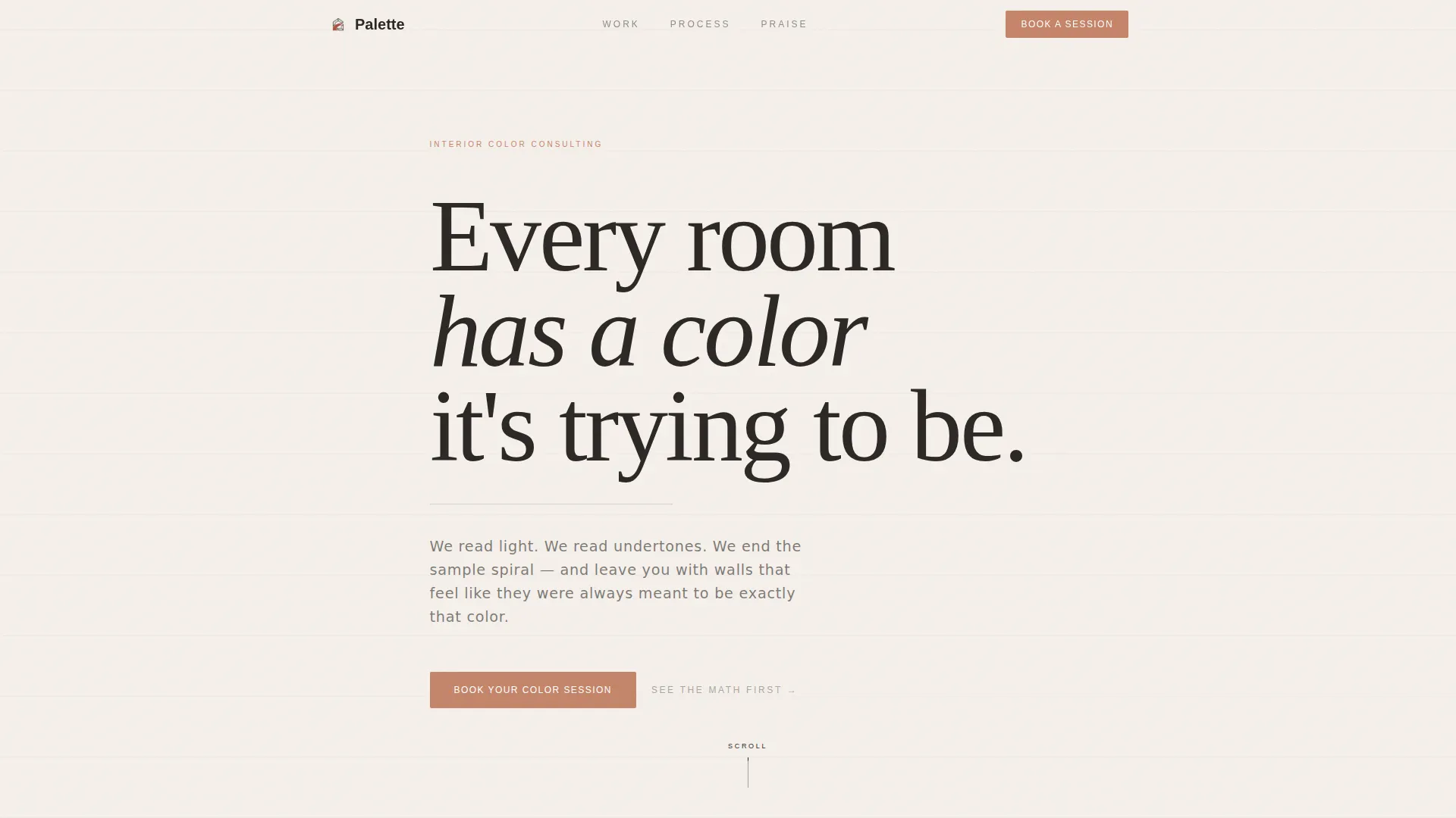
The header opens with an oversized serif quote set against bare parchment white. No hero image, no background photography. The whitespace itself communicates restraint and editorial confidence, signaling expertise to a visitor who is overwhelmed by choices.
Stats-First Impact Sequence
Before any portfolio work appears, the page presents hard industry numbers in full-breath, oversized numeral sections. Each stat occupies its own space and builds a logical case that professional color selection saves time and reduces costly mistakes.
Before-and-After Transformation Gallery
Rooms are shown in editorially composed before-and-after photography. Exact paint codes are typeset alongside each image in a magazine-caption style, combining visual proof with the kind of precise detail that signals real expertise.
Focused Three-Field Booking Form
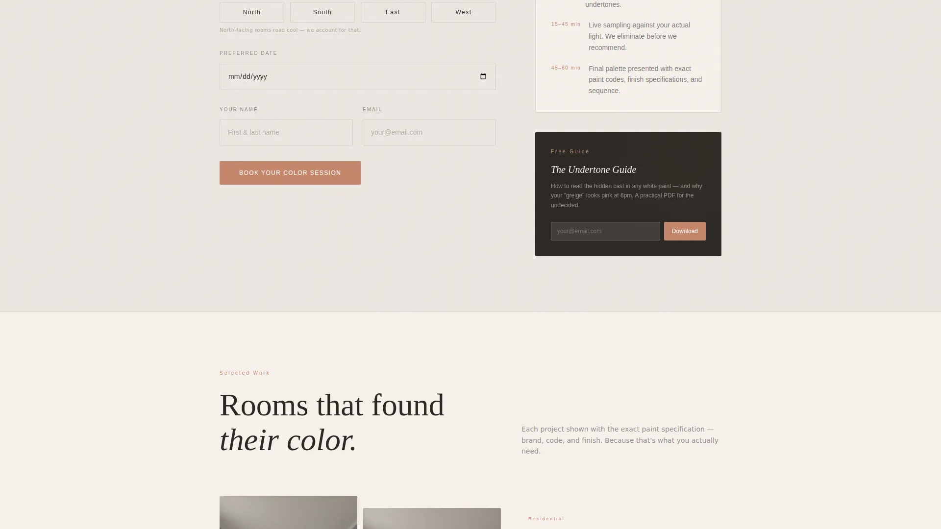
The primary booking form asks only three questions in sequence: room type via dropdown, natural light direction via a simple cardinal selector, and preferred consultation date. The light direction selector alone signals expertise to prospective clients.
Secondary Lead Magnet Path
A secondary conversion path offers a downloadable Undertone Guide as a PDF lead magnet. This captures email addresses from visitors who are not yet ready to commit to a paid consultation, supporting longer-term client nurture.
Dual Call-to-Action Placement
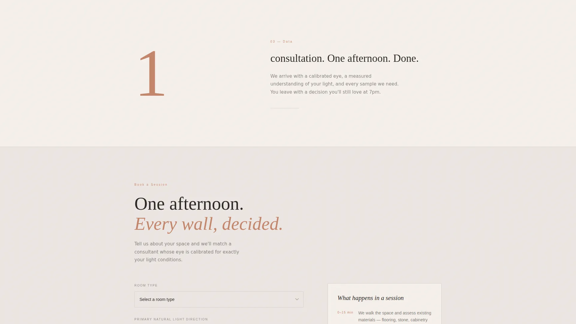
The primary "Book Your Color Session" call to action appears immediately after the stats sequence and again anchored at the page bottom. Repeating the action at both points ensures the booking prompt is always within reach as visitors scroll.
Page sections overview
| Section | Purpose |
|---|---|
| Quote/Manifesto Header | Opens with an oversized editorial serif statement to immediately establish voice and restraint |
| Stats Impact Block | Presents hard industry numbers to frame professional color consulting as a practical, cost-saving decision |
| Primary Booking call to action | First call-to-action placement directly after the stats sequence, when trust is freshest |
| Transformation Gallery | Before-and-after room photography with typeset paint codes to demonstrate real results |
| Three-Field Booking Form | Captures room type, light direction, and date to qualify and convert ready visitors |
| Lead Magnet Offer | Secondary conversion path offering a downloadable Undertone Guide in exchange for an email address |
| Anchored Bottom call to action | Final "Book Your Color Session" prompt to re-engage visitors who have scrolled the full page |
Design & branding system
The template follows an Editorial Magazine theme built on the Cloud Canvas color system. Every color decision is deliberate and restrained, keeping the visitor's attention on the content rather than the interface. The overall feel is described in the brief as linen paper stock with a soft-touch finish.
- Warm parchment white (#F5F0EB) as the primary background, whisper gray (#D6D1CB) for section dividers and pull-quote backgrounds, deep charcoal (#2C2825) for body text, and muted terracotta (#C4856A) reserved exclusively for buttons and interactive elements
- Oversized editorial serif type for the manifesto header and stat numerals, paired with tracking-wide sans-serif for subheadings and caption text
- All decorative restraint is intentional: no hero photography in the header, no competing visual noise, so the portfolio transformation images carry full visual weight when they appear
Mobile & speed optimization
The single-column flow structure of this template is inherently well-suited to mobile viewing. A single-column layout means the reading order and hierarchy translate directly to smaller screens without requiring a separate mobile rearrangement.
- Stat sections using oversized numerals are designed to occupy full-breath space, which reads with impact on mobile screens as well as desktop
- The three-field booking form is compact by design, reducing friction for visitors filling it out on a phone
How this template helps you convert
Palette is structured around a deliberate persuasion sequence. Every section earns the next one, so by the time a visitor reaches the booking form, the decision feels logical rather than pressured.
- The stats sequence reframes professional color consulting as a time-saving, cost-reducing decision rather than a luxury, reducing price resistance before the booking form ever appears.
- The dual call-to-action placement ensures visitors encounter the booking prompt at the moment of peak trust and again at the natural end of the page, capturing both fast deciders and thorough readers.
- The lead magnet provides a low-commitment secondary path, so visitors who are not yet ready to book still leave behind a way to be reached.
Other information about this template
The Palette template is a specialty consulting landing page template suited for color-focused interior design practices of all sizes. It is built as a single-column flow layout, meaning all sections stack vertically in a defined order with no sidebar or multi-column grid complexity.
- The template style is Single Column Flow, the header concept is Quote/Manifesto, the creative direction is Stats-First Impact, and the landing page direction is Booking/Scheduling
- The Cloud Canvas color system and Editorial Magazine theme are paired specifically to evoke the quiet, art-directed quality of shelter and design publications
- The natural light direction selector in the booking form is a small but meaningful detail: it communicates that the consultant understands how light affects color perception, which builds immediate credibility with knowledgeable clients
- This template fits within the Professional Services and Specialty Consulting category and is designed for the interior color consulting niche
Theme
Editorial Magazine
Creative direction
Stats-First Impact
Color system
Cloud Canvas
Style
Single Column Flow
Direction
Booking/Scheduling
Page Sections
Editorial Manifesto Header
Stats-first Impact Sequence
Before-and-after Transformation Gallery
Focused Three-field Booking Form
Secondary Lead Magnet Path
Dual Call-to-action Placement
Related questions
Can I customize the paint codes and gallery images in this template?
What does the booking form collect from visitors?
Is the Undertone Guide PDF included in this template?
Who is this template best suited for?
Can this template work for commercial color consulting, not just residential projects?



