Mediterranean Architecture Professional Website Template
Palimpsest is a full-width immersive landing page template built for Mediterranean heritage conservation consultancies. It uses an Ink and Paper visual identity, a Gallery Walk scroll structure, and a Click-Through conversion path to move serious clients toward a site assessment request. The design feels like a leather-bound field journal, dense with precision and material authority.
by Rocket studio
Quick summary
Palimpsest is a single-page, full-width immersive landing page template designed for a Mediterranean heritage conservation consultancy. It presents diagnostic expertise through an escalating project gallery, guiding visitors from cosmetic fresco rehabilitation through structural rescue to UNESCO emergency stabilization. The visual language draws on an Ink and Paper color system, transitional serif typography, and editorial documentary photography to build immediate trust before any conversion ask is made.
Who this template is for
This landing page template is built for conservation professionals who need to demonstrate material knowledge and project scale to a technically informed audience. It is designed for practitioners whose clients judge credibility before they ever make contact.
- Municipal heritage officers in coastal Italian towns seeking a qualified conservation partner
- Private owners restoring Dalmatian stone houses or Puglia farmhouses who need documented methodology
- EU-funded rehabilitation teams, architects, and project managers working on Ottoman hammams or UNESCO-listed structures
What problem this template solves
Conservation consultancies face a specific credibility problem. Potential clients arrive with high stakes and low tolerance for generic marketing language. A standard portfolio page or a typical agency landing page fails to communicate the diagnostic fluency and material specificity that this audience demands.
- The template replaces shallow service descriptions with an immersive gallery of escalating case studies that show, not tell, the consultancy's range
- It withholds the conversion ask until the visitor has walked through three documented projects, so the request for a site assessment arrives with earned authority
- It provides two structured exit paths: a methodology review and a downloadable Stone Pathology Atlas, each calibrated to a different stage of buyer readiness
What you get with this template
This template delivers a complete, production-ready landing page structure built around seven distinct content blocks. Every section is designed to carry weight without redundancy.
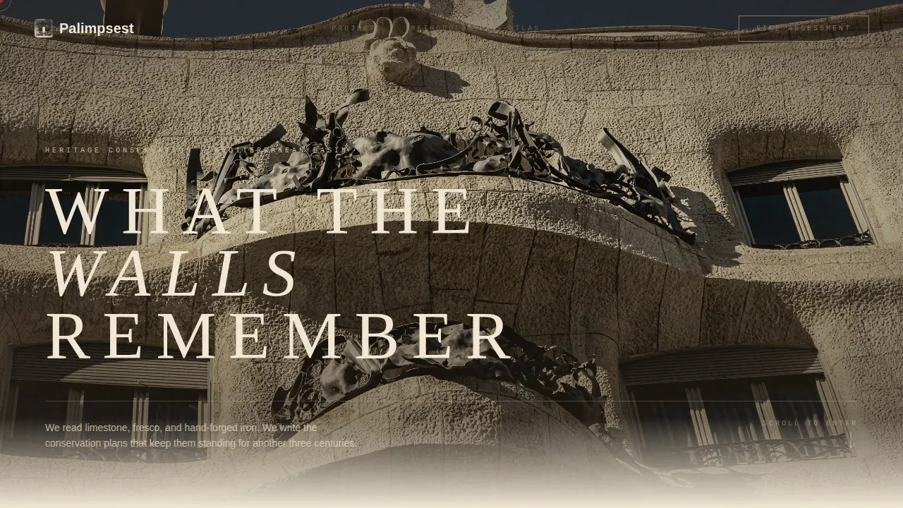
- A cinematic hero section with a full-bleed Mediterranean facade photograph and a typographic title set in wide-letterspaced transitional serif over raw stone texture
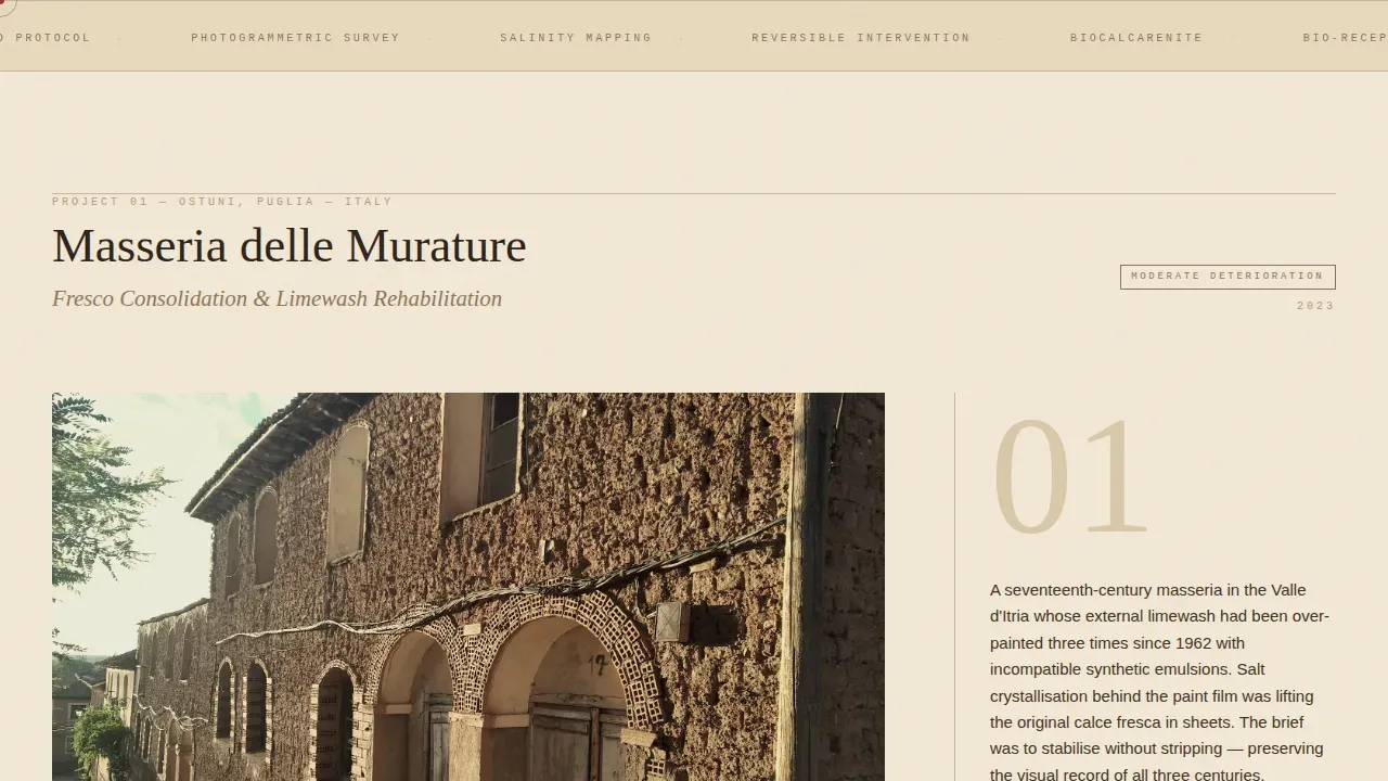
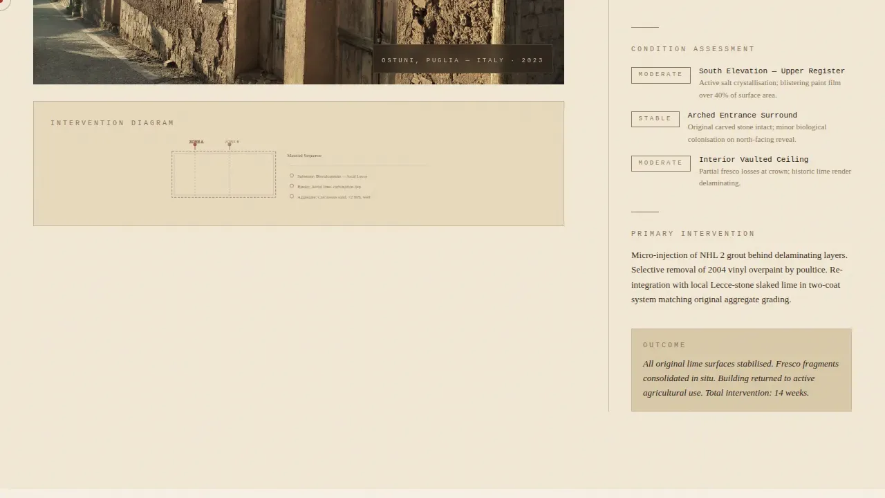
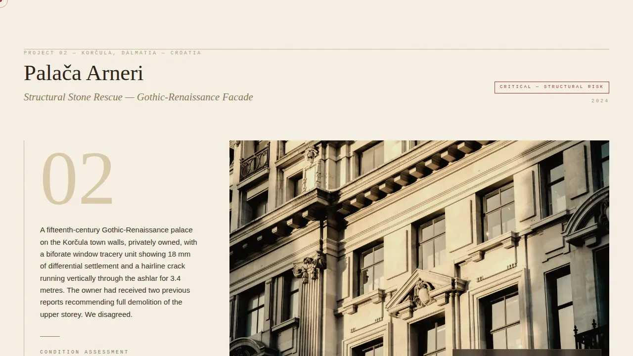
- Three escalating project gallery sections, each with a full-bleed documentary photograph transitioning to a tight field-notes column with condition assessments and material analysis notation
- Two conversion touchpoints: a sepia-bordered cross-reference text link after the third project, and a full-width parchment band at the bottom with a site assessment button
Feature list
This landing page template includes six carefully considered structural and design features drawn directly from the source brief.
Escalating Project Gallery Structure
The core of the template is a three-room Gallery Walk that builds consultant credibility progressively. Project one covers faded fresco rehabilitation at a Puglia farmhouse. Project two documents a structural rescue of a Dalmatian stone house. Project three presents UNESCO-listed Ottoman hammam emergency stabilization. Each room opens with a full-bleed photograph, then narrows into a column of field notes with condition assessments, material analyses, and intervention drawings rendered in thin ink lines. Stakes escalate with each project, so the consultancy's full range reveals itself gradually, like walking deeper into a gallery where the work grows larger and more serious.
Ink and Paper Color System
The template's entire visual identity is built on four precisely defined colors. Aged parchment at hex F2E8D5 serves as the primary background. Iron gall ink at hex 2B2118 anchors all headlines. Faded sepia annotation at hex 8B7355 carries body text and field note copy. Conservation red at hex A4342E appears only on interactive elements and critical callouts, functioning as a controlled accent that reserves visual urgency for moments that deserve it. Backgrounds alternate between deep parchment and full ink-dark sections to create rhythm across the scroll.
Type Over Image Hero Section
The hero is a single vast, full-bleed photograph of a Mediterranean facade shot in flat documentary light with no golden-hour romance. Over it, the headline "WHAT THE WALLS REMEMBER" is set in a sharp transitional serif, letterspaced wide, in parchment color. The type rests directly on the stone texture so letter and building become one artifact. There is no navigation bar and no button in this section, only image, type, and intentional silence. This opening communicates authority before a single word of service copy is read.
Dual Conversion Path Design
The template includes two distinct conversion paths, each serving a different buyer stage. The primary path leads visitors to a detailed methodology PDF and a consultation booking calendar on the next page. The call to action "Review Our Conservation Methodology" appears first as a sepia-bordered text link styled like a manuscript cross-reference after the third project room, then recurs at the bottom as a full-width parchment band containing the button "Request a Site Assessment." The secondary path offers the downloadable Stone Pathology Atlas as a lead magnet, capturing an email in exchange for immediate, tangible expertise.
GSAP ScrollTrigger Animation System
The template is built with high-fidelity animation throughout. GSAP ScrollTrigger drives section reveals as the visitor scrolls through each project room. A cursor follower and magnetic cursor effect respond to interactive elements. Photographs animate from grayscale to warm tone on hover, reinforcing the Ink and Paper aesthetic through motion. A parallax effect applies to full-bleed photographs across all gallery sections. A marquee element provides ambient motion in designated zones. All animations use GPU-accelerated transforms to keep motion smooth across the scroll journey.
Typography and Annotation System
Three typefaces work together to replicate the feel of a surveyor's field journal. Fraunces, a sharp transitional serif, handles all display headlines and project titles. DM Sans carries body copy and field note text at a legible reading weight. JetBrains Mono renders measurements, material annotations, and technical notation in a monospaced style that reads like handwritten site data translated to screen. This three-font system creates a clear visual hierarchy that separates observation from analysis from structural annotation, making every section easy to scan and trust.
Page sections overview
| Section | Purpose |
|---|---|
| Full-bleed hero | Opens with type over facade photograph |
| Project I room | Fresco rehabilitation, Puglia farmhouse |
| Project II room | Structural rescue, Dalmatian stone |
| Project III room | UNESCO hammam stabilization |
| Methodology call to action | Cross-reference link, first conversion ask |
| Stone Pathology Atlas | Email capture, lead magnet section |
| Full-width call to action band | Site assessment button, final conversion |
| Minimal footer | Linear single-row, contact details |
Design & branding system
The Ink and Paper theme governs every visual decision in this template. The palette feels like a document pulled from an archive drawer, warm and foxed, where the paper itself carries history and the ink has bitten permanently into the grain. This is not decorative vintage styling. It is a deliberate editorial stance that aligns the consultant's visual identity with the physical materials they study.
- Typography uses Fraunces for serif display, DM Sans for field note body text, and JetBrains Mono for measurements and technical annotations, creating a three-tier reading hierarchy
- A CSS grain overlay runs across all sections to simulate paper texture without slowing render, while GPU-accelerated transforms keep all animation responsive
- Conservation red at hex A4342E is reserved strictly for interactive elements and critical callouts, so every use of that color carries functional weight
Mobile & speed optimization
This template is designated desktop-first, reflecting the research behavior of its primary audience: municipal heritage officers, EU project managers, and architects who assess consultancy credentials on full-screen desktop browsers. The template is also built with responsive design so it adapts correctly for mobile devices when needed.
- All animations use GPU-accelerated transforms only, keeping scroll behavior smooth without heavy paint operations
- Photographs are treated with parallax and grayscale-to-warm-tone hover effects that degrade gracefully on smaller screens
- The two-column field-notes layout collapses cleanly on mobile devices, preserving readability of condition assessments and material annotations
How this template helps you convert
This landing page is designed as a Click-Through template. It does not ask for anything until the gallery has earned the request. That sequencing is deliberate and it works for this specific audience.
- The escalating project gallery builds social proof through specificity. Each case study includes location, year, material analysis detail, and intervention scope. Visitors accumulate evidence of diagnostic fluency across three rooms before any conversion element appears, which means the call to action arrives with momentum rather than friction.
- The dual conversion path serves buyers at two different stages of readiness. Visitors who are ready to engage click through to the methodology PDF and booking calendar. Visitors who need more evidence before committing download the Stone Pathology Atlas, exchanging their email for a tangible expert resource. Neither path requires a form on this page, keeping the gallery experience uninterrupted.
Other information about this template
This template sits at the intersection of architectural editorial design and professional services conversion. It draws on principles that apply broadly across consultancy landing pages in the heritage and cultural sector, and it shares structural DNA with well-regarded approaches in patient-centric, professional-services web design.
Effective landing page design for specialist consultancies follows many of the same principles found in patient-centric healthcare website design. Patient-centric website design prioritizes needs, preferences, and expectations above all other considerations, and it requires understanding that visitors arrive in a specific cognitive and emotional state. For heritage professionals, that state is one of high stakes and careful evaluation, not casual browsing. A healthcare website must establish credibility from the moment users land on the homepage by surfacing credentials, case evidence, and relevant testimonials. Palimpsest applies the same logic: credibility is front-loaded through documentary photography, material specificity, and escalating case studies.
Clarity and simplicity in professional-services web design are essential for building user trust and engagement. A well-structured layout promotes user confidence and encourages engagement with the content. Healthcare website design should actively work to reduce visitor anxiety rather than increasing it through overwhelming layouts or confusing visual hierarchies. This template avoids both problems. The Gallery Walk rhythm alternates between wide immersion and tight reading, giving visitors room to absorb each project before moving to the next. Concise language in each field-notes column keeps the reading experience manageable without sacrificing technical depth.
The key elements of an effective professional landing page include a compelling headline, high quality images, relevant content organized into clear sections, and call to action buttons placed at the right moments in the visitor journey. This template includes all of these. High quality imagery is the structural backbone of every gallery room. The escalating project sequence is the relevant content framework. The two call to action buttons appear only after the gallery has done its work.
From a landing page design standpoint, this template also reflects principles documented in effective mental health website design, which shares the challenge of earning trust from visitors who are cautious, evaluative, and specific about what they need. An effective patient-centered landing page must answer "What do you do?" and "Who do you help?" within the first visible screen. Palimpsest does this through the hero headline "WHAT THE WALLS REMEMBER" and the immediate entry into the first project room. Empathetic, action-oriented design should address the visitor's core concern immediately and focus on evidence of capability rather than technical service lists.
No-code tools and template platforms have made it significantly easier to launch professional, visually demanding landing pages without extensive coding knowledge. No-code platforms often include features for mobile optimization, ensuring that professional websites are accessible across devices. Healthcare websites built with no-code tools can integrate essential functionalities like appointment scheduling systems and patient portals. The same approach applies here: this template is built so that a conservation consultancy can launch a credible, immersive presence without needing to build a custom editorial site from the ground up.
This template is also relevant context for buyers comparing professional consultancy templates across categories. The clarity patient centered psychiatry comparison landing page template is one reference point for understanding how high-converting professional landing pages balance trust building elements with conversion architecture. Whether the audience is evaluating mental health services, heritage conservation, or other specialized services, the structural principles remain consistent: establish authority, demonstrate range, and earn the click before asking for it.
- This landing page template is suitable for consultancies in the heritage conservation, cultural sector, and architectural professional services space
- The email capture section for the Stone Pathology Atlas functions as a registration form lite, asking only for an email address in exchange for the downloadable resource
- The footer follows a linear single-row pattern with minimal design elements and contact details
- The template supports a seo strategy built on editorial depth and downloadable expert resources rather than on-page form conversion
- Buyers looking for a free domain to pair with this template should check their platform's hosting and domain options separately, as domain registration is handled at the platform level
Theme
Ink & Paper
Creative direction
Gallery Walk
Color system
Ink & Paper
Style
Full-Width Immersive
Direction
Click-Through
Page Sections
Escalating Project Gallery Walk
Ink and Paper Color System
Type Over Image Hero Section
Dual Conversion Path Architecture
GSAP Scrolltrigger Animation System
Three-font Editorial Typography System
Related questions
Who is this landing page template designed for?
What conversion actions does this landing page support?
Can I adapt this template for a different type of professional consultancy?
What animations are included in this template?
Does this template include a contact form?



