Pain Management Comparison Website Template
Palliate is a cancer pain management landing page built for clinical practices that need to reach oncologists, caregivers, and patients simultaneously. A stats-driven header, an expandable WHO ladder comparison table, and a seven-question interactive audit work together to expose pain management gaps before visitors ever reach the call to action.
by Rocket studio
Quick summary
Palliate is a single-page clinical resource for cancer pain management practices. It opens with three large typographic statistics as the emotional hook, then guides visitors through an expandable WHO pain ladder comparison table and a self-scoring interactive audit. By the time visitors reach the dual call to action, they already know exactly which gaps the resource will fill.
Who this template is for
This landing page was built for cancer pain management practices that serve more than one type of visitor at the same time. It speaks with equal clarity to a clinician reviewing co-management protocols and a caregiver searching at two in the morning for plain-language answers.
- Oncologists and clinicians seeking opioid rotation guidance and co-management protocols
- Caregivers who need plain next steps when a current pain regimen stops working
- Patients mid-treatment trying to understand why breakthrough pain persists
What problem this template solves
Most pain management pages either talk over patients or talk under clinicians. Palliate solves the tonal mismatch by teaching through gap exposure rather than lecturing. Visitors discover what is missing from their current approach before they are asked to act.
- Standard landing pages push a call to action before visitors understand why they need it
- Complex pharmacology is rarely translated into readable, role-appropriate language
- Caregivers and patients rarely receive the same quality of structured guidance as clinicians
What you get with this template
The template delivers a fully structured, section-led layout with interactive components and a dual conversion path. Every section earns its place by moving visitors one step closer to either downloading the protocol checklist or requesting a case review.
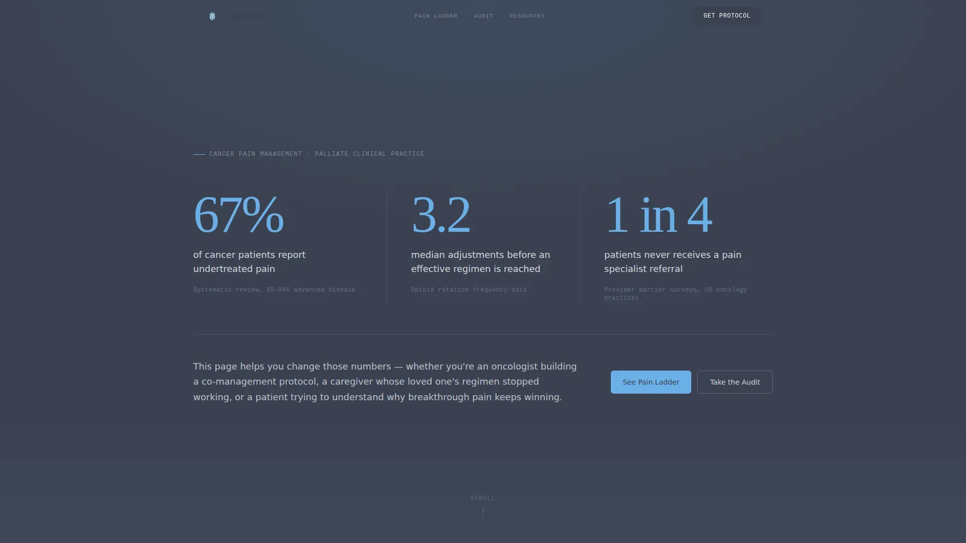
- A stats wall header with three large typographic figures and a single clarifying subhead
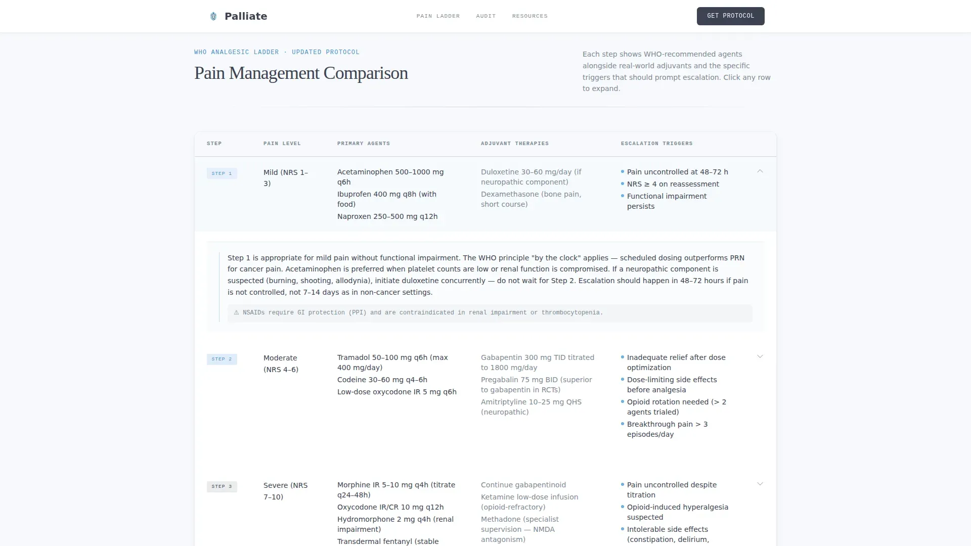
- An expandable WHO pain ladder comparison table with adjuvant therapies and escalation triggers
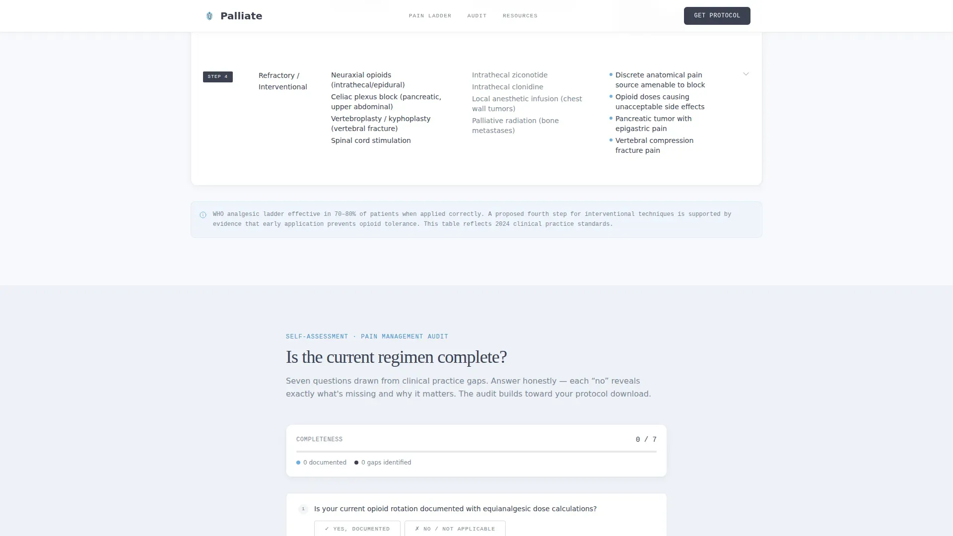
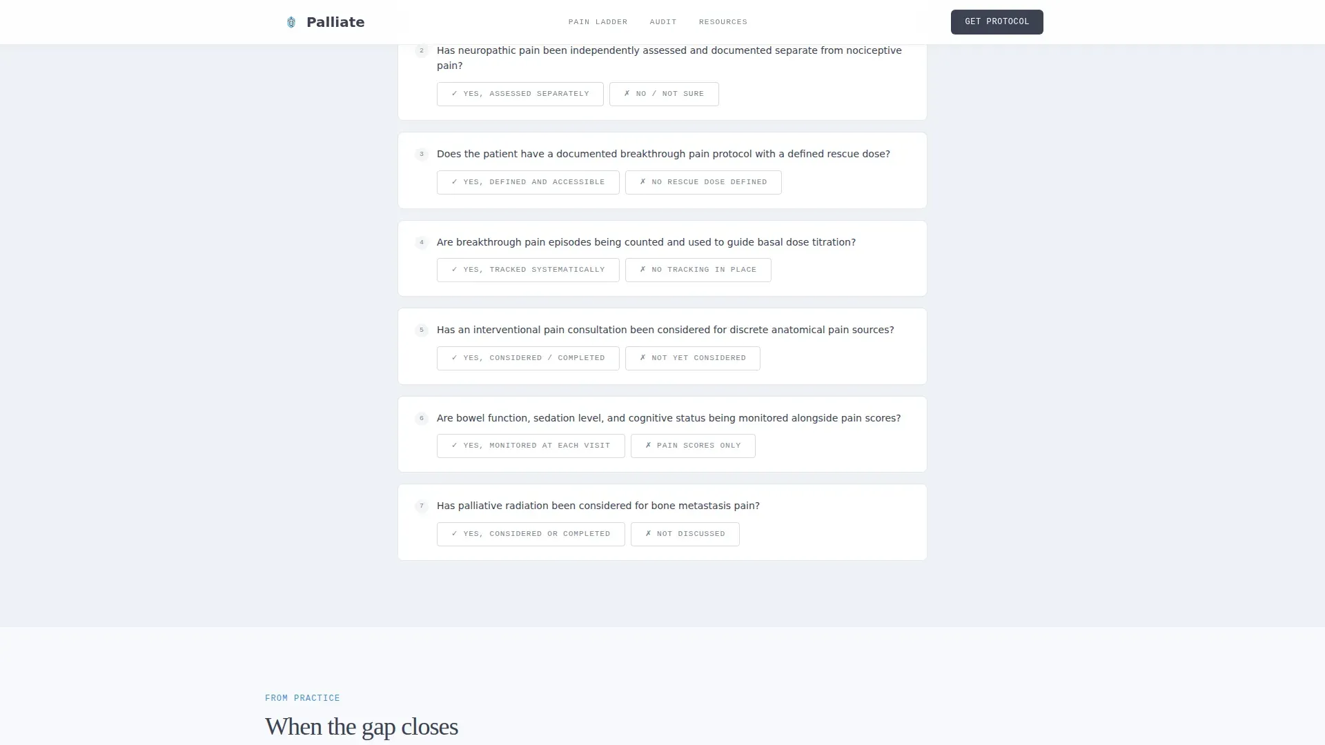
- A seven-question interactive audit with a live completeness bar and inline gap education
- A dual call to action with role-specific checklist download and a case review request form
Feature list
This section covers the core built-in capabilities that define how the template functions and converts.
Stats Wall Header
Three large typographic figures occupy the full viewport width, set in open-sky blue against clinical charcoal. The numbers communicate urgency without using alarm colors. A single subhead line beneath the figures anchors the emotional hook and frames the purpose of the page.
Expandable WHO Ladder Table
The comparison table places World Health Organization pain ladder steps side by side with real intervention options, adjuvant therapies, and when-to-escalate triggers. Each row is individually expandable so visitors can dig into the detail that matters to them without losing the overview.
Interactive Pain Management Audit
Seven yes-or-no questions build a visual completeness bar as the visitor answers. Each incomplete answer reveals a short educational paragraph explaining the clinical significance of that gap. The audit turns self-assessment into momentum toward the download.
Role-Specific Checklist Download
The primary call to action captures an email address and a role selector with three options: patient, caregiver, or clinician. The role selection determines which reading level the delivered PDF matches, making the resource genuinely useful to all three audience types.
Case Review Request Form
A secondary conversion path collects diagnosis stage, a current regimen summary, and referring physician name. This gives the practice a structured intake for higher-commitment visitors who are ready for direct clinical engagement.
Social Proof Section
Clinician testimonials with listed specialties and specific outcome references provide credibility for skeptical professional visitors. Caregiver voices alongside them signal that the practice understands the full care circle, not just the clinical side.
Page sections overview
| Section | Purpose |
|---|---|
| Stats Wall Header | Open with three key pain-care statistics as the emotional hook |
| WHO Ladder Table | Compare pain ladder steps against real clinical interventions |
| Interactive Pain Audit | Seven yes-or-no questions that reveal gaps in the current regimen |
| Testimonials & Social Proof | Clinician and caregiver voices that build trust through specificity |
| Dual Call to Action | Role-matched checklist download and case review request form |
| Single-Row Footer | Navigation and contact essentials in a clean linear layout |
Design & branding system
The visual identity follows an Educational Guide theme built around the Slate & Sky color system. Every color decision reinforces the clinical calm the practice needs to project: no urgency reds, no alarm oranges, just steady and authoritative clarity.
- Clinical charcoal (#3B4252) carries all body text and table headers for grounded readability
- Soft slate (#7B8794) handles secondary labels and divider lines without competing for attention
- Open-sky blue (#6AAFE6) activates interactive highlights, active-state audit rows, and the stats wall numbers
- Dawn white (#F7F9FC) fills all backgrounds, creating the diffused-light calm the brief describes as the quiet side of a pillow at four in the morning
- Typography uses DM Sans for body copy, Fraunces for display figures, and IBM Plex Mono for data labels
Mobile & speed optimization
The template is built mobile-first because caregivers searching at two in the morning are almost always on a phone. Every interactive component is designed to function cleanly at small screen sizes without sacrificing the audit experience or the table readability.
- Expandable table rows collapse to single-tap reveals on mobile, keeping the comparison usable on narrow viewports
- The interactive audit and call-to-action forms are isolated as client-side components while the rest of the page renders as static content
- Scroll reveals and audit bar animations are set to medium intensity so they enhance rather than delay the reading experience
How this template helps you convert
The conversion logic is built into the content sequence. Visitors do not encounter the call to action cold. They arrive at it having already identified their own gaps through the audit, which makes the download feel like the next logical step rather than an interruption.
- The stats wall creates immediate emotional relevance by confronting visitors with data that describes their current situation before they read a single line of body copy.
- The interactive audit builds personal investment. Each answered question moves the completeness bar, and each gap revealed makes the protocol checklist feel like something the visitor specifically needs.
- The dual call to action offers a lower-commitment path (email for the checklist) and a higher-commitment path (case review form) so the page converts at two different readiness levels simultaneously.
Other information about this template
This template is built specifically for English-language clinical practices operating in the United States market. It does not require date formatting or currency display. The layout uses a single-row linear footer pattern for minimal distraction at the bottom of the scroll path.
- No stock imagery or hero photography is used anywhere in the layout; the data and typography carry the visual weight
- The role selector on the checklist download form supports three audience types: patient, caregiver, and clinician
- The footer follows a Pattern 1 Linear Single-Row layout for clean, low-friction page closure
- This template suits practices in cancer pain management, palliative care, and oncology support that need a single resource hub rather than a full multi-page website
Theme
Educational Guide
Creative direction
Checklist & Audit
Color system
Slate & Sky
Style
Comparison Table
Direction
Content/Resource
Page Sections
Stats Wall Header with Typographic Data
Expandable WHO Ladder Comparison Table
Seven-question Interactive Pain Audit
Role-specific Checklist Download
Case Review Request Form
Clinician and Caregiver Social Proof
Related questions
Who is this landing page designed to serve?
What does the interactive pain audit do?
Can the WHO ladder comparison table handle detailed clinical content without overwhelming visitors?
Does the page support both light-touch lead capture and direct clinical intake?
Is this template suited for a single-page clinical resource rather than a full website?



