Glazier Reviews Website Template
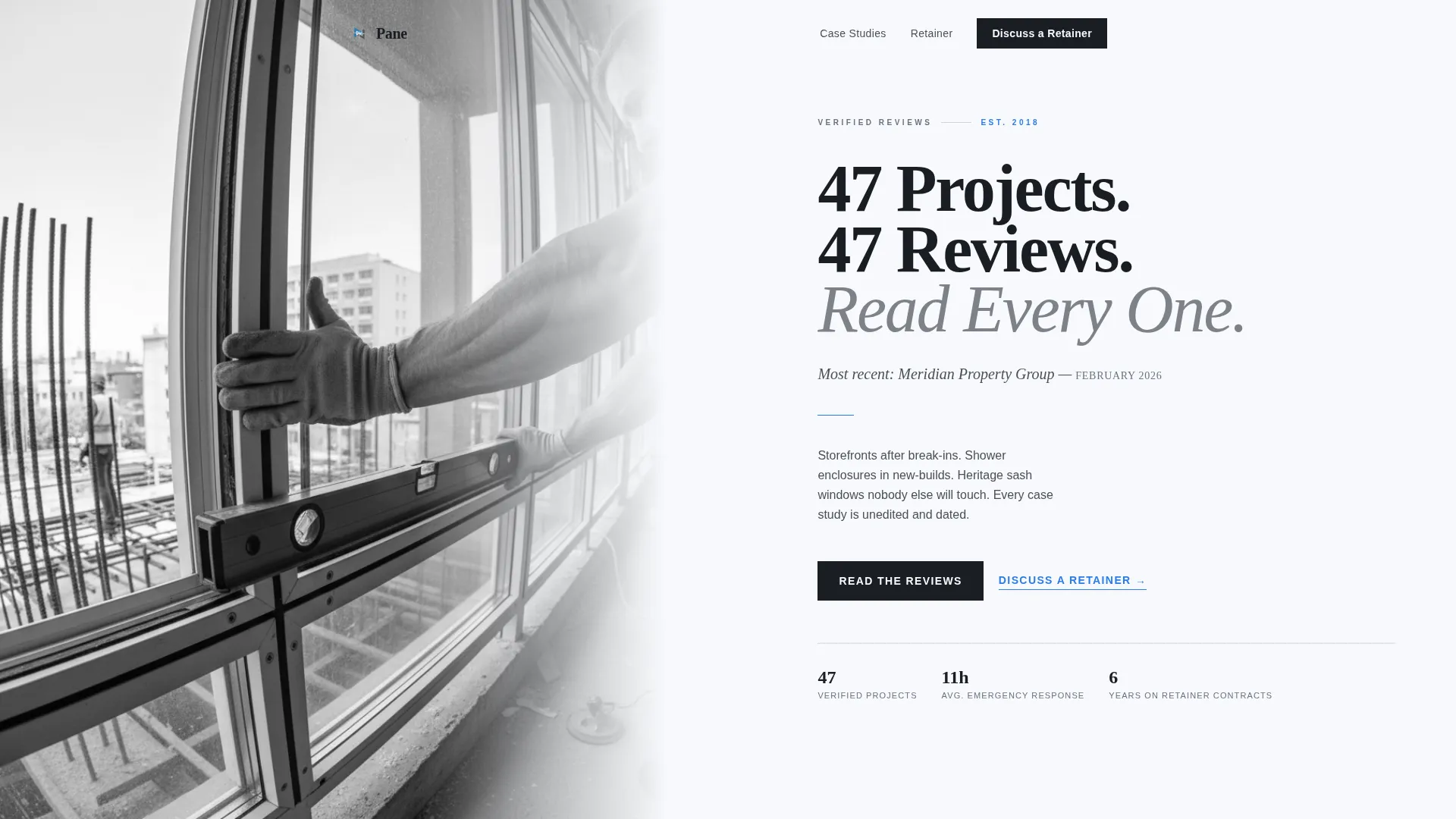
Pane is a single-column editorial landing page built for glaziers who want to win retainer contracts with property managers, insurance adjusters, and general contractors. Each verified review becomes a structured case study with scene-setting prose, a pull-quote, a project photo, and an outcome metric. The result reads like a trade journal profile, not a review widget.
by Rocket studio
Quick summary
Pane turns a glazier's client reviews into a compelling editorial record. The landing page presents four narrative case studies across residential, commercial, emergency, and heritage projects. A qualifying partnership form and a gated PDF download capture both ready and early-stage leads. The whole page runs in a disciplined single-column flow that feels authoritative from the first scroll.
Who this template is for
This template is built for glazing businesses that work across multiple project types and want to attract long-term commercial partners rather than one-off enquiries. If your pipeline depends on trust before the first phone call, this page does that work for you.
- Glaziers pitching retainer agreements to property management firms
- Glass contractors seeking placement on insurance adjuster preferred supplier lists
- Glazing businesses targeting general contractors for sub-contractor agreements
What problem this template solves
Most glazier websites list services and drop in a few quote cards. That approach rarely convinces a property manager overseeing 200 units or an insurance adjuster approving a preferred supplier list. They need documented proof of range, reliability, and professionalism before they engage.
- Generic review widgets lack the context a commercial partner needs to make a decision
- Isolated quote cards cannot communicate project complexity or turnaround capability
- A missing or weak online presence costs glaziers retainer contracts they were qualified to win
What you get with this template
You get a complete, ready-to-deploy landing page structured around editorial case studies. Every section is purposeful, with copy prompts and layout positions that guide you toward filling in real project data.
- A half-page editorial hero with a serif headline and a subline grounding the page in real time
- Four narrative case study blocks with pull-quote typography, project detail shots, and bold outcome metrics
- A qualifying partnership form and a gated PDF download for lead capture at two readiness levels
Feature list
A brief overview of the core capabilities built into this template, drawn directly from the page structure and interaction design.
Editorial Case Study Blocks
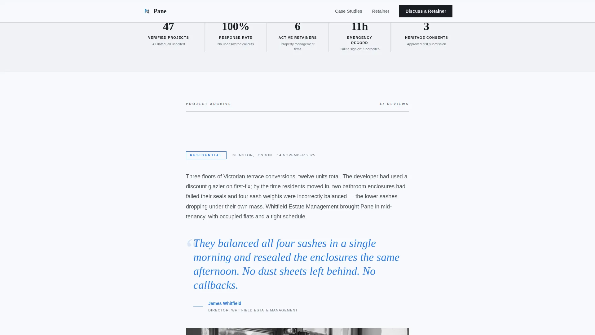
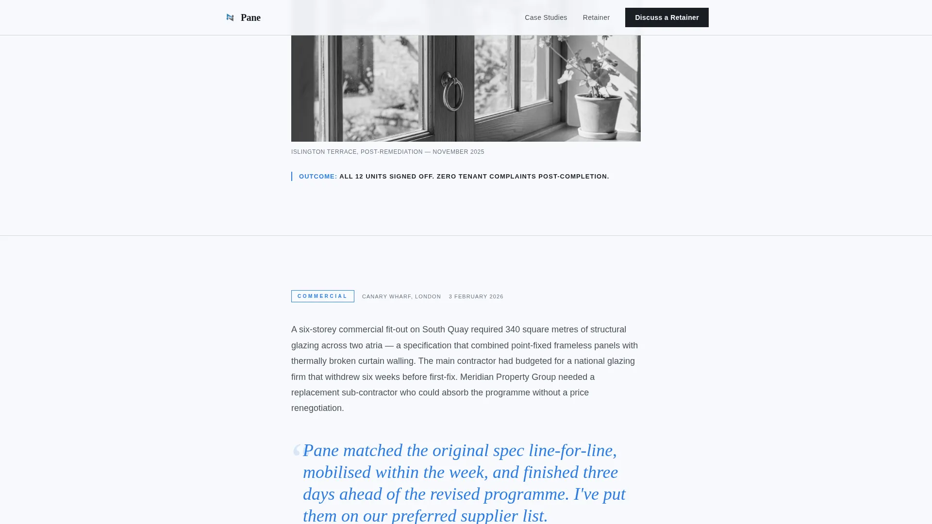
Each testimonial is presented as a mini-feature rather than a quote card. A scene-setting paragraph establishes the problem, the client's words appear in oversized pull-quote typography, a detail shot of the finished installation follows, and a bold one-line outcome metric closes each story. Four case studies are included: residential, commercial, emergency, and heritage.
Scroll-Paced Single Column Layout
The page runs in a strict single-column flow with generous white space and thin silver rules separating each case study. GSAP scroll reveals and staggered case study entrances pace the reader like turning magazine pages, so the stakes build naturally without any explicit claim of range.
Partnership Qualifying Form
The primary conversion path is a focused "Discuss a Retainer" form. It asks for company name, portfolio size, and a free-text field: "What's your most common glass issue?" This qualifies intent without friction and invites the prospect to open a real conversation.
Gated PDF Lead Capture
A secondary conversion path offers a downloadable case study pack gated by work email. This captures prospects who are researching rather than ready to call, keeping them inside the pipeline with minimal commitment.
Scroll-Triggered Call-to-Action Bar
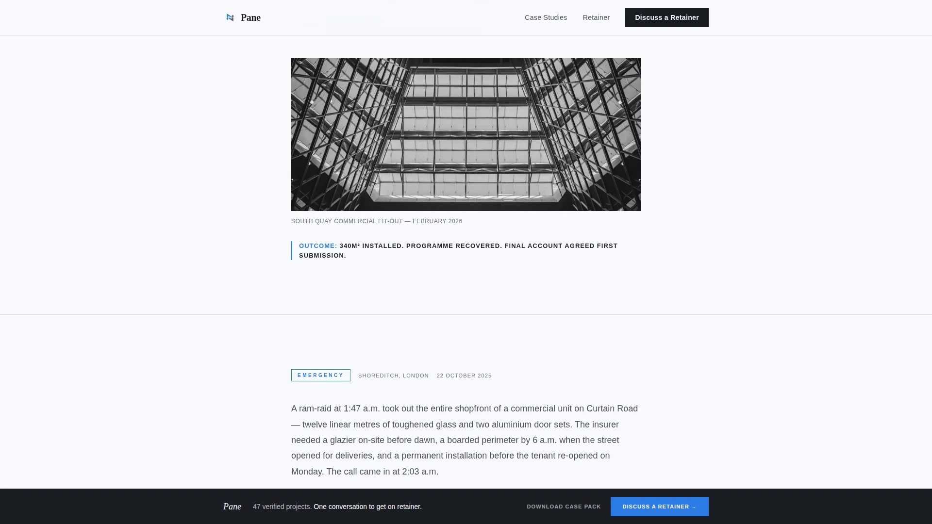
The primary call to action first appears as a quiet text link after the third case study. After the fifth case study, a fixed-bottom bar activates on scroll, keeping the conversion path visible without interrupting the editorial reading experience.
Editorial Magazine Visual System
The layout uses Fraunces serif display type for headlines and pull-quotes alongside DM Sans for body text. Installation blue is reserved strictly for pull-quotes, linked names, and interactive elements, giving the page a restrained, broadsheet-quality visual authority.
Page sections overview
| Section | Purpose |
|---|---|
| Hero Portrait Header | Opens with an editorial photograph and the confidence-setting headline |
| Residential Case Study | Establishes credibility with a relatable domestic project narrative |
| Commercial Case Study | Demonstrates scale and professional process for B2B readers |
| Emergency Case Study | Proves 24-hour responsiveness with a timed outcome metric |
| Heritage Case Study | Shows specialist capability on complex, irreplaceable work |
| Retainer Text Link | First quiet call to action placed after the third case study |
| Fixed Bottom Bar | Scroll-triggered persistent call to action after the fifth case study |
| Partnership Retainer Form | Qualifies intent with company name, portfolio size, and open question |
| PDF Download Gate | Captures early-stage leads via work email in exchange for case study pack |
| Footer Row | Single linear row with essential contact and navigation links |
Design & branding system
The visual identity follows an Editorial Magazine theme. Every design decision references the feel of a heavyweight trade journal held under north-facing studio light: authoritative, unhurried, and impossible to fake.
- Color palette: glacier white (#F7F9FC) for fields, cool newsprint gray (#4A4F57) for body text, hairline rule silver (#D1D5DB) for section dividers, and installation blue (#2C7BE5) as the sole accent
- Typography: Fraunces for all display serif headlines and pull-quotes, DM Sans for body copy and form labels
- Black-and-white editorial photography, thin column-border rules, and open white space define the layout's broadsheet character
Mobile & speed optimization
The template is designed desktop-first to serve B2B decision makers reading at a desk. The layout is fully responsive so the same editorial quality carries across screen sizes without breaking the reading flow.
- Static content sections use server components to keep initial load light
- Scroll animations and the fixed-bottom bar are handled by client-side components, isolating interactivity from static rendering
- The single-column flow adapts naturally to mobile without requiring a separate layout rebuild
How this template helps you convert
Every structural choice in this template is built around moving a careful commercial reader from scepticism to a retainer conversation.
- The case study narrative format gives property managers and insurance adjusters the documented project evidence they need before approving a preferred supplier, replacing weak review widgets with a credible professional record.
- The two-path conversion design matches different buyer stages: the qualifying form captures ready prospects, and the gated PDF download holds early-stage researchers in the pipeline until they are ready to engage.
Other information about this template
This section covers additional context about how the template was designed and where it fits within the glazier online presence category.
- The template is localised for a UK English audience, with date formats set to DD/MM/YYYY and pricing context in GBP
- Page type is a single-column flow landing page, not a multi-page website, keeping all content and conversion paths within one scrollable document
- The intersection of glazier reviews and testimonials with a partnership and business-to-business conversion direction makes this a focused tool for glazing businesses moving upmarket from residential one-offs to commercial retainer work
- The template sits within the Professional Services category under the Glazier Online Presence subcategory, designed specifically for the Glazier Reviews and Testimonials Page niche
Theme
Editorial Magazine
Creative direction
Case Study Narrative
Color system
Arctic White
Style
Single Column Flow
Direction
Partnership/B2B
Page Sections
Editorial Case Study Blocks
Qualifying Partnership Form
Gated PDF Lead Capture
Scroll-triggered Fixed Bar
Editorial Magazine Visual System
GSAP Scroll Animation Layer
Related questions
Can I replace the placeholder case studies with my own project reviews?
Is this template suitable for a glazier who works on both domestic and commercial projects?
What does the partnership form ask prospects to provide?
Does the PDF download gate require a long sign-up process?
Who is this landing page template primarily designed for?



