Glazier Reviews & Testimonials Landing Page Template
Pane is a single-column editorial landing page built for glazing workshops that need to earn B2B trust fast. It presents 47 documented project reviews as narrative case studies, pacing readers through residential, commercial, emergency, and heritage work. Two conversion paths target property managers, insurance adjusters, and contractors ready to discuss a retainer or download a case study pack.
by Rocket studio
Quick summary
Pane is a reviews and testimonials landing page designed for glaziers pursuing retainer contracts with property management firms, insurance adjusters, and general contractors. It uses an editorial magazine layout to present 47 project reviews as narrative mini-features. Two conversion paths capture partners at different stages of commitment, from a direct retainer inquiry form to a gated PDF lead capture.
Who this template is for
This template is built for glazing workshops that do serious commercial work and need to prove it. It speaks to a professional audience that reads carefully and decides slowly. Glossy claims land flat here. Documented project outcomes do not.
- Glaziers pitching retainer contracts to property management firms
- Workshop owners seeking placement on insurance adjuster preferred supplier lists
- Independent glazing businesses sub-contracting to general contractors on new builds or fit-outs
What problem this template solves
Most glazier websites list services and hope the phone rings. This template solves a different problem: convincing a procurement manager or loss adjuster that your workshop is the safest choice on their shortlist. Trade buyers need evidence, not enthusiasm.
- Generic portfolio pages that show work but never explain outcomes or response times
- No structured path for a B2B buyer to move from reading reviews to booking a discovery call
- Missing proof of range across residential, commercial, emergency, and heritage glazing jobs
What you get with this template
You get a complete single-column landing page built around documented social proof. Every section is designed to move a cautious trade buyer closer to a partnership conversation, without ever feeling like a sales pitch.
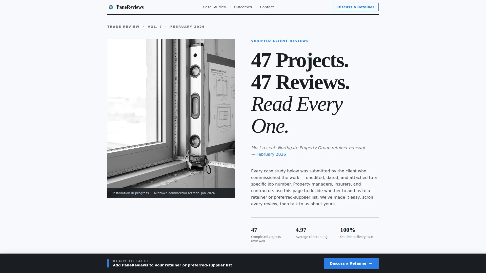
- A half-page editorial hero with a bold serif headline and a scene-setting subline anchored to a real client and date
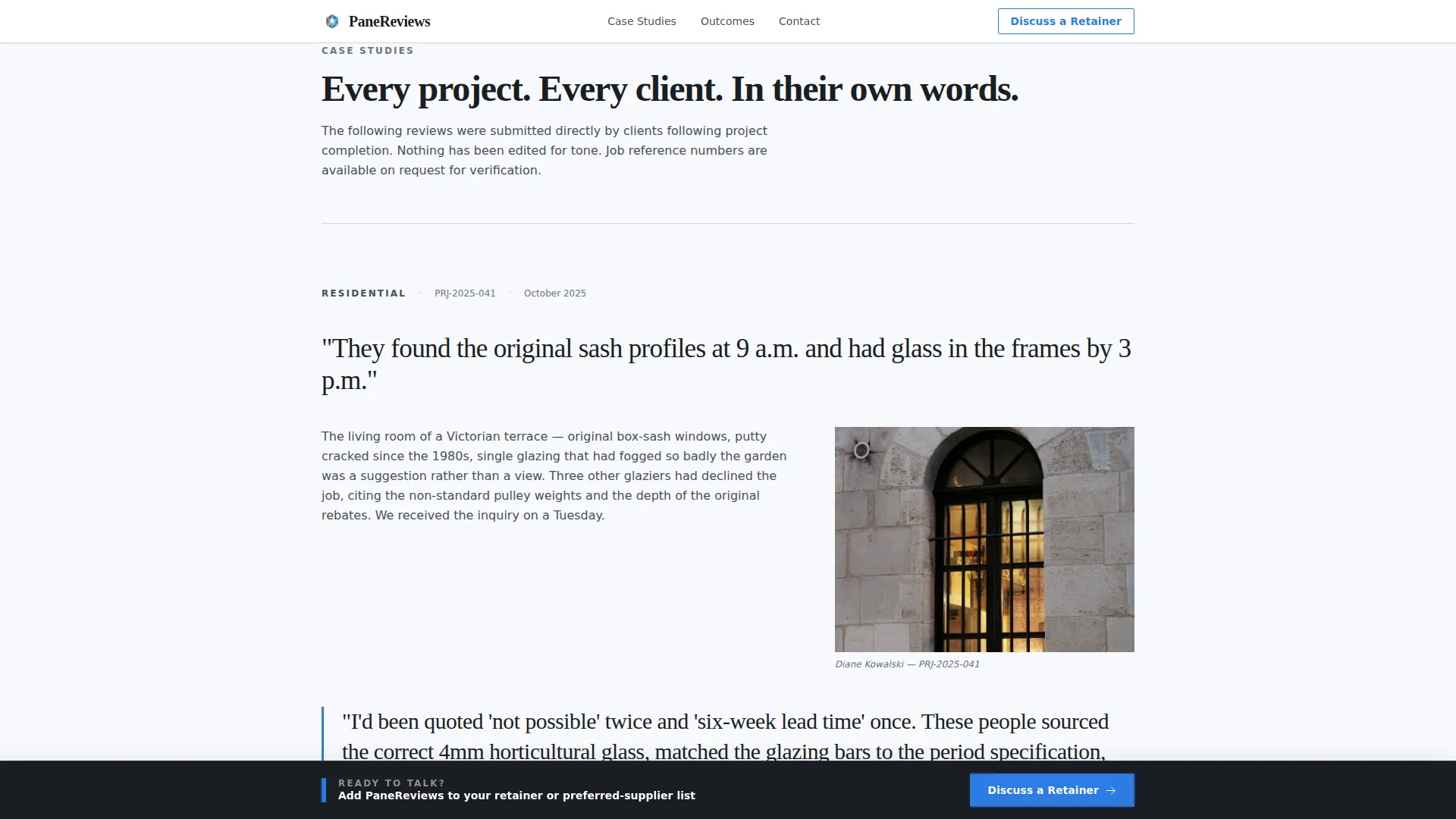
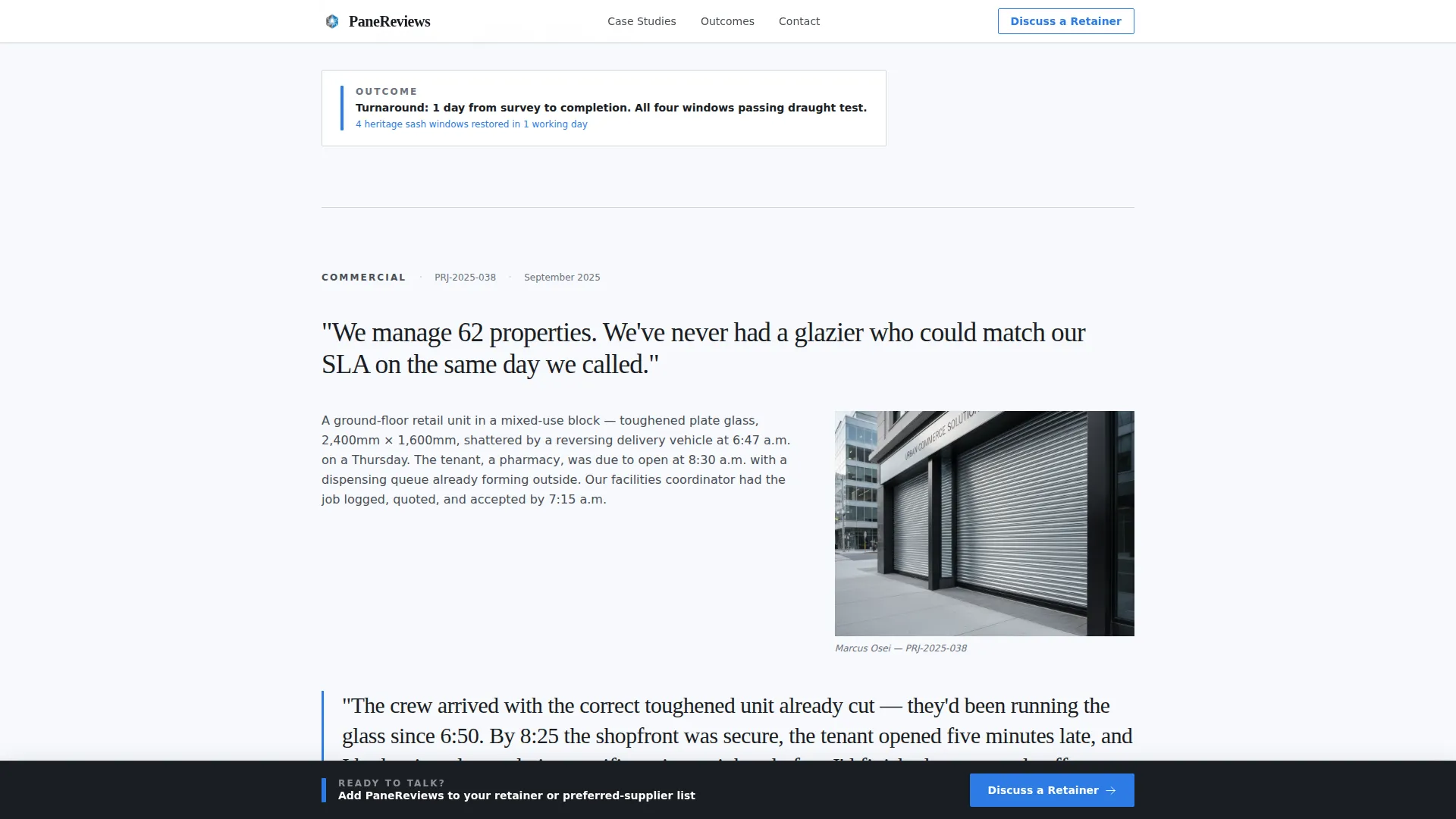
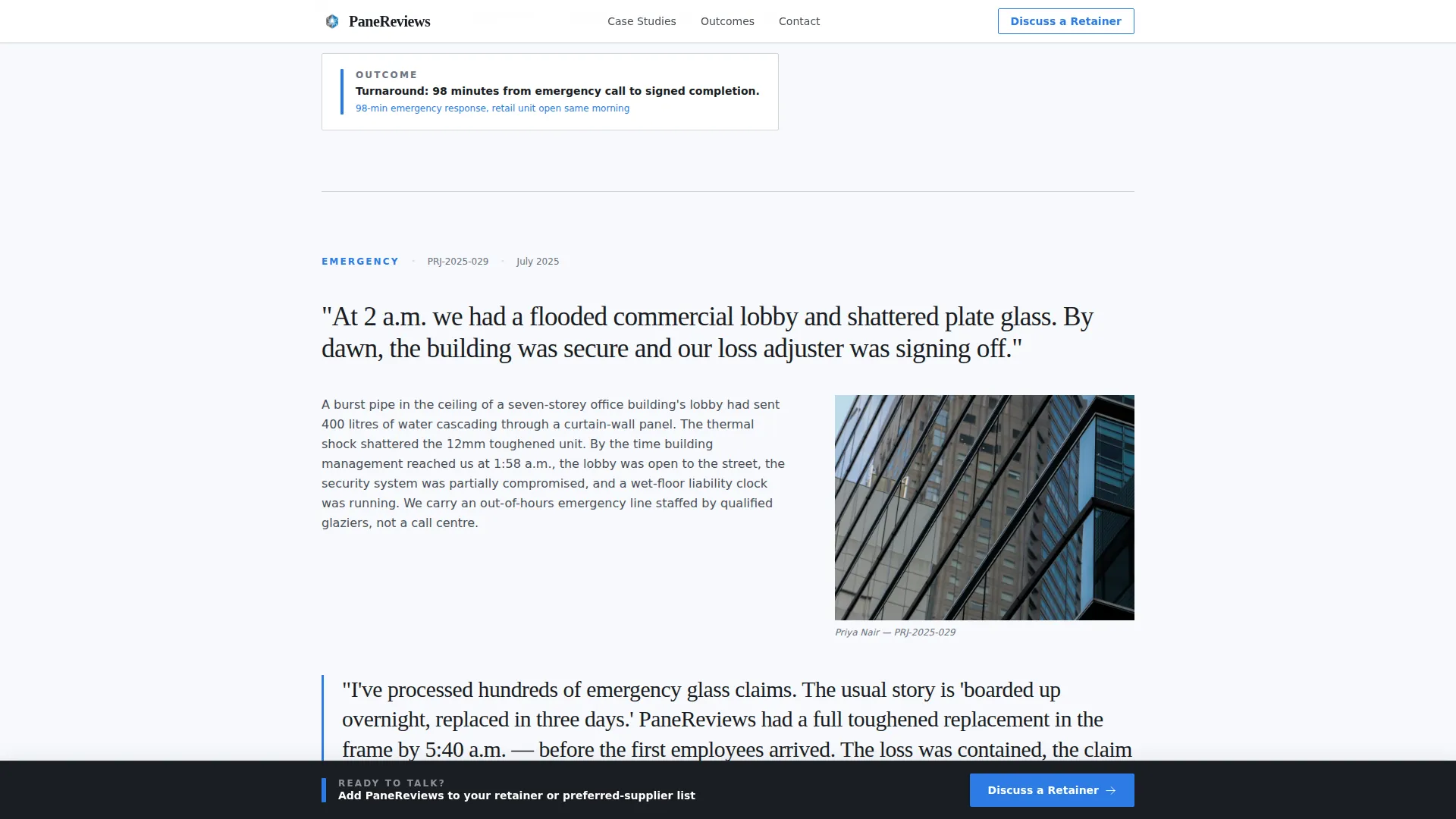
- Four narrative case study blocks, each with a scene paragraph, oversized pull-quote, project detail image, and a bold outcome metric line
- Two conversion paths: a qualifying retainer inquiry form and a gated PDF case study download
Feature list
A short paragraph introduces the feature set: Pane delivers each capability below as a built-in, ready-to-deploy component. No extra configuration is needed to activate the core page structure.
Editorial Hero Section
A half-page composition pairs a black-and-white editorial photograph with a large serif headline set in Fraunces. A single italic subline names the most recent partnership client and date, grounding the page in real project history from the first scroll.
Narrative Case Study Blocks
Each of the four case study blocks follows a fixed structure: a scene-setting problem paragraph, the client's words in oversized pull-quote typography styled in installation blue, a project detail shot, and a bold one-line outcome metric. Blocks are separated by generous white space and a thin silver rule.
Dual Conversion Paths
The primary path is a retainer inquiry form asking for company name, portfolio size, and a free-text field for the prospect's most common glass issue. The secondary path gates a downloadable PDF case study pack behind a work email address, capturing leads not yet ready for a direct call.
Inline and Fixed-Bottom Calls to Action
A quiet text link appears after the third case study for readers who are already convinced. After the fifth case study, a fixed-bottom bar activates, keeping the retainer prompt visible without interrupting the reading experience.
Outcome Metrics Strip
A four-stat strip displays key performance figures from the 47 documented projects, such as turnaround times and project counts. These numbers appear in a clean, scannable row that reinforces credibility at a glance before the conversion form.
Editorial Typography System
Fraunces serif handles all headlines and pull-quotes, while DM Sans carries all body copy. The pairing gives the page the weight of a trade journal profile without sacrificing readability in longer case study paragraphs.
Page sections overview
| Section | Purpose |
|---|---|
| Editorial Hero | Establish authority and anchor the page with a real project headline |
| Case Study One | Introduce residential glazing proof with client quote and outcome metric |
| Case Study Two | Escalate to commercial project scale with scene narrative and pull-quote |
| Case Study Three | Demonstrate emergency response capability and fast turnaround time |
| Case Study Four | Close the range argument with a heritage sash window restoration story |
| Inline Retainer Link | Offer a quiet conversion path to readers convinced by the first three studies |
| Outcome Metrics Strip | Display four headline project stats in a scannable row format |
| Partnership Form | Qualify retainer prospects with company name, portfolio size, and glass issue |
| PDF Lead Capture | Gate the case study pack download behind a work email field |
| Fixed-Bottom Bar | Keep the retainer call to action visible after the fifth case study scroll |
Design & branding system
The visual identity follows an Editorial Magazine theme built on an Arctic White color system. Every design decision reinforces the feeling of a heavyweight trade journal profile, authoritative and unhurried.
- Color palette: glacier white (#F7F9FC) for fields and backgrounds, newsprint gray (#4A4F57) for all body text, hairline rule silver (#D1D5DB) for section dividers, and installation blue (#2C7BE5) reserved for pull-quotes, linked names, and interactive elements
- Typography: Fraunces serif for headlines and pull-quotes, DM Sans for body copy and form labels, creating clear reading hierarchy across long case study text
- Layout rhythm: a single-column flow with generous white space between case studies, thin silver rules acting as column borders, and a desktop-first composition that scales responsively for mobile readers
Mobile & speed optimization
The layout is built desktop-first to match the browsing habits of B2B decision-makers reviewing suppliers during the working day. Mobile responsiveness is included so the page remains readable on any device.
- Single-column flow means the reading order is natural on both desktop and mobile without restructuring
- Scroll-reveal animations on case study blocks are handled by client-side components, while static sections use server components to keep initial load lean
- The fixed-bottom call to action bar and PDF gate modal are built as interactive client components, activating only when triggered by scroll position or user action
How this template helps you convert
Trade buyers do not convert on enthusiasm. They convert when they have read enough evidence to feel confident making a recommendation internally. This template builds that confidence step by step.
- The case study narrative structure moves readers through four proof points in ascending order of complexity, residential to heritage, letting the range argument build without ever stating it outright.
- The inline text link after the third case study catches readers who decide quickly, while the fixed-bottom bar keeps the retainer prompt visible for readers who need all five case studies before they act.
- The qualifying form asks the right questions upfront, company name, portfolio size, and their most common glass issue, so every lead that submits is already a relevant partner prospect.
Other information about this template
This template is part of the Professional Services category, sitting within the Glazier Online Presence subcategory and the Glazier Reviews and Testimonials Page niche. It is designed as a single-page flow with a high intersection match score, meaning the layout, creative direction, and conversion strategy are tightly aligned to the glazier B2B trade context.
- Template style: Single Column Flow with an Editorial Magazine theme
- Creative direction: Case Study Narrative, structured to escalate proof across four project types
- Header concept: Half-Page Photo and Text composition with left-aligned serif headline
- Landing page direction: Partnership and B2B acquisition, not consumer lead generation
- Localization: English language, with USD implied pricing context and US and UK trade conventions supported
Theme
Editorial Magazine
Creative direction
Case Study Narrative
Color system
Arctic White
Style
Single Column Flow
Direction
Partnership/B2B
Page Sections
Editorial Hero with Serif Headline
Narrative Case Study Blocks
Dual Conversion Paths
Inline and Fixed-bottom Call to Action
Outcome Metrics Strip
Editorial Typography Pairing
Related questions
Can I add more than four case studies to this template?
Does the PDF download gate require third-party tools to function?
Is this template only suitable for glaziers with commercial project experience?
How does the fixed-bottom call to action bar behave on smaller screens?
Can the retainer inquiry form fields be edited?



