Mixed-Use Developer Landing Page Template
Parcel is a zigzag landing page template built for mixed-use building developers. It leads every section with a bold outcome metric, then follows with the design philosophy behind it. The result is a persuasive, data-first page that earns trust before asking for a click, guiding municipal planners, institutional investors, and anchor tenants toward a project portfolio.
by Rocket studio
Quick summary
Parcel is a single-page landing page template designed for mixed-use real estate developers. It uses a zigzag layout where every alternating section opens with a hard performance metric before explaining the thinking behind it. The tone is confident and grounded. The visual identity draws from deep greens and soft limestone, with goldenrod reserved strictly for numbers and calls to action.
Who this template is for
This template is built for developers whose work spans more than a single building type. It speaks to professionals who need to earn trust with data before they earn desire with imagery.
- Mixed-use real estate developers presenting neighborhoods to institutional investors or planning boards
- Development teams seeking anchor tenants for ground-floor retail and co-working spaces
- Urban project leads who need a single persuasive page to drive traffic into a detailed project portfolio
What problem this template solves
Mixed-use development projects are complex to communicate. A single building type is easy to pitch, but a layered neighborhood requires layered proof. Generic real estate landing pages lead with photography, which invites skepticism before trust is established.
- Investors and planners want occupancy rates, walk scores, and retail revenue data before they want renderings
- Anchor tenants need evidence that foot traffic is the result of intentional design, not chance
- Most templates cannot carry the weight of city-level impact storytelling alongside unit-level conversion goals
What you get with this template
You get a fully structured, single-page layout that sequences data and narrative in a deliberate order. Every section is designed to escalate the story from unit-level performance to neighborhood-level livability to city-level impact.
- A cinematic hero header with animated metric counters and a slow-dissolving aerial photograph
- A true zigzag alternating layout with stat-first section openers and narrative paragraphs beneath each metric
- Two distinct call-to-action placements and a secondary email-capture text link for higher-intent visitors
Feature list
This template is built around a specific conversion rhythm: proof first, then poetry. Each feature below reflects a deliberate design decision from the source brief.
Animated Metric Hero Header
The header opens on a dark screen and counts three key metrics up from zero in oversized goldenrod type. Each number resolves before the background aerial photograph fully fades in, so the data lands with authority before the visual beauty registers.
Zigzag Alternating Section Layout
Sections alternate between left-image-right-text and right-image-left-text arrangements. Every block opens with a single bold metric, followed by a paragraph explaining the design philosophy that produced that result.
Stat-First Narrative Rhythm
The page escalates from unit-level data to block-level livability to city-level impact. This structured rhythm ensures each section builds on the last, moving the reader from curiosity to conviction before the call to action appears.
Primary and Secondary Call-to-Action System
The primary call to action, "Explore Our Communities," appears in goldenrod on deep emerald beneath the header and again after every second zigzag section. A secondary text link, "Download the Impact Report," captures higher-intent visitors who are ready to exchange an email.
Pastoral Calm Visual Identity
The color system uses deep canopy green, twilight loam, soft limestone, and muted goldenrod. Backgrounds alternate between the deep greens and limestone tones. Goldenrod appears only on data callouts and hover states, keeping the palette disciplined and intentional.
Section-Escalating Storytelling Structure
The page moves through three narrative layers: individual unit data, walkable block livability, and city-scale outcomes. By the time the final call to action appears, the reader understands these are ecosystems with addresses, not just buildings with amenities.
Page sections overview
| Section | Purpose |
|---|---|
| Hero Header | Introduces three animated performance metrics against a dissolving aerial photograph |
| Primary call to action Block | Prompts visitors to explore the project portfolio immediately after the hero |
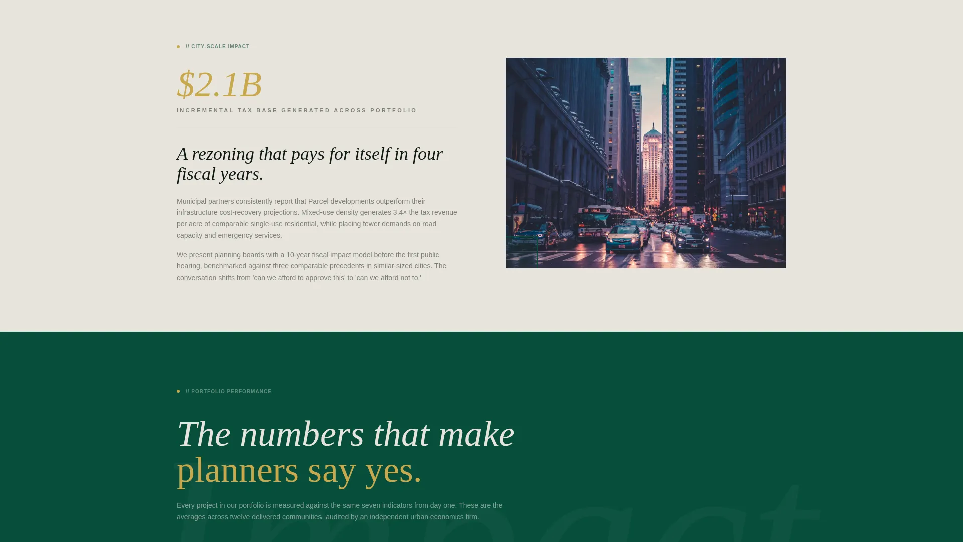
| Zigzag Section One | Opens with a walkability metric and explains the pedestrian-first design philosophy |
| Zigzag Section Two | Presents retail vacancy data and the ground-floor activation strategy behind it |
| Mid-Page call to action Block | Repeats the primary call to action after the second alternating section |
| Zigzag Section Three | Delivers resident retention figures and the community programming that drives them |
| Zigzag Section Four | Presents city-level impact data, connecting the development to broader urban outcomes |
| Final call to action Block | Closes the page with both primary and secondary calls to action side by side |
Design & branding system
The visual identity follows a Pastoral Calm theme. Every color and typographic choice is grounded in the feeling of a landscaped courtyard at dusk, with warm light spilling from a ground-floor café onto wet pavers.
- Color palette: deep canopy green (#064E3B), twilight loam (#1B2A21), soft limestone (#E8E4DD), and muted goldenrod (#C9A84C) used only for data callouts and hover states
- Typography and layout: oversized type for metrics, readable body text in limestone or white against dark backgrounds, and goldenrod reserved for numbers that demand attention
- Background alternation: sections switch between deep green tones and limestone to create visual rhythm without relying on imagery alone
Mobile & speed optimization
The zigzag layout is structured to reflow cleanly on smaller screens without losing the stat-first narrative order. The section sequence remains intact whether viewed on a desktop monitor or a mobile device.
- Alternating image-text blocks collapse into a single-column stack on mobile while preserving the metric-then-paragraph reading order
- The animated metric counters in the hero are designed to perform within the constraints of the layout without requiring external dependencies described outside the brief
- Call-to-action buttons and the secondary text link remain clearly visible and tappable at all viewport sizes
How this template helps you convert
This template is optimized for click-through traffic toward a detailed project portfolio. The conversion logic is deliberate: trust is built with data before any ask is made.
- The hero header leads with three irrefutable performance metrics before the background image fully resolves, so visitors form a data-grounded first impression rather than an aesthetic one.
- The zigzag section rhythm delivers proof before poetry in every block, steadily raising the reader's confidence in the developer's outcomes until the call to action feels like the natural next step.
- The secondary "Download the Impact Report" text link captures higher-intent visitors who want deeper due diligence, giving the page two conversion paths without competing for the same attention.
Other information about this template
This template sits within the Real Estate and Property category, with a focus on mixed-use building real estate. It is designed to serve the specific communication needs of developers who work across residential, retail, and community-space typologies within a single project.
- The Pastoral Calm theme and the data-first creative direction make this template well suited for projects that need to present livability outcomes alongside financial performance
- The template supports a click-through landing page model, directing visitors toward a portfolio page rather than closing a transaction directly on the page
- Developers targeting both institutional investors and municipal planning boards will find the escalating narrative structure useful for tailoring the same page to multiple decision-making audiences
- The goldenrod accent color is used sparingly and intentionally, appearing only on metrics and interactive elements to signal importance without visual noise


Theme
Pastoral Calm
Creative direction
Before/After Reveal
Color system
Cloud Canvas
Style
Split Screen (50/50)
Direction
Booking/Scheduling
Page Sections
Animated Metric Hero Header
Zigzag Alternating Layout
Stat-first Narrative Structure
Dual Call-to-action System
Pastoral Calm Color System
Escalating Storytelling Flow
Related questions
Who is this landing page template designed for?
Can I use this template to capture leads directly on the page?
How does the zigzag layout work across the page?
What makes the hero header different from a standard photo header?
Is this template suitable for a single project or a full development portfolio?


