Curated Subscription Gift Box Landing Page Template
Parcel is a curated subscription gift shop landing page built to turn curious browsers into committed subscribers. It pairs a warm Ink & Paper visual identity with a masonry gallery, expandable box detail panels, a Gift Timeline filmstrip, and a clear "Pick Your First Box" call to action, designed to make every scroll feel like unwrapping something worth keeping.
by Rocket studio
Quick summary
Parcel is a single-page landing experience for a curated monthly subscription gift shop. The design blends editorial warmth with deliberate scroll pacing, guiding visitors from a lifestyle header through a growing gallery of themed boxes toward a confident click. Every section earns the next by revealing another object worth owning.
Who this template is for
This template suits any creative business that sells curated, subscription-based gifts. It works especially well for independent gift curators who want a refined, editorial presence online.
- Shop owners running a monthly or seasonal subscription gift box service
- Gift curators and independent retailers who want a story-driven product page
- Office managers or gifting coordinators looking for a polished storefront to share with clients
What problem this template solves
Most subscription box pages describe their product instead of showing it. Visitors leave because they cannot feel the value of what arrives each month. Parcel solves that by building desire through layered visual proof, not bullet-point promises.
- The masonry gallery and expandable detail panels show every item inside each box before asking for a commitment
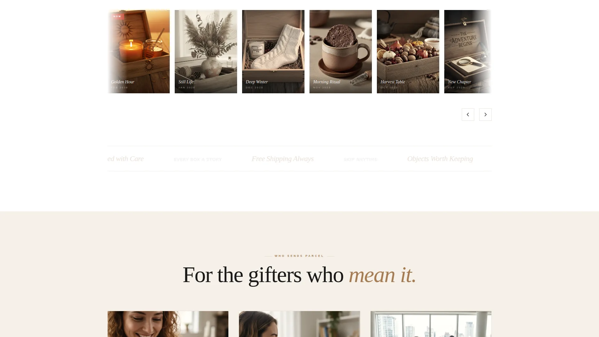
- The Gift Timeline filmstrip demonstrates twelve months of consistent, considered curation
- Clear reassurance messaging (free shipping, skip anytime, gift message included) removes common hesitations at the point of decision
What you get with this template
You get a fully structured, single-page layout that moves visitors from first impression to click with purpose. Every section is already sequenced to build confidence and appetite together.
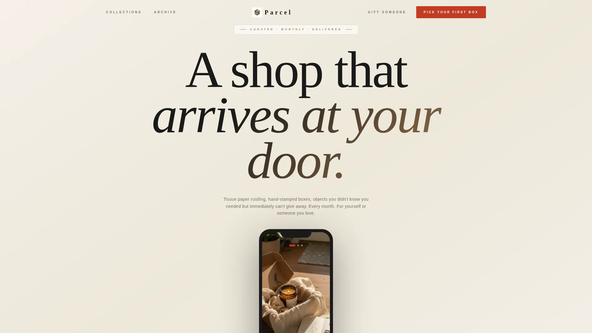
- A lifestyle header with a device mockup cycling through three curated box moments
- A masonry gift box gallery with expandable detail panels and per-item origin stories
- A sticky mobile call-to-action bar, a Gift Timeline filmstrip, and a final reassurance strip
Feature list
This template includes the components described below, each designed to support a subscription gift business.
App Store Preview Header
The header presents a lifestyle photograph of a half-opened subscription box, framed inside a device mockup that scrolls through three curated gifting moments: a birthday unboxing, a holiday mantel, and a just-arrived desk delivery. Warm afternoon light and shallow depth of field set an immediate mood.
Masonry Gift Box Gallery
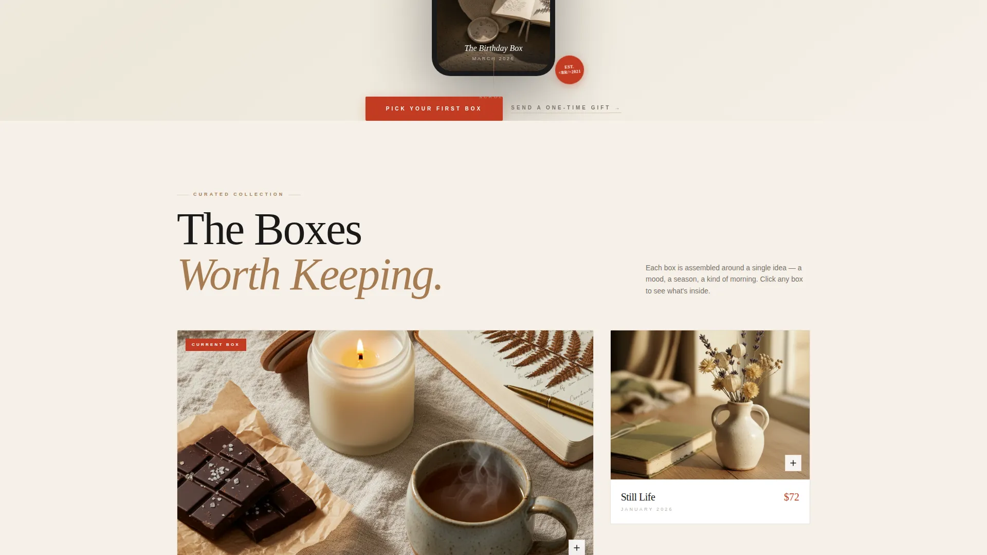
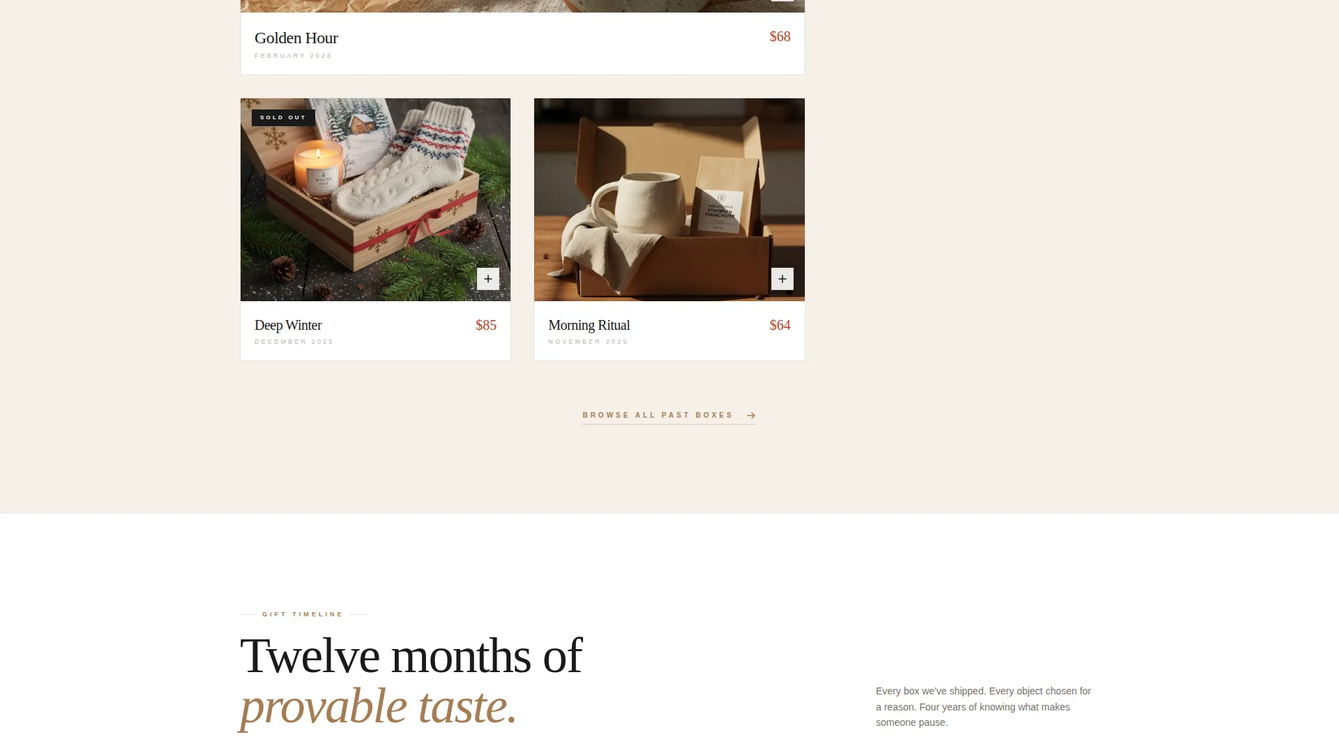
Past the header, the page arranges themed gift boxes in a tight masonry grid. Each tile shows a single hero object with the collection name set in serif capitals beneath it. The rhythm builds deliberately: one box, then a row of three, then a full seasonal collection.
Expandable Box Detail Panels
Clicking any gallery tile opens a detail panel that fans out every item inside the box. Each piece is paired with a one-line origin story, giving visitors a reason to linger and a reason to trust the curation behind each selection.
Gift Timeline Filmstrip
A horizontal filmstrip midway down the page displays twelve months of past boxes. It proves both depth of catalogue and consistency of taste, giving first-time visitors confidence that the shop has a track record worth subscribing to.
Dual Call-to-Action Architecture
The primary call to action, "Pick Your First Box," appears in sealing-wax red at the header and repeats as a sticky bottom bar on mobile. A secondary path, "Send a One-Time Gift," captures visitors who are not yet ready to subscribe, so no intent goes unmet.
Reassurance Strip
The final section closes with a concise strip: free shipping, skip anytime, and gift message included. These three points address the most common objections without cluttering the visual experience above them.
Page sections overview
| Section | Purpose |
|---|---|
| Lifestyle Header | Sets tone, shows unboxing moment inside device mockup |
| Device Mockup Scroll | Cycles through three curated gifting scenarios |
| Masonry Box Gallery | Displays themed gift collections as visual tiles |
| Expandable Detail Panel | Reveals every item and its origin story |
| Gift Timeline Filmstrip | Shows twelve months of past box history |
| Primary call to action Block | Drives clicks to the subscription plan selector |
| Secondary call to action Path | Captures one-time gift senders |
| Reassurance Strip | Addresses shipping, flexibility, and gift messaging |
Design & branding system
The visual identity uses an Ink & Paper color palette that feels like a stationer's workbench: heavy cotton paper, a freshly inked stamp, and a spool of twine. Every color choice is purposeful and restrained.
- Backgrounds stay in unbleached stock cream (#F5F0E8), typography sits in fountain pen black (#1A1A1A), and product cards float on white (#FFFFFF) with hairline kraft borders in brown (#A67C52)
- Sealing-wax red (#C23B22) appears only on buttons, badges, price callouts, and hover states, keeping it visually dominant whenever action is required
- Serif capitals on gallery tiles and dense black body type give the layout an editorial quality that feels considered rather than commercial
Mobile & speed optimization
The mobile layout preserves the full intent of the desktop experience without losing any key conversion touchpoint. The sticky bottom bar ensures the primary call to action is always within reach, no matter how deep a visitor has scrolled.
- The masonry grid reflows cleanly for narrower screens, keeping the gallery visual and browsable on mobile devices
- The sticky "Pick Your First Box" bar appears consistently at the bottom of the screen on mobile, so the click path is never more than a thumb-tap away
How this template helps you convert
The page is structured as a progressive reveal. Each scroll exposes another reason to stay, another object to want, and another proof that the curation is worth trusting.
- The header places visitors inside a gifting moment before they read a single word, creating emotional context that description alone cannot achieve
- The masonry gallery and expandable panels build desire through accumulation: the more a visitor explores, the harder it becomes to leave without clicking
- The dual call-to-action structure and final reassurance strip address both committed subscribers and hesitant one-time gift senders, so the page earns clicks from two distinct visitor intentions
Other information about this template
This template was built under a Marketplace Grid theme using a Scroll Reveal progressive structure. The creative direction follows a Curated Collection logic, where content density increases as the visitor scrolls, reinforcing the feeling that there is always another perfect thing just below the fold.
- The template is categorized under Retail & E-Commerce, Subscription-Based Business, making it directly suited to monthly gift box and curated subscription shop use cases
- No checkout flow is included on this page; the primary click lands on a separate plan selector, keeping the landing page focused on desire and trust rather than transaction
- The Ink & Paper color system is self-contained within the template, requiring no external design assets to launch with a cohesive visual identity
Theme
Marketplace Grid
Creative direction
Curated Collection
Color system
Cloud Canvas
Style
Scroll Reveal (Progressive)
Direction
Click-Through
Page Sections
App Store Preview Header
Masonry Gift Box Gallery
Expandable Box Detail Panels
Gift Timeline Filmstrip
Dual Call-to-action Architecture
Reassurance Strip
Related questions
Does this template include a checkout or payment flow?
Can I show fewer than twelve months in the Gift Timeline filmstrip?
Is the "Send a One-Time Gift" option a separate page?
How does the expandable detail panel work?
Who is this template best suited for?



