DEI & Inclusion Complete Professional Website Template
Parity is a pay equity analysis landing page template built for B2B SaaS products in the HR and compensation space. It uses a split-screen layout, a live employee count ticker, scroll-triggered statistics, and a three-step progressive lead form to turn VP People Ops leaders, compensation analysts, and general counsel into qualified demo leads.
by Rocket studio
Quick summary
Parity is a single-page lead generation template designed for pay equity analysis tools targeting Series B-to-D startups. It pairs a kinetic split-screen hero with scroll-driven storytelling, escalating gap statistics, and a progressive three-step form. The result is a page that feels urgent, credible, and impossible to leave without acting.
Who this template is for
This template is built for teams selling compensation analytics or pay equity software to HR and People Operations buyers. It speaks directly to the people who carry the weight of pay transparency compliance.
- VP-level People Operations leaders at startups scaling past 200 employees
- Compensation analysts managing spreadsheet-heavy audit workflows
- General counsel teams handling new pay transparency law requirements
What problem this template solves
Most HR software landing pages look the same: stock photography, vague value props, and a buried demo form. This template solves the harder problem of making pay equity feel urgent and real before the visitor scrolls away.
- Buyers arrive skeptical; the live employee ticker and magenta gap alerts make the scale of the problem visceral immediately
- Decision-makers need to justify a purchase; the testimonial split with a quantified result gives them the internal proof point they need
- Hesitant visitors stall; the secondary conversion path captures earlier-funnel leads with just an email before they commit to a demo
What you get with this template
You get a fully structured, desktop-first landing page with high-interactivity components designed to convert VP-level buyers. Every section is mapped to a stage in the buyer's journey, from awareness through decision.
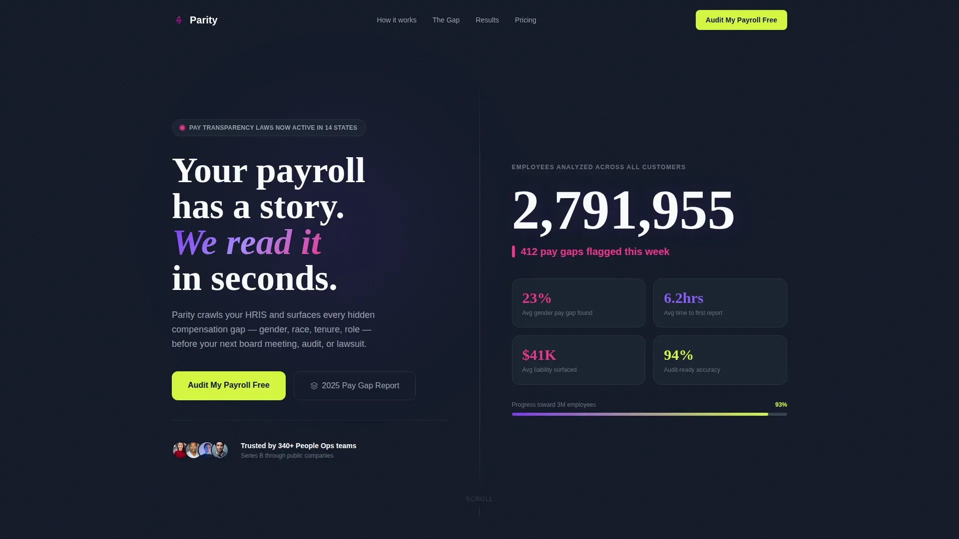
- A split-screen hero with a live animated employee count ticker and a single-line magenta gap stat
- A Hero's Journey scroll flow with five distinct sections, a sticky call-to-action bar, and a three-step progressive lead form
- A secondary conversion path offering a downloadable benchmark report for earlier-funnel visitors
Feature list
This template is built around deliberate, high-impact components. Each one is tied to a specific buyer objection or conversion moment.
Live Employee Count Ticker
The hero's right panel displays an animated counter that climbs in real time, showing the total number of employees analyzed across all customers. Each thousand crossed triggers a soft chartreuse pulse, turning raw scale into felt momentum.
Split-Screen Hero Layout
The header uses a strict 50/50 split. The left side holds a bold kinetic headline against ink-black. The right side holds the animated ticker and the single-line magenta stat. No stock photography, no dashboard previews. Just velocity made visible.
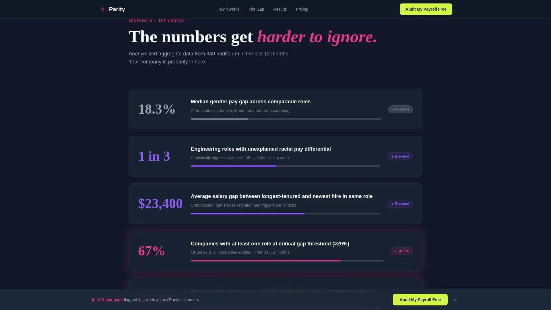
Scroll-Triggered Gap Statistics
Section three surfaces anonymized, real-feeling gap data that escalates in severity with each scroll step. Each statistic is harder to ignore than the last, compounding the cost of inaction until signing up feels like the only rational move.
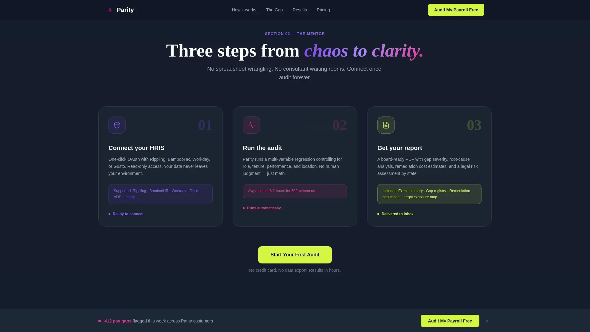
Three-Step Progressive Lead Form
The primary conversion form breaks the ask into three sequential steps. Step one captures work email and company size. Step two asks for the current human resources information system in use. Step three offers an optional calendar embed to book a 15-minute gap briefing.
Sticky Call-to-Action Bar
After the second scroll, a sticky bottom bar appears carrying the primary call to action. It stays visible as the visitor moves through the escalating statistics and testimonial sections, keeping the conversion moment always within reach.
Secondary Benchmark Report Path
A second conversion path lets hesitant visitors download a 2025 Pay Gap Benchmark Report with just an email address. This captures earlier-funnel leads who are not yet ready to book a demo but want to take something away.
Page sections overview
| Section | Purpose |
|---|---|
| Hero Split Screen | Opens with kinetic headline left, animated employee ticker right, and a magenta gap stat below |
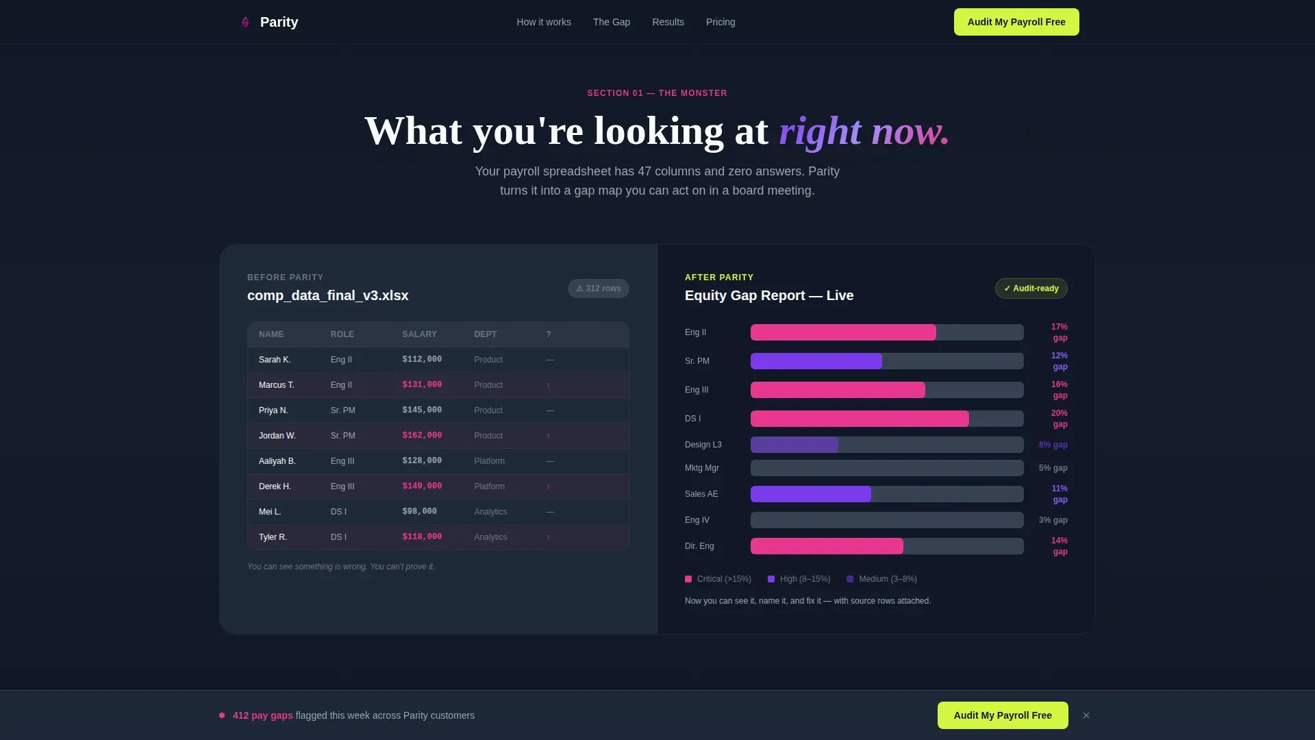
| Before / After | Shows messy spreadsheet on the left versus a clean equity heatmap on the right |
| Three-Step Workflow | Animates the connect-audit-report process sequentially to reduce setup anxiety |
| Escalating Gap Stats | Surfaces anonymized real data that compounds in severity with each scroll |
| Testimonial + Form | Pairs a VP of People quote with a quantified result and the progressive lead form |
| Linear Single-Row Footer | Closes with a clean, minimal footer using the single-row pattern |
Design & branding system
The visual identity follows a Startup Velocity theme powered by a Dopamine Pop color system. The palette feels like a notification you actually want to open: urgent without anxiety, bright without distraction.
- Ink (#111827) dominates all backgrounds; violet (#7C3AED) carries headlines and data visualizations; magenta (#E8368F) marks critical gaps and alerts
- Chartreuse (#D4F542) appears exclusively on interactive elements, hover states, and the primary call-to-action button to preserve its signal value
- Typography pairs DM Sans for body text with Fraunces display headlines, keeping the page data-forward and editorially sharp
Mobile & speed optimization
The template is built desktop-first, reflecting the VP and analyst audience who review tools at their desks. Mobile responsiveness is included so the page holds up across all screen sizes.
- Desktop layout is the priority; the split-screen, ticker, and progressive form are all optimized for wider viewports first
- Static sections use server components for lighter rendering; interactive elements like the ticker and animations run as client components
- The sticky call-to-action bar is designed to remain unobtrusive on smaller screens while staying accessible at the bottom of the viewport
How this template helps you convert
The page is engineered around a single goal: turning a skeptical VP or analyst into a booked demo or a captured lead. Every scroll compounds the pressure to act.
- The live ticker and magenta gap stat create immediate credibility and scale in the first three seconds, before the visitor has read a single word of body copy
- The escalating statistics section turns abstract risk into felt urgency, making inaction feel more expensive than a 15-minute gap briefing
- The progressive form reduces commitment anxiety by breaking the ask into three small steps, with an optional calendar embed as the final, lowest-friction close
Other information about this template
This template is categorized under HR and Hiring, specifically within the DEI and Inclusion subcategory, making it a strong fit for pay equity analysis tool products. It is part of the Startup Velocity theme collection and uses the Dopamine Pop color system, which is designed for dark, data-forward B2B SaaS pages. The creative direction follows a Hero's Journey narrative structure, guiding the visitor from problem awareness through transformation. The header concept is a User Count Ticker, which is an uncommon and attention-holding alternative to static hero images. The landing page direction is Lead Generation, and the template style is Split Screen at a 50/50 ratio.
- Built for the HR and Hiring category with a DEI and Inclusion subcategory focus
- Intersection match score of 13 reflects a high-alignment niche and template pairing
- The User Count Ticker header concept is designed to make product scale immediately tangible
- Suitable for teams running pay equity audits, compensation gap reviews, or pay transparency compliance workflows
Theme
Startup Velocity
Creative direction
Hero's Journey
Color system
Dopamine Pop
Style
Split Screen (50/50)
Direction
Lead Generation
Page Sections
Live Employee Count Ticker
Split-screen Hero Layout
Scroll-triggered Gap Statistics
Three-step Progressive Lead Form
Sticky Call-to-action Bar
Secondary Benchmark Report Path
Related questions
Who is this landing page template designed for?
What makes the hero section different from a standard SaaS hero?
How does the progressive lead form work?
Can a hesitant visitor convert without booking a demo?
What animation and interaction components are included?


