Travel Tech & Booking Platform Cost Calculator Website Template
Passage is a masonry-style travel insurance landing page built around seasonal storytelling and event-driven conversion. It guides gap-year adventurers, honeymooners, and frequent business travelers toward a live webinar registration with hover-reveal scenario cards, an inline quote calculator, and a sticky call-to-action bar rooted in an Alpine Fresh color palette.
by Rocket studio
Quick summary
Passage is a single-page travel insurance landing page built on a masonry grid layout. It turns real travel moments into interactive coverage stories, then funnels visitors toward a live webinar registration called "Cover Before You Go." The page pairs an atmospheric lifestyle header with seasonal card tiles, a sticky registration bar, and a 90-second inline quote calculator.
Who this template is for
This template is built for travel insurance platforms that want to move beyond generic comparison tables and connect with real traveler emotions. It suits brands that use content-led conversion and educational webinars as their primary acquisition strategy.
- Gap-year travelers, honeymooners, and frequent business travelers are the core audience personas.
- Travel insurance marketers who want a visually rich, story-first landing page to drive webinar sign-ups.
- Teams looking for a seasonal, moment-based layout that communicates coverage through relatable scenarios.
What problem this template solves
Travel insurance is a hard sell. Most visitors have no emotional connection to policy language, and generic landing pages do nothing to change that. Passage solves the engagement gap by reframing insurance as permission to travel boldly.
- Visitors scroll past dense policy text before they ever feel the need for coverage.
- A flat layout fails to communicate the variety of real-world scenarios that insurance protects against.
- Standard registration forms feel clinical, killing momentum right before the conversion moment.
What you get with this template
You get a fully structured, single-page layout with every section designed to build trust and drive event registrations. The template is detailed enough to launch with minimal copy changes.
- A wide-angle lifestyle header with headline overlay and an amber pulse call-to-action button.
- A seasonal masonry grid of travel scenario cards with hover-reveal coverage details.
- A sticky registration bar, a webinar sign-up form, and a secondary inline quote calculator.
Feature list
This template ships as a complete, conversion-focused layout. Every component is intentional and tied directly to the travel insurance use case.
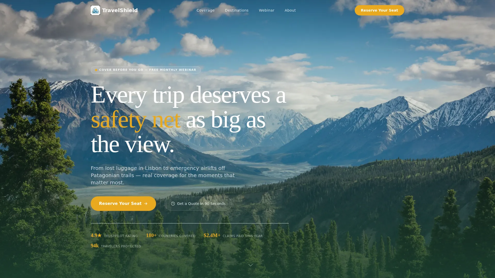
Lifestyle Header with Headline Overlay
A wide-angle, golden-hour hero image frames a solo traveler on a Swiss ridgeline. The headline "Every trip deserves a safety net as big as the view" sits in letterspaced evergreen type, and an amber call-to-action button pulses below like a trailhead marker.
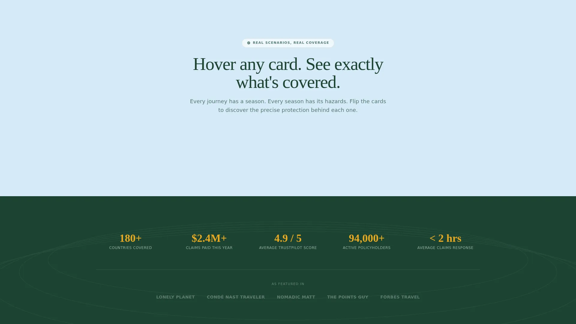
Seasonal Masonry Grid
The masonry grid tiles real travel moments across four seasons: a spring train platform in Kyoto, a summer cliff dive in Dubrovnik, an autumn Vermont road trip, and a winter ski lift in cloud. Cards are organized by season and emotional beat to build a layered argument for coverage.
Hover-Reveal Scenario Cards
Each masonry card carries a one-sentence scenario on its face, such as "Your ski snaps in Chamonix. Now what?" On hover, the card flips to reveal the exact coverage that applies. By the time visitors reach the registration form, they have already imagined multiple emergencies and want real answers.
Sticky Registration Bar
After the third masonry row, a sticky bar appears at the top of the viewport. It repeats the "Reserve Your Seat" call-to-action in wildflower amber, keeping the webinar sign-up visible without interrupting the browsing experience.
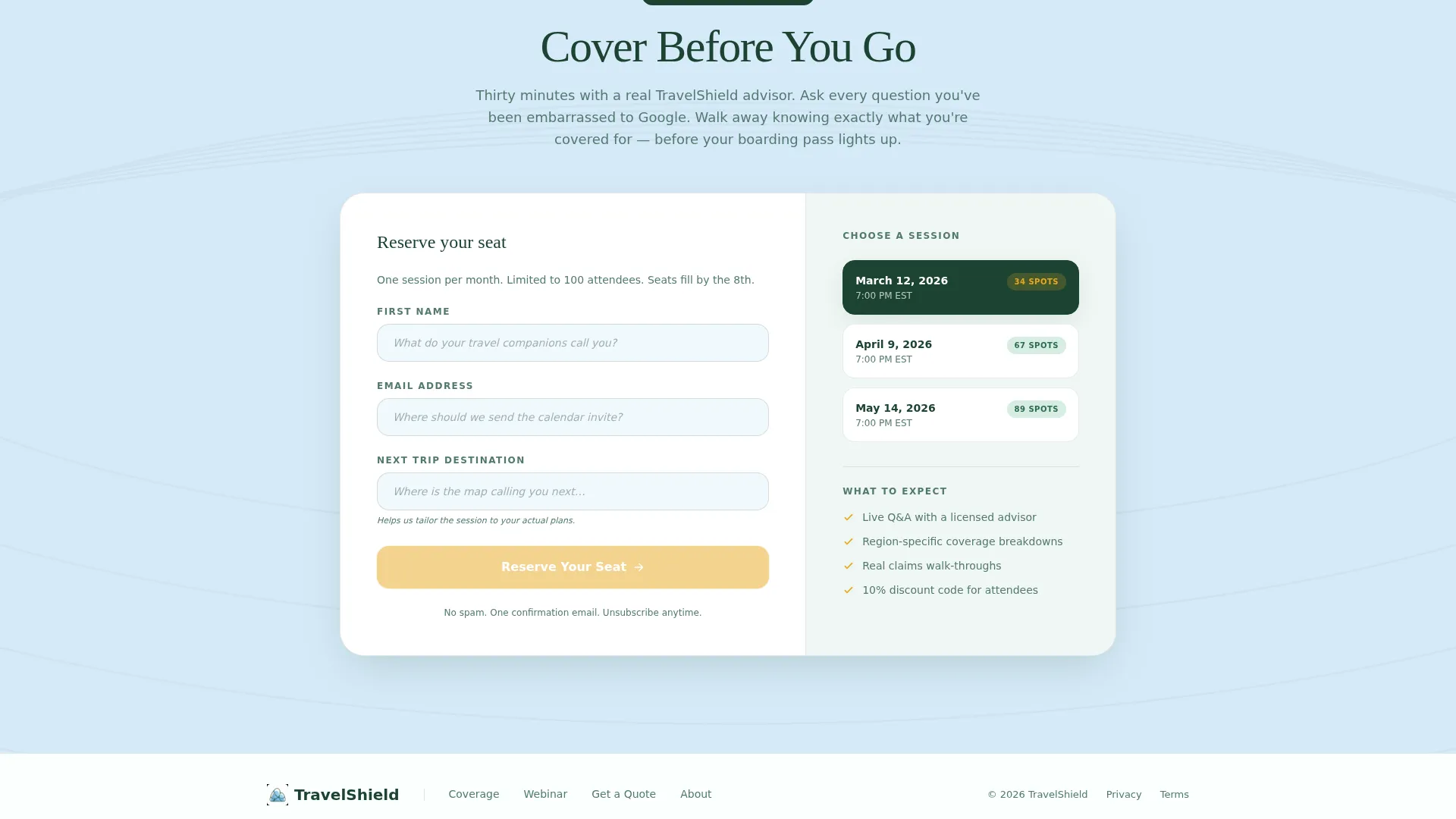
Webinar Registration Form
The sign-up form collects first name, email, and next trip destination via an open text field styled as a daydream prompt. A session date picker displays the next three upcoming webinar dates for the "Cover Before You Go" event.
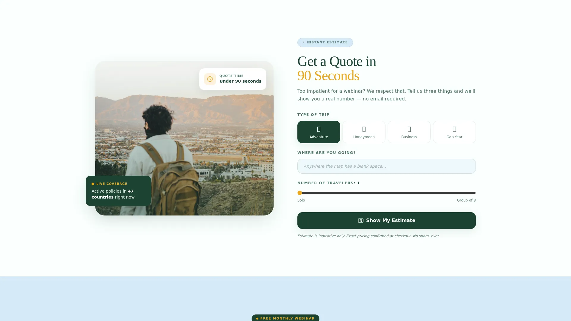
Inline Quote Calculator
A secondary conversion path labeled "Get a Quote in 90 Seconds" sits alongside the registration form. It offers an inline calculator for visitors who prefer an immediate estimate over a live webinar session.
Page sections overview
| Section | Purpose |
|---|---|
| Lifestyle Hero Header | Anchors brand tone and presents the primary call to action |
| Headline Overlay Copy | Delivers the core value proposition in one line |
| Amber Pulse call to action | Drives first click toward webinar registration |
| Spring Season Card | Opens the masonry grid with a cherry-blossom scenario |
| Summer Season Card | Continues seasonal arc with a cliff-dive moment |
| Autumn Season Card | Shifts emotional tone with a foggy road-trip card |
| Winter Season Card | Escalates stakes with a mountain ski emergency |
| Sticky Registration Bar | Keeps the "Reserve Your Seat" call to action persistent after scroll |
| Webinar Sign-Up Form | Captures name, email, destination, and preferred date |
| Quote Calculator | Offers an immediate 90-second quote for impatient visitors |
Design & branding system
The Organic Flow theme uses the Alpine Fresh color palette to evoke the physical sensation of high-altitude travel. Every color decision has a functional purpose, and the system stays disciplined throughout the page.
- Glacier melt blue (#D6EAF8) and morning frost white (#FAFFFE) alternate as section backgrounds, keeping the layout airy and readable.
- Evergreen shadow (#1B4332) carries all body and heading text, grounding the cool palette with depth and legibility.
- Wildflower amber (#E9A820) appears only on calls-to-action, badges, and interactive hover states, directing the eye precisely where action is needed.
Mobile & speed optimization
The masonry layout is structured to reflow gracefully from a multi-column desktop grid to a single-column mobile stack. Card interactions and the sticky bar are designed with touch-friendly targets in mind.
- The masonry grid adapts from a multi-column layout to a vertical scroll on smaller screens without losing the seasonal narrative order.
- The sticky registration bar remains accessible on mobile viewports, keeping the primary conversion path visible during scroll.
- The registration form and date picker are sized for comfortable tap interaction on touchscreen devices.
How this template helps you convert
Passage earns its conversions by stacking emotional micro-moments before it ever asks for anything. The layout is a deliberate funnel that moves visitors from wonder to urgency to action.
- The hover-reveal scenario cards do the pre-selling work. Each card surfaces a specific travel disaster and its matching coverage, so visitors arrive at the registration form already convinced they need help.
- The dual conversion paths reduce drop-off. Visitors who are not ready for a webinar can pivot immediately to the 90-second quote calculator, keeping them inside the funnel rather than bouncing.
Other information about this template
Passage is built specifically for travel insurance platforms operating in the travel technology and booking space. It is a strong fit for brands that lead with education and live events rather than hard-sell pricing pages.
- The template style is Masonry/Pinterest, making it visually distinctive in a category crowded with table-heavy comparison pages.
- The creative direction is Seasonal/Moment, meaning the layout communicates risk and coverage through relatable, time-stamped travel experiences rather than abstract policy language.
- The header concept is a Lifestyle Shot, using emotional photography rather than illustration to establish immediate trust and wanderlust.
- The landing page direction is Event Registration, with every visual and copy element pointed toward the "Cover Before You Go" webinar sign-up.
- The Organic Flow theme and Alpine Fresh color system are consistent throughout, ensuring brand cohesion from first scroll to form submission.
Theme
Organic Flow
Creative direction
Seasonal/Moment
Color system
Alpine Fresh
Style
Masonry/Pinterest
Direction
Event Registration
Page Sections
Lifestyle Hero Header
Seasonal Masonry Grid
Hover-reveal Scenario Cards
Sticky Webinar Registration Bar
Webinar Sign-up Form with Date Picker
Inline 90-second Quote Calculator
Related questions
What type of travel insurance platform is this template designed for?
How does the hover-reveal card mechanic work?
Is the inline quote calculator included in the template?
Can I update the webinar dates shown in the registration form?
Can this template be adapted for a different travel niche?


