Immigration Consulting Landing Page Template
Passage is a single-page immigration consulting landing page template built for firms that handle work permits, family sponsorships, and permanent residency cases. It combines a commanding Navy Authority color system, a zigzag visa-pathway layout, and a multi-step eligibility form to move anxious prospects toward a confident first step with the right counsel.
by Rocket studio
Quick summary
Passage is a lead-generation landing page template designed for immigration consulting firms. It uses a zigzag alternating layout to walk visitors through four key visa pathways, establishes institutional credibility through a logo wall, and captures qualified leads via a sequential eligibility form. The design feels authoritative and reassuring from the first scroll.
Who this template is for
This template suits immigration consultants and specialty legal service firms that handle complex visa cases and need a professional first impression online. It works especially well for practices serving multiple client types at once.
- Immigration consultants managing work permit, family sponsorship, and permanent residency cases
- Boutique specialty consulting firms that need to convey institutional authority before explaining services
- Practices targeting clients like software engineers waiting on work visa results, families separated by visa expiry, and small business owners sponsoring foreign hires
What problem this template solves
Most immigration consulting pages either look generic or overwhelm visitors with walls of legal text. Prospects arrive anxious and leave before making contact. This template solves that gap directly.
- It establishes trust visually before listing a single service, using a logo wall of embassy seals and agency badges to anchor credibility early
- It structures case complexity progressively, so visitors understand the firm handles difficult cases before they see the intake form
- It reduces the fear of the first step by breaking lead capture into three simple sequential questions rather than a full intake form upfront
What you get with this template
You get a fully structured, single-page layout with every section purpose-built for an immigration consulting firm. Nothing needs to be invented from scratch.
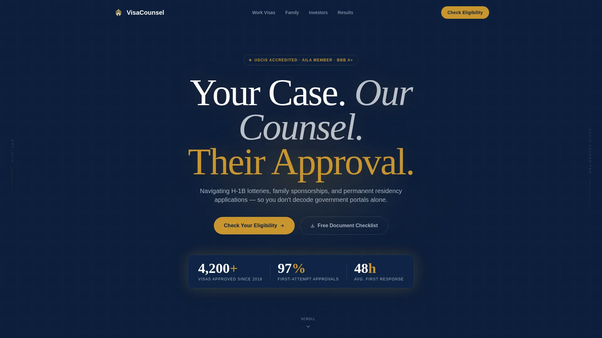
- A dark full-bleed header with a centered headline and a warm gold glow effect, plus a single trust metric displayed prominently below the headline
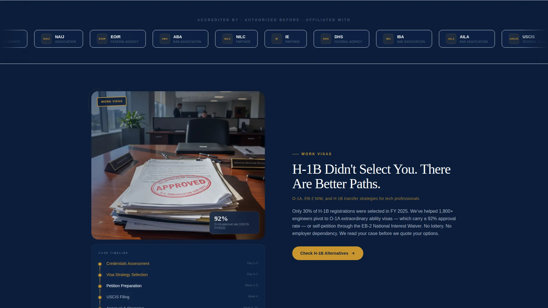
- A horizontal logo wall ticker section for embassy seals, government agency marks, bar association badges, and partner firm logos
- A four-section zigzag layout covering work, family, investor, and asylum visa pathways, each with an image panel and a text panel
- An inline multi-step eligibility form after the third zigzag section, with a sticky bottom bar variant for mobile visitors
- A secondary conversion path offering a downloadable document checklist for email capture and nurture
Feature list
The template is built around components that serve the specific workflow of an immigration consulting landing page.
Dark Full-Bleed Header with Glow Effect
The header uses a deep federal navy background with a warm gold glow radiating from behind the centered headline. A single stat, such as visas approved since a specific year, floats below the headline to anchor authority immediately.
Horizontal Logo Wall Ticker
A scrolling ticker sits directly below the header and displays institutional marks before any service description appears. This placement builds credibility at the moment visitors are still deciding whether to keep reading.
Zigzag Visa Pathway Sections
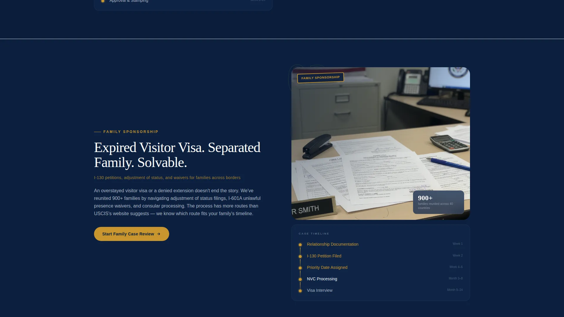
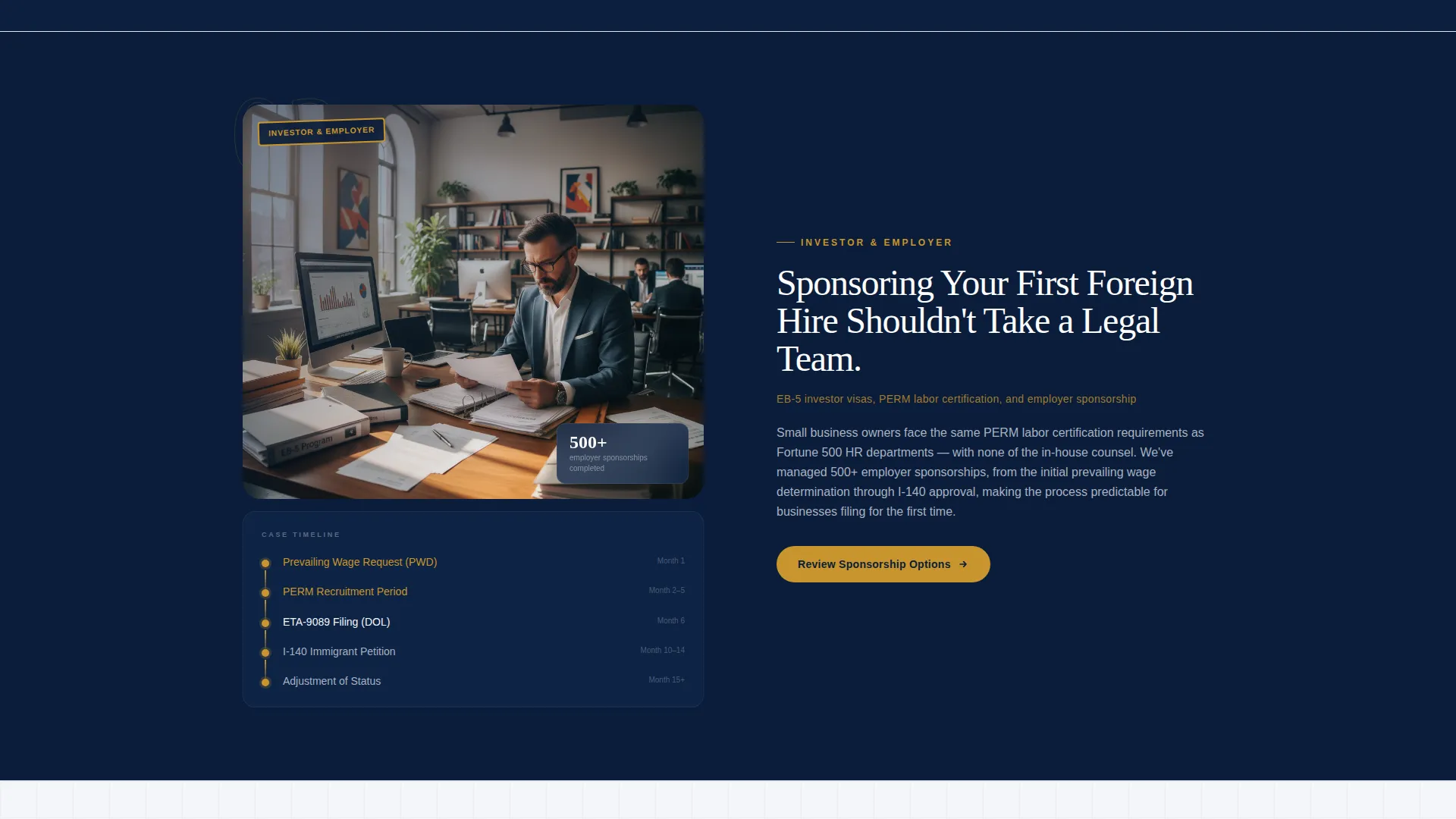
Four alternating left-image/right-text and right-image/left-text sections each cover one visa pathway. The image panel is designed to hold a redacted approval notice or a case timeline diagram rather than generic lifestyle photography.
Sequential Multi-Step Eligibility Form
The inline form asks three questions in order: visa type via a dropdown, current country of residence, and urgency timeline with three clear options. Email and phone fields appear last, after the visitor is already engaged.
Sticky Mobile Bottom Bar
On smaller screens, a sticky bottom bar keeps the primary call to action visible throughout the scroll without interrupting the reading experience.
Secondary Checklist Lead Capture
A secondary conversion path invites visitors to download a document checklist. This captures email addresses from visitors who are not yet ready to speak with a consultant, keeping them in a nurture flow.
Page sections overview
| Section | Purpose |
|---|---|
| Full-Bleed Header | Establish authority and display a key trust metric |
| Logo Wall Ticker | Show institutional credibility before services are described |
| Work Visa Section | Present work permit pathway with case evidence panel |
| Family Visa Section | Cover family sponsorship pathway and case complexity |
| Investor Visa Section | Highlight investor pathway with timeline or approval visual |
| Asylum Appeal Section | Demonstrate capability on the most complex case type |
| Eligibility Intake Form | Capture qualified leads through a three-step sequence |
| Checklist Download Block | Offer a secondary opt-in for document checklist nurture |
| Sticky Mobile call to action Bar | Keep primary call to action accessible on mobile |
Design & branding system
The visual identity follows a Service Utility theme built around a Navy Authority color system. Every color choice is intentional and tied to the emotional weight of immigration documents.
- Deep federal navy (#0B1D3A) dominates the background, polished silver-gray (#A8B2C1) handles secondary text and dividers, and clean white (#F4F6F9) is used for content panels to keep body copy readable
- Approval-stamp gold (#C9952D) is used exclusively for calls to action, success metrics, and trust indicators, reserving its weight for the moments that matter most
- The overall palette references the inside of a passport: the dark blue cover, the metallic foil of an embassy seal, and the gravity of a document that shapes where someone can live
Mobile & speed optimization
The template is structured to deliver a clean, functional experience on mobile devices without sacrificing the authority of the desktop layout.
- The sticky bottom bar replaces the inline call to action on smaller screens, keeping the eligibility prompt accessible without requiring a scroll back to the form
- The zigzag layout stacks into a single-column flow on mobile so each visa pathway section reads cleanly from image to text without overlap
- The logo wall ticker and header glow effect are designed to render at any viewport width, maintaining the visual hierarchy on phones and tablets
How this template helps you convert
The layout is built around a deliberate persuasion sequence that earns the lead before asking for contact details.
- The header and logo wall establish institutional weight in the first two sections, so visitors arrive at the service descriptions already trusting the firm rather than evaluating it
- The zigzag case escalation builds an implicit argument: a firm that handles asylum appeals treats an H-1B transfer as routine, which reduces hesitation for prospects with simpler cases
- The three-question eligibility form lowers the barrier to entry by starting with a visa type dropdown, turning the first interaction into a guided process rather than a blank contact form
Other information about this template
This template is part of a broader library of specialty consulting landing page templates designed for service businesses that need to convert cautious, high-consideration buyers.
- The template style is Zigzag/Alternating, which is particularly effective for service businesses that need to present multiple distinct offerings without making the page feel like a list
- The creative direction follows a Logo Wall Authority approach, a proven structure for professional services firms where third-party credibility marks carry more weight than self-reported claims
- The header concept, Dark Full-Bleed with Glow, is well suited to firms in high-stakes niches where the emotional register of the design needs to match the seriousness of the subject matter
- All color values, layout patterns, and component placements are defined in the template and can be updated to match a firm's existing brand guidelines
Theme
Service Utility
Creative direction
Logo Wall Authority
Color system
Navy Authority
Style
Zigzag/Alternating
Direction
Lead Generation
Page Sections
Dark Full-bleed Header with Glow
Horizontal Logo Wall Ticker
Zigzag Visa Pathway Layout
Sequential Three-step Eligibility Form
Sticky Mobile Bottom Bar
Secondary Checklist Download Path
Related questions
Can I change the visa pathway sections to match my firm's actual services?
What type of image works best in the zigzag panel?
How does the three-step eligibility form reduce drop-off?
Is the sticky bottom bar separate from the inline form?
Can a single-focus immigration practice use this template?



