Horse & Equestrian Booking Website Template
Passage is a hero-dominant dressage training landing page built for equestrian barns and riding instructors. It combines a full-viewport lifestyle hero, a community photo gallery with real student captions, and a structured three-step booking form. The Japanese Zen color palette and generous negative space give every section the calm, intentional feel of a well-prepared schooling session.
by Rocket studio
Quick summary
Passage is a single-page template for dressage training barns. It opens with a full-viewport hero image and a serif tagline, then flows through a community gallery of real student moments before landing on a clear booking form. The design is quiet, grounded, and purpose-built to convert curious riders into scheduled lessons.
Who this template is for
This template is built for dressage barns and equestrian riding instructors who want a landing page that reflects the quality of their training program. It suits coaches who rely on personal reputation and visual trust rather than loud marketing.
- Adult amateur riders looking for correct biomechanics at Second Level and beyond
- Barns serving young competitive riders building regional championship scores
- Re-riders and returning adult students who need a welcoming, judgment-free first impression
What problem this template solves
Most equestrian barn websites feel either too generic or too cluttered. They lead with text-heavy descriptions and stock photography that could belong to any stable anywhere. Passage solves this by making the visual experience do the heavy lifting first.
- Prospective students cannot picture themselves training there when photography feels impersonal
- Barns lose booking inquiries because the path from "I'm interested" to "I'm scheduled" has too many steps
- The tone of most equestrian pages does not match the quiet discipline that dressage training actually demands
What you get with this template
You get a complete, ready-to-customize landing page structure. Every section has been designed with a specific job to do, from building emotional connection in the hero to capturing scheduling information in the form.
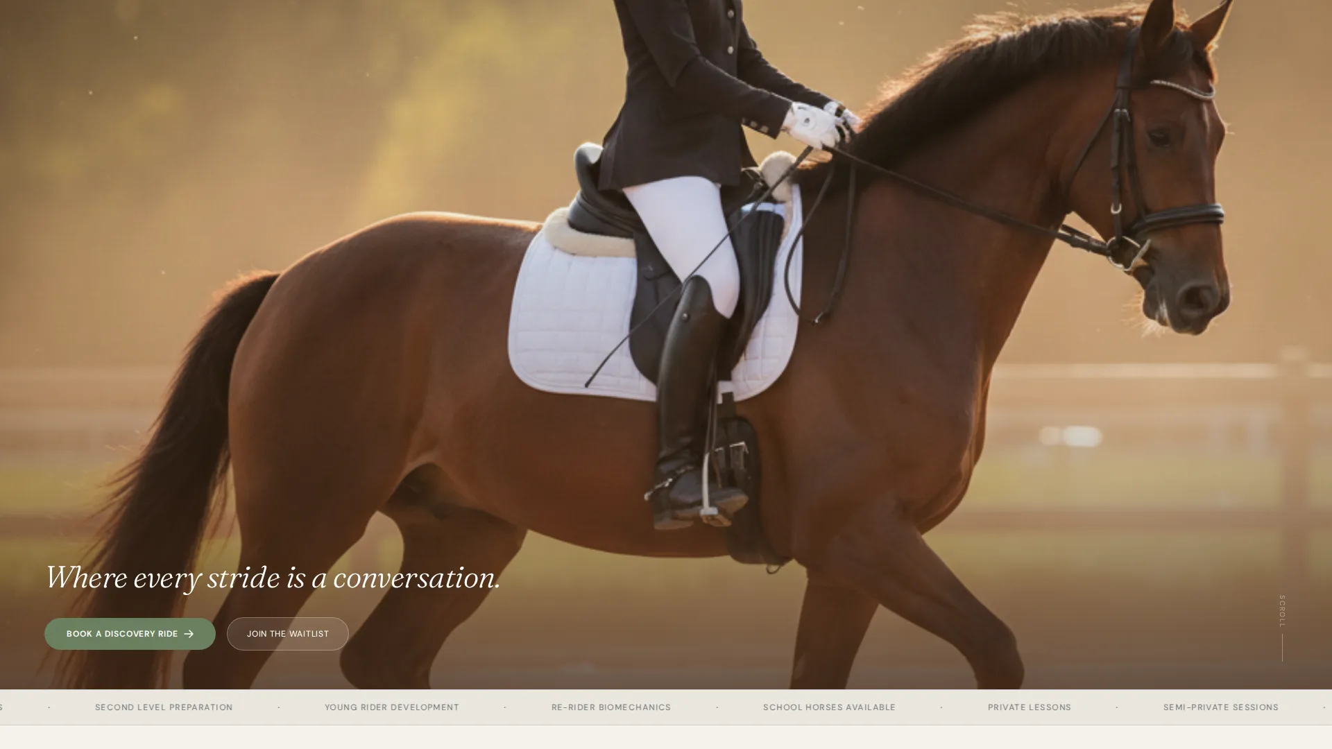
- A 90/10 hero-dominant layout with a full-viewport lifestyle image and a single serif tagline
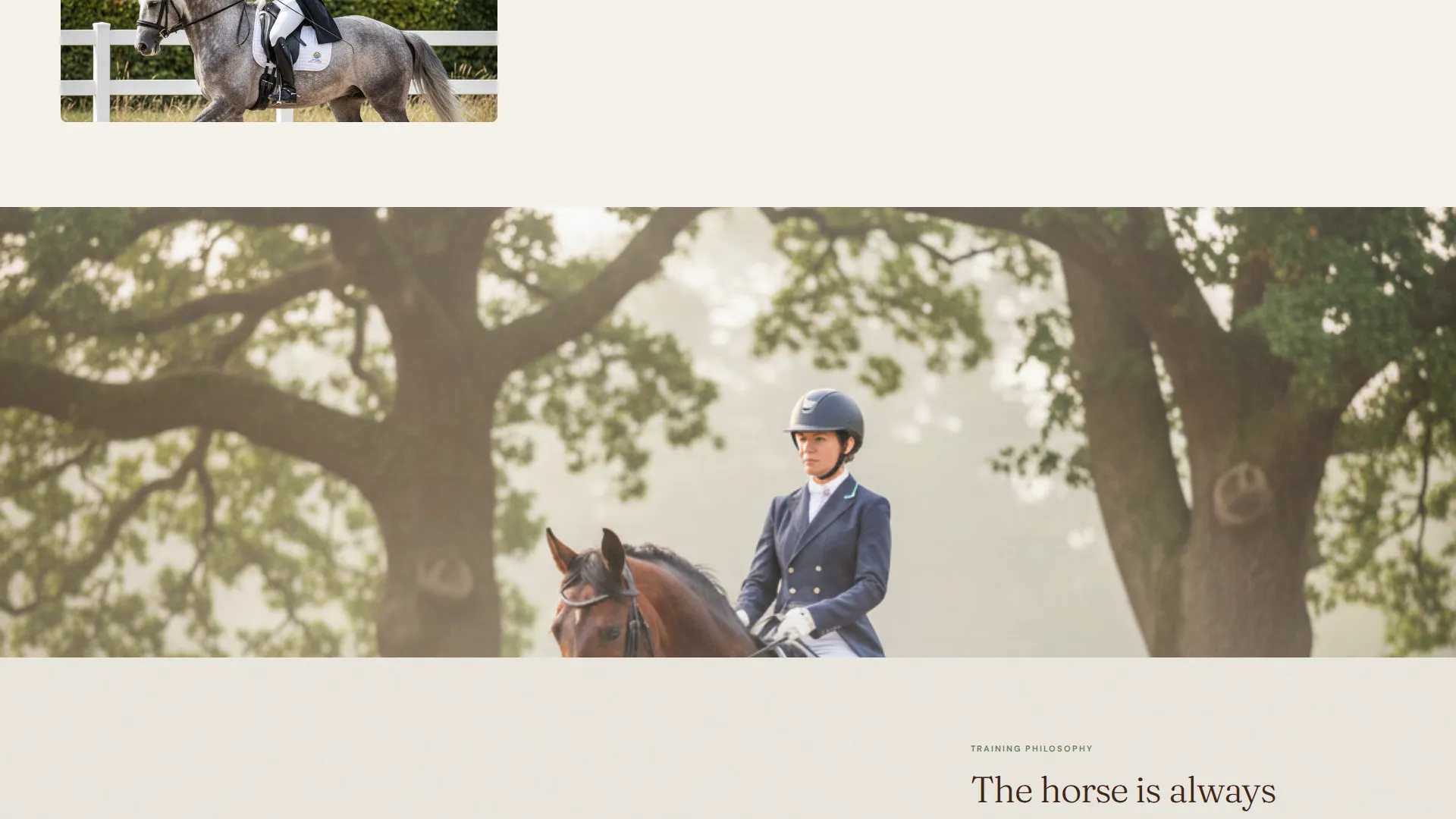
- A scrolling community gallery that alternates full-bleed student portraits with philosophy text blocks
- A three-step booking form with lesson type selection, an embedded weekly calendar, and a rider intake field
Feature list
This template is built around a small number of high-impact features. Each one serves the rider who is deciding whether to book and the barn owner who needs that decision to happen.
Full-Viewport Hero Section
The hero fills ninety percent of the screen with a single lifestyle photograph. A serif tagline fades in at the bottom edge of the image. There is no navigation and no logo competing for attention, only the image and the invitation to scroll.
Community Gallery with Captions
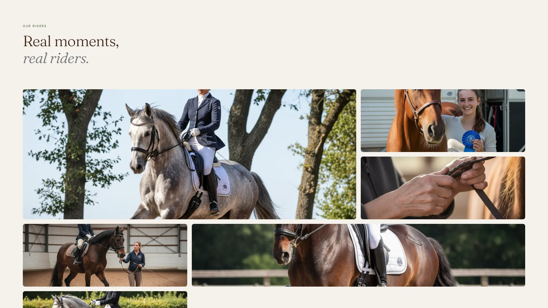
Below the hero, a mosaic of student photography unfolds. Each image carries a first name, a horse name, and one sentence the student actually said. The gallery alternates between full-bleed portraits and narrow philosophy text blocks, creating a reading rhythm that mirrors a working trot.
Three-Step Booking Form
The primary call to action opens a structured three-step form. Visitors choose a lesson type (private, semi-private, or lunge lesson), pick an available date from an embedded weekly calendar, and then enter their name, years of riding experience, and whether they have their own horse or need a school horse.
Sticky Booking Prompt
After the second scroll, a moss green booking button remains visible as a sticky element on the page. This keeps the primary call to action reachable at every point in the visitor's journey without interrupting the reading flow.
Waitlist Capture Path
A secondary conversion path labeled "Join the Waitlist" captures overflow demand. It asks only for an email address and a one-sentence goal statement, keeping the barrier low for visitors who are interested but not yet ready to commit to a date.
Japanese Zen Color System
The palette uses four intentional values: stone garden gray, deep stable timber, morning fog white, and a single moss green accent. Color is used sparingly, with moss green reserved for buttons, hover states, and scheduling prompts only.
Page sections overview
| Section | Purpose |
|---|---|
| Hero Image Block | Establishes atmosphere and emotional tone immediately |
| Tagline Fade-In | Anchors the barn's training philosophy in a single line |
| Community Gallery | Builds social proof through real student moments |
| Philosophy Text Blocks | Articulates training values between gallery images |
| Primary Booking Form | Converts interest into a scheduled lesson in three steps |
| Waitlist Capture | Retains overflow visitors with a minimal email form |
| Sticky Booking Button | Keeps the call to action accessible throughout the scroll |
Design & branding system
The visual identity follows a Nature-Inspired theme expressed through a Japanese Zen color system. Every design decision prioritizes calm and intention over decoration or animation. Negative space carries the same weight as any visual element.
- Stone garden gray (#6B6E70), deep stable timber (#3C2415), morning fog white (#F5F2ED), and moss green (#6B7F5E) form the complete palette
- Backgrounds use fog white, body text anchors in timber, and moss green appears only on buttons and interactive scheduling prompts
- Typography uses serif faces for headings and the hero tagline, reinforcing the unhurried, classical tone of the training discipline
Mobile & speed optimization
The hero-dominant layout is designed to translate cleanly to smaller screens. The 90/10 structure means the most important visual element takes priority at every viewport size, and the sticky booking button remains functional on mobile throughout the scroll.
- The gallery mosaic adapts from a multi-column desktop layout to a single-column mobile view without losing the caption context
- The three-step booking form is structured in a linear sequence that works naturally on a touch screen
- Generous negative space reduces visual clutter on smaller displays, keeping the page legible and calm
How this template helps you convert
Passage is structured so that trust is built before the booking ask is ever made. By the time a visitor reaches the form, the gallery has already shown them what training at this barn looks and feels like.
- The hero earns attention immediately with a single, high-quality lifestyle image and a tagline that speaks to the rider's aspiration rather than listing credentials.
- The community gallery functions as layered social proof, moving visitors from passive observers to people who can picture themselves in those moments.
- The three-step form reduces friction at the decision point by breaking the booking process into small, clear actions rather than presenting a long intake questionnaire all at once.
Other information about this template
Passage fits naturally into the broader category of equestrian and horse-related service pages where visual credibility matters as much as information. It is a strong starting point for any dressage barn, riding instructor, or equestrian coaching program that wants a page with presence.
- The template is categorized under Pet and Animal, specifically the Horse and Equestrian subcategory, within the Dressage Training niche
- The Community Gallery creative direction means the template is designed to showcase authentic, barn-specific photography rather than generic stock images
- The Lifestyle Shot header concept and the Nature-Inspired theme work together to establish credibility before any written copy is read
- The Booking and Scheduling landing page direction means every structural decision, from the sticky button to the waitlist form, serves a single conversion goal
Theme
Nature-Inspired
Creative direction
Community Gallery
Color system
Japanese Zen
Style
Hero-Dominant (90/10)
Direction
Booking/Scheduling
Page Sections
Full-viewport Hero Section
Community Gallery with Student Captions
Three-step Booking Form
Sticky Booking Button
Waitlist Capture Path
Japanese Zen Color System
Related questions
Can I use my own barn photography in the gallery?
What lesson types does the booking form support?
Do visitors need their own horse to submit a booking request?
Is the waitlist form a separate path from the main booking form?
Can this template be adapted for a barn that teaches more than one discipline?