Outplacement & Career Transition Careers Website Template
Passage is a warm, editorial-style landing page template built to recruit professionals into a twelve-week retirement transition program. It uses a Persona Selector header, scrolling before-and-after comparison tables, and persona-matched testimonials to guide visitors from recognition to enrollment. The design feels unhurried and human, earning trust before asking for a single click.
by Rocket studio
Quick summary
Passage is a single-page recruitment template for a twelve-week guided retirement transition program. It opens with three illustrated persona archetypes, shifts testimonials and curriculum highlights dynamically based on the visitor's selection, and scrolls through an emotional before-and-after arc that ends with a low-friction cohort sign-up form. The result is a page that feels personal before it feels persuasive.
Who this template is for
This template is built for coaches, counselors, and program directors who run structured retirement transition programs and need to recruit participants into a new cohort. It also works well for the adult children of soon-to-retire parents who are searching for something meaningful to share.
- Program facilitators recruiting professionals aged roughly fifty-five to sixty-five into a guided cohort
- Wellness or coaching practices offering structured group programs around life transitions
- Career transition services with a retirement-focused offering in the outplacement space
What problem this template solves
Retirement transition programs often struggle to explain their value before a visitor has even admitted the problem exists. Most landing pages lead with features or pricing. This template leads with recognition, showing three emotionally specific archetypes so the visitor identifies themselves before reading a single paragraph of body copy.
- Visitors who do not yet have language for what they are feeling need to see themselves reflected first
- Generic program pages lose the adult-child visitor who found the page for someone else and needs a clear secondary path
- Before-and-after tables that compare pricing tiers miss the point; this template compares versions of the visitor's own life instead
What you get with this template
You get a fully structured, single-page layout designed around the emotional arc of retirement transition. Every section is sequenced to build trust progressively, from persona identification at the top to cohort enrollment at the bottom.
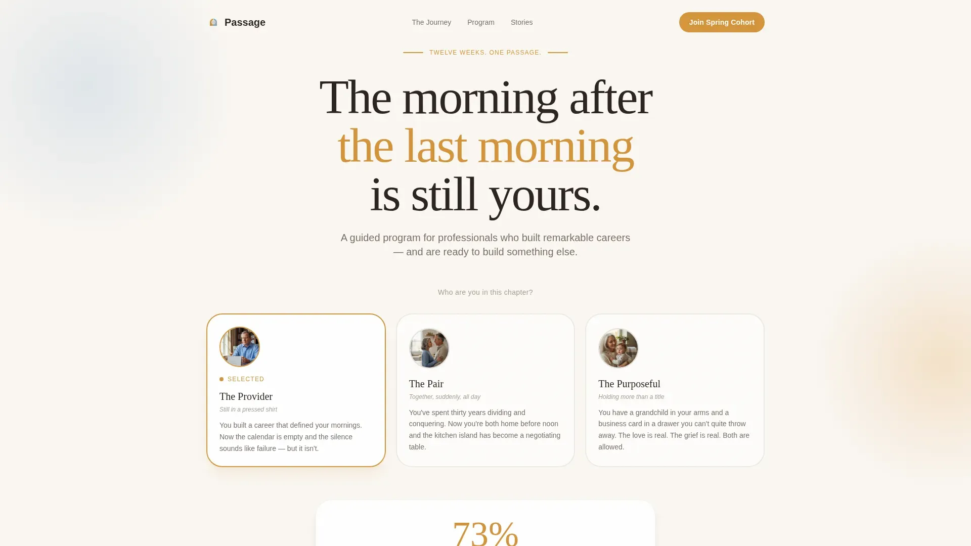
- A Persona Selector header with three illustrated archetypes that dynamically update testimonials, curriculum highlights, and outcome statistics on hover
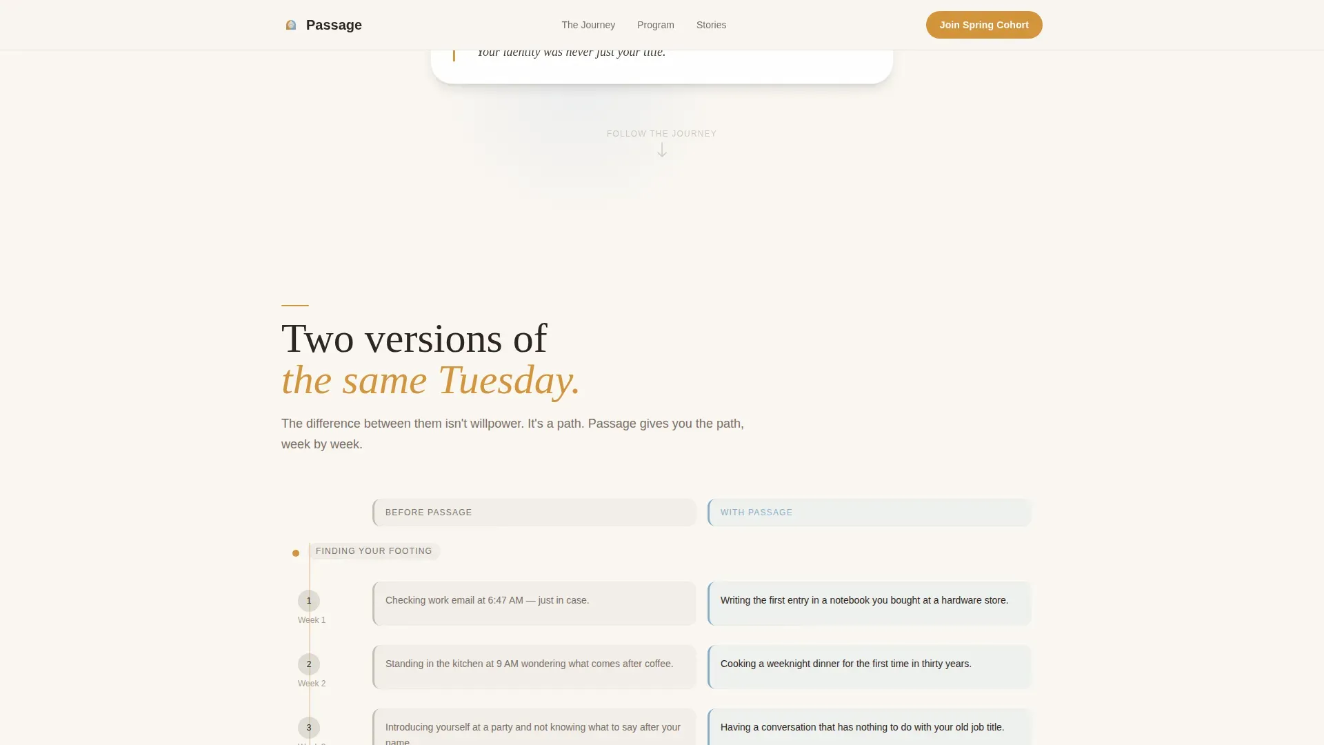
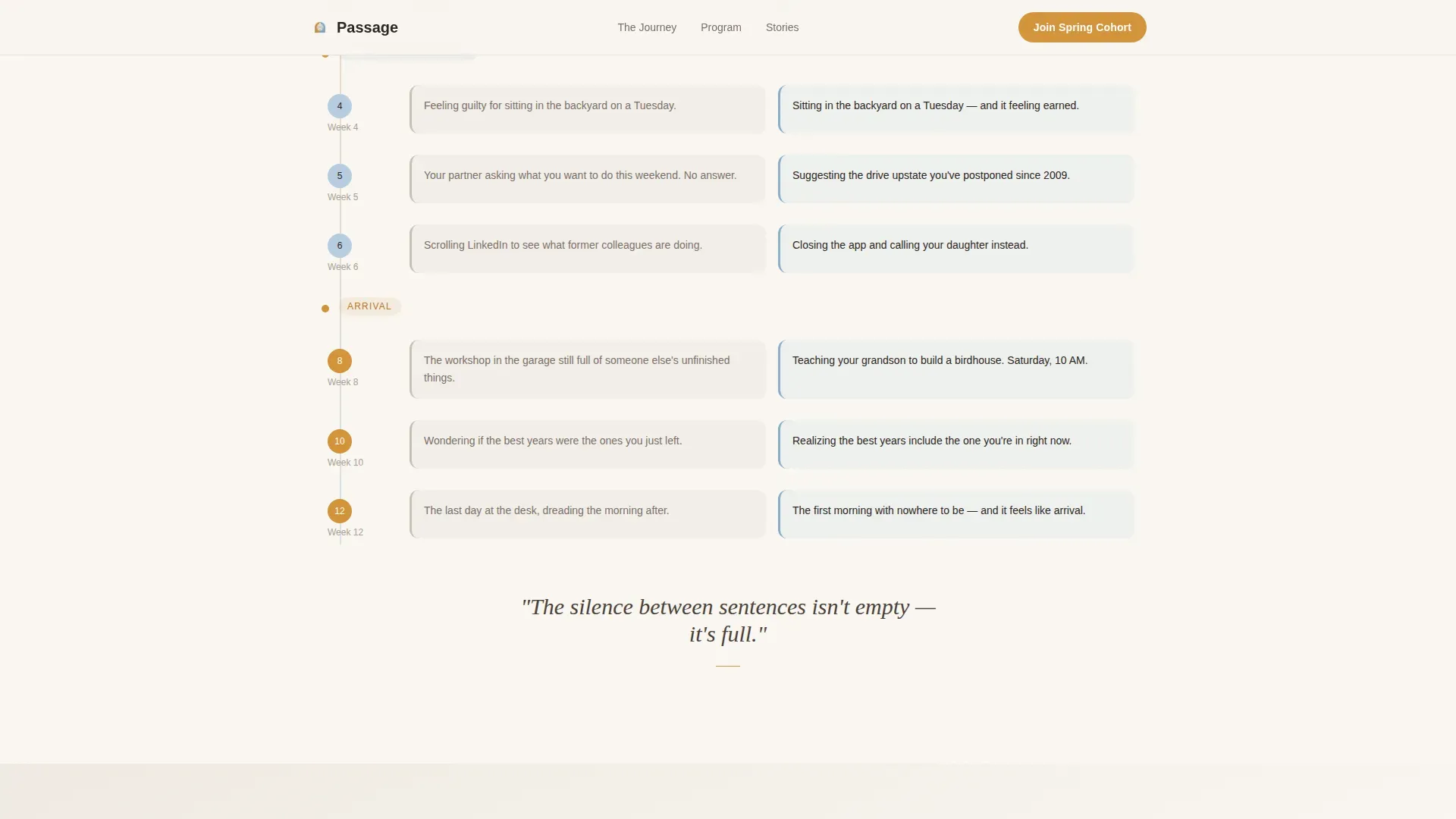
- A scrolling comparison table arc that moves week by week from disorientation through meaning, structured as before-and-after life states rather than pricing rows
- A three-field cohort sign-up form paired with a secondary "Send This to Someone You Love" path for adult-child visitors
Feature list
A paragraph introducing the feature set: every component in this template is designed to reduce friction, build recognition, and move the right visitor toward enrollment in a way that feels earned rather than pushed.
Interactive Persona Selector
Three illustrated portrait cards sit side by side in the hero section. Hovering each one shifts the page's testimonials, curriculum highlights, and outcome statistics to match that archetype's journey. The visitor chooses their own story before they read a single line of body copy.
Before-and-After Journey Tables
The scroll follows a single emotional arc across twelve weeks. Each section pairs a comparison table showing a "before" state, such as checking work email out of habit, alongside an "after" state, such as teaching a grandchild to build a birdhouse. The tables escalate from survival to meaning as the visitor scrolls.
Persona-Matched Social Proof
Testimonials, outcome statistics, and cohort size indicators update dynamically to reflect whichever persona the visitor selected. Each testimonial includes a name, a former role, and a concrete outcome, so the social proof feels specific rather than generic.
Cohort Enrollment Form
The primary call to action reads "Join the Spring Cohort" and appears after the persona-matched outcome statistics, where trust is highest. The form asks for three fields only: first name, retirement date or target year, and which persona resonated most.
Secondary Sharing Path
A clearly placed secondary call to action reads "Send This to Someone You Love." It gives adult children a frictionless way to pass the page to a parent, without disrupting the primary enrollment flow.
Warm Editorial Visual System
Typography pairs Fraunces serif headlines with DM Sans body text. The Cloud Canvas color palette uses linen white as the background, heirloom amber for buttons and accent moments, morning sky blue for supporting elements, and hearthstone warm gray for secondary text.
Page sections overview
| Section | Purpose |
|---|---|
| Persona Selector Hero | Visitor identifies their archetype before reading body copy |
| Week-by-Week Journey Tables | Scrolling before-and-after arc builds emotional recognition |
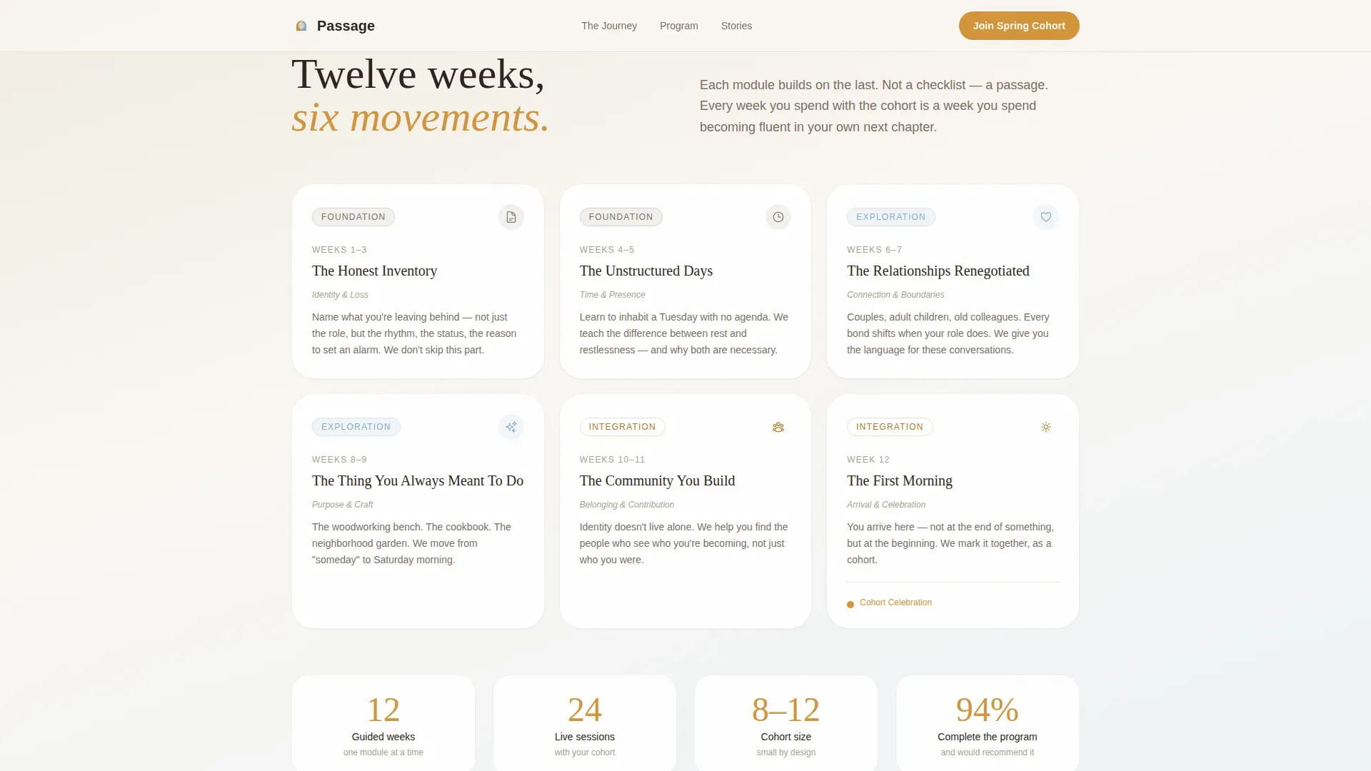
| Twelve-Week Curriculum | Persona-matched program highlights show structured progress |
| Persona-Matched Testimonials | Dynamic social proof with names, roles, and real outcomes |
| Cohort Sign-Up Form | Three-field enrollment form anchored after peak trust moment |
| Secondary Sharing Path | "Send This to Someone You Love" route for adult-child visitors |
| Footer Arc Split | Logo and tagline left, navigation links right |
Design & branding system
The visual identity follows a Family First theme built on the Cloud Canvas color system. The overall impression is warm, editorial, and unhurried, like a Sunday magazine left open on a kitchen table. Nothing on the page demands attention, but every element earns it.
- Colors: linen white (#FAF7F2) background, heirloom amber (#D4943A) for buttons, pull quotes, and milestone markers, morning sky blue (#B8CDE0) for supporting components, and hearthstone warm gray (#A89F91) for secondary text
- Typography: Fraunces serif for all headlines to carry emotional weight, DM Sans for body text to keep reading effortless
- Animation: scroll reveals, persona hover state transitions, and staggered fade-ins create a medium level of motion that feels gentle rather than flashy
Mobile & speed optimization
The template is designed desktop-first, reflecting the primary visitor profile of professionals aged fifty-five to sixty-five who are likely browsing at home on a laptop. The layout still adapts cleanly for tablet and mobile viewports so adult-child visitors on a phone can navigate and share without friction.
- Static page sections use optimized server-side rendering while the interactive persona switcher runs as a client component to keep the dynamic behavior snappy
- Scroll reveal animations and staggered fade-ins are calibrated to feel smooth without introducing unnecessary load weight
- The three-field enrollment form is touch-friendly and straightforward on any screen size
How this template helps you convert
The page earns the click through recognition rather than urgency. By the time a visitor reaches the call to action, they have already identified their archetype, watched their own life described week by week, and read a testimonial from someone who shares their former role.
- The Persona Selector at the top immediately signals that this program was built for someone like them, which lowers resistance before a single marketing claim is made.
- The before-and-after comparison tables replace abstract program descriptions with specific, emotionally resonant life moments, making the transformation feel real and believable.
- The low-friction three-field form and the secondary sharing path together reduce drop-off at the moment of commitment, serving both the primary enrollee and the adult-child referrer in one layout.
Other information about this template
This template is categorized under HR and Hiring, specifically within the Outplacement and Career Transition subcategory, making it a strong fit for organizations offering retirement coaching or structured transition support as part of a broader career services portfolio.
- Template style: Comparison Table, using life-state comparisons rather than feature or pricing rows
- Creative direction: Hero's Journey scroll arc, moving from disorientation through awkward middle weeks to purposeful arrival
- Header concept: Persona Selector with three illustrated archetypes, "The Provider," "The Pair," and "The Purposeful"
- Localization: English (United States), no currency symbols, dates formatted as MM/YYYY
- Cohort indicator and outcome statistics are included as social proof elements alongside the persona-matched testimonials
Theme
Family First
Creative direction
Hero's Journey
Color system
Cloud Canvas
Style
Comparison Table
Direction
Recruitment/Hiring
Page Sections
Interactive Persona Selector Header
Before-and-after Comparison Tables
Persona-matched Social Proof
Low-friction Cohort Enrollment Form
Secondary Adult-child Sharing Path
Warm Editorial Typography and Color System
Related questions
Who is the primary visitor this page is designed for?
How does the Persona Selector work on the page?
What makes the comparison tables different from a standard pricing table?
Can I adapt this template if my program runs on a different schedule?
Is this template suitable for a solo coach or only for larger organizations?


