Funeral Home & Booking Website Template
Passage is an editorial funeral home landing page built for family-owned services. It guides grieving families through the arrangement journey with a calm, unhurried scroll experience. A sumi-e ink-wash illustration, Japanese Zen color palette, and a gentle booking form combine to create a page that feels like a trusted conversation, not a sales pitch.
by Rocket studio
Quick summary
Passage is a single-page funeral home template designed for traditional, family-owned services. It blends editorial storytelling with a quiet Japanese Zen aesthetic to walk bereaved families through every stage of the arrangement process. The primary goal is a scheduled consultation call. The page earns that click by placing care before conversion.
Who this template is for
This template is built for traditional funeral homes that lead with trust and human warmth. It suits established, family-owned businesses that want a dignified online presence without cold corporate design.
- Funeral home owners seeking a thoughtful, editorial alternative to generic service pages
- Families or advisors building a memorial services site that centers the human experience
- Established providers with a legacy story worth telling slowly and honestly
What problem this template solves
Grieving families arrive at a funeral home website already overwhelmed. Most funeral home pages bombard visitors with pricing grids, generic stock photos, and cluttered navigation. Passage removes that friction entirely.
- Families feel rushed or sold to before they feel understood
- Decision-makers, often adult children or surviving spouses, need reassurance before they can act
- A disorganized page breaks trust at the exact moment trust matters most
What you get with this template
Passage delivers a complete, single-page layout structured as an editorial journey from first contact to aftercare. Every section is purposeful and ordered to deepen emotional reassurance as the visitor scrolls.
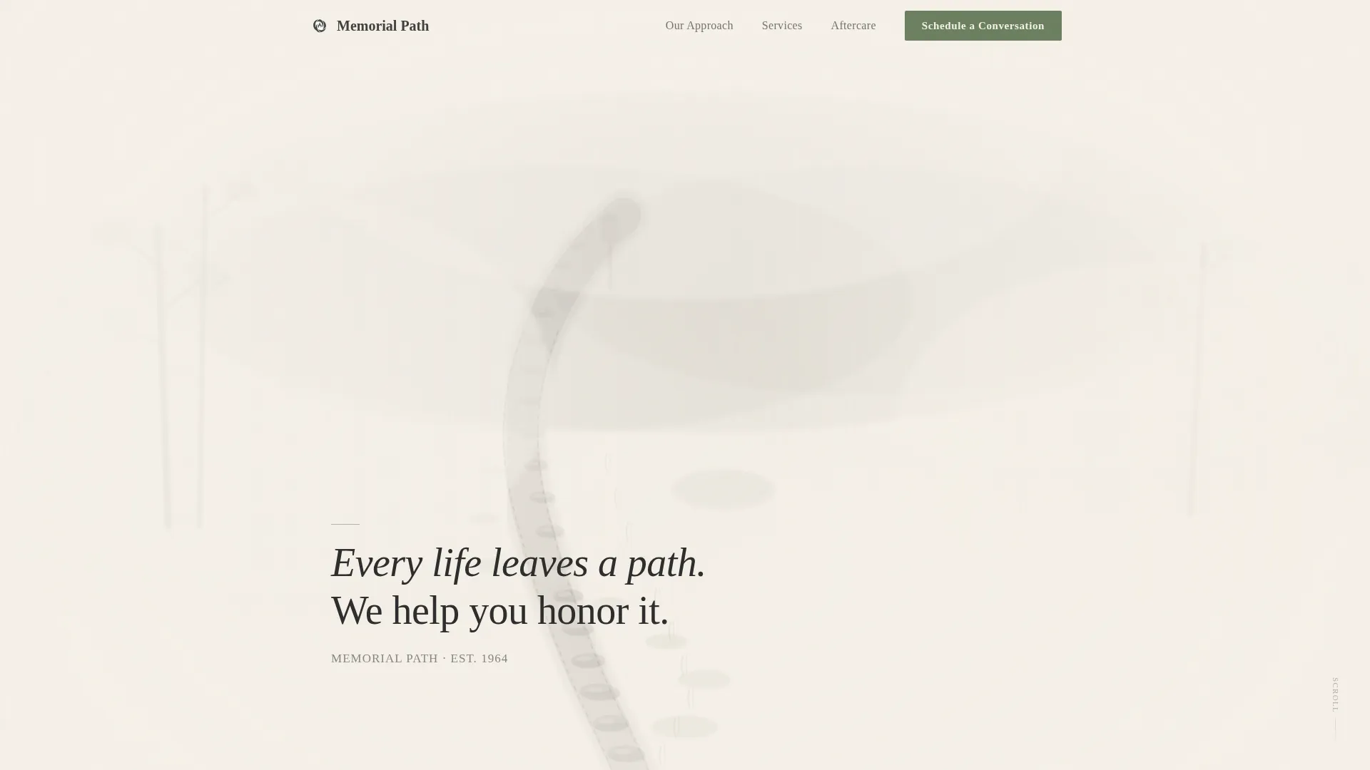
- A full-viewport sumi-e illustration hero with a low-set serif headline
- A seven-section narrative arc covering the first call through grief support and remembrance
- Two booking form placements, a multi-step scheduling form and a secondary phone call-to-action
Feature list
A brief note on what drives this template: every feature is chosen to serve grieving families first, and the design enforces that priority at every level.
Sumi-e Ink-Wash Hero Illustration
The header uses a hand-drawn, ink-wash landscape in the sumi-e tradition. A winding stone path dissolves softly into white mist at the edges of the full-viewport frame. A single serif headline sits low in the composition: "Every life leaves a path. We help you honor it."
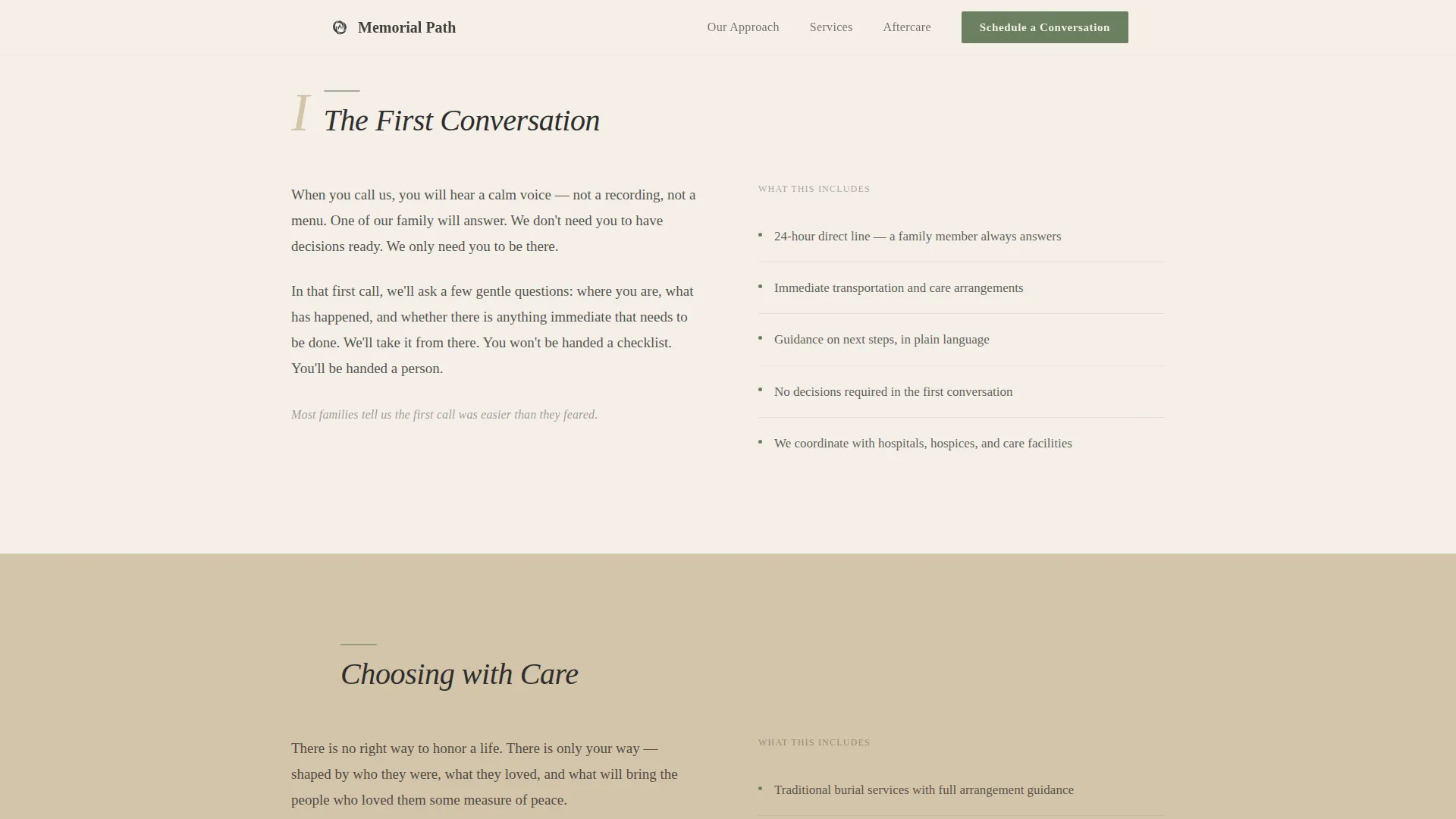
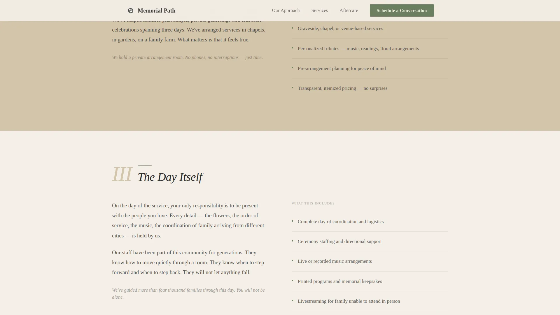
Timeline Progression Scroll Structure
The page moves visitors through four emotional stages: the initial conversation, choosing arrangements, the ceremony, and the days that follow. Each stage pairs a narrative passage on the left with specific service details on the right, in an editorial two-column layout. Scroll-triggered reveals use soft vertical movement and gentle opacity transitions.
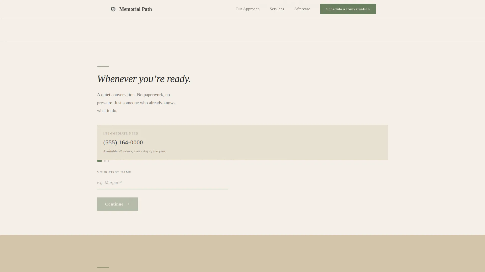
Multi-Step Booking Form
The scheduling form asks only three things in sequence: a first name, a preferred day and time from a calendar selector, and an optional line for anything the family wants to share. A secondary "Call Us Now" path with a direct phone number serves families in immediate need.
Japanese Zen Color System
The palette uses washed ink black, tatami warm beige, raked sand white, and a single moss green accent reserved for interactive elements and calls to action. Backgrounds alternate between sand white and tatami beige in long, breathing sections, creating visual calm without monotony.
Editorial Typography Pairing
Display headings use Fraunces, a contemporary serif with warmth and personality. Body text uses Crimson Text, a classical reading serif. No sans-serif typefaces appear anywhere in the layout, keeping the editorial register consistent throughout.
FAQ Accordion and Social Proof Framing
A collapsible FAQ accordion lets families find answers without leaving the page. Quiet testimonial quotes and a sixty-year legacy reference are woven into the narrative to build trust through context, not loud claims.
Page sections overview
| Section | Purpose |
|---|---|
| Hero Illustration | Set tone, introduce headline |
| The First Call | Reassure, explain first contact |
| First Booking call to action | Invite early scheduling gently |
| Choosing Arrangements | Personalization and service details |
| The Ceremony | Ceremony narrative and specifics |
| The Days After | Grief support and aftercare |
| Final Booking call to action | Full form plus phone option |
| Minimal Footer | Navigation and legal baseline |
Design & branding system
The visual identity follows an Organic Flow theme. Every design decision is deliberate, muted, and warm without effort. The palette and type system work together to feel like a ceramic tea bowl cradled in both hands.
- Colors: raked sand white (#F5F0E8) primary background, tatami warm beige (#D4C5A9) alternate sections, washed ink black (#2C2C2C) for all text, moss green (#6B7F5E) for interactive elements only
- Typography: Fraunces for display headings, Crimson Text for body copy, consistent serif register throughout
- No photographs of buildings or people appear anywhere; the sumi-e illustration carries all visual weight
Mobile & speed optimization
The template is built desktop-first, reflecting the reality that primary decision-makers, often adult children on laptops, tend to review options from a desk rather than a phone. Mobile adaptation is careful and deliberate rather than an afterthought.
- Server components handle all static sections, keeping initial load lightweight
- Client-side rendering is scoped to the booking form and scroll-triggered reveal interactions
- Soft vertical scroll animations use low-motion transitions with no bounce or jarring movement
How this template helps you convert
Passage is designed so that the visitor feels guided, not sold to. By the time the booking form appears, the emotional groundwork is already complete.
- Two-section narrative warmup before the first call-to-action means visitors arrive at the form already feeling cared for, which meaningfully lowers hesitation
- A minimal three-field form reduces friction for families who are exhausted and short on capacity, making it easy to take the next step
- A secondary "Call Us Now" path with a direct phone number captures families in immediate need who are not ready to wait for a scheduled callback
Other information about this template
Passage is part of a curated set of editorial templates built for emotionally sensitive service categories. A few additional details worth knowing before you build with it.
- The footer follows a minimal horizontal flow pattern, keeping navigation uncluttered at the close of a long emotional page
- Localization is set for English, United States, with standard date formatting in the calendar selector
- The sixty-year legacy reference in the social proof framing can be adapted to reflect your own service history
- Testimonial quote placement is woven into the narrative sections rather than isolated in a dedicated review block
- The template style is editorial and magazine-inspired, making it well suited for funeral homes that communicate through story rather than specification
Theme
Organic Flow
Creative direction
Timeline Progression
Color system
Japanese Zen
Style
Editorial/Magazine
Direction
Booking/Scheduling
Page Sections
Sumi-e Ink-wash Hero Illustration
Timeline Progression Scroll Structure
Multi-step Booking Form
Japanese Zen Color System
Editorial Serif Typography
FAQ Accordion and Social Proof Blocks
Related questions
Can I change the booking form fields?
Does the page include real testimonials?
Is this template suitable for a newly opened funeral home?
How does the scroll animation work?
What happens at the two booking form placements?


