Refugee Advocacy Nonprofit Landing Page Template
Passage is a modular card grid landing page built for refugee and migration advocacy organizations. It walks visitors through a family's full journey, arrival, services, and resolution, using named stories, warm editorial design, and a single coral call-to-action button that clicks through to a dedicated donation or volunteer signup page. No forms, no friction, just earned trust.
by Rocket studio
Quick summary
Passage is a click-through landing page template for nonprofit immigration advocacy organizations. It uses a Hero's Journey card grid to move visitors from crisis to resolution through real family stories. The Botanical color system and warm editorial visuals build trust before a single ask is made. The primary call to action links out to a dedicated signup page.
Who this template is for
This template is built for organizations that accompany families through the full arc of the immigration process, not just one part of it. It speaks to groups that lead with humanity before asking for anything.
- Refugee resettlement nonprofits and immigration legal aid organizations
- Advocacy groups offering translation, community navigation, and school enrollment support
- Nonprofit communications teams who want donors and volunteers to feel the mission before seeing a button
What problem this template solves
Most nonprofit landing pages lead with their org chart, not the people they serve. Visitors leave before they feel anything. This template flips that structure entirely.
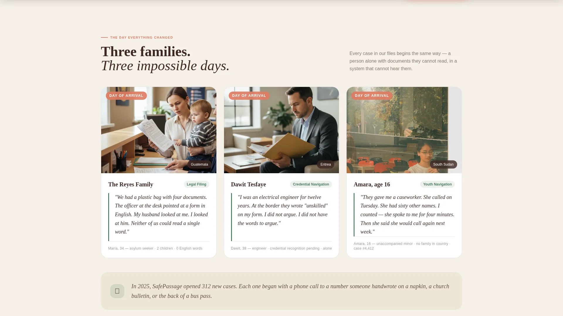
- It opens with arrival-day family stories, not service lists, so visitors connect immediately
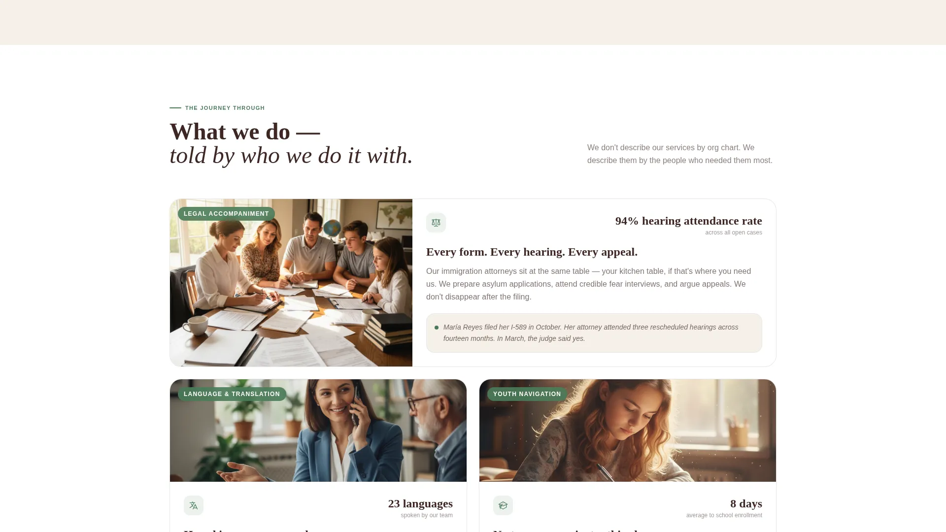
- It shows the middle of the journey, legal prep, language classes, first interviews, so donors understand the depth of the work
- It withholds the call to action until visitors have already walked through three complete story arcs, making the ask feel earned rather than transactional
What you get with this template
You get a fully structured, single-page layout built around a modular card grid. Every section has a defined purpose within the Hero's Journey narrative arc.
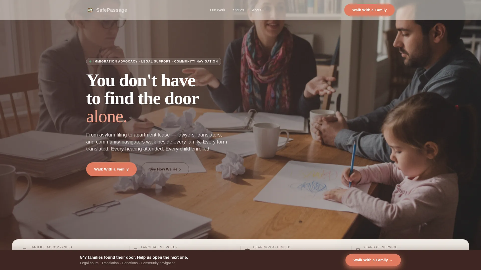
- A cinematic team photo hero with a floating statistics strip for families served, languages covered, and years of operation
- Three card rows mapping the before, through, and after of a family's immigration journey, each row serving a distinct narrative and functional purpose
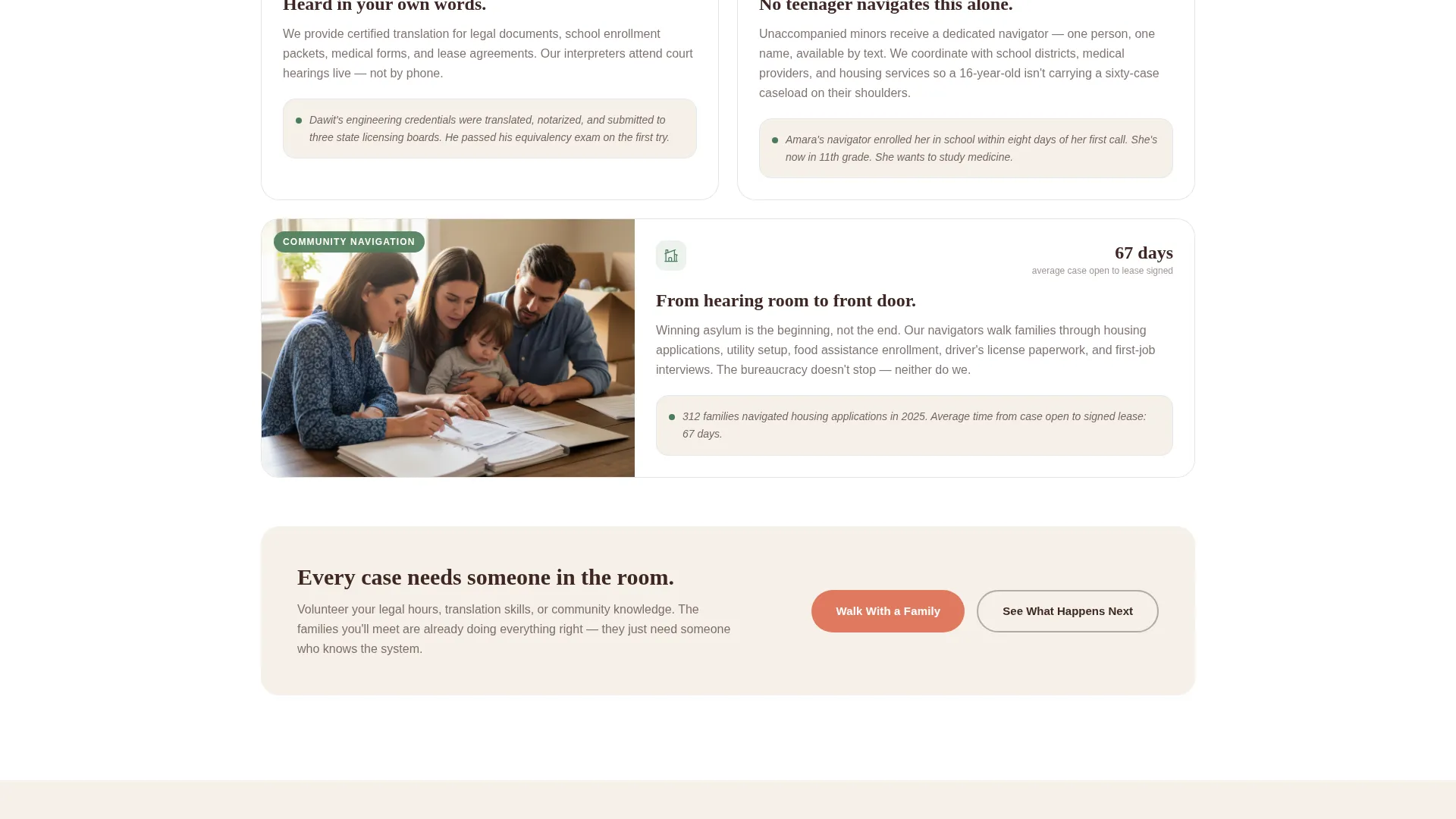
- A coral call-to-action section with three volunteer paths and a fixed bottom bar that persists after the resolution cards
Feature list
The template includes a focused set of components designed to carry emotional weight and drive action.
Hero's Journey Card Grid
The page is organized as three distinct card rows. The first row shows arrival-day snapshots. The middle row reveals services through the eyes of the person receiving them. The final row closes each family's arc with resolution moments like lease signings and graduations.
Cinematic Team Photo Header
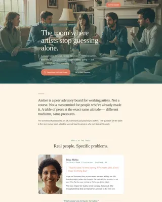
The hero section uses a wide, warm-lit team-at-work photograph rather than posed stock imagery. The composition places lawyers, translators, and navigators mid-task, alongside the families they serve, to establish credibility and warmth from the first scroll.
Floating Statistics Strip
A stats strip overlays the hero section and displays key figures, families served, languages supported, years of operation. The numbers use counter animations on scroll to draw attention without interrupting the visual narrative.
Named Family Story Cards
Each card in the grid is anchored to a named individual or family. The before and after cards are designed to echo each other, so visitors trace a specific family's journey across the full page.
Coral Call-to-Action System
The primary "Walk With a Family" button appears in coral only after the mid-journey section. It repeats as a fixed bottom bar following the resolution cards. The two-stage placement is intentional: trust is built before the ask is visible.
Fixed Bottom Action Bar
After the resolution row, a persistent coral bar remains in view as the visitor scrolls. It links to a dedicated page where visitors choose between donating, volunteering legal hours, or offering translation skills, no form lives on this page.
Page sections overview
| Section | Purpose |
|---|---|
| Hero with Stats | Establishes mission and scale with a cinematic team photo and animated statistics strip |
| Crisis Row Cards | Introduces three arrival-day family snapshots to open the emotional narrative |
| Services Journey Cards | Shows legal support, translation, and navigation through the recipient's perspective |
| Resolution Story Cards | Closes each family arc with lease signings, ceremonies, and graduations |
| Call-to-Action Block | Presents three volunteer paths with the coral "Walk With a Family" button |
| Fixed Bottom Bar | Keeps the primary action visible after the resolution section |
| Footer | Single-row linear footer with essential organization links |
Design & branding system
The Botanical color system anchors every visual decision in this template. The palette feels rooted and warm, like a community garden in early summer, patient and alive.
- Parchment (#F5F0E8) dominates all card and page backgrounds so content breathes; soil brown (#3E2723) anchors headlines and navigation; fern green (#4A7C59) marks progress indicators and success story elements
- Coral (#E07A5F) is reserved exclusively for buttons and urgent callouts, appearing only where action is needed, warm as an offered hand
- Typography pairs Fraunces serif for headlines with DM Sans for body text, creating an editorial warmth that feels human rather than institutional
Mobile & speed optimization
The template is built mobile-first, reflecting how families in need most often find the page, on a phone. Donors on desktop receive the same structured experience at a wider layout.
- Card grid modules reflow cleanly for smaller screens, keeping named family stories readable at every viewport size
- Images are optimized for fast loading, and static content sections use server components to reduce unnecessary rendering work
- Scroll-reveal animations and staggered card entrances are set to medium intensity, so they enhance the narrative without slowing the experience on mobile connections
How this template helps you convert
The page earns trust before it asks for anything. By the time coral appears, visitors have already followed three families through a complete journey.
- The Hero's Journey structure ensures visitors are emotionally invested before the call to action is visible, reducing the friction that causes early exits on traditional nonprofit pages.
- Named family stories and concrete statistics act as social proof woven into the page's design, not isolated testimonial blocks, so credibility feels organic rather than marketed.
- The fixed bottom bar and click-through model send visitors to a dedicated signup page where they choose their own path, donate, volunteer legal hours, or offer translation skills, matching their motivation to a specific action.
Other information about this template
This template is part of a broader Family First theme collection designed for community-focused and mission-driven organizations.
- The page is localized for a United States audience, with English copy and USD donation context in mind
- Scroll-reveal animations, stagger effects, and card hover states are included at medium intensity to support narrative pacing without overwhelming the content
- The template does not include a form on the landing page itself; the call-to-action button clicks through to a separate dedicated signup or donation page
Theme
Family First
Creative direction
Hero's Journey
Color system
Botanical
Style
Card Grid (Modular)
Direction
Click-Through
Page Sections
Hero's Journey Card Grid Layout
Cinematic Team Photo Hero
Animated Statistics Strip
Named Family Story Cards
Two-stage Coral Call-to-action System
Click-through Volunteer Path Design
Related questions
Can I use this template if my organization serves a different immigrant community?
Does this template include a donation form?
How many sections does the template include?
Is the modular card grid easy to customize?
What makes the two-stage call-to-action placement effective?