Italy Travel Blog Website Template
Passeggiata is an Italy travel guide landing page template built on a masonry layout with a scrapbook-style collage header and a warm Rainforest color palette. It serves travel bloggers, itinerary builders, and expat writers who want their pages to feel as inviting as the places they describe. Multiple conversion paths are woven naturally into the content flow.
by Rocket studio
Quick summary
Passeggiata is a single-page Italy travel guide template with a masonry card layout and a collage header that feels like a well-loved travel journal. It blends editorial storytelling with practical conversion tools: a multi-step trip-planning quiz, email capture for an offline map, and affiliate booking cards for agriturismos and cooking classes.
Who this template is for
This template suits anyone who writes about Italy with genuine depth and wants their page to reflect that care. It is built for writers who lead with story and convert through trust.
- Travel bloggers and digital journalists covering Italian destinations, food, and regional culture
- Itinerary creators targeting honeymooners, solo travelers, and long-stay expats
- Affiliate travel publishers who embed hand-picked accommodation and experience recommendations within editorial content
What problem this template solves
Most travel landing pages force readers into a rigid grid that feels more like a booking engine than a guide. Passeggiata solves the problem of making editorial travel content feel alive while still driving real conversions.
- A standard grid layout makes every card feel equal, flattening the editorial hierarchy that travel storytelling depends on
- Generic calls to action interrupt reading flow, reducing trust before the reader is ready to act
- Travel writers often have no clear path from a free content preview to a paid booking or email sign-up without cluttering the page
What you get with this template
You get a fully designed single landing page that balances immersive editorial design with multiple structured conversion paths. Every visual and layout decision in this template comes directly from the Passeggiata creative brief.
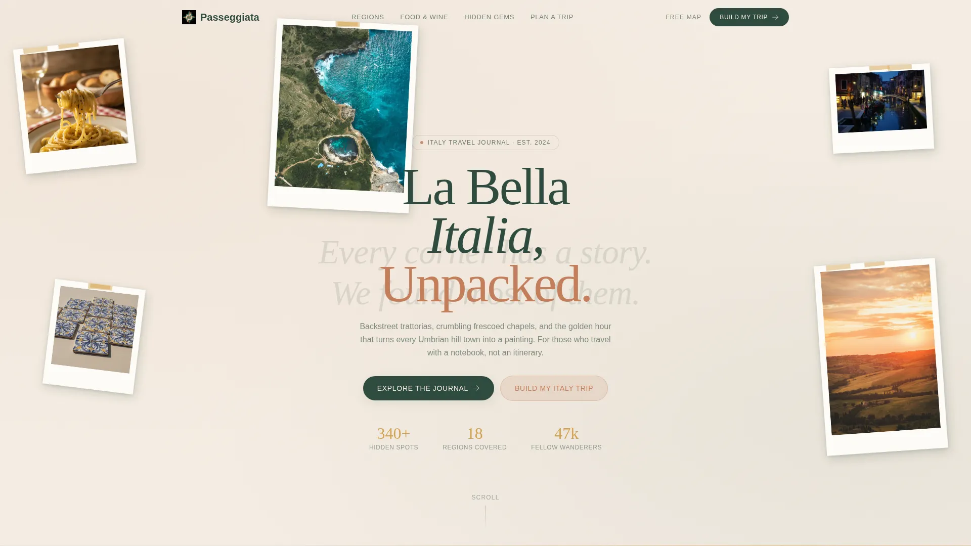
- A parallax collage header with overlapping photographs at irregular angles, handwritten-style type layered beneath, and polaroids that drift apart on scroll to reveal the first content section
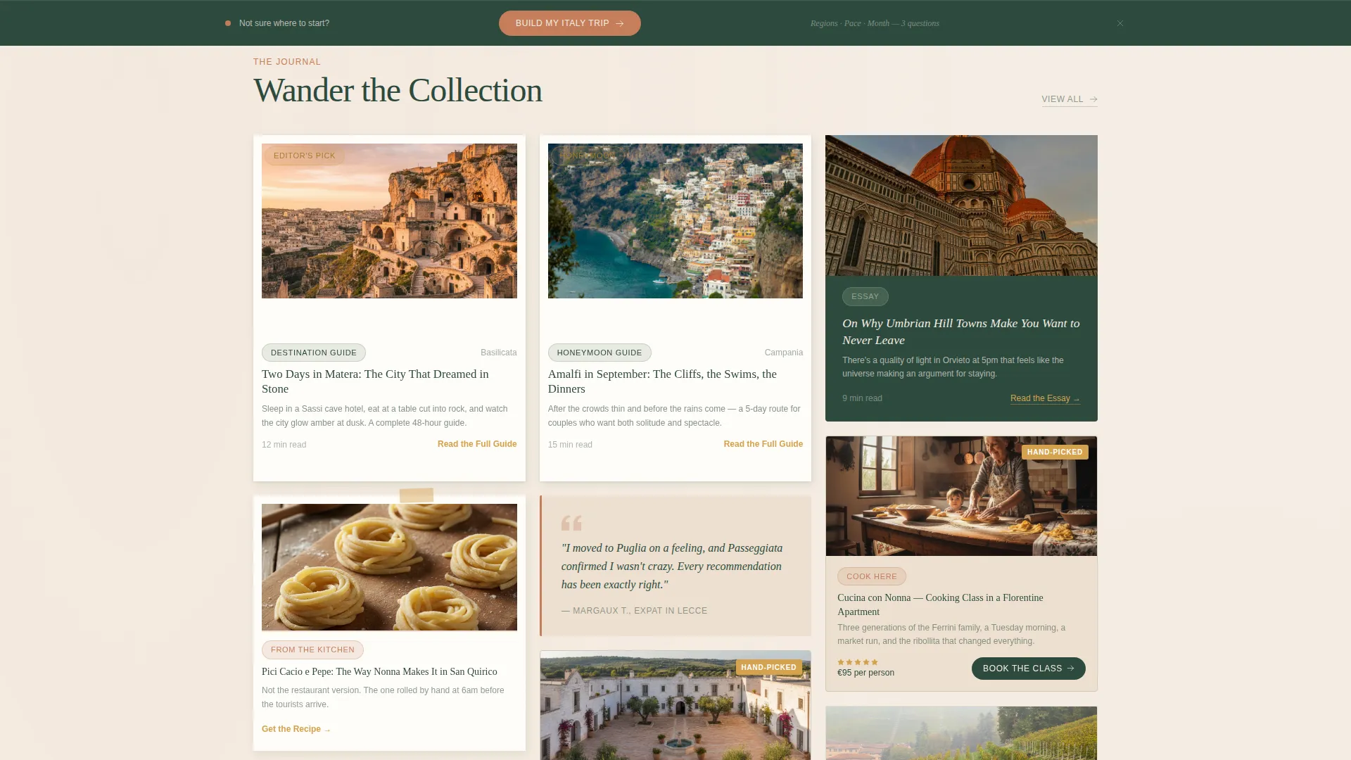
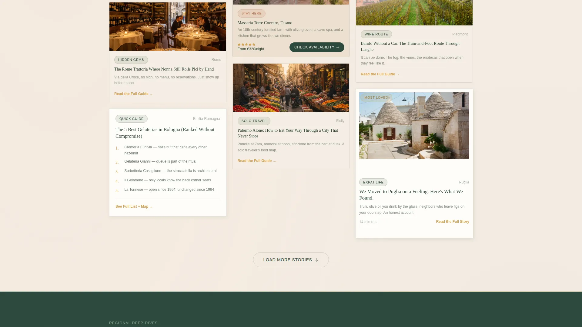
- A masonry card flow alternating large hero photography cards with clusters of smaller guide tiles, plus seasonal collections and regional deep-dives that break the rhythm like gallery room dividers
- Conversion components including a persistent bottom bar for the trip-planning quiz, inline email capture for the offline map download, and naturally embedded affiliate booking cards
Feature list
This template delivers a specific set of designed features drawn directly from its creative brief.
Parallax Collage Header
The header is a scrapbook composition of overlapping photographs at irregular angles. Subtle parallax causes the polaroids to drift apart as the visitor scrolls, revealing the first content section underneath. Handwritten-style type sits layered beneath the images, partially obscured as if the photos were tossed on top.
Masonry Card Gallery
Cards vary in size and aspect ratio like mismatched picture frames. Large hero photography cards alternate with clusters of smaller guide tiles so the eye meanders rather than settles. Hovering lifts a card slightly and deepens its shadow, reinforcing the gallery-walk creative direction.
Multi-Path Conversion System
The primary call to action on hero cards reads "Read the Full Guide." A persistent bottom bar offers "Build My Italy Trip," leading to a multi-step quiz covering regions, travel month, and pace preference. A separate email capture prompt delivers an offline map download.
Affiliate Booking Cards
Hand-picked agriturismo stays and cooking class bookings are embedded as cards within the masonry flow. They sit naturally alongside editorial content rather than breaking the reading experience with obvious advertising placement.
Preview-First Content Strategy
Select cards display genuinely useful content fragments before the click. A two-day Matera itinerary preview and a numbered list of top gelaterias in Bologna are built into the card design to earn reader trust before asking for a conversion.
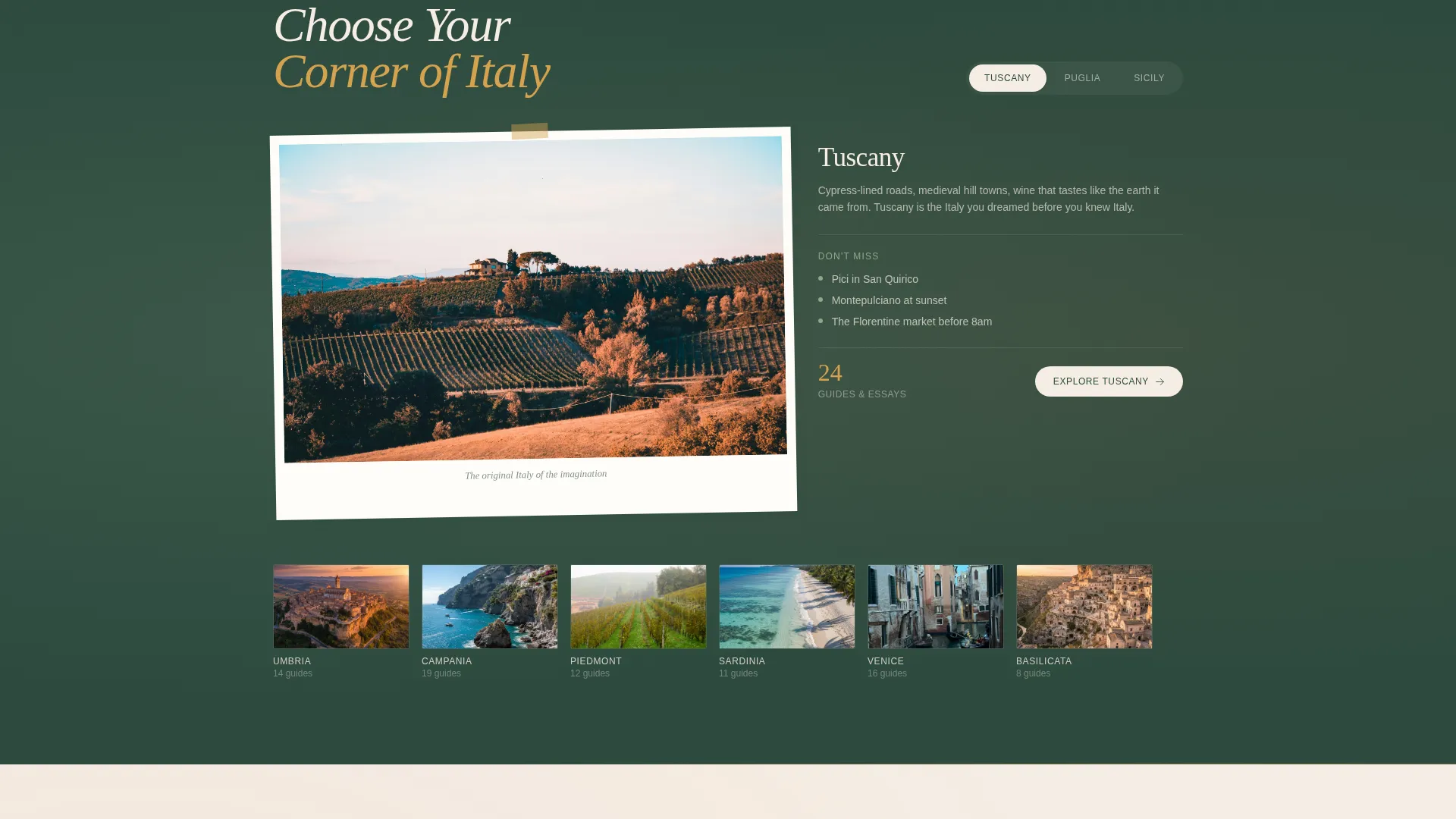
Seasonal and Regional Dividers
Seasonal collections and regional deep-dives interrupt the card flow at natural intervals. These act as gallery room dividers, giving the page a curated editorial structure rather than a continuous scroll of uniform content.
Page sections overview
| Section | Purpose |
|---|---|
| Collage Hero Header | Introduces the journal with layered photographs and handwritten-style type |
| Hero Photography Cards | Anchor the masonry flow with large destination and essay features |
| Guide Tile Clusters | Fill the rhythm between hero cards with shorter tips and local recommendations |
| Seasonal Collections | Group content thematically by travel season or Italian calendar event |
| Regional Deep-Dives | Segment the page into geographic chapters such as Umbria, Puglia, and Amalfi |
| Affiliate Booking Cards | Embed agriturismo and cooking class recommendations within the editorial flow |
| Email Capture Card | Offer the offline map download as an inline content piece for list building |
| Persistent Bottom Bar | Anchor the trip-planning quiz call to action across the full page scroll |
Design & branding system
The visual identity follows an Organic Flow theme built around the Rainforest color system. The palette is drawn from an overgrown lemon grove: aged linen cream dominates the background, deep cypress green anchors headers and navigation, and terracotta warms photography borders and pull quotes.
- Core colors: deep cypress green (#2D4A3E), sun-bleached terracotta (#C47E5A), aged linen cream (#F5EDE3), wild herb sage (#8FA68A), and warm ochre (#D4A24E) reserved for links and hover states
- Typography uses handwritten-style display type for the header overlay, with sage softening secondary text throughout the card body
- Photography cards use terracotta borders, irregular card angles, and shadow depth on hover to reinforce the scrapbook aesthetic
Mobile & speed optimization
The masonry layout and collage header are designed to reflow cleanly across screen sizes. Card proportions and the persistent bottom bar are built to remain usable on smaller viewports.
- The masonry grid adapts so card clusters and hero photography cards maintain their visual hierarchy on mobile screens
- The persistent bottom bar stays anchored at the bottom of the viewport on all screen sizes, keeping the trip-planning quiz reachable throughout the scroll
- The parallax collage header is designed to scale gracefully so overlapping photograph compositions remain legible on narrower displays
How this template helps you convert
The conversion model is built around earned trust. Each component gives the reader something useful before asking for anything in return.
- Hero cards display partial itineraries and curated lists so readers experience the quality of the content before clicking "Read the Full Guide," reducing friction on the primary call to action.
- The persistent bottom bar keeps "Build My Italy Trip" visible throughout the entire scroll, so the multi-step quiz is always one tap away without interrupting the reading experience.
- The inline email capture for the offline map download is embedded as a natural content card, not a pop-up, making it feel like a useful resource rather than a gate.
Other information about this template
Passeggiata is built specifically for the Italy travel guide and blog niche, where readers expect editorial depth alongside practical planning tools. The template name itself references the Italian tradition of the evening stroll: unhurried, social, and pleasurable.
- The template style is Masonry/Pinterest, suited to content-rich travel sites that publish a high volume of destination guides, food essays, and regional itineraries
- The creative direction is Gallery Walk, meaning the layout is designed to feel curated rather than algorithmically generated
- The header concept is Collage/Scrapbook, which differentiates the page visually from standard travel blog templates that use full-bleed hero photography
- The landing-page direction is Marketplace/Multi, supporting three distinct conversion paths from a single page without requiring separate landing pages for each goal
- This template is a strong fit for travel content creators building an audience around slow travel, agriturismo culture, and Italian regional cuisine
Theme
Organic Flow
Creative direction
Gallery Walk
Color system
Rainforest
Style
Masonry/Pinterest
Direction
Marketplace/Multi
Page Sections
Parallax Collage Scrapbook Header
Masonry Gallery Card Layout
Multi-step Italy Trip Quiz
Inline Email Capture for Offline Map
Embedded Affiliate Booking Cards
Preview-first Content Fragments
Related questions
Can I use this template for a food-focused Italy blog, not just destination travel?
How does the multi-step trip quiz work within the template?
Is the collage header difficult to customize with my own photos?
Does this template support affiliate booking links?
Can I use this template if I only cover one Italian region?


