Travel Influencer Agency Landing Page Template
Passport is a masonry-style landing page template built for travel influencer marketing agencies. It pairs an editorial Ink & Paper visual identity with a gallery-walk scroll experience, staggered campaign cards, flip-on-hover proof panels, and a single stamp-red call-to-action button. The design guides hospitality brand managers from first impression to campaign briefing click.
by Rocket studio
Quick summary
Passport is a single-page, click-through landing page template for a travel influencer marketing agency. It uses a masonry grid of campaign cards, an editorial Ink & Paper color system, and one clear call to action. The goal is to accumulate visual proof until a qualified brand manager clicks through to a campaign briefing page.
Who this template is for
This template is built for agencies and studios that connect travel content creators with hospitality and destination brands. It speaks directly to the people who need to show results fast and earn trust before a conversation even begins.
- Boutique resort marketing directors who need to see campaign evidence before committing to an agency
- Destination tourism boards trying to reach younger travelers with authentic, creator-led content
- Airline brand managers looking for genuine voices across cabin classes and route campaigns
What problem this template solves
Hospitality brand managers are skeptical by default. They have watched competitors grow on social media and they need proof, not promises, before they brief a new agency. A generic agency page with a form and stock photography does not close that gap.
- Brand managers bounce when they see polished pitches with no real campaign evidence
- A long-form intake form on the first page signals friction instead of confidence
- Static layouts cannot convey the variety and volume of creator work an agency actually delivers
What you get with this template
You get a complete, ready-to-customize landing page structure that leads with bold editorial typography and earns trust through sheer campaign volume. Every section is designed to move a skeptical buyer from scroll to click.
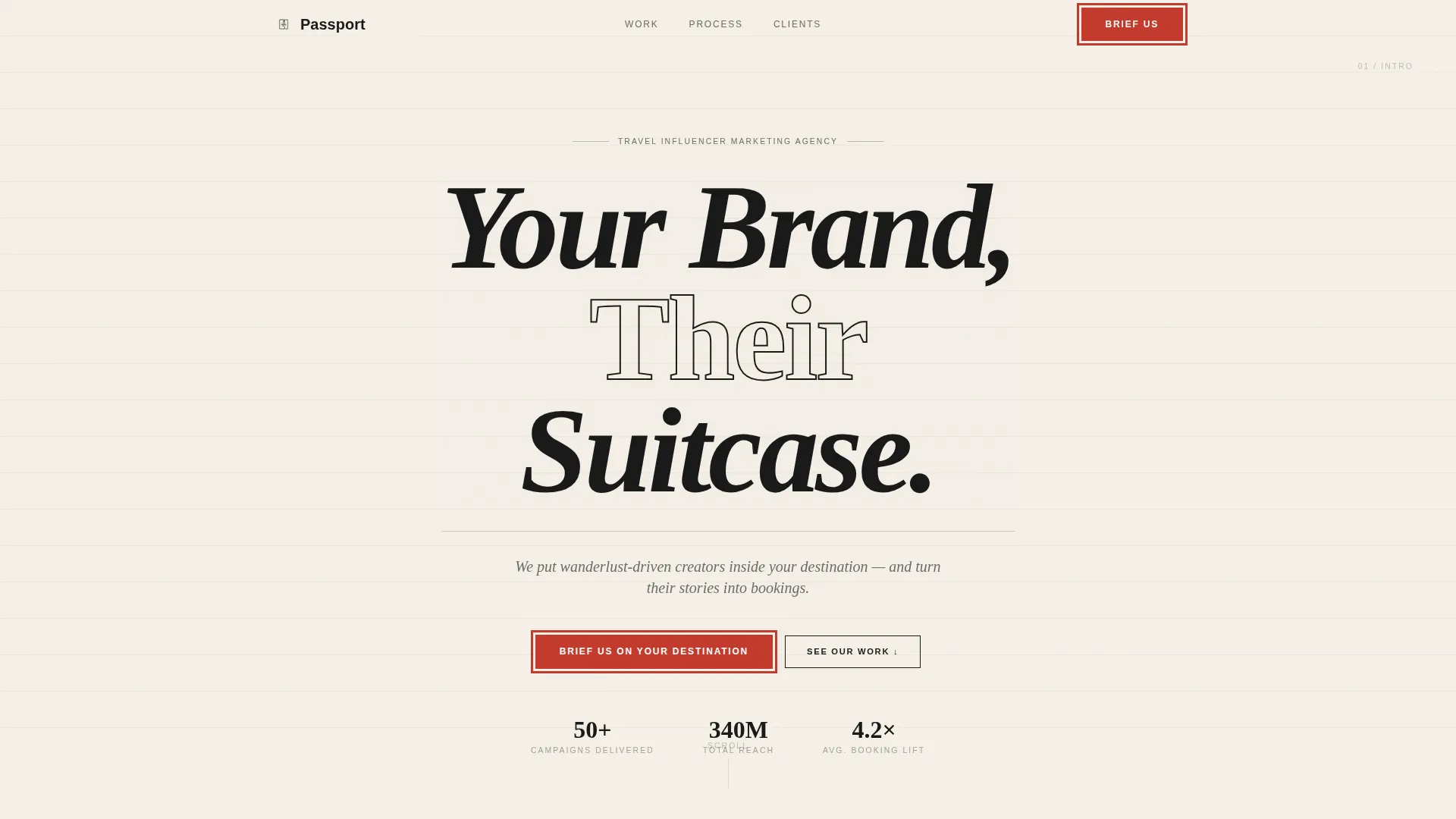
- A giant centered headline section set in oversized serif with ink-bleed texture on the letterforms
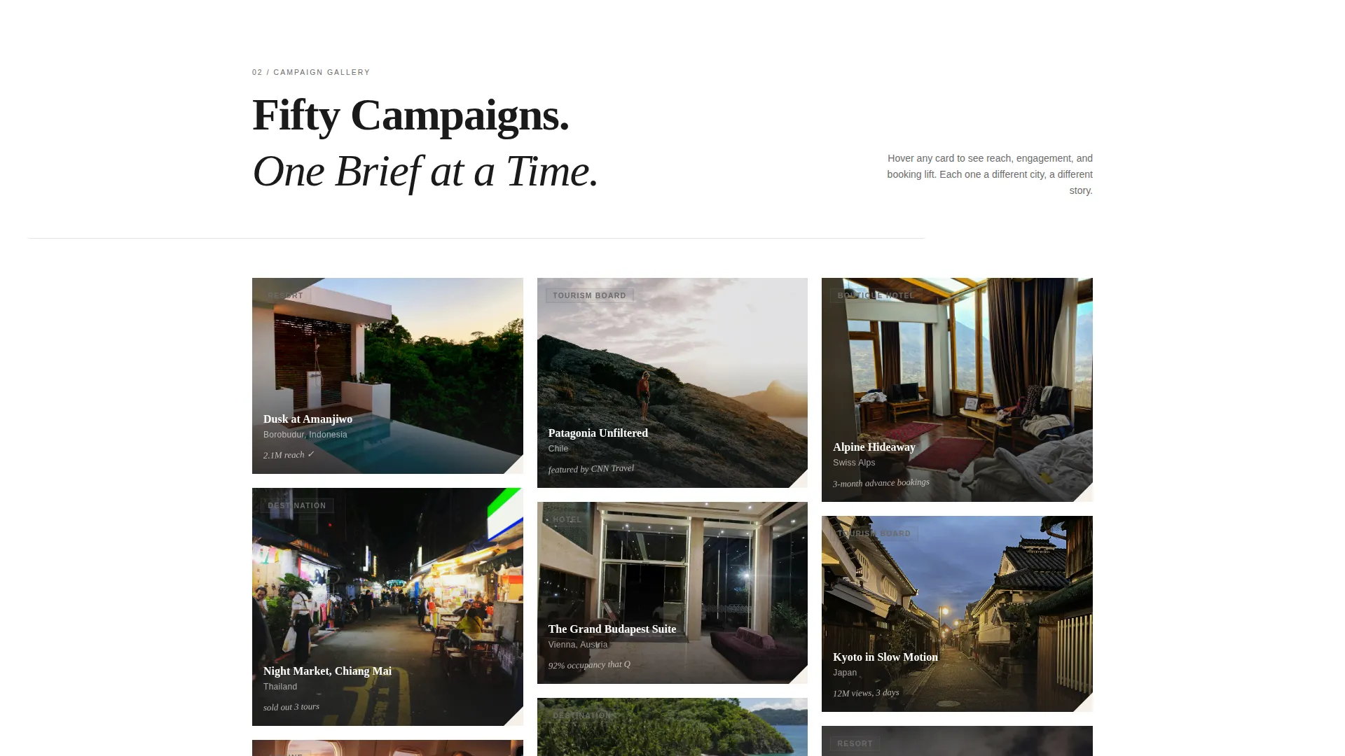
- A staggered masonry grid of campaign cards with flip-on-hover proof panels showing reach and conversion data
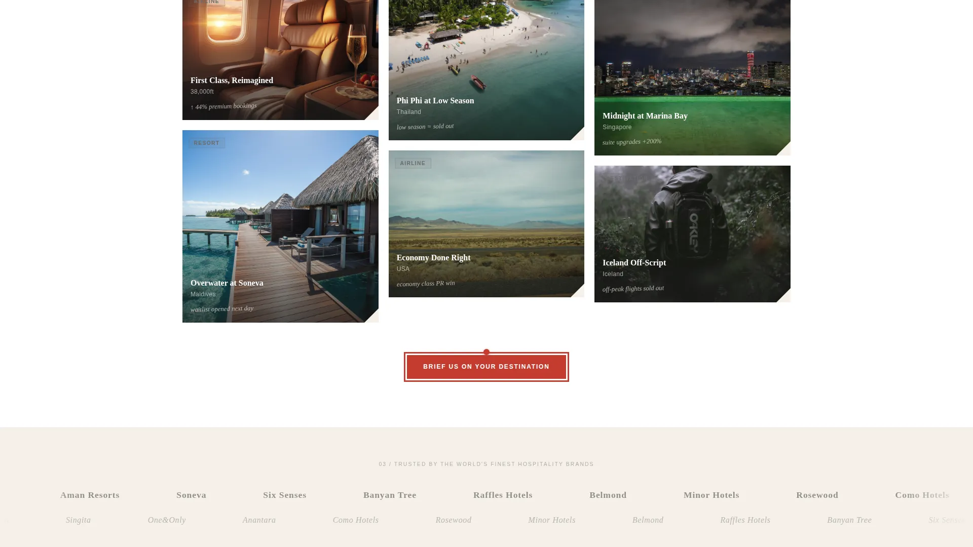
- A fixed navigation call-to-action button and a pinned grid-bottom button, both styled in stamp red
Feature list
This template includes a focused set of purpose-built features drawn directly from the creative brief. Each one serves the single goal of converting a browsing brand manager into a booked briefing call.
Giant Headline Header Section
The header centers a single bold headline on a parchment-toned field. No competing imagery appears. Oversized serif type with ink-bleed texture carries the full visual weight, and a pencil-gray italic positioning line sits beneath it. The negative space is intentional and communicates confidence.
Staggered Masonry Campaign Grid
Campaign cards load in a staggered sequence that mimics postcards being pinned to a corkboard. Each card shows a different creator collaboration, from moody resort dusk photography to street food reel thumbnails, with engagement metrics styled as handwritten margin notes.
Flip-on-Hover Proof Panels
Hovering over any campaign card lifts it off the grid and flips it to reveal the brand name, reach numbers, and conversion data. This interaction keeps the front face clean while surfacing hard proof on demand, exactly when a buyer is already curious.
Dual Call-to-Action Placement
The primary call-to-action button appears twice: pinned to the bottom of the masonry grid and fixed inside the navigation bar. Both instances use the stamp-red accent color. Neither placement requires a form. The click routes directly to a campaign briefing intake page.
Grayscale Brand Logo Ticker
A horizontal ticker displays recognizable hotel and hospitality brand logos in grayscale. The grayscale treatment keeps the visual hierarchy clean while signaling the scale of past partnerships without interrupting the editorial tone.
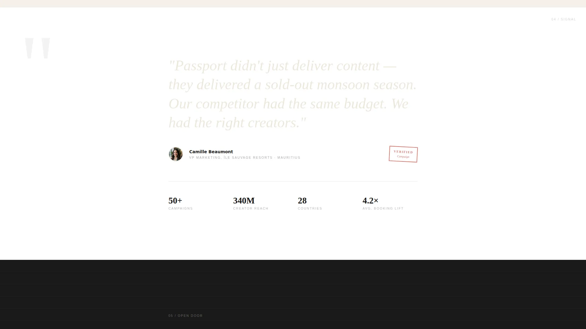
Epigraph-Style Testimonial Block
A single client testimonial is pulled out in large serif type, formatted like an epigraph or a book-opening quote. This restraint makes the social proof feel authoritative rather than promotional, fitting the analog, editorial identity of the page.
Page sections overview
| Section | Purpose |
|---|---|
| Header headline field | Anchors brand positioning with oversized serif type and negative space |
| Positioning statement line | Delivers the agency's one-line value statement in pencil-gray italic |
| Masonry campaign grid | Accumulates visual proof through staggered creator collaboration cards |
| Flip proof panels | Surfaces reach and conversion data on hover without cluttering card fronts |
| Brand logo ticker | Signals hospitality partnership scale using grayscale logo strip |
| Testimonial epigraph | Adds a single authoritative client quote in large editorial serif |
| Grid-bottom call to action button | Routes qualified buyers to campaign briefing with a stamp-red button |
| Fixed navigation bar | Keeps the call-to-action visible at every scroll depth |
Design & branding system
The visual identity follows an Ink & Paper theme that feels tactile, analog, and editorially confident. Every color and type decision reinforces the sense of a well-traveled journal rather than a digital brochure.
- Color palette: heavy black ink (#1A1A1A) for type, unbleached journal stock (#F5F0E8) and pure white for alternating backgrounds, pencil graphite (#6B6B6B) for secondary text, and stamp red (#C43B2E) used sparingly for interactive elements and hover states
- Typography: high-contrast black serif set with generous letter-spacing, as if typeset on a press, with ink-bleed texture on headline letterforms
- Red accent discipline: the stamp-red color appears only on buttons and hover states, functioning like a wax seal rather than a decorative element
Mobile & speed optimization
The masonry layout and card-flip interactions are structured to adapt across screen sizes. The staggered load sequence and restrained asset approach support a clean experience on smaller viewports.
- The masonry grid reflows for narrower screens so campaign cards remain readable without horizontal scrolling
- The fixed navigation call-to-action button remains accessible at all scroll depths on both desktop and mobile viewports
How this template helps you convert
This landing page is built around a single conversion goal: get a qualified brand manager to click through to your campaign briefing page. Every design and copy decision supports that one action.
- The volume of campaign cards does the persuasion work passively. Scrolling through fifty staggered proof panels shifts a skeptical buyer's posture before they read a single headline.
- Removing the intake form from this page eliminates the main friction point. The click-through structure places qualification where it belongs, on the briefing page, not on the first impression.
Other information about this template
This template is a strong fit for travel influencer marketing agencies that operate at the intersection of content creation and hospitality brand strategy. A few additional details are worth noting.
- The page type is a click-through landing page, not a multi-page website, so all persuasion happens within a single scroll session
- The masonry and Pinterest-style grid layout is particularly well suited to visually rich niches like travel, hospitality, and destination marketing
- The template is designed for agencies that manage creator partnerships, not for individual influencers building personal portfolio pages
- The Ink & Paper aesthetic differentiates this template from high-gloss digital agency templates, which tend to blur together in a competitive pitch environment
Theme
Ink & Paper
Creative direction
Gallery Walk
Color system
Ink & Paper
Style
Masonry/Pinterest
Direction
Click-Through
Page Sections
Giant Serif Headline Header
Staggered Masonry Campaign Grid
Flip-on-hover Proof Panels
Dual Stamp-red Call to Action Buttons
Grayscale Brand Logo Ticker
Epigraph-style Testimonial Block
Related questions
Is this template suitable for a solo travel content creator?
Does this template include a contact form?
Can I customize the campaign cards and the metrics they display?
How many campaign cards does the masonry grid support?
Can the stamp-red accent color be changed to match a different brand identity?



