Parkinson's Clinical Trial Finder Landing Page
Pathway is a single-page Parkinson's disease clinical trial finder landing page built on a quiet split-screen layout. It guides patients and caregivers through a structured assessment covering medications, daily symptoms, and travel range. The goal is simple: turn uncertainty into a clear, personalized list of trials worth exploring, without making the experience feel clinical or rushed.
by Rocket studio
Quick summary
Pathway is a compassionate, assessment-driven landing page designed to connect Parkinson's patients and their caregivers with relevant clinical trials. It uses a split-screen hero, a multi-step intake form, and a progressive checklist system to gather medication history, symptom detail, and location range before presenting matched trial options.
Who this template is for
This template is built for patient advocacy organizations, clinical research networks, and healthcare teams who want to reach real people affected by Parkinson's disease. It speaks directly to the humans doing the searching, not the institutions running the studies.
- Recently diagnosed patients in their 50s to 70s who are still processing their neurologist's guidance
- Adult children and long-term caregivers researching options late at night on behalf of a loved one
- Clinical trial recruitment teams that need a human-centered intake experience to improve qualified lead quality
What problem this template solves
Most clinical trial pages present eligibility criteria as dense medical text. That approach loses the very people who need the information most. Pathway flips the experience entirely.
- Patients struggle to know whether a trial is even relevant before investing emotional energy in reading it
- Caregivers researching at midnight need a clear, guided path, not a wall of protocol language
- Trial recruiters lose qualified candidates who disengage before completing a standard intake form
What you get with this template
You get a fully structured, single-page assessment flow that earns the visitor's trust section by section. Every layout decision is grounded in reducing anxiety while increasing completion rates.
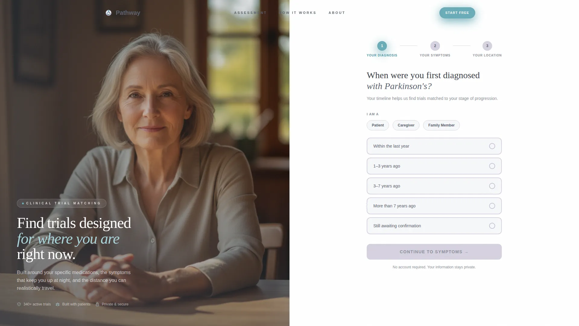
- A split-screen hero with a human photograph on the left and a three-step form on the right
- Five scrollable checklist sections, each with a progress ring that visibly fills as the visitor engages
- A primary call-to-action button that activates only after the visitor completes at least three of five sections, plus a secondary neurologist email path
Feature list
A brief paragraph introduces the feature set: each component in Pathway is purpose-built for the Parkinson's patient journey, from first scroll to final submission.
Split-Screen Hero with Multi-Step Form
The hero divides the screen evenly. The left side shows a calm, real-feeling photograph of a person in their sixties at a sunlit table. The right side opens the first form step immediately, asking only one focused question about diagnosis date. This keeps the entry point low-pressure and personal.
Progressive Checklist Assessment
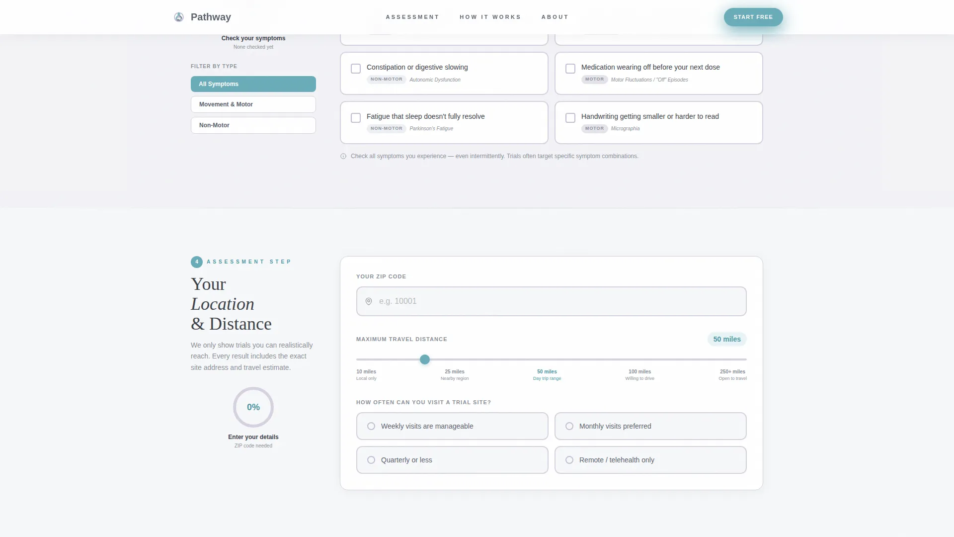
Below the hero, five checklist sections guide the visitor through their medication profile, daily symptoms, and location range. Each completed section fills a progress ring on the left panel, giving the scroll a sense of forward momentum rather than interrogation.
Plain-Language Symptom Checkboxes
The Daily Reality section translates clinical symptom language into plain phrasing that patients actually recognize. Examples include "freezing when walking through doorways," "difficulty buttoning a shirt," and "voice getting quieter." This builds trust by reflecting the visitor's lived experience back to them.
Selectable Medication Tiles
The Medication Profile section presents common Parkinson's medications as tappable visual tiles. Visitors select what they currently take without typing anything. This reduces friction and makes the data feel like a conversation rather than a form.
Activation-Gated Primary call to action
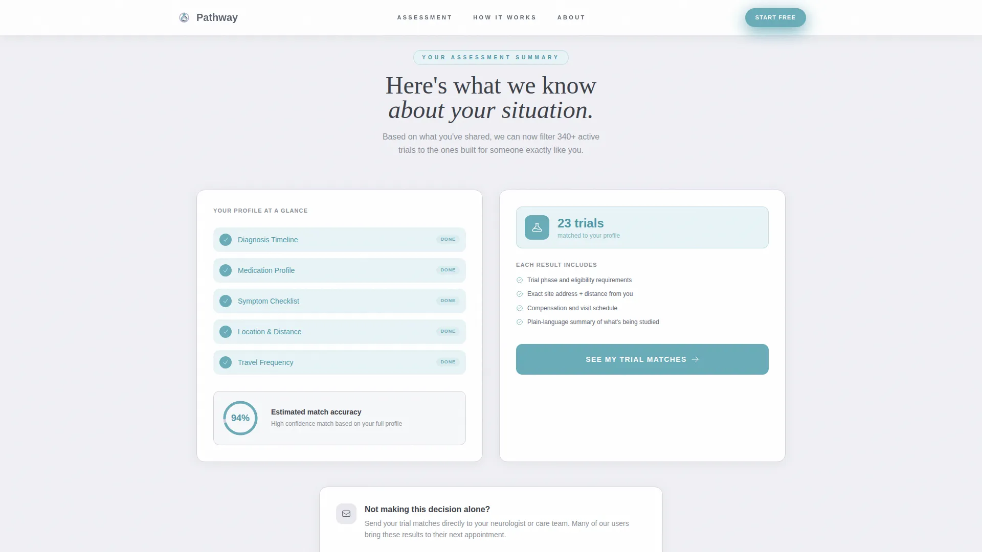
The "See My Trial Matches" button remains inactive until the visitor completes at least three of five checklist sections. It then glows in teal, signaling readiness. This design rewards engagement and filters out low-intent interactions before any contact information is requested.
Neurologist Email Path
Below the primary call to action, a secondary option lets visitors send their assessment results to their neurologist using a single email field. This acknowledges that most patients are not making this decision alone and reduces the pressure of the moment.
Page sections overview
| Section | Purpose |
|---|---|
| Split-Screen Hero | Opens the page with a human photo and the first form step already active |
| Medication Profile | Selectable drug tiles let visitors identify their current Parkinson's medications |
| Daily Reality | Plain-language checkboxes translate UPDRS symptoms into recognizable experiences |
| Location and Distance | A travel range selector captures how far the visitor can realistically travel |
| Trial Matches call to action | Activates the primary button and offers the neurologist email path |
| Footer | Single-row linear layout closes the page cleanly |
Design & branding system
Pathway uses a Soft Mist color palette designed to feel like early morning light in a quiet, unhurried room. Every color choice serves a specific emotional function: openness, legibility, or action.
- Morning fog white (#F7F8FA) provides base backgrounds and breathing room between sections; washed lavender (#D6D2E0) marks distinct section areas without adding visual weight
- Steady slate (#5C6370) anchors all body text for easy reading; gentle teal (#6AACB8) appears exclusively on interactive elements, progress indicators, and the primary call-to-action button
- Typography pairs Plus Jakarta Sans for body text with Fraunces serif for display headings, creating a warm and authoritative reading experience without clinical coldness
Mobile & speed optimization
Pathway is designed desktop-first to serve caregivers who typically research on a laptop, but full mobile support is built in so patients on phones are never turned away. The interactive assessment adapts cleanly across screen sizes.
- GSAP ScrollTrigger handles section reveal animations and progress ring fills without blocking the page load
- Server Components power all static sections while Client Components handle the interactive assessment, keeping the heaviest interactivity isolated
- Form step transitions are smooth and deliberate, avoiding jarring layout shifts on any device
How this template helps you convert
Pathway earns the conversion by making the visitor feel understood before asking for anything. Each design decision reduces hesitation and builds forward momentum.
- The split-screen hero presents a calm, relatable image alongside a single focused question, lowering the emotional barrier to starting the assessment
- Progress rings fill visibly as each checklist section is completed, giving the visitor a concrete sense of progress and a reason to continue scrolling
- The primary call-to-action button only activates after meaningful engagement, which means the visitor who clicks it has already invested in the process and is far more likely to follow through
Other information about this template
Pathway sits at the intersection of patient advocacy design and clinical trial recruitment. It is built specifically for the Parkinson's disease care context, where trust is the primary conversion currency.
- The template is categorized under Health and Medical, with a focused subcategory in Parkinson's Disease Care
- Distance inputs use miles, and all copy is localized for English (US) audiences
- The Healing Space visual theme and Soft Mist color system are intentional choices to avoid the sterile look of traditional clinical interfaces
- The template style is Split Screen (50/50) with a Multi-Step Form header concept and a Quiz and Assessment landing-page direction, all of which align with the Checklist and Audit creative direction

Theme
Healing Space
Creative direction
Checklist & Audit
Color system
Soft Mist
Style
Split Screen (50/50)
Direction
Quiz/Assessment
Page Sections
Split-screen Hero with Intake Form
Progressive Checklist with Progress Rings
Plain-language Symptom Checkboxes
Selectable Medication Tiles
Activation-gated Call to Action Button
Neurologist Email Secondary Path
Related questions
Who is this landing page template designed for?
Can I customize the medication tiles and symptom checkboxes?
Does the primary call-to-action button appear right away?
What is the neurologist email path?
Is the template suitable for mobile users?



