Stroke Recovery Patient Education Landing Page
Pathway is a stroke recovery patient education landing page template built for families and survivors navigating care after a stroke. The split-screen layout guides visitors through three clear phases: Understand, Practice, and Progress. Calm, clinical-human visuals and a structured booking flow make it easy for caregivers and patients to take the next step, day or night.
by Rocket studio
Quick summary
Pathway is a single-page stroke recovery education template designed for healthcare platforms serving survivors and their caregivers. It uses a 50/50 split-screen layout, a stepped three-phase structure, and a warm clinical visual identity. The primary goal is to help visitors book a guidance session or download a recovery roadmap, whichever step they are ready for.
Who this template is for
This template is built for organizations and practitioners who guide people through stroke recovery. It speaks directly to the people sitting in hospital waiting rooms and living rooms trying to understand what comes next.
- Stroke recovery platforms and patient education services targeting adult caregivers and survivors
- Healthcare practitioners or clinics offering guided recovery sessions or telehealth consultations
- Digital health products needing a calm, trust-first landing page with a clear booking path
What problem this template solves
Families facing a stroke often encounter cold, jargon-heavy medical resources at the worst possible moment. They need clear guidance, not clinical overwhelm. Pathway solves the communication gap between medical discharge and real-world recovery support.
- Caregivers searching at 2 a.m. get a structured, readable page instead of scattered clinical documents
- Survivors navigating discharge packets find plain-language explanations that do not require a medical background
- Platforms without a clear conversion path gain a booking-focused layout that captures both ready and not-yet-ready visitors
What you get with this template
This template delivers a fully structured, section-led landing page that takes visitors from arrival to action in a calm, unhurried flow. Every section has a defined purpose and a clear visual role.
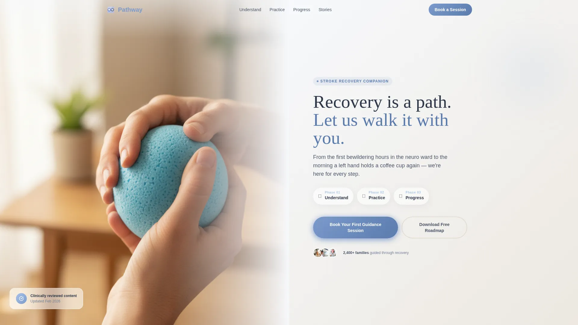
- A 50/50 split-screen hero with a photo panel and a headline, phase chips, and a booking call to action
- Three educational phase sections covering Understand, Practice, and Progress, each with its own content panel and interactive element
- A dual-conversion system featuring a primary booking form and a secondary free PDF download path
Feature list
This template includes purpose-built components designed for stroke recovery education contexts. Each feature below comes from the template's defined structure and interactive requirements.
Split-Screen Hero Section
The hero uses a 50/50 horizontal split. The left panel holds a natural-light therapy photograph. The right panel carries the headline, a three-phase subhead, and a booking call to action button. Glassmorphic phase chips label each stage at a glance.
Three-Phase Scrolling Education Flow
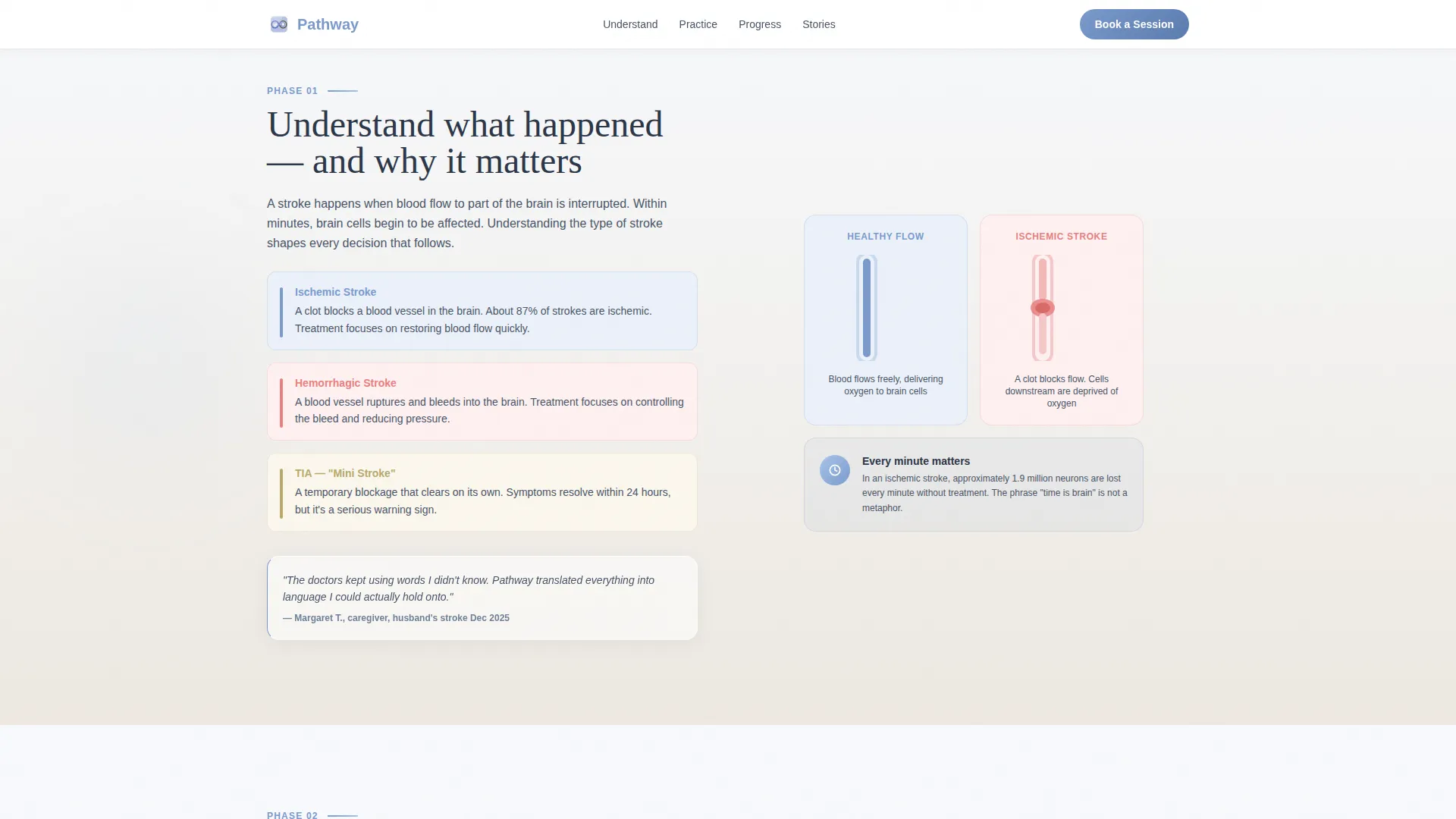
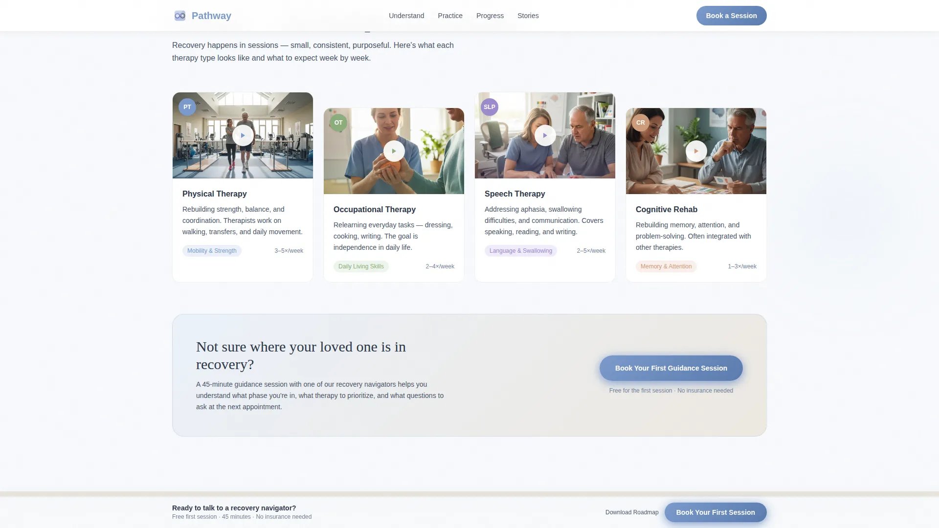
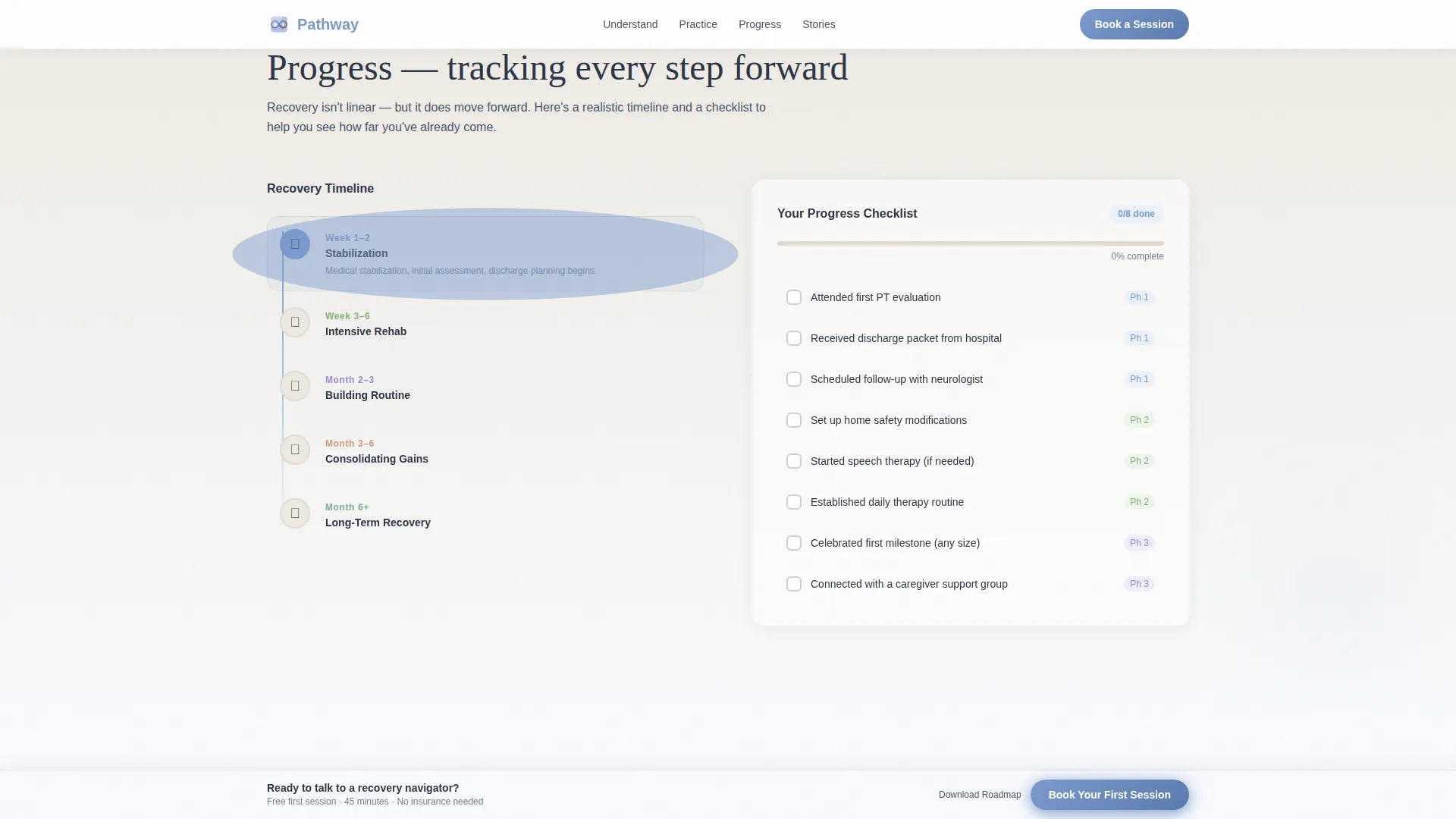
The page unfolds as a numbered recovery timeline across three phases. Phase one explains what happened in the brain using a split illustration. Phase two presents therapy types with previewable video thumbnails. Phase three shows milestone tracking with an interactive checklist.
Dual-Conversion Booking System
The primary call to action is a booking form placed after Phase two and repeated in a sticky bar that follows the visitor on scroll. The form collects patient relationship, stroke timeframe, and preferred session format. A secondary path offers a free PDF download for visitors who are not ready to book.
Staggered Testimonial Section
A dedicated testimonial section displays staggered quote cards from both caregivers and patients. This social proof section sits between the phase content and the footer, reinforcing trust before the final call to action.
Sticky Call to Action Bar
A persistent booking bar stays visible as visitors scroll through the page. It ensures the primary conversion action is never more than one tap away, particularly important for mobile users arriving mid-crisis.
Arc Browser Split Footer
The footer follows a two-column split layout. The left side holds the logo and tagline. The right side holds navigation links. This keeps the bottom of the page clean and functional without visual clutter.
Page sections overview
| Section | Purpose |
|---|---|
| Hero Split Panel | Introduce the platform and prompt a booking action |
| Phase One: Understand | Explain stroke basics with a plain-language brain illustration |
| Phase Two: Practice | Present therapy types with video thumbnails and the primary booking call to action |
| Phase Three: Progress | Show milestone tracking and an interactive recovery checklist |
| Testimonial Cards | Build trust with staggered caregiver and patient quotes |
| Split Footer | Close the page with logo, tagline, and navigation links |
Design & branding system
The visual identity follows an Educational Guide theme built on the Cloud Canvas color system. The palette is soft, warm, and clinical enough to feel trustworthy without feeling cold.
- Colors: cirrus white (#F7F9FC) for backgrounds, warm parchment (#EDE8E0) for content panels, steady slate (#4A5568) for body text, and reassuring periwinkle blue (#7B9ACC) for buttons, progress indicators, and interactive elements
- Typography: Fraunces serif for headlines to communicate warmth and authority, Plus Jakarta Sans for body text to keep long explanations easy to read
- Visual style: linen therapy room aesthetic with natural-light photography, glassmorphic phase chips, staggered card layouts, and scroll-linked reveal animations at medium intensity
Mobile & speed optimization
This template is designed mobile-first, reflecting the reality that many visitors arrive on a phone from a hospital parking lot or a bedside chair. Every layout decision accounts for small screens and distracted readers.
- The 50/50 split stacks vertically on mobile so each panel reads clearly at full width without horizontal scrolling
- The sticky booking bar and the secondary PDF download path remain accessible at all scroll positions on both mobile and desktop
- Static-first architecture with images sourced via Unsplash and Pexels keeps the page lightweight and fast to load on variable connections
How this template helps you convert
Pathway is structured around two conversion paths so that no visitor leaves without a clear next step. The layout reduces friction at every decision point.
- The primary booking form appears directly after Phase two, when visitors have just reviewed therapy options and are most likely to act. The sticky bar reinforces this call to action throughout the rest of the scroll without interrupting the reading flow.
- The secondary PDF download path captures visitors who need more time. It collects an email address and current recovery phase, allowing follow-up communication to stay relevant to where each person actually is in their journey.
Other information about this template
This template is a strong fit for stroke recovery patient education platforms operating in the Health and Medical space. It is equally useful for practitioners building their first digital presence in the Stroke Recovery Care subcategory.
- Template style: Split Screen 50/50, single landing page layout
- Header concept: Half-Page Photo and Text split with natural-light clinical photography
- Creative direction: Step-by-Step Guide with scroll-linked phase reveals
- Landing page direction: Booking and Scheduling with a dual-path conversion system
- Color system: Cloud Canvas, a palette calibrated for calm clinical contexts
- Localization: English (United States), no currency fields, standard date formats
- Animation level: Medium intensity with staggered reveals and glassmorphism effects
Theme
Educational Guide
Creative direction
Step-by-Step Guide
Color system
Cloud Canvas
Style
Split Screen (50/50)
Direction
Booking/Scheduling
Page Sections
Split-screen Hero with Phase Chips
Three-phase Educational Timeline
Dual-path Conversion System
Sticky Booking Bar
Staggered Testimonial Cards
Arc Browser Split Footer
Related questions
Who is this template designed for?
Can I use this template for telehealth or remote session bookings?
Does the template include a path for visitors who are not ready to book?
How is the page structured for someone arriving in a stressful moment?
What sections does this landing page include?



