Proven Immigration Landing Page Template
Latch is a split-screen landing page template built for board-certified lactation consultants who offer in-home, on-demand support. It pairs a dark, authoritative header with a credential wall, a service area map, and a step-by-step lead form. The design feels calm and trustworthy, built to reassure exhausted new parents and convert late-night searches into booked visits.
by Rocket studio
Quick summary
Latch is a single-page template designed for lactation consultants who serve specific neighborhoods and need to earn trust fast. The layout moves from credentials to coverage to contact in a clear, unhurried flow. It is built for parents who are searching at 2 a.m. and need to feel, immediately, that help is close and qualified.
Who this template is for
This template is built for independent or practice-based lactation consultants who offer in-home visits within a defined service area. It speaks directly to clients who need fast, local, expert support during the most vulnerable postpartum days.
- Board-certified lactation consultants (International Board Certified Lactation Consultant, or IBCLC) running a private or group practice
- Lactation professionals who cover multiple neighborhoods and want to show real availability by location
- Consultants who accept insurance, work with pediatrician referrals, or partner with hospitals and need to display those credentials prominently
What problem this template solves
Most lactation consultant websites fail the parents who need them most. They are cluttered, slow to build trust, and impossible to navigate when someone is exhausted and overwhelmed at midnight. Latch solves that gap directly.
- Parents searching for local lactation support cannot quickly confirm whether a consultant serves their zip code or is available soon
- Generic service pages do not communicate credentials or urgency, making it hard for a qualified consultant to stand apart
- Standard contact forms ask too much too soon, driving anxious parents away before they ever reach out
What you get with this template
You get a fully structured split-screen landing page that guides visitors from first impression to form submission in a single confident scroll. Every section has a clear job, and no section wastes the visitor's attention.
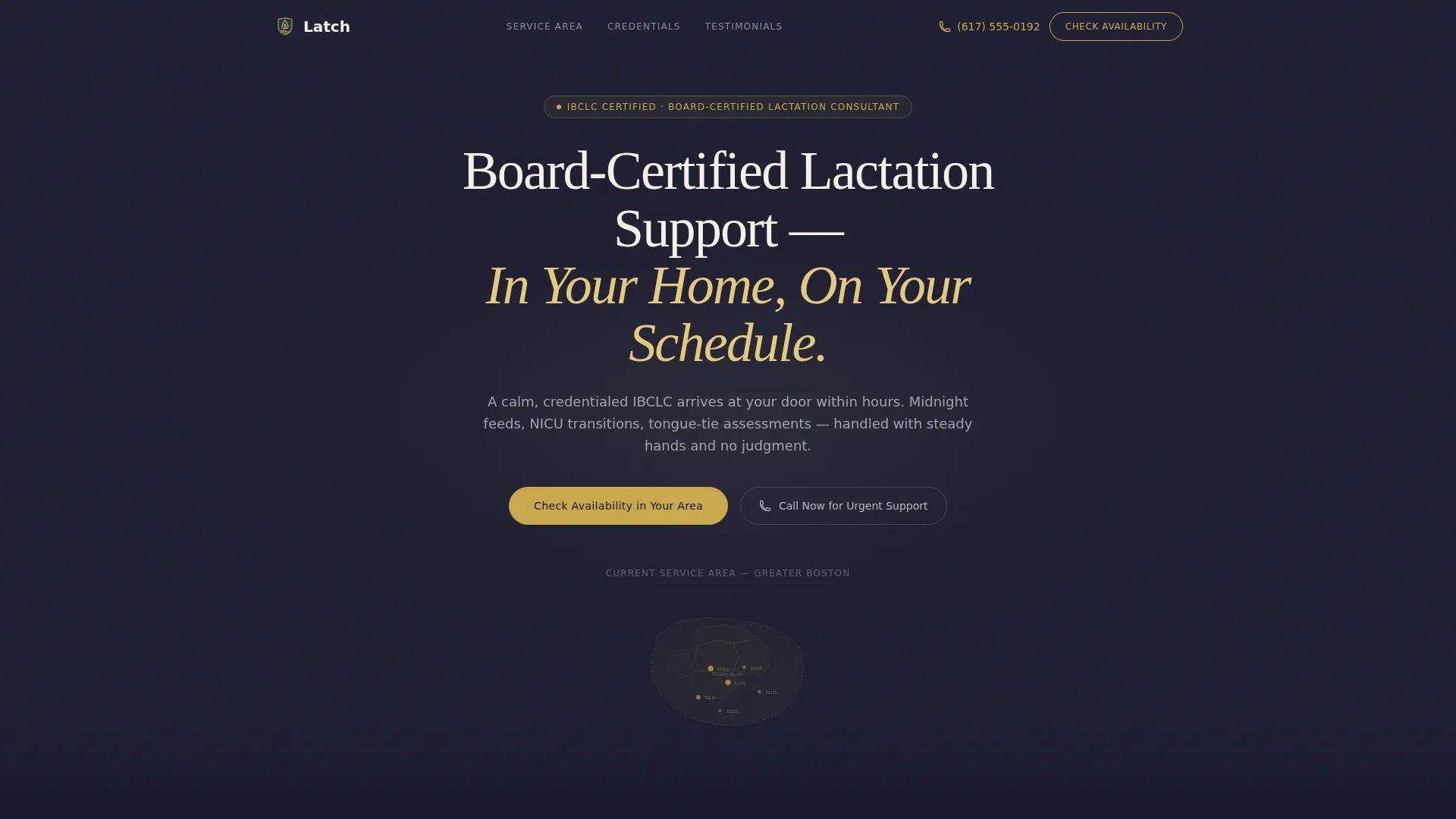
- A dark, glow-lit header with a parchment headline and a gold-outlined service area map showing clickable zip code regions
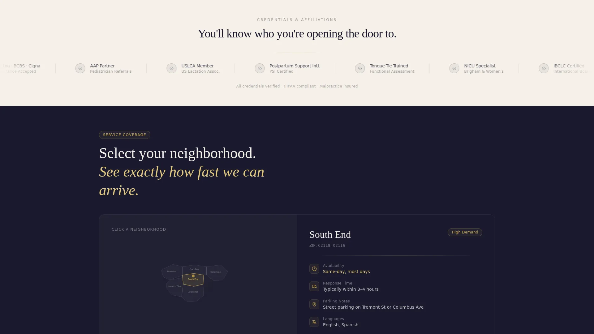
- A credential logo wall displaying certifications, hospital affiliations, insurance panels, and referral partnerships in monochrome on parchment
- A 50/50 split-screen section pairing an interactive neighborhood map with location-specific logistics, followed by a testimonial section and a lead capture form
Feature list
This template is built around a small number of high-impact components. Each one has a specific job in the conversion flow.
Dark Full-Bleed Glow Header
The header fills the full viewport with deep ink black (#1A1A2E). A soft warm glow radiates from the center, evoking a nursery nightlight. The parchment headline sits inside that glow, and a thin gold-outlined map of the service area pulses gently below it. No stock photography is used anywhere in this section.
Credential Logo Wall
Immediately below the header, a full-width horizontal band displays certification seals, hospital affiliate marks, insurance panel logos, and referral partner badges. All logos render in monochrome on a warm parchment background. This section functions as the first handshake between the consultant and a skeptical visitor.
Split-Screen Service Area Map
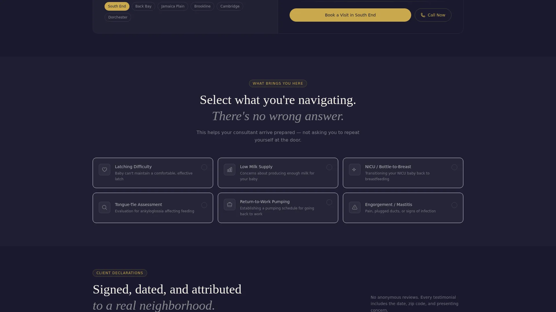
The 50/50 layout places an interactive neighborhood map on the left and location-specific details on the right. Each neighborhood entry pairs a place name with a real logistical note, such as typical same-day availability or parking guidance. Visitors can confirm coverage without filling out a form.
Step-by-Step Lead Capture Form
The lead form opens with zip code entry, which confirms service coverage and shows an estimated response time before asking for anything personal. It then collects the baby's age or due date, a checkbox grid of concerns, a preferred visit window, and finally name and phone number. This sequence reduces friction at every step.
Sticky Mobile Call-to-Action Bar
On mobile, a sticky bottom bar keeps the primary call to action visible at all times. It reads "Check Availability in Your Area" and stays anchored as the visitor scrolls. A secondary tap-to-call button styled in muted gold (#C9A84C) offers an immediate phone path for urgent overnight requests.
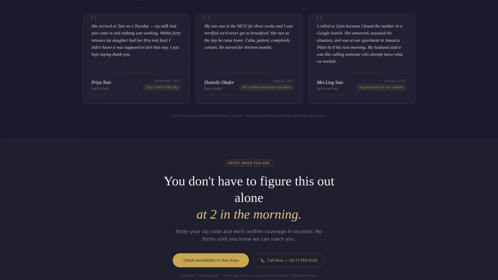
Testimonial Declaration Blocks
Client testimonials are formatted as signed declarations, each attributed with a date and a neighborhood name. This format reinforces the legal-brief visual language of the page and adds geographic social proof that mirrors the service area map above it.
Page sections overview
| Section | Purpose |
|---|---|
| Dark Glow Header | Establish authority and show service area map at first glance |
| Credential Logo Wall | Display certifications, affiliations, and insurance panels |
| Split-Screen Map | Show neighborhood coverage paired with logistical details |
| Lead Capture Form | Collect zip code first, then visit preferences and contact info |
| Testimonial Declarations | Reinforce trust with dated, neighborhood-attributed client statements |
| Sticky call to action Bar | Keep primary action and tap-to-call visible on mobile scroll |
Design & branding system
The Ink and Paper color system gives this template the visual weight of an official document. Every color choice reinforces trust before a single word is read.
- Deep document black (#1A1A2E) anchors the header and creates a calm, authoritative first impression
- Warm parchment (#F5F0E8) and soft graphite (#4A4A5A) carry the body sections, keeping the page legible and easy to read at any hour
- Muted gold (#C9A84C) is used only for trust badges, certification borders, call-to-action borders, and the tap-to-call button, so it retains its signal value throughout the page
Mobile & speed optimization
The template is built with the late-night mobile visitor in mind. Every layout decision assumes the person viewing this page is tired, holding a newborn, and using one hand.
- The sticky bottom bar keeps both the availability check and the tap-to-call button reachable without scrolling back to the top
- The zip code entry sits at the very start of the form flow so visitors get a coverage answer before they commit to giving personal information
- The split-screen layout stacks cleanly on smaller screens, keeping the neighborhood map and location details readable without horizontal scrolling
How this template helps you convert
The page is structured as a persuasion sequence, not a brochure. Every section earns the next click.
- Credentials appear before copy, so trust is built visually before the visitor reads a single service description, lowering skepticism from the first scroll
- The service area map lets visitors self-qualify by zip code, which means form submissions come from people who already know they are in the coverage zone
- The form collects the least sensitive detail first and reveals availability before asking for a name or phone number, which keeps completion rates high even among anxious first-time visitors
Other information about this template
This template is a strong fit for lactation consultants who want a focused, professional online presence without building a full multi-page website. It handles the most critical conversion path from search to booked visit in a single, well-organized page.
- The Legal Shield theme and Ink and Paper palette are intentionally chosen to communicate the same authority as a professional credential document, not a generic wellness blog
- The Logo Wall Authority creative direction means the page leads with proof before persuasion, which is especially important in a niche where parents are making a trust-sensitive care decision
- This template can support a consultant serving a single city or one covering several neighborhoods, since the split-screen location section is built to scale across multiple area entries
- The tap-to-call path is treated as an equal conversion route alongside the form, reflecting the reality that urgent overnight inquiries often convert better by phone than by form submission
Theme
Legal Shield
Creative direction
Logo Wall Authority
Color system
Ink & Paper
Style
Split Screen (50/50)
Direction
Lead Generation
Page Sections
Dark Full-bleed Glow Header
Credential Logo Wall
Split-screen Service Area Map
Step-by-step Lead Capture Form
Sticky Mobile Call-to-action Bar
Testimonial Declaration Blocks
Related questions
Can I customize the neighborhood and zip code entries for my own service area?
Does the form work for consultants who serve just one neighborhood or a wide metro area?
What if a potential client needs help urgently and does not want to fill out a form?
Is this template suitable for a consultant who accepts insurance?



