Veterinary Payment Plan Landing Page Template
Pawfund is a heartfelt veterinary payment plan landing page built for pet owners facing unexpected treatment costs. The zigzag layout follows a family's journey from diagnosis to recovery, using warm Desert Rose tones and hand-drawn illustrations to build emotional trust. Every section guides visitors toward the application portal with calm, clear confidence.
by Rocket studio
Quick summary
Pawfund is a single-page, click-through landing page template for veterinary payment plan services. It uses a Day-in-the-Life narrative structure, alternating illustrated panels with short story-driven text. The Desert Rose color system and hand-drawn animations create a warm, emotionally resonant experience that moves anxious pet owners toward a payment application with confidence and relief.
Who this template is for
This template is built for businesses that help pet owners manage the financial side of unexpected veterinary care. It speaks directly to the emotional reality of receiving a treatment estimate that feels out of reach.
- Veterinary payment plan providers and pet finance services looking to build trust before asking for an application
- Pet care businesses and clinics that partner with third-party financing portals and need a warm, story-led entry page
- Marketers and designers who need a production-ready emotional landing page for the pet insurance and finance niche
What problem this template solves
Pet owners in a financial crisis rarely trust a clinical finance page. They arrive scared, overwhelmed, and looking for a reason to believe things will be okay. A cold, form-heavy page loses them before they ever click.
- The template removes that friction by leading with emotional outcome first: a healthy pet, a manageable bill, and a family still together
- It eliminates premature form fatigue by directing visitors to the application portal only after trust is fully built through storytelling
- It replaces stock-photo distance with hand-drawn illustration, keeping the page universally relatable and emotionally safe
What you get with this template
You get a fully structured, single-page layout with a clear narrative arc and a consistent visual identity ready for customization. Every section is designed to reduce visitor anxiety and increase click confidence.
- Animated header illustration, zigzag alternating content sections, Day-in-the-Life story panels, and dual call-to-action placements throughout
- A complete Desert Rose color system with blush pink, warm sandstone, deep clay, and parchment white applied across all sections
- Click-through architecture with a primary call-to-action button and a secondary speed-qualifier text link repeated at every narrative turn
Feature list
This template bundles several carefully considered design and content features into one cohesive page. Each feature is rooted in the emotional and functional needs of the veterinary payment plan audience.
Animated Header Illustration
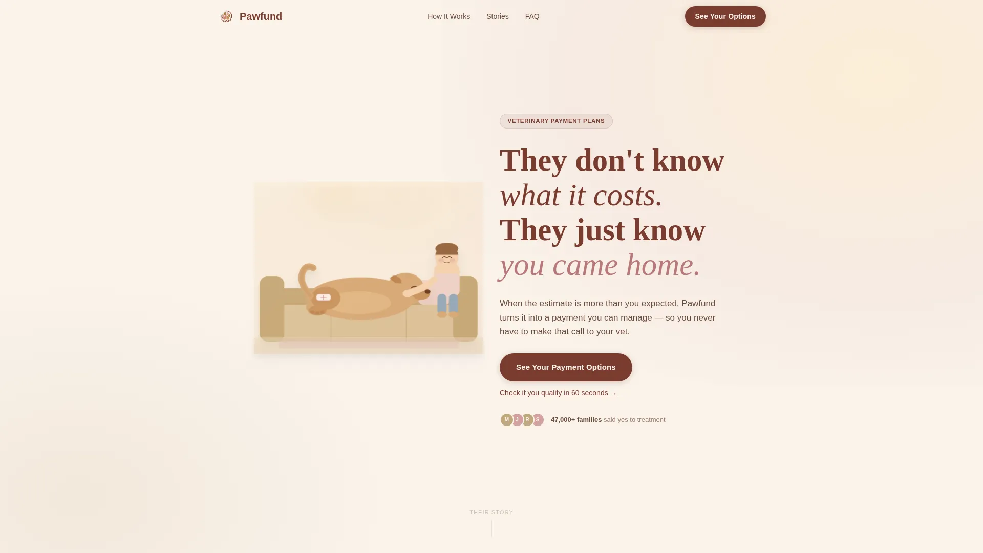
The header opens with a hand-drawn golden retriever resting beside a child, both breathing gently in a looping animation. A subtle bandage on the dog's hind leg and drifting warm afternoon light in soft parallax layers set the emotional tone before a single word is read.
Handwritten-Style Headline Entry
After two beats, the headline eases in using a handwritten-style typeface: "They don't know what it costs. They just know you came home." This delayed entrance gives the illustration time to land emotionally before the narrative begins.
Day-in-the-Life Zigzag Sections
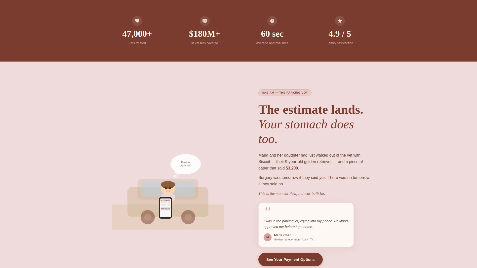
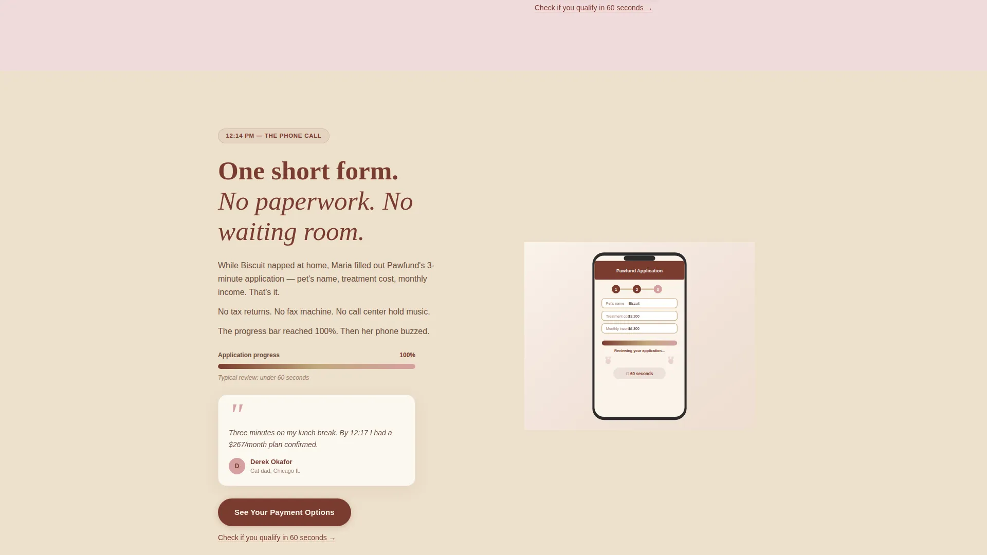
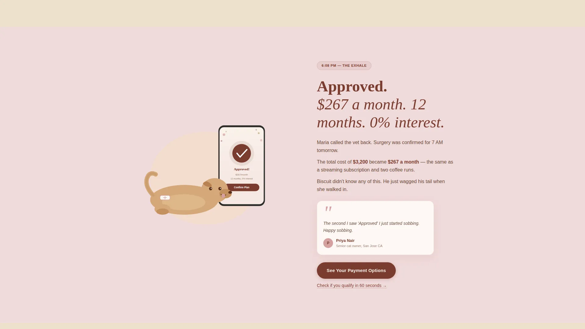
Each alternating section follows one family through a single day: morning panic at diagnosis, the midday phone call, the evening sign-up, and the next-day surgery. Illustration and short narrative text alternate sides as the scroll progresses, creating a natural reading rhythm.
Micro-Animation Story Cues
Small motion details reinforce the emotional arc as visitors scroll. A progress bar fills, a tail begins to wag, and a child's drawing appears taped to a fridge. These micro-animations signal forward movement and emotional resolution without interrupting the reading flow.
Dual Call-to-Action Structure
The primary call-to-action button, "See Your Payment Options," appears beneath the header and repeats at every zigzag section turn. A secondary text link, "Check If You Qualify in 60 Seconds," sits below each button to reduce friction for visitors who need a faster on-ramp.
Warming Palette Progression
The page shifts slightly warmer in both color and language as the visitor scrolls deeper. Blush and sandstone alternate across section backgrounds, with deep clay anchoring headlines and buttons throughout, so the visual journey mirrors the emotional journey from worry to relief.
Page sections overview
| Section | Purpose |
|---|---|
| Animated Header | Opens with illustration and delayed headline to set emotional tone |
| Primary call to action Block | First "See Your Payment Options" button placement beneath header |
| Morning Panic Panel | Zigzag section one: diagnosis moment, left illustration, right narrative |
| Midday Call Panel | Zigzag section two: phone call moment, right illustration, left narrative |
| Evening Sign-Up Panel | Zigzag section three: approval moment, left illustration, right narrative |
| Next-Day Surgery Panel | Zigzag section four: recovery moment, right illustration, left narrative |
| Outcome Resolution Block | Shows healthy pet, manageable bill, and family intact before any terms |
| Repeating call to action Footer | Final "See Your Payment Options" button with secondary qualifier link |
Design & branding system
The Desert Rose palette was chosen to feel tender and grounded, like a sun-faded family photo. Every color has a specific role that supports both the visual hierarchy and the emotional arc of the page.
- Soft blush pink (#D4A0A0) and warm sandstone (#C2A87D) alternate as zigzag section backgrounds, keeping the scroll visually active without feeling clinical
- Deep clay (#7A3B2E) anchors all headlines and call-to-action buttons, with a soft blush hover state on the primary button for warmth
- Parchment white (#FAF3EB) serves as the resting background, giving every illustration and text block room to breathe
Mobile & speed optimization
The template is structured for comfortable reading and interaction on smaller screens. The zigzag layout adapts so that illustration and text stack clearly on mobile without losing the narrative progression.
- Each section is built with vertical stacking in mind, so the story panels read top-to-bottom naturally on a phone screen
- Call-to-action buttons are sized and spaced for easy thumb access at every section break
- Micro-animations are designed to be subtle enough to remain smooth even on mid-range mobile devices
How this template helps you convert
This template earns the click by building emotional confidence before making any financial ask. The page architecture is specifically designed to reduce hesitation at every scroll point.
- The header illustration and delayed headline create immediate emotional identification, so visitors feel seen and understood before reading a single benefit claim
- The Day-in-the-Life zigzag structure shows the outcome first, a healthy pet and a family intact, so the application portal feels like a logical next step rather than a risk
- The dual call-to-action placement at every section turn means a visitor who is ready to act never has to scroll back up or search for the next step
Other information about this template
This template is built for the veterinary payment plan niche inside the broader pet insurance and finance category. It is particularly well-suited for click-through campaigns where the goal is portal referral rather than on-page form completion.
- The page intentionally avoids mentioning interest rates or terms above the fold, keeping the emotional outcome front and center until trust is established
- No stock photography is used anywhere in the template; all visuals rely on hand-drawn illustration to keep the page universally relatable
- The Family First theme and Desert Rose color system were selected together to reinforce warmth and credibility for a financially sensitive audience
- This template works as a standalone entry point that hands off to a partner or third-party application portal for income and treatment detail collection
Theme
Family First
Creative direction
Day-in-the-Life
Color system
Desert Rose
Style
Zigzag/Alternating
Direction
Click-Through
Page Sections
Animated Header with Parallax Layers
Day-in-the-life Zigzag Layout
Dual Call-to-action Placement
Warming Scroll Progression
Micro-animation Story Cues
Outcome-first Conversion Architecture
Related questions
Does this template include a payment application form?
Can I update the colors and illustrations to match my brand?
Who is this landing page designed to speak to?
Does the page support hesitant visitors who are not ready to apply immediately?
Can the illustration and story be adapted for pets other than dogs?